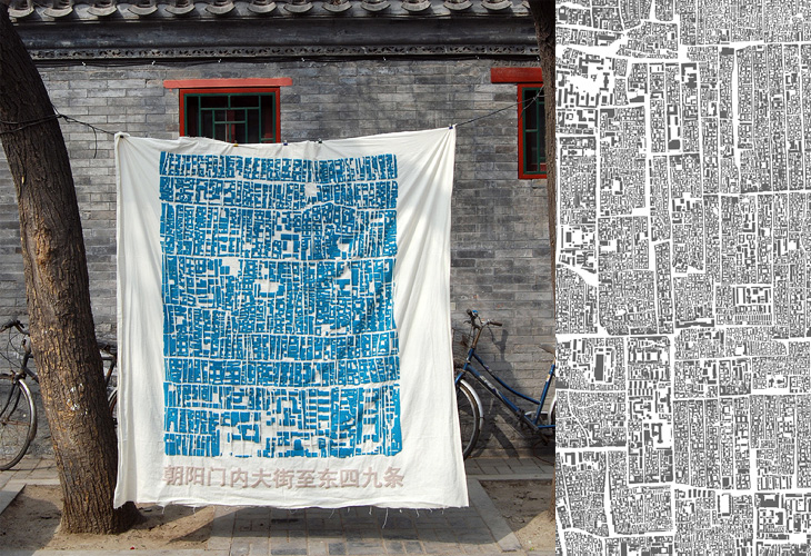
Only yesterday I posted about cities, maps and dense architecture, and I find this on NOTCOT - Instant Hutong. It’s an art project to both record and to bring to people’s attention the traditional patterns of neighbourhoods, courtyards and lanes in Beijing - under threat from development (of course). When I saw the small picture on NOTCOT, I thought it was actually close-set lettering as the main streets appear to form natural ‘baselines’ in the dense pattern of buildings. Interestingly, one of the pieces in the project is a collection of name stamps, set with small chunks of the street pattern - bringing to mind the idea of the built environment as being part of people’s identity, a kind of language they use in interacting with the city and the world. To lose that language, the structures of the city, the place where you grew up, is to lose a part of your identity - not a particularly controversial or new idea, but definitely worth reminding ourselves of from time to time.
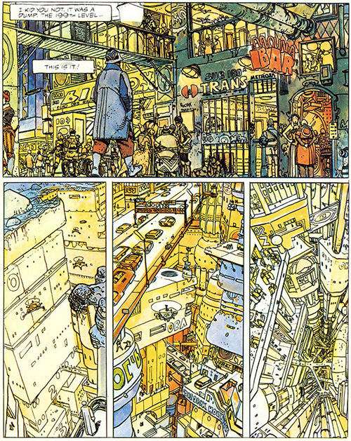
This has been hanging around in my browser tabs for a little while - it’s right up my street too, The Top 10 Comic Book Cities on the Architect’s Journal. A few people have linked to it (I have no idea where I first found it), so you may have already seen it, or even have the books listed. I’ve got a couple, and I think I’ve tracked down a copy of The Long Tomorrow, with Moebius’ fantastic visualisations. I’m quite fond of the idea of megacities, maps (especially of the builtenvironments) and really crowded, dense architecture. It’s not type related, but I imagine such things tend to appeal to the typographically-inclined, if only for the recognition of the similarly detail-obsessed personalities that created them. Anyway, I got the picture below from a regular read of mine, Sci-Fi-O-Rama, which feeatures sci-fi related art and book covers:
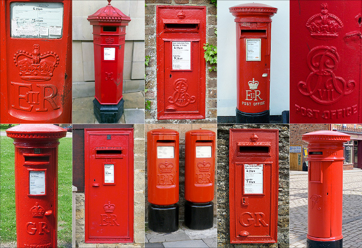
I love projects like this, a Flickr group purely for Royal Mail postboxes identified by postcode. There are currently 5679 photos in the group, so is getting to be a pretty good catalogue of the postboxes in the UK - though with 115,000 in total there’s still a way to go. One of the first ones I clicked was pretty close to where I’m from, and lo, a quick search reveals the one very close to where I grew up. Ah, memories.
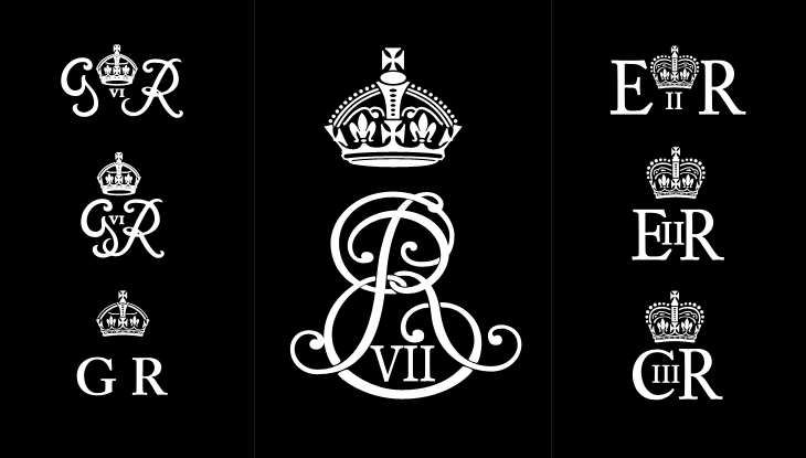
One of the interesting things about all these postboxes is the variety in the emblems of the reigning monarch - from Victoria to Elizabeth, they range from the florid and calligraphic to the frankly rather austere. Naturally, I’ve had a play around recreating some of the emblems, below. I wonder at the unnumbered George ones though; I’d guess they must be from during the Second World War, or directly afterwards - they suggest the Austerity period to me, but why no number? The extra metal and work required would be minimal, after all. As for the other later ones, the lettering looks to be inspired by Caslon types, though with plenty of variation from the hand-carved moulds, which has given them various profile styles from soft to sharp-edged, strengthening and highlighting the symbols - a kind of 3D hinting, if you like. I hope the effect was intentional, as it’s rather nice.
Some of the emblems - which I rather freely recreated rather than tracing them accurately. Show here are the rare Edward VII, variants on George VI, Elizabeth II and my very own wild speculation at Charles III (if that is indeed what he takes as his regnal name).
Perhaps controversially, I also had a bit of a play at creating a symbol for Prince Charles when (or if?) he becomes king. He may choose to reign as George VII, though from a design point of view I hope not - if he keeps his current first name he can have that ‘III’ fitting into the counter of the C, which I rather like the look of.
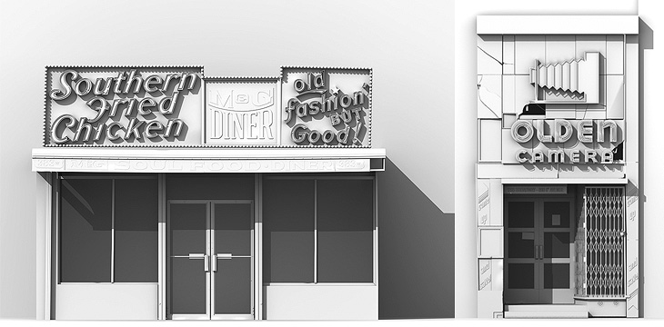
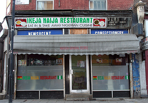
I think I saw this one on Coudal Partners, an ongoing photo study of London shop fronts. What fascinates me is the range of type and typography on the shop signs. Some are good, some are strange, some are very strange, and there are quite a lot that are pretty dreadful, all making up what I suppose you could call London Small Shop Vernacular.
Nice bit of signage archaeology on this one.
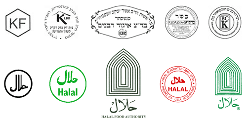
From time to time I’ve thought of doing this in Brighton, there’s quite a range of shop fronts, and they seem to change quite frequently too. I saw a lovely roundel on the window of a burger takeaway announcing the availability of halal meat, and it got me wondering whether there are any sort of recognised marks for halal and kosher, and it turns out there are. Quite a few of them in fact, and not really very consistent. I guess if you’re sure no-one is actually going to out-and-out lie, these are all consistent enough:
The idea of being ‘consistent enough’ reminds me of other logos for food labelling. There’s the ‘v’ for vegetarian, and sometimes vegan, food - something you see a lot in Brighton. There’s also the Vegetarian Society logo which often gets used by food suppliers whether they have permission to do so or not, but again, no consistent mark for the whole thing. Perhaps with some things there’s no need for consistency because the truth of what the symbol claims can be easily checked, but with other things there definitely is a need. For example, the demand for fairly traded products has led to the development of an official Fair Trade logo. However, there are lots of other ones that imply lovely, fair, environmentally and socially responsible origins, but have so few checks and balances as to be essentially meaningless - greenwashing in other words.
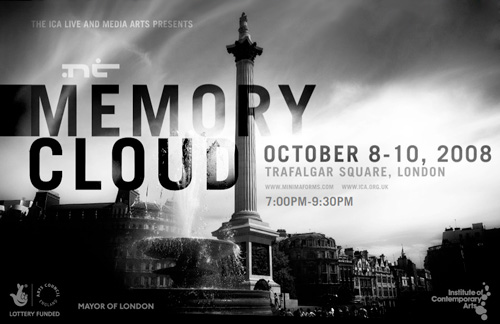
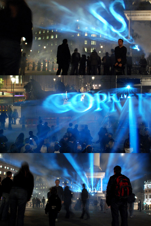
Alas, I found out about this way too late to visit it in person, but there are some pictures of the event on Flickr. I love the way the words float, apparently in multiple planes; a rich, multilayered and compelling effect; the silhouettes of the crowd, the dramatically lit lush architecture with the bright, translucent clouds of glowing words in the centre. Maybe the photos make it seem more impressive than it was, but I’d certainly like to have been there… with my own camera.
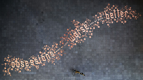
I came across this remarkable piece of work earlier today. It’s a design created with 250,000 euro cents in a public square with the intention that people would interact with it, presumably by taking (or rearranging?) the coins. Even though it’s €2500 lying there, it would take a fair bit of determination to take the lot and get it to (at least) a coin-changing machine, a level of hard work a casual thief is unlikely to want to do I think. The Amsterdam police viewed it rather differently, seeing all this money left on the pavement as being at risk of theft and swept the whole lot up for safekeeping. Rather keen of them, no? The site ExperimentaDesign explains some of the background to the project:
Droog Design and Scott Burnham have assembled a team of some of the most innovative designers and architects from around the world to create 13 newly designed interventions, tools, toys and objects that are temporarily placed along a route on the central IJ-riverfront in Amsterdam.
The design is remarkable and attractive, and there are a few pictures and videos of it before it was ‘saved’. The people building it are clearly working from a plan, but there isn’t a copy of it online that I can find unfortunately. I’ve combined these twophotos by Jens to show the whole design - it’s a bit rough but you get the idea:
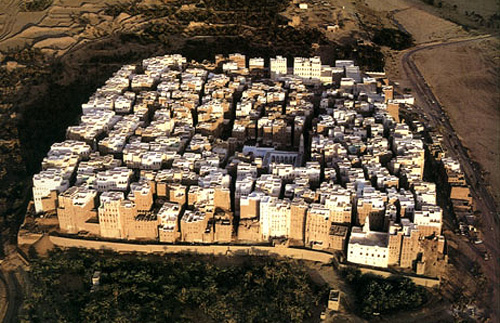
As I’ve mentioned before, one of my obsessions is for maps, especially maps of cities. Maps and images of cities. Walled cities that exist into the modern era are especially fascinating to me. In most societies the conditions that forced people to defend themselves with walls (and for those walls to be successful as a defensive measure) have long gone. Walls can be breached with artillery, bypassed by cruise missiles, made insignificant by ICBMs, and made irrelevant by changes in economies and societies. However, there are still walled cities in the world, and some have even been revitalised (however briefly) by modern conditions.
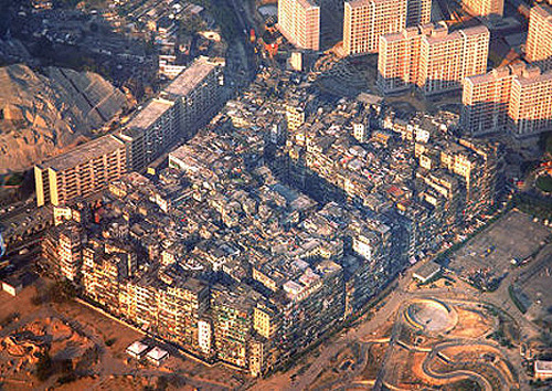
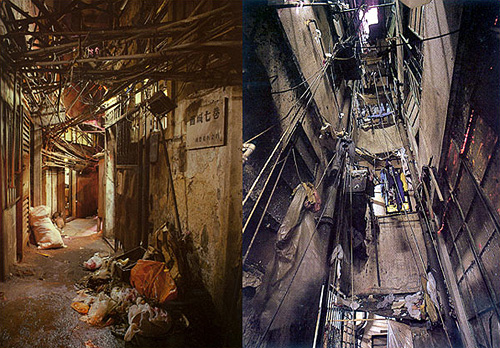
One such was Kowloon Walled City, a small patch of Hong Kong technically never in the British mandate, but never de facto controlled by the Chinese either. As a territory in limbo, it became an incredibly dense city, almost a single building, covering only 0.026 km² and at its peak apparently having a population as high as 350,000 people; though as a virtual anarchy detailed census figures naturally don’t exist. I wish that someone had been brave and resourceful enough to mount a survey of the city at its peak - the place was, as far as I can tell, unique in the modern world. Knowing more about it, how the societies within it interacted, how the buildings were modified over time, the nature of personal vs. public space and how the power structures (and their limits) altered over time would help with the study of our own increasingly dense societies.
Looking at pictures of it, I’m reminded of these pictures of Shibam in Yemen. The structural similarity to Kowloon Walled City is remarkable:
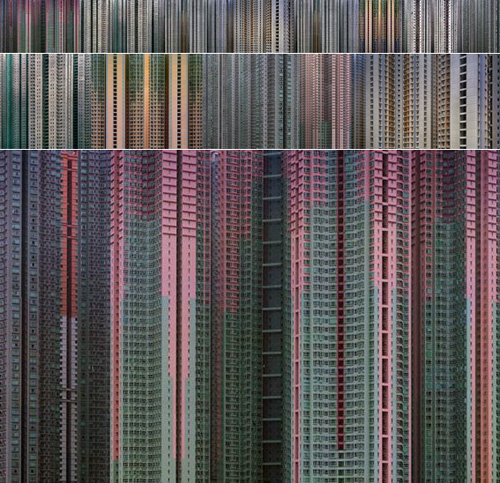
I’ve had a link saved to these pictures for quite a while, and of course they’ve been linked from countless sites over the years, but hey, they’re still worth linking to again.
The thing that I’ve noticed about them is the effect of the small thumbnails all together. You click them and in a way some of the mystery is dispelled, as the smaller size allows you to see the overall pattern. They could be microchip designs or supermarket shelves, so I put them together at a couple of sizes below. To see the details there’s an original size one too.
The Denver Egotist sent me a link to this rather nice piece of work, for Crawley Library in West Sussex. The new library is due to open in January 2009, so I might have to go up and have a look - I’ve not been to Crawley in years. There’s some more info on the Crawley Borough Council website, and some pictures on the Crawley Library Flickr set.