Coastal Typography

I traced this lovely ligature from the photo, representing the “ff” digraph from the 28-letter Welsh Alphabet.

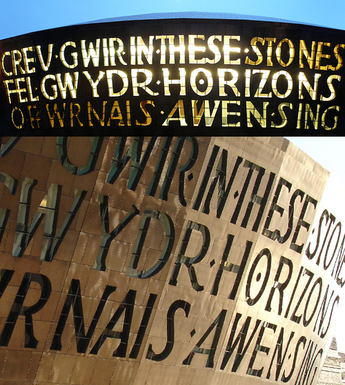
During a discussion of modern architecture in Wales (as you do), David pointed me in the direction of some pictures of the Millennium Centre in Cardiff, which has some fantastic lettering on the front canopy. The letters, big, chunky and pretty dramatic and spell out the title of a work for chorus and orchestra commissioned from Gwyneth Lewis for the opening ceremony of the building. I particularly like the way the two languages have been written together - the Welsh one being flush-left, the English flush-right, with the ragged edges slotting together nicely - and that they aren’t a direct translation of each other. The lettering itself is lovely, with varied letterforms and spacing giving the whole thing the sense of something hand-done, which given its scale is something to behold. In Lewis’ own words:

The windows out of which the words are made suggest to me an ideal of poetry: that it should be clear enough to let light in and out of a building, offering enough a distinctively local view of the world; it should speak a truth which is transparent, beautifully crafted but also fragile and, therefore, doubly precious.

I think it looks great as it is, but I’ll be interested to see what it looks like after a good layer of verdigris has formed on the copper.
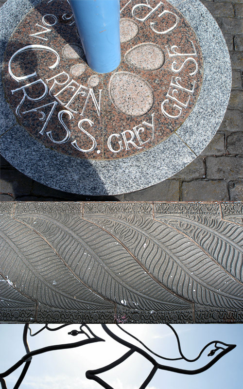
The appearance of the building reminded me of a big regeneration project for Morecambe’s seafront, which also has a strong typographic element. Well, several in fact. It’s the Tern Project, a series of sculptures, walkways, and general improvements to the seafront to make it a more fitting location to see Morecambe’s (arguably) finest asset - its view of the bay. The Tern Project website gives you some idea of what’s been done, but I think whoever built it based it on a museum or art gallery’s site - i.e. make the pictures as small and uninformative as possible - probably labouring under some delusion that seeing a nice big photo will somehow deter you from visiting. Note to developers of these sites: it doesn’t! Put big pictures on your site! Let people get an idea of it, and they’ll be more likely to visit! A photo can only give a rough impression, but seeing the context and some detail, you will hopefully want to visit. The top two of these pictures are mine, the bottom one is from this we-think-all-caps-is-cool site. Still, irritating websites aside, I would strongly suggest paying a visit to Morecambe to have a look at the artworks, and to see the view across the bay to the Lake District.
Books in Buildings in Books

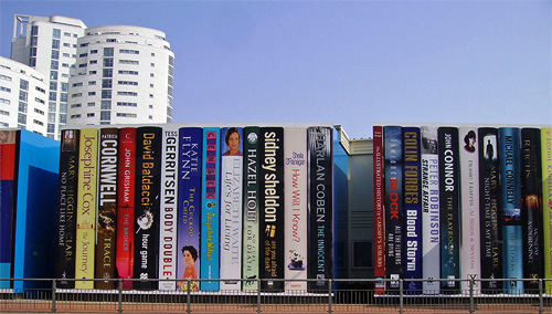
In 1997 the British Library moved to its new building in St Pancras, which I remember reading was designed to roughly resemble a stack of books. Very roughly. It seems that other libraries had a similar idea but decided to be less abstract, much less abstract.

First off, Cardiff Public Library, which has built this (unfortunately) temporary covering for the building until it’s completed. I partly agree with the sentiments here (where I got the images) that the installation should be permanent, but that the books should change. I’m sure book publishers could provide the panels, both advertising the book (should people want to buy it) and the library (if they want to borrow it). It’s interesting how the books are all modern bestsellers, I’ll get to that later.

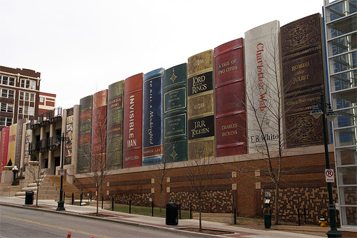
Then there’s the Kansas City Public Library, where the installation is permanent, on a much larger scale, and is designed to conceal the library’s car park. Here the public were asked to nominate books that they felt represented Kansas City. I’m not sure how Lord of the Rings meets that criteria, and I’m sure the last time I read Romeo and Juliet it wasn’t set in the mid-west, but there’s a hell of a lot I don’t know about Kansas City so I’m sure there’s a perfectly valid set of connections there. Mind you, notice here that all the books are great works, classics, high points of Western literature, which is a bit of a contrast with the Cardiff choices.

Now, I have some entirely unsubstantiated wild guesses about why this might be. I could suggest that the Cardiff Library is taking a deliberately populist stance, trying to make itself appear more relevant to “today’s busy Welshman and woman” and not as some ivory-tower isolated repository of dead knowledge. The British Press does tend to have a schizophrenic view of cultural establishments, either they’re lauding some wonderful new Establishment, preserving and restoring Great British Culture, or slagging off yet another white elephant, a waste of money, ignoring the sensible wishes of the Great British Public who Couldn’t Give A Toss.

The Kansas Library on the other hand, like other American city libraries, is likely to be regarded as an educational institution in its own right and an asset, worthy of city pride. Not forgetting that educational institutions in the US are big business, I would hazard a guess that city residents would have some pride invested in their city having a big library, it shows an educated population, and an educated population must have been able to afford college, so Kansas City must be a prosperous place indeed, well worth investing in. So they pick great works, because they represent learning and achievement better than books you could pick up at the checkout line at Wal-Mart.

Oh, and I’d just like to say that philosophical musings aside, I think both of these are bloody marvellous, and we should see more of this kind of thing.

Very Bad Information Design

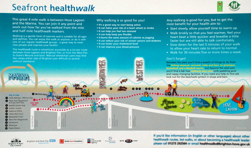
This sign on Brighton’s seafront (click for a larger view) is one of the worst, if not the worst bit of information ‘design’ I have ever come across. I am a long-time resident of Brighton, and most of my time here has been spent living very close to the seafront. I am also very familiar with maps of the place (being obsessed with maps in general). When I first saw this sign, I had to look closer to see what it was about, as I hadn’t recognised that it was a map of Brighton seafront!

So what’s wrong with it? Let’s look at some properties of it in turn.

  • The orientation
    There are two usable ways to orient a map. The first is to place the ‘You Are Here’ point at the bottom of the map, and have everything that lies in front of the person looking at the map above that point. The further away it is, the closer to the top of the map it is. This is the most usable orientation for a map where you know the position and orientation of the person reading it. The second, and most usual, way is to honour the generally-accepted global convention of having north at the top, and south at the bottom. This is a good idea for maps that may end up being moved around, or duplicated and placed in different locations you don’t know or can’t control.This map does neither. It places south at the top of the map, and yet if you look at what you see when facing towards the map, south is to the left.
  • Landmarks
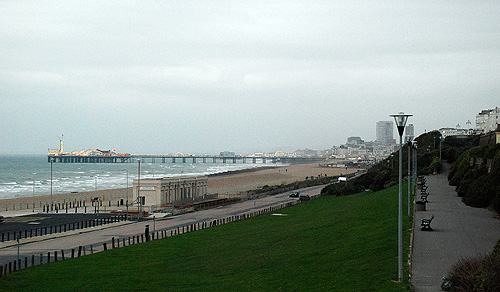
    A look at this map shows that it has various landmarks marked on it, most prominently the Brighton Pier and the West Pier. The problem here is that the broken south-at-the-top orientation of the map gives the impression of a skyline, rather than the top-down view of a map, and as you can see from the actual view below, for Brighton this represents a different idea. Brighton has two prominent tall buildings on the seafront - Sussex Heights and Chartwell Court. Showing the piers sticking up like that is more likely to evoke these two buildings, even for a local resident who is familiar with the two piers. For a visitor, they would look out from this position and see one pier, the West Pier having burned down and largely collapsed into the sea (I must point out that this happened long before these signs appeared) and two tall buildings. Despite the names on the map, it would be enough to trigger doubt in the reader regarding whether they were reading it correctly.
  • The typography
    While much of the type on the sign is perfectly readable and reasonably well-set, it is again the map that has the problems. The lettering on the labels for the Marina, the two piers and the other landmarks is pointlessly, and needlessly, excessively casual and hard to read. I wonder sometimes if the mantra to ‘make it look friendly’ doesn’t get so locked into people’s minds that they lose sight of what the purpose is of what they’re designing. After all, surely it is far friendlier to make signs informative and easy to read?
  • Drop shadows
    One of the pitfalls for a computer-based designer working for print is to be distracted by the benefits and limitations of screen display technologies. In other words, things look different on screen than they do in print. Colours on screen are made by generating light, colours in print are made by selectively absorbing and reflecting ambient light. Drop shadows are a boon to a screen designer, outlining and adding definition to otherwise indistinct or low-contrast images, whereas in print, a drop shadow will come out as incredibly dark and heavy. Quite often you don’t see this until the final print proof has been made, if you get one. Printing workflows are so quick and easy now that often a obtaining a proof is considered in the same the way that maintaining a effective and robust backup strategy for your hard drive is, i.e. a chore to be put off, if possible. Printing a copy out on an inkjet photo printer doesn’t make an effective proof either, as these printers tend to be a lot more forgiving. On this sign, the designer has fallen right into the trap. Almost all the graphical elements have drop shadows, and the label for ‘Hove Lawns’ is barely readable thanks to the great blob of black ink surrounding it. The label with the fish jumping over it… I can only guess that that says ‘Fishing Museum’, and only then because I know that it’s there. Any tourist looking at this wouldn’t have a clue!
  • The roads
    I’m at a bit of a loss over the choice of roads chosen as landmark routes. It shows ‘East Street’ just to the right of the roundabout, but the main road that any visitor could identify in Brighton (after the seafront) isn’t shown - The Steine. Just take a look at a real map of Brighton to get an idea of how strange the omission is. I wonder whether they thought that for a map promoting walking it shouldn’t show main roads, despite them being obvious and easy to identify? The other roads are a bit odd too - why Seafield Road? I’ve never actually heard of the place, and yet just two streets along is Hove Street, leading to Sackville Road, very much main roads and easy to identify. A poor map indeed.
  • The graphics
    This is more of a personal dislike. I detest ugly things, and the graphics on this sign are relentlessly hideous. Poorly drawn, garishly coloured, artless, unpleasant abominations mocking everything that is beautiful and graceful about the human form and the world in general, these little icons would be best left off this sign. It doesn’t help that they have strong drop shadows under them too - the blue blob under the ‘West Pier’ label is, I assume, a pool of water, and yet it has a shadow under it. Since when did a pool of water have a shadow? And one so dark?
  • The route itself
    Yes, the very point of this map, is in essence, wrong! It shows you having to cross the roundabout by the Brighton Pier, when in fact you pass around it. The colours of the background too, they imply that you’re nowhere near the beach on your walk, and yet in actuality, you’ll be right on the beach.
  • The logotype
    Last, but by no means least, what is going on with the italicised ‘walk’? Perhaps they thought they needed to add some ‘dynamism’ to the name, but this really is not the solution.

In short, I detest this sign. Whoever did it should be placed in remedial graphic design training.

Architecture

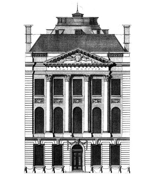
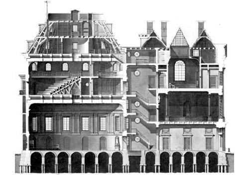
Ah, another great passion of mine: architecture. So I created a new category for it. I came across Andrew Cusack’s site this weekend, and it’s full of wonderful photos, illustrations and articles on the subject. A couple below, though I have to say this has to be one of my most favourite buildings. I’m not fond of the interior, mind.

Murals of Philadelphia

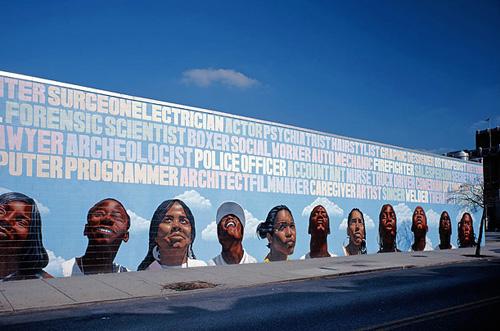
I was just looking through the Time piece on The Murals of Philadelphia, and came across this rather wonderful bit of lettering. I love the subtle changes in the colours to differentiate the words and the slight variations in the letterforms and x-height. It’s a really nice piece, I love the faces at the bottom too, but it was the lettering that caught my eye. Also, this one is just wonderful. Go and look at all of them!