Deruluft

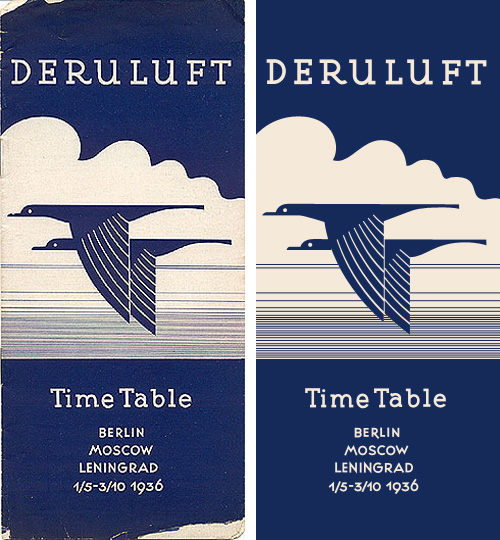
I love this timetable cover for Deruluft - the double bird motif is really quite lovely. The use of the motif in their brand imagery apparently starts out strong (good) and then falls out of favour entirely between 1933 and 1935 (strange) - even in the 1932 brochure it’s reduced to a small image on the flag, then finally being nicely refined and promoted to the central image on the 1936 timetable.

The type is interesting as a monoline form too - the serifs are enormous, and the one on the ‘a’ is just strange, especially given how close it comes to the ‘T’. I really like the numbers though - the balance between the 9 and the 6 in the year is particularly pleasing.

The airline was a joint venture between Germany and the Soviet Union, which didn’t survive the changing political situation between the two countries:

Deruluft’s route network remained fairly intact until the airline discontinued operations in March 1937. By then, relations between Nazi Germany and the Soviet Union had deteriorated to a point where a joint venture was politically impossible. Deutsche Lufthansa took over the route through the Baltic countries, but a service to Moscow was reopened only after the unexpected German-Soviet nonaggression pact of August 1939 had temporarily brought the two countries closer to each other.timetableimages.com

Of course, I had to trace the cover. Mind, much of the appeal of the original is down to the artifacts produced from the printing process, which I didn’t replicate here. I gather there are now filters for Photoshop to create them though.

Original image via ffffound.

The Beta Label As Poor Excuse

Steve sent me a link to the all-new official site for the Prime Minister of the UK, which, incredibly, is in beta. Get that: The official online presence for the leader of (allegedly) the fifth richest country in the world is a crummy beta site with dodgy kerning, inconsistent use of typefaces, colours, rounded corners, spacing, and, well everything apart from general crumminess. Look at the masthead. It’s in Clarendon, Times New Roman Bold and Georgia. The typographic soup continues with the addition of Arial for body text (and oddly, some headlines too), and on a graphic, Copperplate. There are boxes with rounded corners at the top but not the bottom, containing images that also have rounded corners but where the curvature doesn’t match the container (and appears to be damaged by JPEG artifacting on most images). The site is a mess.

The masthead at the time of writing.

The idea of adding features to the site such as YouTube, Twitter and Flickr feeds is a good one, and yes, these things can be a bit messy to integrate at first, but it’s not hard to get those things up and running in any design. The hard bits, especially for a site as prominent as this, is to ensure security, that the background infrastructure can handle the traffic and (importantly) all your content is written and entered into the site. Is this a site that got designed and implemented by several groups who never communicated? It looks like there may have been a design done at pitch stage, but largely ignored throughout development. A good, consistent design is vital for any site, and sticking to it is a must throughout all stages of development.

Still. All these things can be fixed. The design can be clarified, the layout can be rationalised, attention can be paid to consistency and quality, the HTML and CSS can be cleaned up, but it beggars the question, why did they launch an unfinished site and call it a beta? This is not what betas are about. This is arguably one of the most important sites representing the UK and should be implemented to the highest of standards, and yet they launched a crap blog and tried to cover their arses by calling it a beta. Very poor show indeed.

Robot Milk

I love robots, I love invented brands, and I love well-made artifacts, so this set of bottles really got my attention. Trouble is, there’s very little I can find out about it. I know it’s something to do with 826LA, it might be a student project, the bottles themselves might be for sale (though not from their online store) and that I would like one. Or two. Or three.

The typeface for the main brand is Home Run Script, which was identified for me by beejay and Ignacio at Typophile.

Via NOTCOT

Political Grids

There’s been loads written about the high quality and consistency of Barack Obama’s campaign branding and design. I don’t disagree with any of it, but I’ve not really seen anything that really grabs my eye, that makes me look closer and see how it was done. Maybe I’m being cynical because it’s advertising for a political campaign, but they’re perhaps too knowing, too carefully designed, sometimes perhaps too derivative, to be commented on individually as pieces of design work. That is in itself quite remarkable, of course, and collectively they’re interesting as an example of brand power, but at the end of the campaign it’ll be interesting to look at all of it together, as a single body of work, and I fully expect there to be a book published to allow us to do just that. I’ll probably buy it, too.

So, having said all that, I just came across this scan of a flyer promoting Obama’s speech at the Tiergarten in Berlin last week, and it’s a bit more special. It’s got a very nice grid, which to some, invites some comparison to the work of the Bauhaus, though I can’t be the only one to realise that diagonal grids are unique to the Bauhaus. Indeed, they’re quite often used in political, commercial and (dare I say it) theatrical advertising. Still, the flyer below is an excellent example of a diagonal grid, well applied:

Kix

I’ve had this link on Hello Bauldoff hanging around for ages - the design of the box and the bold typography are fantastic, and the colours in the photo really appeal. One thing I noticed was the old-style General Mills logo which is far nicer than the version on their website, though they still use the crazy ‘G’ symbol. It’s the kind of thing that would drive me bonkers if I had to stare at it at breakfast every morning - is it a ‘G’? Is there an ‘M’ in there? Or is it some bonkers ampersand?

I know it’s the main point of the campaign they’re doing, but I’d remove the t-shirt promo flash, or massively simplify it - to me it looks like it’s trying too hard for that retro-Americana thang. The rest of the box carries that off perfectly, so it’s just not necessary.

OGC? Oh Gee, See?

You know, when it comes to designing a logo that’s going to appear on documents, mousemats, brochures, you know: portable things, you really do have a duty to examine it from all angles. It also helps to get people in whose thought processes tend to the profane, because such people exist in great numbers ‘out there’ in the real world and will at a moment’s notice point out any even slightly lewd or coarse associations*. Also, perhaps develop a familiarity with iconographic representations of the human body, just in case your logo resembles such a figure. Say, like the Cerne Abbas Giant would be if the ancients fancied a more demonstrably explicit image…

Anyway, this logo for a British Government agency is quite hilarious, and I’m amazed they’re going ahead with it. Oh, and from the Register article that the Times sourced this from:

For the record, and in case you’d like to get your hands on a rebranded OGC mousemat, we gather staff have stripped the building of every example not nailed down, so check eBay later this week for your five-knuckle shuffle collectable.

* I have to state that I, of course, would never do such a thing. I blame the Times.

An Orchestral Rollercoaster

This advert for the Zurich Chamber Orchestra has been linked from several design related sites (I can’t remember where I first saw it), but all of them were linking either to Zapp Internet or to YouTube, both of which only had low quality and low resolution versions. For animations with such fine detail as this has, you really need to see the clean, high-res version to appreciate it fully. So, a good few Google searches later, and I’ve found this article on Llámame Lola, which not only carries a link to the MPEG but appears to be the originator of the Zapp upload. My paraphrased translation of their description, which is, to be fair, a bit random:

Here’s a great commercial for the Zurich Chamber Orchestra made by the agency Euro RSCG Zürich. Recently the orchestra carried out a concert in Spain with the Swiss flautist Emmanuel Pahud, at the Palau de la Música in Valencia. For the opening night last week, Emmanuel Pahud performed with the ZKO under the direction of Giovanni Antonini, the Flute Concerto nº7 by Devienne.

Also, I was intrigued by the ZKO logo, and not immediately finding any PDFs containing a high-res version of that either, I decided to redraw it, as is my wont. It’s a beautiful logo, and probably is the subject of much jealousy by other orchestras.

You may need to download VLC to play the video from Llámame Lola as Quicktime claims it’s not a valid video file. Go figure.

A New Standard in Legibility

A few years ago I worked on the UI design of an online government-backed TEFL learning programme, which had a lot of input from various charities and education experts. One of the earliest inputs regarded the typeface to use for it. I remember an argument I had with a consultant for a large charity, who argued that Verdana was inherently an illegible face because the ascenders and capitals were different heights; an odd approach to take as I’m fairly sure that enough research had already been done into word shape and readability (by her own organisation as it turns out) to encourage faces with different ascender and cap-heights. Still, the argument quickly ended when the main stakeholder (other than the government) decreed that Comic Sans was the most readable text ‘face’ available and that it must be used for everything. They would allow no dissent. Fortunately a few months down the line and a couple of review stages later, we ended up dropping Comic Sans in favour of Arial - not normally a face to make designers rejoice, but so much of an improvement it felt like a liberation from purgatory. One of the main official objections to Comic Sans was that the letterforms were different from those end-users would be used to, and therefore unfamiliar and hard to recognise. Of course there were many unofficial objections, often centered around the end-users feeling somewhat insulted by such a childish face.

Anyway, I was reminded of all this when David pointed me towards the new face produced by Fontsmith for Mencap, which was actually designed in collaboration with end-users, and benefits greatly as a result. From the press release:

Having narrowed the choice down to a cleaner and more crisp letterform, which avoided the pitfalls of being too childlike and patronising, Fontsmith refined the design to aid legibility and maximise accessibility.FS Mencap is not quirky or odd looking, doesn՚t resemble the childlike design of fridge magnets or early learning tools and is set to challenge Arial as a new standard in legibility.

So rather than to treat people with learning or sight disabilities (or those who just don’t know English) as big children, Fontsmith and Mencap created a face that is clean, professional and adult, while still being friendly and (of course) legible. According to the Typophile article, the face will be available for the public to use too, which is excellent news. I wonder what range of characters are included in it though? The press release shows only basic Latin characters in the examples, but I hope it has broader coverage.

3D Type Design

There’s a great collection of 3D type designs on You The Designer. I was looking through them and was reminded of the long-neglected Atlas Magazine, which is sort-of still going (well, it’s there but not being updated from what I can tell). I remember Atlas having a new design with each issue, which was what kept me going back, and looking through previous issues you can see how fast the technology was developing in those years. One of them even offers a link to the Netscape Plugin Finder, using a pop-up window. Still, it’s stuck on the last design now, though you can look at previous issues by clicking the roman numerals floating about on the left, if you can. It’d be interesting to see how it would have developed, had it avoided the big-time of IPOs and say, a merger with Slate or similar. I wonder if it would still have navigation that tries to run away from you?

Imaginary Products

I’m fascinated by imaginary products created for films and games - there’s an art to creating something just similar enough to real products to be recognisable as a brand type, but without actually copying any particular identity. Some films and games come very close to existing brands (RUF in Children of Men; GAP for pets, Tube in GTA 3; Subway) while others work within the conventions of a product type so you know what kind of thing it’s supposed to be (pretty much everything in the Truman Show). I have an article I’m writing on brand conventions, but that’s not for today. The reason for this post is some of the work featured in this interview with Sarah Bradley, graphic designer and typographer at Pixar, and ex-lead title designer at Disney. In the article is a matrix for a box of rat poison shown in Ratatouille, which I just had to make into a fake box shot - I do this a lot at work and it’s fun to do, so I couldn’t resist.

The original matrix: