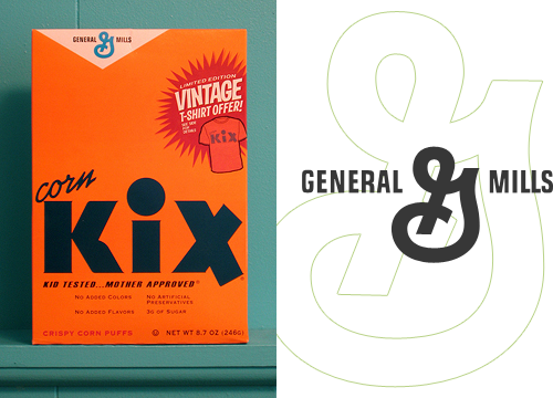
I’ve had this link on Hello Bauldoff hanging around for ages - the design of the box and the bold typography are fantastic, and the colours in the photo really appeal. One thing I noticed was the old-style General Mills logo which is far nicer than the version on their website, though they still use the crazy ‘G’ symbol. It’s the kind of thing that would drive me bonkers if I had to stare at it at breakfast every morning - is it a ‘G’? Is there an ‘M’ in there? Or is it some bonkers ampersand?
I know it’s the main point of the campaign they’re doing, but I’d remove the t-shirt promo flash, or massively simplify it - to me it looks like it’s trying too hard for that retro-Americana thang. The rest of the box carries that off perfectly, so it’s just not necessary.