
I just found this great collection of mostly French and Dutch promotional materials for the Citroën 2CV. I love the typography of the 2CV bit on a lot of the examples especially.
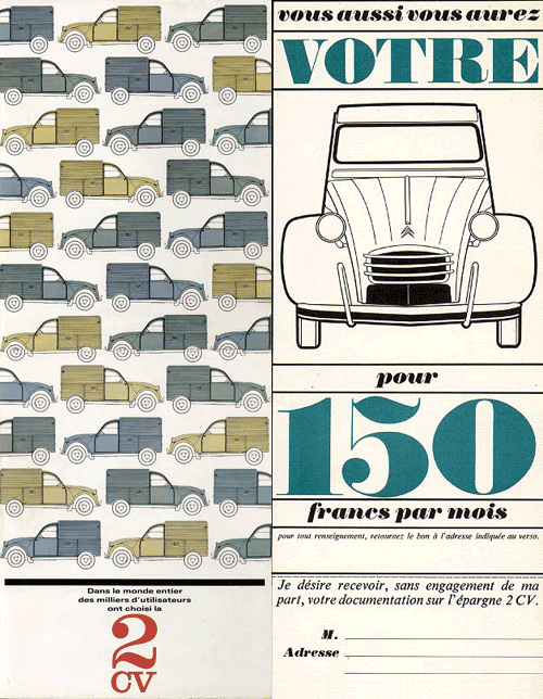

I just found this great collection of mostly French and Dutch promotional materials for the Citroën 2CV. I love the typography of the 2CV bit on a lot of the examples especially.

A few weeks ago, I spent a good hour trying to find some background info on the rebrand of Dubai International Airport, without success. I just went back to the Brand New post on it and there it is, a link, courtesy of Ty Wilkins.
While the airport logos have patterns similar to the tesselations characteristic of islamic art, the main logo pattern is rather reminiscent of a compass rosette, perhaps to imply that Dubai is at the centre of things? I generally agree with the Brand New post (and many of the comments) in that the positioning of the type on the individual airport logos seems clumsy and distracting. Having the type endpoint line up with the apex of the implied sphere is a straightforward solution, and yes, it’s not all that bad, but it’s not all that good either.
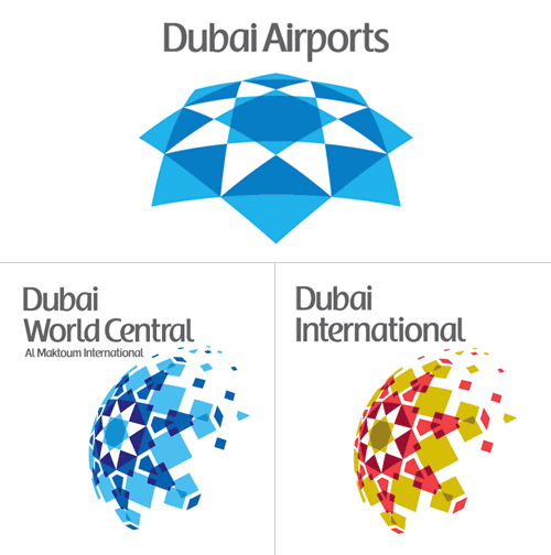
There’s something oddly old-fashioned about the choice of typeface and colour too, like something from the late 1980s. I’d prefer to see either the word “Dubai” or the airport identifier in a different weight, or black (instead of grey), or something - anything to give the type some life. I’m not sure about the face - it does look a bit like the Emirates logo, and I’m interested to see that there’s no arabic version of it too. Changing the positioning of the type, as below, focuses attention on that centre of the centre-of-things pattern and would look even better in arabic right-to-left lettering - in my everso humble opinion, naturally:
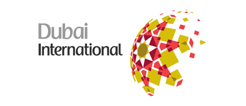
Mind, when we get some wider applications of the logo to brochures, signage, wayfinding and the like, it could appear quite different, with the odd type integrated and comfortable with the patterned globe.
…
Oh, and I have to point out the odd language on the logolounge article,
Dubai Airports tapped Cato Purnell Partners in 2007 to develop an identity system that would not only unite the organization’s holdings, but also mark Dubai as an international air hub.
Tapped? How do you tap an agency? I have horrific visions of plumber-surgeons installing chromeware directly into living flesh, a media agency relationship direct from the mind of Guillermo del Toro! Of course, this would hardly be the only linguistic horror inflicted on the language by the media industry, I say over and over again, the word creative is not a noun, no, not even when applied to a person, and especially not when referring to artwork. Rant over.
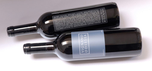
I just came across this site, The Dieline, which claims to be “The Web’s Leading Packaging Design Blog”. There are some very nice things on there indeed, including these wine labels. I must admit to being rather heavily influenced by the labels on wine - if I like the label, generally I think I’ll like the wine, and oddly enough it’s been quite successful in the past. Is that so wrong? After all, I’m not alone (same site, another nice wine label). So, having said that, I think I would definitely like to try this:
I just saw the new Animal Planet logo here, then after a search, here (of course). My first impressions weren’t too great, immediately I was wondering why the M was on its side - it looks like a reversed sigma, a kind of mathematical AniΣal Planet, if you will - and the mixed of weights and stretched type just seemed confusing and messy. However, after looking at some of the applications on the website (there aren’t many yet, though look at the videos on the home page, and here) I’ve changed my mind. Despite the obvious typographic objections (stretched type - ow!) I actually like it. I still think the sideways M isn’t too great, but overall the logo has a strong identity and fits with the aim of moving the channel from exclusively family friendly fare. They wanted to make the channel more grown up, and I think they’ve done it, simultaneously cutting the apron strings to the main Discovery brand by losing the spinning globe. I often like global ‘over-brands’ like Discovery had but it requires a consistently high standard of application and I think the old Animal Planet logo shows that that wasn’t the case. The new logo has a big advantage in that as it lacks imagery, it has a much wider range of applications for combining it with photography and video - a big strong typographic logo is much easier to apply to transitions, fades and tints than something with an image of an elephant on it, by far. The old one had some nice applications, but I look forward to far more from the new one.

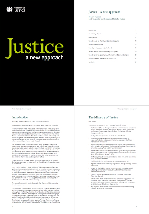
Digging around in my files this afternoon, I found this PDF. I’ve had it since early June 2007 after being sent it by David, who noted that they’d developed a branding remarkably similar to the far more important Ministry of Type, something I still find amusing. Hey, I was here first - just. The combination of white, black and chartreuse must be quite the current fashion for ministries - though I notice that the website carries the oh-so-accessible-but-dull Standard Public Sector branding. Shame that, as the branding of the PDF is rather pleasant.
I was trying to identify the typefaces used. It’s unlikely to be a custom job since the time between the announcement of the MoJ and the publication of this document was only a couple of months. I doubt they’d have been able to create a whole new typeface in that time. Also, the branding was included in the costs of “capital, hardware, accessibility, branding, templates, desktop” - £700,000 in all, and after the costs of IT that doesn’t leave much. So yes, I think it’s a modified version of Bliss - the y is not quite exactly the same, so perhaps some tweaking was done (if I’m right). As for the serif, that’s Perpetua. Quite a nice combination really.
The logo and some sample pages:

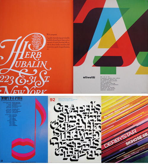
Here’s a good collection of photos of Graphis Magazine from between 1965 and 1982 which might be useful for inspiration. I’ve moaned about Flickr before, but I still wish that people would take the opportunity to write something about the pictures they dump there. Still, I shouldn’t complain too much, as I’d rather people put them there at least than not share them at all! I’ve assembled a few of my favourites, and at right is a particularly nice logo - I’ve played around with fitting a J into a round letter (an ‘O’ I recall), and it can be hard to get it just right.
This one’s a bit of a “Fancy that!” post. I came across this interesting post on Kit-Blog about the remarkable typographic consistency of Woody Allen’s film titles. For pretty much all his films, the titles are set in Windsor-EF Elongated, by Elsner+Flake. Not having seen a great deal of his films, I’d not noticed, but looking at these images, they just say “Woody Allen film”. How about that for brand identity?
Go and read the full article for more info and images.

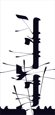
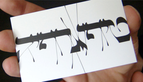
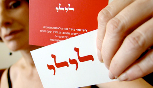
I’ve been meaning to write something about Oded Ezer for ages, ever since seeing his contribution to the Urban Forest Project (at right). Unfortunately I know only a little about Hebrew typography and calligraphy so I can’t write from any qualified angle on it. Ezer’s work is just amazing though, and so I add another entry to my ever-expanding Things To Learn Or Find Out More About list - Hebrew! Recently I saw a link on Notcot about his recent Ketubah project, which looks great, but I’m having a little difficulty working it out. The closeups show what appear to be cut out letterforms folded over to form new shapes, but the photos don’t say whether they’re printed to look like that or they’ve actually been cut out and stuck down again. I’m hoping the former. Below are some images of his work that I’ve saved for inspiration. Take a look at his site for more, and here for some samples of his poster work.
From Ketubah:
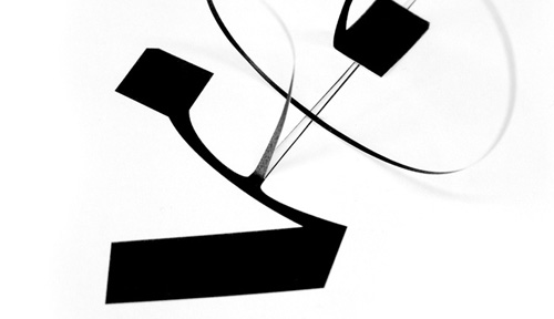
Other inspirational images from Oded Ezer’s site. These really are lovely.

Found via Computerlove, the portfolio site of James Stone, mimeArtist. It’s a nice site, but the thing that got my attention was the great logo, it’s beautifully expressive and simple. Wish I’d thought of it.
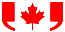
This is a great logo. I came across it today on the Canadian Press site (oddly enough). I’ve recreated the logo here from a graphic of the Canadian flag on Wikipedia. The Canadian flag itself is a great piece of work too. Why can’t we all have nice graphical flags?