An Olympic Poster Proposal

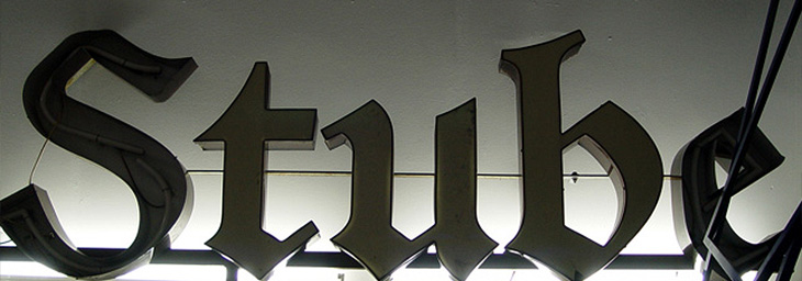
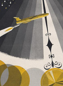
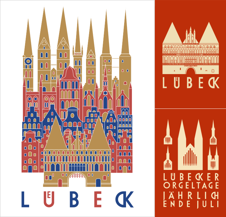
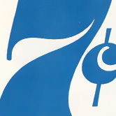
I am indebted to Adrian Giddings for finding the originals of these images. I saw them on Design Crush, and from there to ffffound and from there… a blank. Blogger really needs some kind of reverse lookup for their dreadful impenetrable image URLs, and ffffound needs to better record the URL of the page containing the image. Still, I now know where these posters are from. They’re clever, simple, and have a graphic elegance reminiscent of Otl Aicher’s work for the 1972 Munich Olympics, with typography that is pure London. If Wolf Olins had gone down this route I’m sure there would have been far less controversy about the branding for London 2012.

Of course, these are proposals designed to work with the Transport for London branding, not for the Olympics, and I think work perfectly in that context. For the Olympics itself, for all their cleverness and simplicity, they’d be a bit too classic Olympics, a little too safe. Perhaps.

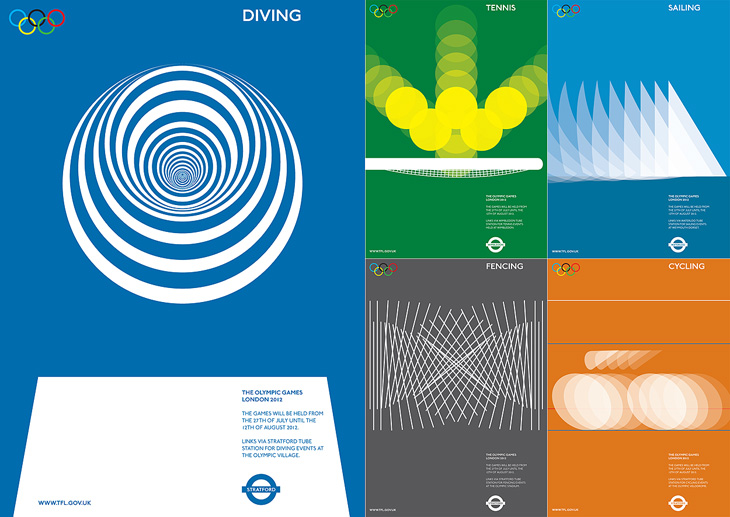
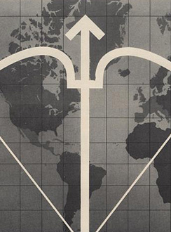
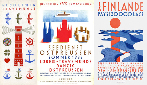
Beautiful posters from Alan Clarke Graphics.

As for the actual 2012 logo/brand, it’s has been out for quite a while now, but I’m still not entirely sure yet what I think of it - I don’t like it, but it may be exactly right for the event. We won’t really know until after the Olympics, and then, no doubt, we’ll have plenty of learned analyses about it to tell us what to think. I wonder how agnostic I’ll be able to be.

Fighting Talk

Yves posted on Friday on the FontFeed about a couple of campaigns by Inlingua promoting their business English courses. One of them is this brilliantly animated advert, creating a battlefield scenario out of words set all in Helvetica caps. As Yves says:

The video looks and feels like a first-​person shooter war game, with excellent POV camera work and sound design. The camera runs and ducks through the environ­ment, hiding behind walls and in trenches, while being assailed from all sides by heli­copters, fighter jets, tanks, and explosions made of type.Yves Peters, The FontFeed.

The thing I like especially, and it’s one of those great detail things, is the sound of voices mingled with the explosions, gunfire and engine noises. It’s not overt, but it’s a really nice touch. Go and take a look (and listen).

It’s a Bug՚s Death

While browsing Ffffound I, er, found a few of the images from this article on Things To Look At on a new book about Geigy’s design and advertising. Some of the examples just call out to be traced - especially the bugs on the pesticide packaging. The illustration for Neocid is quite gloriously morbid - there’s no doubt at all what this stuff is designed to do, even without reading the tagline, “A barrier to house vermin”. The thin white barrier - of death.

Organic this isn’t. I have of course re-composed the elements for the four left-most tracings.

The examples make pretty consistent use of (I would guess) Berthold’s Akzidenz Grotesk, with a few other bits of interesting lettering on things like the herbicide and pesticide packaging above. I traced as best I could the letters from the photos, and though I’m not sure what typeface it is (if it is even a typeface) because of the flat curves and how closed the letterforms are, it reminds me just a little bit of House Gothic 23.

One thing that interests me on some of the examples is the Geigy roundel logo (at right). It’s so at odds with the simple wordmark used elsewhere, and with this other logo on Grain Edit, that I’m wondering where it came from - and where it went. I’m not saying it’s any great loss - I find it rather ugly - but it is very curious, and I will admit the treatment of it in one of the examples (detail below) is rather appealing. Does it have historical relevance I wonder?

The roundel works better as a design element than as a logo.

It’s a logo that works best in multiples, which might explain why it went. Perhaps the book has the answer. And on that note, I would link directly to the book on the publisher’s site, but they don’t have individual pages for them so I can’t. It’s in this list. Look for dolphins.

Further Enduring Characters

Coincidentally, not long after coming across Character, I found this article about the Berlin Museum of Letters on Core77 (via NOTCOT). Obviously enough it’s a museum devoted to letters, big ones created for building signage and wayfinding in wood, metal, glass and plastic. Core77 has some beautiful photographs and a bit of background info on each one. I really, really, want the DaimlerChrysler ones; so shiny! Lovely stuff, go and take a look.

Some of the letters, and the DaimlerChrysler ones on the right. Lovely.

I love this image. This and the other photos in the article are by Aart van Bezooyen.

Preserve

I keep meaning to post about Preserve. I had the image ready and everything, then Mark tells me about a big update to the site. It’s a project to record the painted signs on old buildings and other parts of the urban fabric before they fade completely, are painted over or are destroyed by demolition. Most of the pictures are of New Zealand buildings, but there are a few from elsewhere, including a great Bovril one in Brixton below.

The project also invites contributions, so you can help expand the scope of the site. I think something the site does need is a bit more context - it’s a general complaint I have about the subject of “found type” in general: the lack of context or place in the images. They are nice to look at though, so perhaps I shouldn’t complain too much.

On the topic of found type, you may also be interested in the archive of Found Type Friday posts on Ace Jet 170. There’s some beautiful examples in there, so take a look. There are several pages of it, the pagination link is the little ‘»’ at the bottom.

Racing by Numbers

Grain Edit found a great collection of vintage Porsche posters for sale. Well, some of them are for sale because a lot are already sold, buy they can be seen in the VP Racing poster archive. I’ve had a good look through them and I love the ones by Atelier Strenger - to me they make the 60s and 70s the golden age of Porsche posters - such tight composition, typesetting and use of photography! I’ve traced a couple of examples of type from this Strenger one and the numbers from this Holz one. Lovely stuff.

Honest Ed’s

Ah, the things you see on Twitter. Just now @Elianneke linked to this Torontoist article about the hand-painted signs at Honest Ed’s. Yes, they’re hand-painted, in one department at least, by Wayne Reuben and a colleague called Douglas. I bet Honest Ed’s could do a good sideline in selling used signs online - I’d buy some.

Pictures from the the Torontoist article

Of course, there are more photos of the signs on Flickr, including this one, which I could quite happily have on my wall:

Photo by Andy van der Raadt

Advertising Science and Technology

Here’s a great collection of science and techology adverts from the 50s and 60s, full of wonderful illustration, type treatments, vintage logos and some pretty inspirational layouts. I’ve got a few details of some of my favourites below, but be sure to have a good look through the set as there’s a load more in there that are great, such as this, and this. There are a few other interesting Flickr sets by bustbright too, including this collection of Bebrauchsgraphik covers which I’m going to have a look through. This one is great.

AC Coriolis
Martin
AC Galileo
Motorola Ampersand
Transitron
Alpha Corporation
JPL Hypersonic
STL
LFE
Lockheed
Philco
ITT

Click each image to go to the Flickr page for it.

So there are some of my favourites. The top row is that combination of rough-textured painting and precise drawing that characterises mid-century graphic design. I love it. Below those are some nice type and logo treatments: that ampersand, for example, is made from an orbiting particle, yet sits halfway between the classic and commercial ampersands. Interesting! After that there’s six illustration styles: a dramatic JPL illustration which looks like a Victorian steampunk device for testing space-age technology; a cold-war classic world map with presumably The Crossbow of Progress overlaid on it; then a ghostly green hand of A-OK (don’t try this gesture in Turkey)
; a lovely space scene which I think could do without the little globe inset above the text; a spare and sharp layout and illustration for Philco - though the outline drawing of the computer looks like something demanded by the client rather than part of the original design; then an advert promising a level of defence from incoming missiles that even today we don’t have. Old adverts are great.

Mahlau

I’ve been following the excellent Cooper Typography Blog for a little while now, and recently Sasha pointed me to his article on Alfred Mahlau, with a short biography and a large collection of images of his work. Of course I’ve traced a few of them below. The lettering is distinctive and highly geometric - the curves are all based on circles - and has some attractive ligatures. As Sasha said in his article, the treatment of some of the umlauts is attractive - replacing the diacritic with a digraph when writing Lübeck. Check out the rest of the site; it’s got great articles, fascinating examples and links (you may lose a day or three with this one), and is definitely well adding to your RSS/bookmarks.

Have a look at this article about Lübeck to see the original of what’s represented in these posters. The distinctive cityscape is also used in the still-used brand identities for Niederegger and Schwartauer Werke, also created by Mahlau.

A few more, so you can see the lettering. More here.

Retro Advertising

If you like mid-20th Century print advertising, and like a lot of it, then this page on diskursdisko may well be just for you. It’s a collection of links to various pools on Flickr containing hundreds of scans of old adverts and promotional materials (mostly, but not all, from the mid-20th Century), and is quite a trove of old type, lettering and illustration. I’ve found quite a few inspirational things on there, including this great General Electric illustration. It reminds me a bit of The Stepford Wives (the 1975 film, not the 2004 one) - they’re not selling freezers, they’re selling exultant joy here. I mean, if getting a GE freezer really made you that happy, wouldn’t you want one?

GE Freezer Owners Manual
Gosh, doesn’t she look happy? I love the beautiful brush strokes, they’re so satisfying to trace.
Schaefer Beer
Leather Gloves
City of New York: Municipal Airports
Toast'ems
Frigidaire Cold Pantry
Dwalyne Lingerie
Pall Mall
1936 Berlin Olympics
Türkisches Fest

I’ve linked each image to the photo page on Flickr - some have large originals, others not.