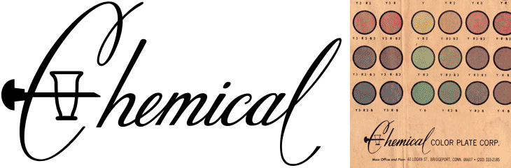
I wanted to trace this for the fun conceit of the C being used as a retort stand. It’s an interesting way of dealing with the open space created inside the Ch pair — I don’t think it quite works, the horizontal bar is a bit clumsy and the positioning of the retort glass itself could be more balanced, but it is all rather fun. I’ve traced it as best I can, not having any higher resolution example than what you see below, so yes, the script is quite clunky. At a certain point you realise you’re creating rather than copying. Who knows, maybe the original was even more wonky? I’d love to see a high-res example of it though. Originally seen here on CO₂Comics, via Drawn.
I love architecture. I love buildings — the art, the engineering, the design, the culture and history of them, and how they form en masse actually places that people recognise and form emotional attachments to; the design of cities, their growth, evolution and (perhaps sadly) eventual decline are all utterly fascinating to me. So I sometimes write about architectural stuff here, as it has a kinship in my mind with the design of type and lettering. I should warn you, this post is a bit of a rant, and because of the subject matter is a tad more political than normal. So, with that out of the way, we can proceed.
I follow a fair few architecture-related sites, one of which (and the most regularly and rewardingly updated) is Arch Daily. It’s basically a pretty damn fine site if you’re into architecture, featuring thousands of projects, new and old, innovative and traditional, and so on. One important thing I’ve noticed is that most of the larger projects being planned and built have a lot in common with each other, with innovation and traditional technique alike apparently reserved for the smaller projects. I’d actually go further and say these large projects are not merely similar but all subscribe to the same blank, unrelenting anonymity — an utterly uninspiring (if glittering and crystalline) mediocrity. Look at the renders below (from this article on New Chengdu City Center on Arch Daily), they could be anywhere in the world:
We’re not talking about adherence to some new International Style here — these buildings subscribe to no ethos, no design principle, no philosophy. They are the safe, neutral buildings guaranteed to be approved by conservative planning departments wanting the skyline of New York, Chicago or Hong Kong at any cost, ignoring the culture, history and sense of place of the city they’re supposedly ‘improving’, and with little to no apparent understanding of the conditions that gave those cities their skylines. Oh sure, they’ll package up some significant buildings, a monument here, a couple of streets there, and they’ll be prettied up and photographed for the ‘culture’ section of tourist brochures, and meanwhile vast swathes of the city will disappear under motorways (labelled ‘boulevards’), office blocks (sorry, ‘towers’) and shopping malls (or ‘pedestrian-friendly traditional streets’) and dreary dormitory estates (‘upscale residential developments’). Then they stick some thin screed of greenwashing over the top and invoke the holy acronym of LEED and declare themselves satisfied.
At this point I probably sound like some arch-traditionalist, railing against the depredations of the modern world and all it brings, but that’s not my intention, or my point. My problem with these developments is that they’re being sold to rapidly-expanding cities around the world and aren’t being designed with the long-term life of those cities in mind. Cities like Chengdu have ancient histories and in some cases still have some of their original structure and urban fabric intact — architecture firms, planners, and most importantly, citizens need to recognise what’s valuable about the best and even the worst areas of their cities and think long and hard before approving any large-scale improvements. If this sounds like western cultural imperialism, the jumped-up western opinionist telling people desperate for an improvement to their lives that they should keep their barrios, their slums, their favelas and their cramped hutongs then perhaps it is. But then, I’m not the only one to say it and this isn’t to say those slum areas should stay slums, that they can’t improve or change on smaller, community-level scales. There doesn’t have to be an overarching project to demolish and replace them with some glittering arcology, instead, a longer-term effort to support the communities within them and prevent their control by gangs, just like what’s happening in the favelas of Rio de Janeiro, including the infamous City of God itself:
For decades the favelas have been a deadly battleground, where thousands died in the turf wars of rival gangsters and drug lords. But two years ago - in anticipation of the football World Cup in 2014 and the 2016 Summer Olympics, the government launched a new initiative. Since then the Police Pacifying Units (UPP), have moved into 12 favelas, freeing 150,000 people from the control of the gangs and bringing a new calm to embattled neighbourhoods.
While the Chengdu development appears to be built at the edge of the metropolitan area, giving perhaps the possibility of the city’s core remaining intact, there are a whole new set of problems as the city expands into wild areas and farmland. Earlier this year Václav Havel explained some of the problems this kind of expansion can cause, citing his experience of the changes to Prague in recent years:
What was until recently clearly recognisable as the city is now losing its boundaries and with them its identity. It has become a huge overgrown ring of something I can’t find a word for. It is not a city as I understand the term, nor suburbs, let alone a village. Apart from anything else it lacks streets or squares. There is just a random scattering of enormous single-storey warehouses, supermarkets, hypermarkets, car and furniture marts, petrol stations, eateries, gigantic car parks, isolated high-rise blocks to be let as offices, depots of every kind, and collections of family homes that are admittedly close together but are otherwise desperately remote.Václav Havel at Forum 2000, October 2010
You can see the effect of this round many British cities; instead of a boundary, the place tails off with business parks, warehouses, big-box stores, and strange areas of empty land, prevented from becoming wild, not used for agriculture, not built on, just waiting. There is nothing about these hinterlands that gives you any clue to where you are, not just which city, but which region and (road signs aside) even which country. Governments bang on about growth, endless growth, but very few people seem to ask what kind of growth it is we want. The kind of growth that turns our cities into this kind of anonymous emulsion of steel, glass and concrete doesn’t seem to be the growth anyone would choose, but the consequences of any individual action that bring it about are so far removed that effectively our choices are abstracted to boardrooms and cabinet offices, where we have little say. When faced with the Anywhere City, should you just shrug and accept it?
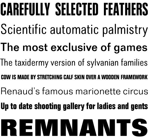
I’m fascinated and delighted by the idea of word harvesting, a term invented by local Brighton copywriter Ellen de Vries and described on her blog, here. I love the collection of phrases she’s listed, especially Carefully Selected Feathers, which I’ve nabbed as the name of my laptop. Stripped of their original context they remind me of the pangrams we use for type samplers, and they do work rather well:
Folio Medium, Light, Extra Bold, Condensed Light, Condensed Bold and Extra Condensed Bold.
It’s so good to see Drawn (sort of) back again, I’d sorely missed its regular supply of illustrations and tutorials and feared it would never come back. But no, thankfully it’s back (as a Tumblr blog) with a beautiful new logo lettered by Chris Gardner. The grammar wonk in me is glad they’ve dropped the exclamation mark from their name too — makes referring to it a little easier, no?
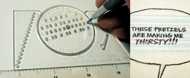
So yes, the Ames Lettering Guide — Drawn linked to a nice tutorial on using one by Dustin Harbin, which brought back some memories of school for me. I remember we were shown how to use one and set some exercises, but since then the hand lettering I’ve done hasn’t had quite the constraints (or the volume) to need anything more than a ruler and a bit of patience, so I’d completely forgotten the thing existed. I’m sure there’s one back at my parents’ in a box somewhere. Maybe I’ll dig it out, because now it seems like a useful thing to have around.
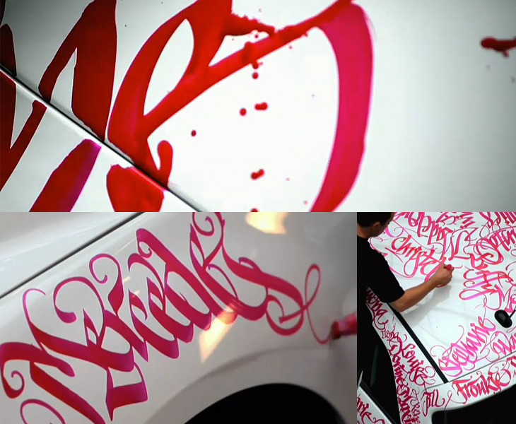
This has been around for a while, but I’ve only just seen it. Niels Meulman of Calligraffiti (AKA Shoe) was commissioned to customise a Mercedes-Benz B-Class by the Pink Ribbon Foundation in the Netherlands. The work consists of hundreds of women’s names, representing the Dutch women the foundation works to help, and is a product of Mercedes’ sponsorship of the foundation. Whatever you think of corporate sponsorship, the end result is pretty spectacular. I especially like the excess ink running down the side of the car, it enriches the flamboyance of the hand lettering and is a welcome contrast to the usual corporate image of Mercedes — and is a badge of honour to confound the cynics, that yes, this was done by hand, live, as it were. Go and look at the video, but I warn you, this is YouTube, so the usual vile trolls have infested the comments.
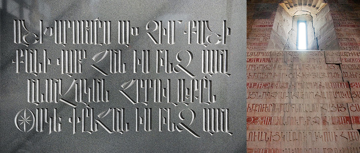
I’ve noticed a fair bit of interest on Twitter and the like recently on the subject of Armenian script, perhaps inspired by Carolyn Puzzovio’s talk on the subject at ATypI 2010. I’ve been meaning to have a look into the subject since then, so I’m glad Nina Stössinger and Hrant Papazian have created armenotype.com, a great new site devoted to the subject of the Armenian script and alphabet. It was only launched a few hours ago and the content is still being added to. In the words of Hrant:
We’d love to see anybody and everybody with even a remote curiosity about the Armenian script check it out, register for the mailing list, and post comments.Hrant on Typophile
It’s a beautiful alphabet. Look on the site for the full gallery, but here are a couple of my favourites so far:
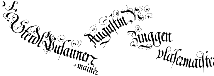
I’ve had some of these woodcuts of The Triumph of Emperor Maximilian open in various tabs for a couple of weeks now, daring me to trace some of the captions on them. It’s not the easiest of jobs, as even in the highest resolution some of the fine lines are too faint to make out clearly, and some of the strokes are hard to understand, so I figure I’d trace one of the banners and see how it worked out. Well, not so bad, but a good learning exercise — the extra flourishes and swashes seem particularly arbitrary (“When are they not?”, you might ask, but these especially so) and it’s interesting to see how this rather florid style is put together. I guess that makes it sound like I’m not fond of it; quite the contrary, I love it.
A couple of the captions from here, obviously not in the same relative positions.
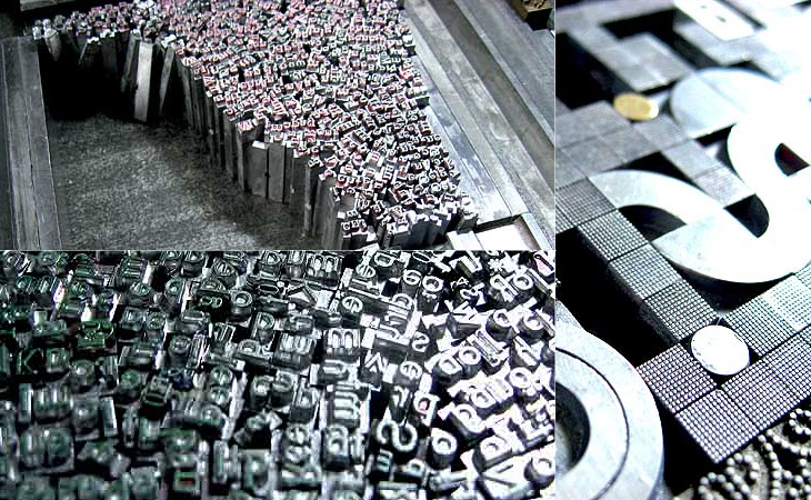
I’ve posted about Martin Schröder’s blog before, but with the images he’s been posting of his recent work I think it’s worth another link. I love the ‘making of’ pictures he puts up, showing how he builds the type in the forms, all that gleaming metal is quite something special:
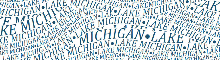
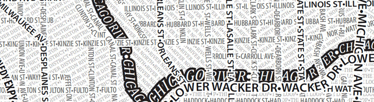
I like the idea of typographic maps, from the fairly abstract ones by ORK to the impressively detailed linocuts by Andrew Webber, so it’s nice to see another approach, especially when there are some clever little touches. These posters from Axis Maps show maps of Chicago and Boston made entirely from type, using a technique that is fairly straightforward and which could risk producing a rather dull result, but Axis have created textures and used typographic colour to create an interesting set of images. The overall effect is pleasing, and I think if there was a New York or London version I’d be tempted to get one. A couple of details showing some of the effects I like — using a heavy stroke on type to create the dark line of a river and the overlapping curved text to create the waves on Lake Michigan:
An obvious solution perhaps, but it works rather nicely.
One little niggle though. As much as I like and admire Museo, I don’t think it works as a titling face on these maps, not at this size, and not in this context anyway.
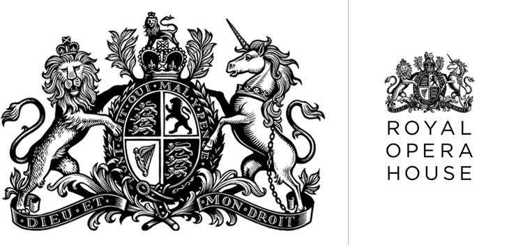
Definitely catching up with old news with this one; I’ve had this Brand New article on the new Royal Opera House identity by Someone bookmarked for a while. If you’ve not seen it already, the new identity centres on a fantastic new cut of the royal crest by Christopher Wormell and is supported by new type and image guidelines. The new typeface is Gotham Light, which is lovely and works wonderfully with the new brand, but I can’t help but feel a little sad to see the Caslon-esque old wordmark go. Still, if it had to go, it had to go, and given how Covent Garden looks and feels nowadays Gotham is a good choice — it’s a fresh clean and light companion to the dense complexity of the crest, and works perfectly with the more modern layouts and imagery they’re using, but was Gill really just too much of a cliché?
The new crest and logo
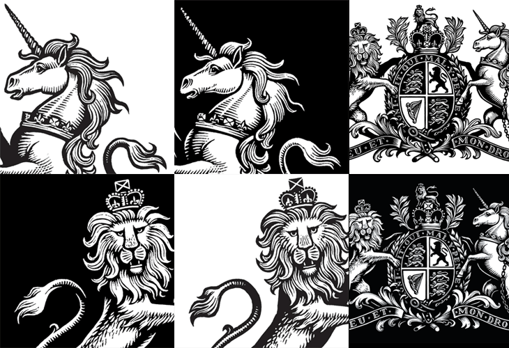
The new crest itself is wonderful. The old one had a certain old-time charm to it, but next to the new one it looks distinctly shabby. Like Armin Vit, I’m especially impressed that they produced two versions for use on light and dark backgrounds, rather than simply inverting the image. The work is so well done that it’s hard to work out what’s actually different between the two images — they’re not just outlined or trimmed, the thickness, detail and density of each image is different, but designed to give the impression they’re the same. Clever and skillful work by a true master of engraving: