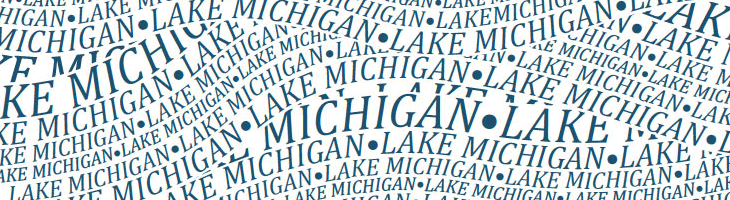
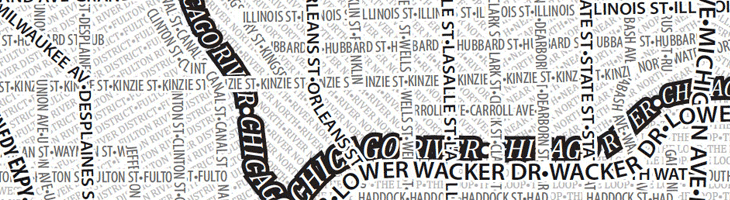
I like the idea of typographic maps, from the fairly abstract ones by ORK to the impressively detailed linocuts by Andrew Webber, so it’s nice to see another approach, especially when there are some clever little touches. These posters from Axis Maps show maps of Chicago and Boston made entirely from type, using a technique that is fairly straightforward and which could risk producing a rather dull result, but Axis have created textures and used typographic colour to create an interesting set of images. The overall effect is pleasing, and I think if there was a New York or London version I’d be tempted to get one. A couple of details showing some of the effects I like — using a heavy stroke on type to create the dark line of a river and the overlapping curved text to create the waves on Lake Michigan:
One little niggle though. As much as I like and admire Museo, I don’t think it works as a titling face on these maps, not at this size, and not in this context anyway.