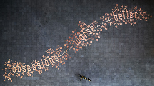
I came across this remarkable piece of work earlier today. It’s a design created with 250,000 euro cents in a public square with the intention that people would interact with it, presumably by taking (or rearranging?) the coins. Even though it’s €2500 lying there, it would take a fair bit of determination to take the lot and get it to (at least) a coin-changing machine, a level of hard work a casual thief is unlikely to want to do I think. The Amsterdam police viewed it rather differently, seeing all this money left on the pavement as being at risk of theft and swept the whole lot up for safekeeping. Rather keen of them, no? The site ExperimentaDesign explains some of the background to the project:
Droog Design and Scott Burnham have assembled a team of some of the most innovative designers and architects from around the world to create 13 newly designed interventions, tools, toys and objects that are temporarily placed along a route on the central IJ-riverfront in Amsterdam.
The design is remarkable and attractive, and there are a few pictures and videos of it before it was ‘saved’. The people building it are clearly working from a plan, but there isn’t a copy of it online that I can find unfortunately. I’ve combined these twophotos by Jens to show the whole design - it’s a bit rough but you get the idea:
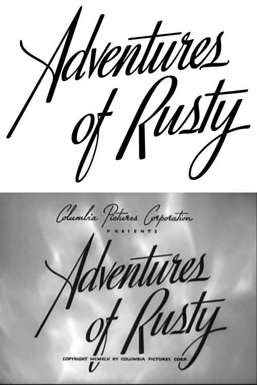
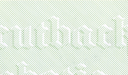
I found this massive collection of movie title screens a couple of weeks ago in a Google image search (for something else, naturally) and, well, the nature of life at the moment meant I didn’t have time to have a proper look. I had a look through it today and found this beautiful piece of script lettering. Of course, I had to trace it, and it’s really quite special; the lowercase reminds me of Savoir Faire a bit, but the capitals are just so… movie! Take a look:
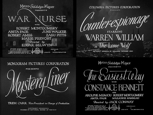
I found many other examples of great lettering, but here are four special ones I might trace at some point:
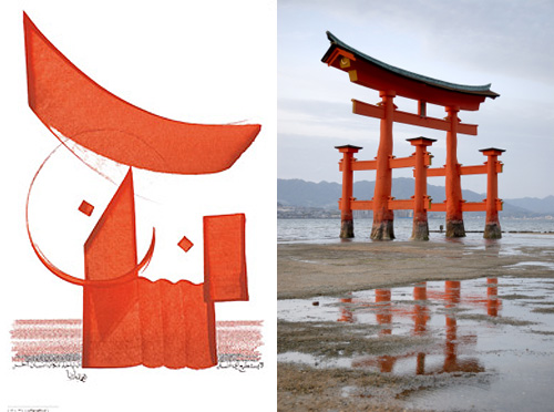
I recently came across this review of the book Arabesque by Gestalten; while I’m probably going to buy it for myself as a present at some point, I couldn’t help but notice the visual similarity between this piece of brushwork and a Torii gate. Purely an irrelevant coincidence I’m sure, but a rather pleasing one nonetheless.
These lettering samples by Daniël Maarleveld look like they would be at home on a banknote or certificate. Such a simple, straightforward idea; easier than the usual banknote bas-relief, yet still highly effective.
Phillip Niemeyer of Double Triple kindly wrote to explain who that VA logo was for:
I checked my own photo archive of the archive and found the VA business card. VA stands for “Ike Vern & Associates, Photography”. Much of Lubalin’s great graphic work seems to have been simple jobs for small clients. I love that.I posted the VA image, a tissue in Lubalin’s handwriting specing a logo, and a unique logo for the World Trade Center.http://www.doubletriple.net/lubalinPhillip Niemeyer
Technically this is an update to this earlier post, but I wanted to create a new one because I rather like the Double Triple logo, at right - a mirrored ‘3’ in ITC Baskerville.
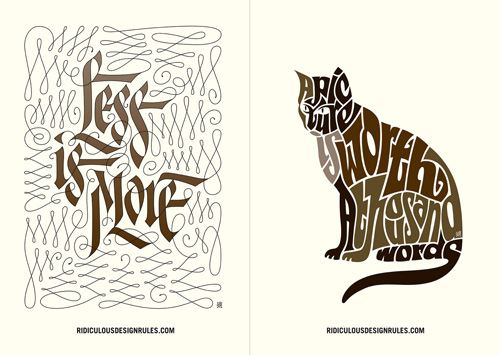
I came across this site the other day - Ridiculous Design Rules. I’m not quite sure what the basic premise of the site is - whether it’s to collect ridiculous rules together and collectively point and laugh at them by giving them stars, or to collect rules together and rate them as ridiculously good or relevant. It’s very odd. I thought of the ridiculous design rules I’ve encountered before but they tend to be about the audience, or users, for example the truly ridiculous and unproven (and unprovable) “99.9% of people set their browser to the correct language” to the too-many-caveats-to-say-one-way-or-another, “text on screen is unreadable compared to print”.
Whatever you think of the rules or how they’re presented, the site does have some beautiful illustrations by Niels Shoe Meulman - only four for now, but hopefully a lot more soon. I’m particularly taken with the cat picture, it’s a nice Latin script variety of the kind of illustrative Arabic writing I’ve posted about before. Very nice indeed. You can see them larger on the site, or on this Flickr set.
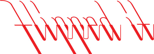
There’s some nice calligraphy and lettering over on Sam Friedman’s site. I particularly liked these two. The “Flipped it” one because the way the letters connect is unusual and could bear some study. The “Obscene” one is a nice piece of lettering.
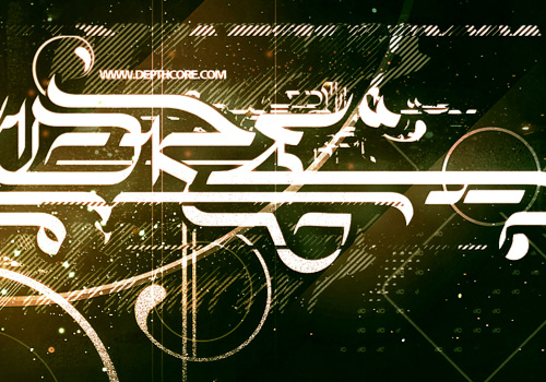
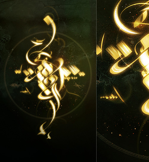
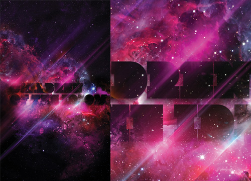
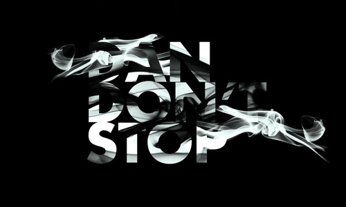
A certain someone commented that many of my recent posts haven’t been about type at all, so, entirely coincidentally I have a post about some very lush type and calligraphy I saw the other day. This post on DesignFeedr has some nice examples of typography on a dark background. Using a dark background is good for making decorative and illustrative type stand out really well - the colours are richer, the darkness concentrates the eye on the main subject, and (on screen at least) the piece literally glows. Some of the examples in the article are nice (others less so) but scroll down for the work by Pablo alFieri, Theo Aartsma and Daniel Gordon especially.
Some of my favourites are below, but visit the article to see all the others.
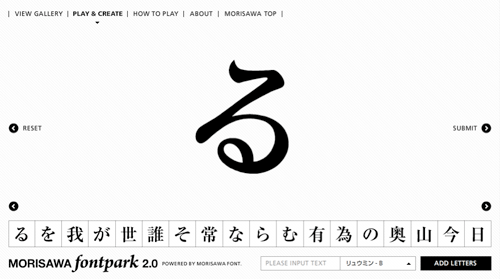
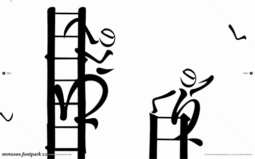
Coudal Partners linked to this rather nice toy by Morisawa & Company. My Japanese knowledge is rather woeful, so I don’t have very much more information than; it’s pretty, it’s fun, it has a very nice interface, and it appears to be promoting the sheer loveliness of Morisawa’s fonts, so please buy some. I was told by a Korean colleague that there are relatively few fonts available for East Asian languages compared to Western ones because of the sheer number of glyphs that need to be designed, so I would guess a new one would elicit at least a moderate fanfare. Maybe. Anyway, have a play - here are a few screenshots:
I’ve been pondering this article for a while, since coming across Jonathan Hoefler’s posts (and here) about Glagolitic script in my RSS reader. It’s a script I’d never heard of before, and I’m always fascinated by writing systems, so I followed some links, sent a couple of emails and did some research on it.
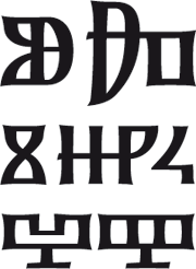
First off, I have to say thank you to Typonine for sending me the font used for some of the illustrations in this post, and specifically Nikola Djurek who designed and developed it, based on the first Croatian printed book in the script: the “Misal po zakonu rimskoga dvora”, printed in 1483. A page, and details, from that book are shown below.
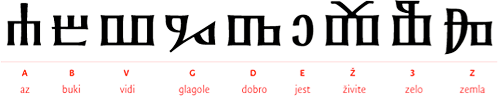
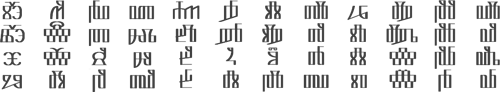
One of the things I noticed when looking at examples of Glagolitic is the way some characters appear and disappear; I was trying to set some text in it, and whichever bit of text I tried had some extra characters that weren’t in the font or in any other examples - each one seemed to have characters unique to it. Of course, this isn’t a deficiency of the font (or of the language), but more a sign of the evolution of the written language and of the strong influences on it from Latin, Cyrillic and Church Slavonic over the years. Croatian was written in all three systems in parallel, and as a local system not widely known outside of the Balkans (despite being the oldest of the Slavic alphabets), the form of written Glagolitic has perhaps been more influenced than influencing; In some written examples there are Cyrillic characters, while in others the characters are presumably the original Glagolitic ones, or newer hybrid forms.
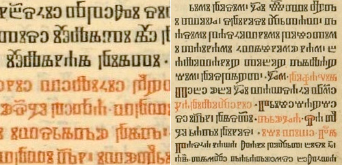
Some ligatures in Glagolitic script.
This leads on nicely to arguably the most interesting feature of Glagolitic (for a typographer at least) - the sheer number of ligatures. This interesting PDF states that in one work alone, the Brozić breviary, there are 250 ligatures - a number you’d more expect to find in a hand-written work from a top scriptorium rather than a printed book of over a thousand pages. Also unique to Glagolitic among printed languages are the broken ligatures, where half of one letter is joined to another letter, adding thousands of apparently new glyphs to the language. Of course, for anyone (like me) trying to set some text in Glagolitic, it all appears rather confusing and frustrating - but the reason why I tried (and why I’m always tracing things) is to learn more about something, and in that it’s certainly succeeded. If you’re interested in finding out more, for further reading there are a few articles out there, including (of course) Wikipedia, and this introduction to the history of the script.
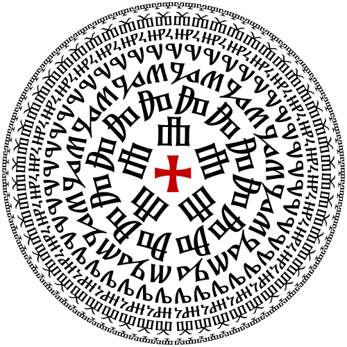
So after all that I didn’t get to set some text properly in Glagolitic. I think to do so I’d need to spend some time learning a lot more about the language - so it’s added to ‘the queue’ of Things That I Must Learn More About. In the meantime, for my own pleasure and so you can see how attractive the glyphs are in Nikola Djurek’s font, I’ve created a pattern using it.
Now, if reading across the circles spells anything rude or inappropriate, let me know, OK? The contact form should be working again after the server move.