I found this nice little video on YouTube earlier. It’s simple enough, but fascinating to watch; Bob Parsons hand lettering his name in a beautiful style on an amplifier.
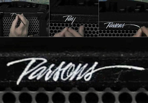
I found this nice little video on YouTube earlier. It’s simple enough, but fascinating to watch; Bob Parsons hand lettering his name in a beautiful style on an amplifier.
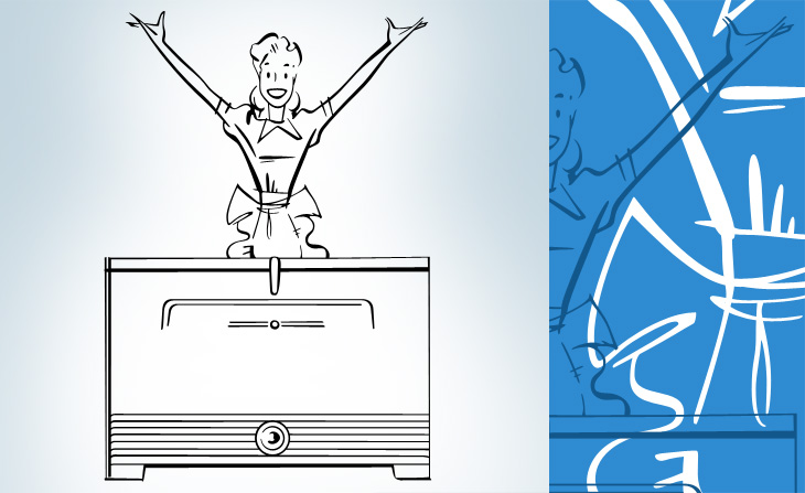
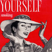
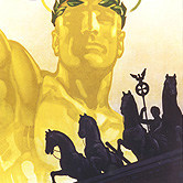
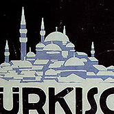
If you like mid-20th Century print advertising, and like a lot of it, then this page on diskursdisko may well be just for you. It’s a collection of links to various pools on Flickr containing hundreds of scans of old adverts and promotional materials (mostly, but not all, from the mid-20th Century), and is quite a trove of old type, lettering and illustration. I’ve found quite a few inspirational things on there, including this great General Electric illustration. It reminds me a bit of The Stepford Wives (the 1975 film, not the 2004 one) - they’re not selling freezers, they’re selling exultant joy here. I mean, if getting a GE freezer really made you that happy, wouldn’t you want one?
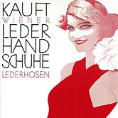
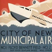

I’ve linked each image to the photo page on Flickr - some have large originals, others not.
One of the sites on Sigurdur Armansson’s list that I’ve been following is Hindi Rinny, which is all about South Asian Typography, and posts gems like this. The title is quite beautiful and (of course) I’ve traced it to get a better look at it.
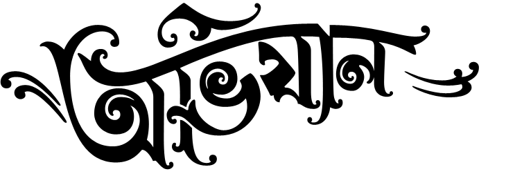
Original here. I did trace the other two bits of text, but I’m not enjoying those quite as much so didn’t include them here.
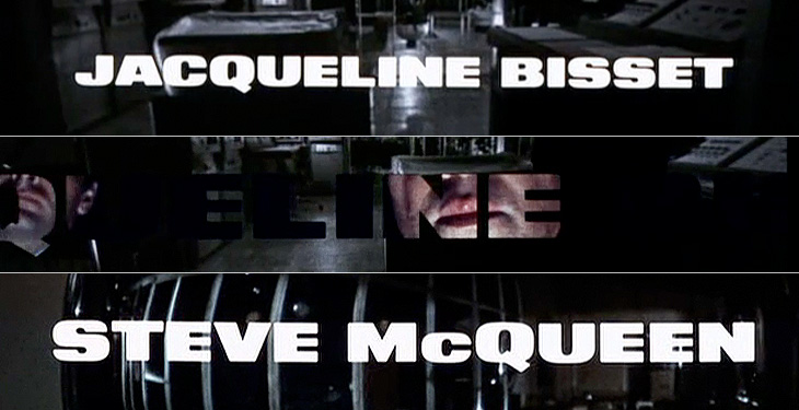
I recently rediscovered The Art of the Title Sequence site, which is a goldmine of inspiration for anyone who needs to animate type, and I’m surprised I’ve not posted about it before. Title sequences are remarkable in that they have to fulfil some important roles in a film - they’ve got to tell you who made it, who’s in it, who paid for it, in a way that complements and introduces the film (but is clearly not the film itself, so you can get all your arrangements with popcorn/noisy snacks/coughing/sneezing, etc. out of the way), and all in a short a time as possible. Those requirements provide a fertile ground for all sorts of creativity, to the extent that the title sequence becomes a genre in itself: a very specific kind of animated short; an animated infographic if you like. So we have sites like this one for people like me to trawl through and drool over lovely examples of typography, lettering and iconography. First up, one of my favourite films, Bullitt.
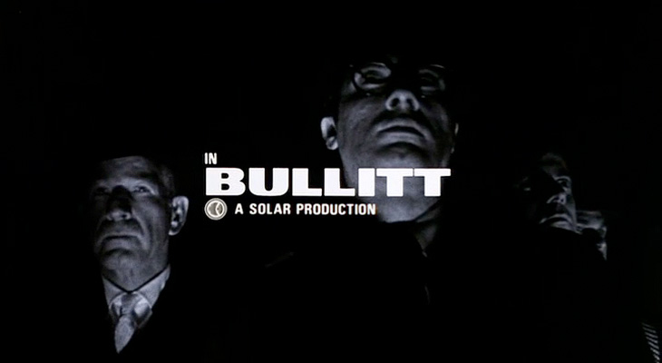
Isn’t that just perfect? See it as part of the full sequence, here.
When I first saw this sequence I was scrabbling for my camera to try and get some shots of the lettering, but didn’t manage to get much worthwhile. The typeface is just beautiful, and I’ve always wanted a copy of it, but after a lot of investigation it turns out there isn’t an exact digital version of it. There’s a very, very similar one called XXII Black Block, but you’ll notice that it has slanted terminals on the E and T - almost there, but not quite.
I love the way the lettering leaves a ‘hole’ in the current scene, which expands to show the next one.
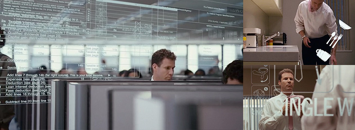
Next up is Stranger Than Fiction, a film I’ve never seen but might get around to watching one day just because the title sequence is interesting. It looks like it could be great or dreadful, and nowhere in between. Either way, the title sequnce is great and makes playful use of type, instructional iconography and labelling to enhance the story. I like the way the labels for everything definitely feel like part of the main character’s world, his obsessions, so real to him, made visible (and real) in the world for us to see.
Mmm. Numbers. Labels. Sequence here.
This next one is not so much about the type. It’s not really about the type at all. In fact, I hate the type in this one. The exploded diagrams are lovely and the way they tie in with the live footage of the Farnborough Air Show is highly compelling, so to have this clumsy uninspired type stuck over it is a real disappointment and a wasted opportunity. I’m including it in my favourites because you can imagine how nice it could be if a typographer had been given a chance to polish it up before delivery:
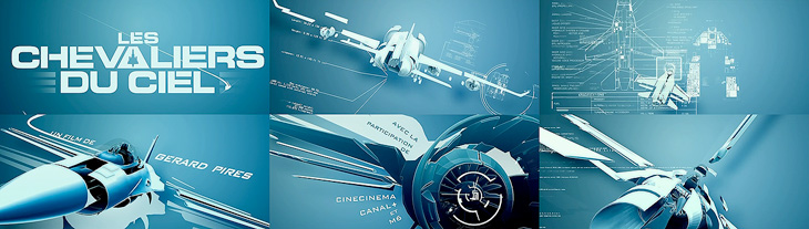
Nice graphics, shame about the type. Full sequence here.
Gradually coming back to nice type with this one - I remember, years ago, playing around with analogue electronics to draw letters and simple shapes on oscilloscope screens and though it was pretty painful it was satisfying when it worked. The animations in Tron were done this way, with the flat surfaces coloured in later by hand. The end sequence for Iron Man deliberately references these very first vector graphics with these CAD-style animations, with the type done perfectly to match:

A still from the Iron Man end sequence. Full animation here.
Next I’ve got this one which is just good solid no-frills typesetting, enlivened with great use of a close-up and, again, those vector graphics:
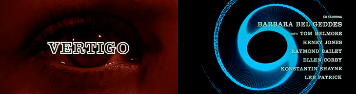
It’s Hitchcock’s Vertigo. Original sequence here.
And last of all, a very satisfying and clever use of 3D to form the names and titles by constantly changing the camera angle. I imagine it would be a nice way to tell a short story, as I found myself watching it and reading the words quite comfortably. It’s paced very well, and the fascination you develop for how the letters come together makes it an entrancing experience:
It’s Le Souffleur. Full sequence here.

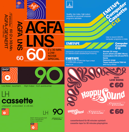
I was mailed a link to these scans of tape cassette inlays the other day. It’s fascinating seeing some of the designs again - most of them look like they’re late 70s and early 80s, but I’m sure I had a few of these in my late-80s “taping things” phase.
I have of course traced a few of my favourites, though there’s plenty more than these four worth looking at. The EMITAPE one is lovely - I recall friends of mine with flashy computers had a few of these. The AGFA one is interesting - I naturally assumed the type would be Helvetica or Univers, but closer inspection (the reason why I trace) reveals a rather different balance to the letterforms. The ‘6’ is rather odd - it looks like it’s about to topple over backwards. The positively psychedelic Happy Sound one was incredibly pleasurable to trace; I think only four points in the whole of that funky set of curves is not at extrema - it’s lovely when that happens. I’ve put a closeup of the patterns on the right (or above, if you’re reading this on RSS).
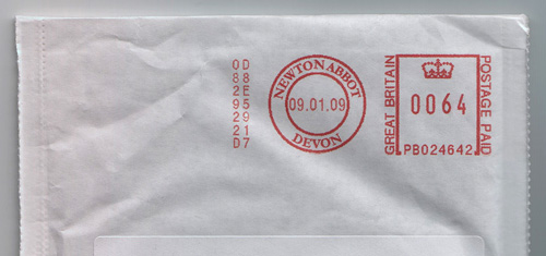
You know when you see something mundane and everyday in a completely new light? When you see something afresh that you’ve never paid attention to? Well last week I got this envelope and for some reason the franking mark caught my eye. I’m not sure whether it’s because it’s so crisp and sharp or whether it’s the neat alignment to the edges of the envelope, but it just made me look again.
One thing that’s a bit special is how the printed “Great Britain” on one side of the square balances the “Postage Paid” on the other. I’ve found (often to my professional disappointment) that it’s rare for two phrases to be similar enough in length that you can do that, so it’s a nice little detail. The roundel with ‘Newton Abbot’ in it is rather pleasant too, and I’m trying to think back but I’m sure the normal Post Office frank is considerably plainer than that. Anyway, it’s just a pleasant little thing that caught my eye the other day - a nice bit of purely functional design, and part of the iconography of the state.
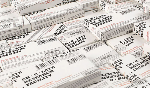
This caught my eye a while back, on NOTCOT, and it turns out there’s a whole range of packaging with it which is all pretty nice. I prefer these ones though, they’re like some cross between newspaper wrap and utilitarian shopkeeping units - it reminds me of how supermarkets sometimes design their own-brand ‘basics’ ranges, which (almost) always end up looking far better than the non-basics stuff. I’m not sure about the treatment of the two Os though, the counters look more like funky bullets somehow. Have a look at the rest of the Asylum site too, there’s plenty of interesting stuff on there.
Hallmark has some very nice trailers for its programmes, usually with great typography, and always with perfect grading. They’re very fond of them too, so you tend to see them several times throughout a programme - something that can easily drive you nuts if you’re not quick with the mute button. Still, they look nice.
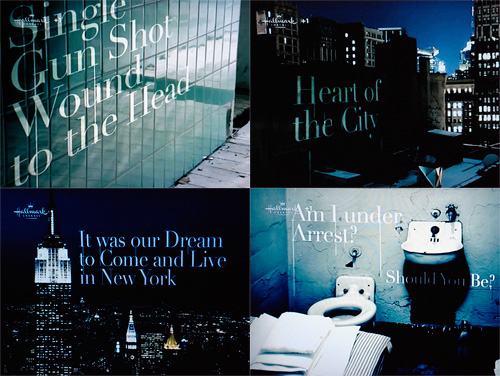
This particular one, for Law and Order, uses the nice technique of placing text set in Didot into various scenes in New York. The point of view changes as the text builds up and enhances the 3D in-world effect, and as it does, dribbles of grime (blood?) trickle down from the words. It’s all very nice, but what, I say what is this I see?
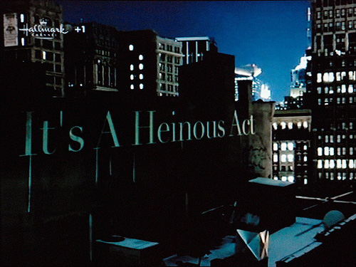
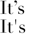
A prime*, used as an apostrophe? A heinous crime, if ever there was one! Someone call the cops! Thing is, you’d have to deliberately turn off “smart quotes” in After Effects to get that symbol to show, and not the correct one (at right). So why?
Perhaps, and here’s a thought, perhaps they did it like that to echo the dribbles in the animation? That would make it an artistic decision, and not an ignorant mistake. I do hope that’s what it is, as the rest of the sequence is rather pleasant:
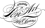
Drawn linked to this fantastic PDF, “Studies in Pen Art”, a scan of a 1914 pamphlet by William Dennis. It has loads of examples of penmanship and advice on techniques and equipment which is pretty much all relevant today - although not perhaps the emphasis on speed; even a commercial letterer today wouldn’t have to produce work as quickly - producing this kind of lettering by hand would be a project in itself these days and so more time would be devoted to it. Still, we all have deadlines and knowing how to work quickly is never a bad idea. The PDF is available for download from the Drawn page - worth a look.
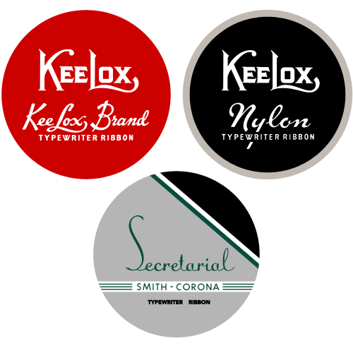
I came across this typewriter ribbon collection on Uppercase a little while ago, and there are some beautiful examples of typography and graphic design in there. They remind me of old tobacco tins, and oddly, of sewing consumables like cotton thread and needle tins. Go and have a look if you’ve not already (the collection is getting famous). Of course I’ve redrawn some of them…