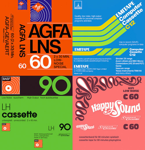
I was mailed a link to these scans of tape cassette inlays the other day. It’s fascinating seeing some of the designs again - most of them look like they’re late 70s and early 80s, but I’m sure I had a few of these in my late-80s “taping things” phase.
I have of course traced a few of my favourites, though there’s plenty more than these four worth looking at. The EMITAPE one is lovely - I recall friends of mine with flashy computers had a few of these. The AGFA one is interesting - I naturally assumed the type would be Helvetica or Univers, but closer inspection (the reason why I trace) reveals a rather different balance to the letterforms. The ‘6’ is rather odd - it looks like it’s about to topple over backwards. The positively psychedelic Happy Sound one was incredibly pleasurable to trace; I think only four points in the whole of that funky set of curves is not at extrema - it’s lovely when that happens. I’ve put a closeup of the patterns on the right (or above, if you’re reading this on RSS).