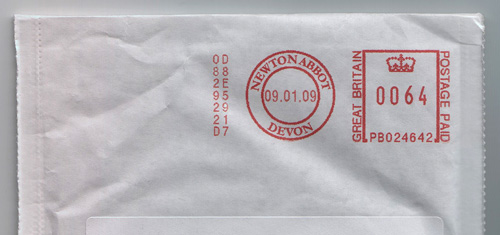
You know when you see something mundane and everyday in a completely new light? When you see something afresh that you’ve never paid attention to? Well last week I got this envelope and for some reason the franking mark caught my eye. I’m not sure whether it’s because it’s so crisp and sharp or whether it’s the neat alignment to the edges of the envelope, but it just made me look again.
One thing that’s a bit special is how the printed “Great Britain” on one side of the square balances the “Postage Paid” on the other. I’ve found (often to my professional disappointment) that it’s rare for two phrases to be similar enough in length that you can do that, so it’s a nice little detail. The roundel with ‘Newton Abbot’ in it is rather pleasant too, and I’m trying to think back but I’m sure the normal Post Office frank is considerably plainer than that. Anyway, it’s just a pleasant little thing that caught my eye the other day - a nice bit of purely functional design, and part of the iconography of the state.