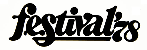
More Tribute to Lubalin

Peter Gabor’s gallery of Herb Lubalin’s work has been linked to from lots of places as the Tribute to Herbert Lubalin, and if you’ve not seen it yet, it’s worth a look.  However, that’s just the gallery for a whole category of articles by Gabor about Lubalin, so that’s worth a look too (it’s all in French, mind). While the gallery does have plenty of great examples, the pages don’t have any background information or titles for any of the pieces of Lubalin’s work; it’s not so much of a tribute as a teaser, or a portfolio that really needs the artist there to explain each piece - at least to say what it was for.
Victoria and Albert logo, by Alan Fletcher, 1989.

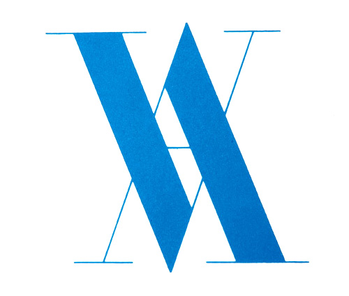
The case in point for me is the “VA” logo below. Who or what was it for? Searching for it online gives a list of everything Lubalin did in Virginia, but nothing that appears to explain this. It’s a mystery. And yes, it does remind me of the Victoria and Albert Museum logo by Alan Fletcher, at right.
Mysteries aside, I just like this one:
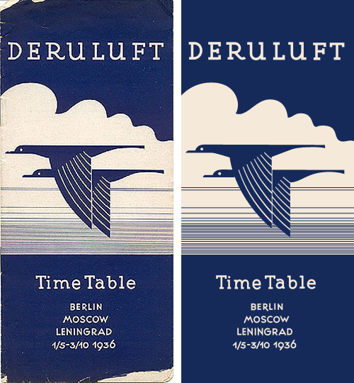
Deruluft

I love this timetable cover for Deruluft - the double bird motif is really quite lovely. The use of the motif in their brand imagery apparently starts out strong (good) and then falls out of favour entirely between 1933 and 1935 (strange) - even in the 1932 brochure it’s reduced to a small image on the flag, then finally being nicely refined and promoted to the central image on the 1936 timetable.

The type is interesting as a monoline form too - the serifs are enormous, and the one on the ‘a’ is just strange, especially given how close it comes to the ‘T’. I really like the numbers though - the balance between the 9 and the 6 in the year is particularly pleasing.

The airline was a joint venture between Germany and the Soviet Union, which didn’t survive the changing political situation between the two countries:

Deruluft’s route network remained fairly intact until the airline discontinued operations in March 1937. By then, relations between Nazi Germany and the Soviet Union had deteriorated to a point where a joint venture was politically impossible. Deutsche Lufthansa took over the route through the Baltic countries, but a service to Moscow was reopened only after the unexpected German-Soviet nonaggression pact of August 1939 had temporarily brought the two countries closer to each other.timetableimages.com

Of course, I had to trace the cover. Mind, much of the appeal of the original is down to the artifacts produced from the printing process, which I didn’t replicate here. I gather there are now filters for Photoshop to create them though.

Original image via ffffound.

StyleStation

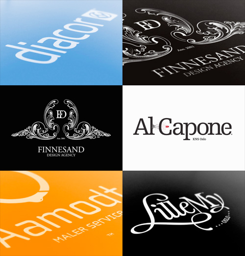
There’s some lovely identity and online design work here. I found it via Graphic Exchange, who commented that the presentation style adds to the visual appeal. I have to agree. Identity work is often about the feel and weight of the physical artifacts - the headed paper, folders, envelopes - and a good way to document them is with good macro photography. You can’t feel the paper, but you can see how it might feel.

Anyway, here are some of my favourites - it’s only a very small sample and they’re scaled down quite a bit, so take a look at the full site. The UI of the site is all flash, but it’s a pretty good example of the genre. I like the way the colours change as you move through the work.

Lush Type

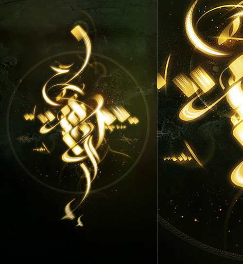
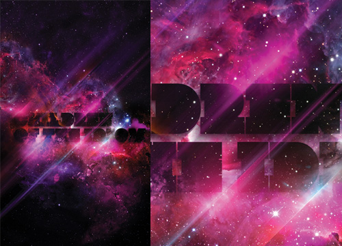
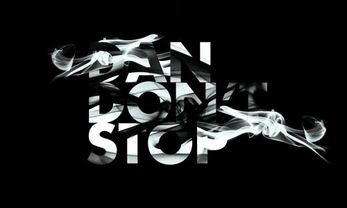
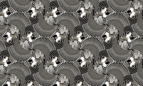
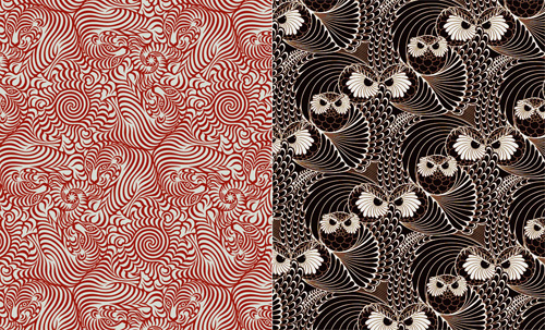
A certain someone commented that many of my recent posts haven’t been about type at all, so, entirely coincidentally I have a post about some very lush type and calligraphy I saw the other day. This post on DesignFeedr has some nice examples of typography on a dark background. Using a dark background is good for making decorative and illustrative type stand out really well - the colours are richer, the darkness concentrates the eye on the main subject, and (on screen at least) the piece literally glows. Some of the examples in the article are nice (others less so) but scroll down for the work by Pablo alFieri, Theo Aartsma and Daniel Gordon especially.

Some of my favourites are below, but visit the article to see all the others.

Walled Cities

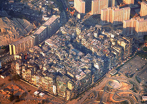
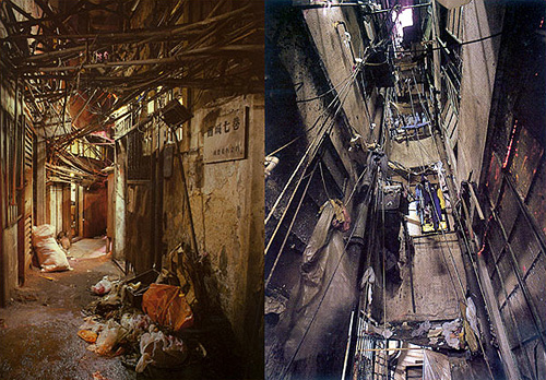
As I’ve mentioned before, one of my obsessions is for maps, especially maps of cities. Maps and images of cities. Walled cities that exist into the modern era are especially fascinating to me. In most societies the conditions that forced people to defend themselves with walls (and for those walls to be successful as a defensive measure) have long gone. Walls can be breached with artillery, bypassed by cruise missiles, made insignificant by ICBMs, and made irrelevant by changes in economies and societies. However, there are still walled cities in the world, and some have even been revitalised (however briefly) by modern conditions.

One such was Kowloon Walled City, a small patch of Hong Kong technically never in the British mandate, but never de facto controlled by the Chinese either. As a territory in limbo, it became an incredibly dense city, almost a single building, covering only 0.026 km² and at its peak apparently having a population as high as 350,000 people; though as a virtual anarchy detailed census figures naturally don’t exist. I wish that someone had been brave and resourceful enough to mount a survey of the city at its peak - the place was, as far as I can tell, unique in the modern world. Knowing more about it, how the societies within it interacted, how the buildings were modified over time, the nature of personal vs. public space and how the power structures (and their limits) altered over time would help with the study of our own increasingly dense societies.

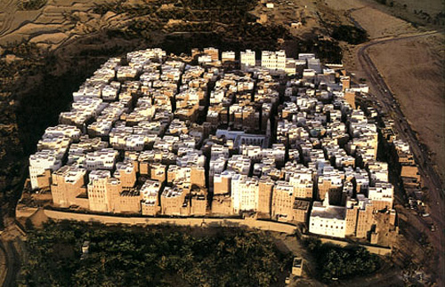
Looking at pictures of it, I’m reminded of these pictures of Shibam in Yemen. The structural similarity to Kowloon Walled City is remarkable:

Travel Posters of Other Times

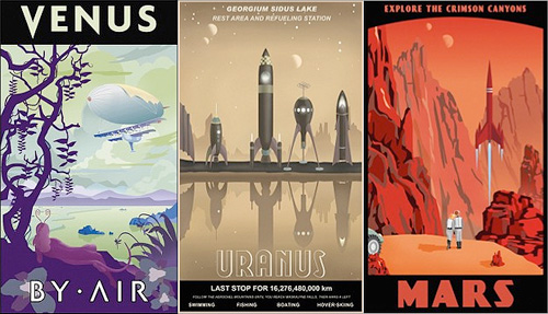
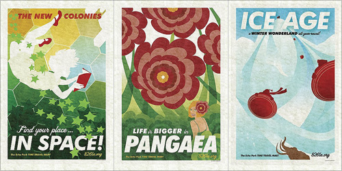
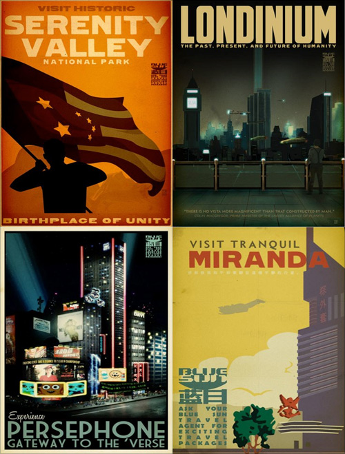
Again, some other things that have been doing the rounds but got stuck in my pile of ‘things to look at’. These travel posters by Steve Thomas, Amy Martin and Adam Levermore-Rich promote travel to exotic eras and destinations, such as the Crimson Canyons of Mars, Tranquil Miranda, or the Winter Wonderland of the Ice Age.

I like the ones for destinations in the solar system by Steve Thomas. Aside from their obvious fantasy, I find them a little poignant though. They evoke the ideas of the early 20th Century when we were going to colonise space pretty soon and it was going to be amazing. Except we didn’t, and space is pretty expensive and we’re only just starting to get space tourism, and even that barely above our atmosphere. Still, perhaps looking at these posters we can live in hope! Well, not for Uranus, what with it not having a solid surface and all, oh, and Venus needing some hefty terraforming… but Mars is about right! Oh, except it’s brown, not red. Ho hum:

Then the Amy Martin ones, which are simply beautiful. The colours are lovely, and these are the ones that to me more closely resemble travel posters:

Lastly, the ones that are from the universe of Firefly and Serenity. I have to admit I’ve not watched either so I can’t really comment other than to say they’re rather attractive. You can buy them here though.

Found via Blue Tea, and via the visits to 826LA I made for the Robot Milk post.

Robot Milk

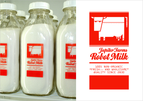
I love robots, I love invented brands, and I love well-made artifacts, so this set of bottles really got my attention. Trouble is, there’s very little I can find out about it. I know it’s something to do with 826LA, it might be a student project, the bottles themselves might be for sale (though not from their online store) and that I would like one. Or two. Or three.

The typeface for the main brand is Home Run Script, which was identified for me by beejay and Ignacio at Typophile.

Via NOTCOT

The Bigger Picture

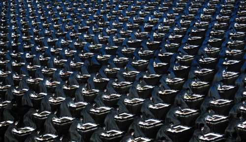
The Boston Globe’s Bigger Picture has a series of images of the Beijing Olympics opening ceremony. I missed it on TV as I was travelling, so I’ll have to watch it later, but I’ve heard a bit about it. I can’t quite remember all the hyperbole, but apparently it was spectacular, ground-breaking, amazing, mind-boggling and other great superlatives.

This one also reminds me of the Matrix, or Gattaca, or even Minority Report. It’s all very sci-fi. (AFP PHOTO / Joe Klamar)

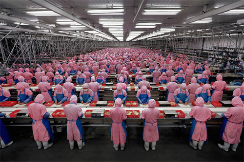
The only negative thing I read about it was that while it meant to represent the history of China, modern China was barely represented at all and that this omission was down to ‘lack of time’. I disagree. I think the whole thing was about modern China - the glitz, glamour, spectacle, all the money and technology poured into the event, it’s all about how China is today. Also, the very means of presentation are a clear and dramatic demonstration of what the country is about nowadays: mass production. Take a look at Edward Burtynsky’s Manufacturing series of photos and you can see what I’m on about:

You can see his work here, though I warn you, the site is one of those idiot ones that resizes your browser for you without asking.

Fontpark

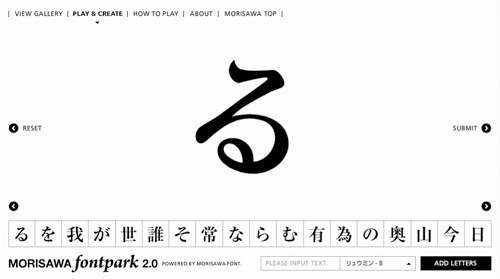
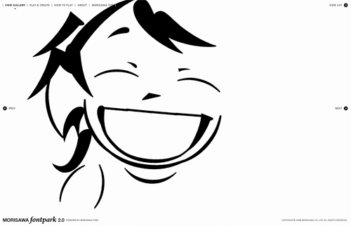
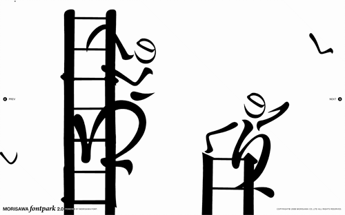
Coudal Partners linked to this rather nice toy by Morisawa & Company. My Japanese knowledge is rather woeful, so I don’t have very much more information than; it’s pretty, it’s fun, it has a very nice interface, and it appears to be promoting the sheer loveliness of Morisawa’s fonts, so please buy some. I was told by a Korean colleague that there are relatively few fonts available for East Asian languages compared to Western ones because of the sheer number of glyphs that need to be designed, so I would guess a new one would elicit at least a moderate fanfare. Maybe. Anyway, have a play - here are a few screenshots: