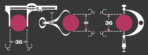
This is fantastic. I think I saw it here, linked from Design Observer first, though quite a few sites have linked to it too, but that’s no reason not to link to it again. It’s got some beautiful touches in it, with a gentle kind of humour and some reasonably groan-worthy puns. I love the little joke about the perfect proportions of the dot, playing off the classic ‘36-24-36’ hourglass proportions supposedly ideal at the time for women. The calipers are great, with the little hearts instead of arrows for the dimensions, and just demanded to be redrawn:
A few sites I’ve seen it on have lamented that things like this aren’t made anymore because it wouldn’t be popular, that people would be afraid of anything that mentions ‘hard stuff’ like mathematics. Perhaps they’re right, and maybe it is really anti-intellectualism preventing stuff like this being made today, but the animation is hardly a mathematical treatise. The only mentions of anything mathematical are the title and a few puns scattered here and there, ending in the rather nice, “To the vector go the spoils”.
The real point of this animation is the animation itself. It’s certainly not the story: a simple morality tale on the importance of hard work and discipline (and also, avoiding narrow thinking) to achieve your desire; in this case, a remarkably shallow and feckless sounding creature who is easily wowed by flashy glitz and glamour. Perhaps these days we might wonder whether that was worth all the poor line’s effort; “You can do better than that” we might say.
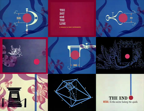
So the animation seems like a kind of showreel, a portfolio piece, beautifully done of course, but more remarkable in that it was released by the studio commercially. I have a little theory that it might have been released with the new technology of colour TV in mind - the audience at the time was very small and would have consisted of those who could afford it; professional, college-educated people? That might explain the choice of story too.