The Dollar Redesign Project

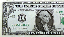
I saw this linked from ISO50 this morning: The Dollar Redesign Project is a competition (Campaign? Bit of fun?) to promote the idea of fully redesigning the US banknotes, possibly on a regular basis, like many banknotes the world over:

The American Dollar has not truly been redesigned since about the 1930s. The Dollar ReDe$ign Project is your opportunity to theoretically ‘change’ that. Yes, technically there are many limitations and complications when it comes to bank note design, but if the Swiss can do it on a regular basis, why can’t we North Americans too?The Dollar Redesign Project

There are only a few designs on there at the moment, some a bit jokey, but of the serious ideas I quite like the ones in the first set below. I can’t see any notes that deviate too far from the originals being successful, as there are so many cultural and linguistic associations with the ol’ greenback; it may seem tediously conservative, but notes that aren’t predominantly green just won’t feel like dollars. I hope the designs go further than the ‘stick a guilloche on it and call it a banknote’ idea - guilloches are beautiful things - I wrote about them before, here - but it takes more than a few of those to make a successful banknote.
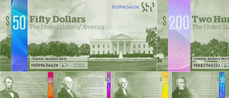
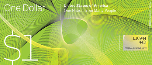
Perhaps a little too reliant on that colour bar to tell them apart, but I like these.
I like the return of the original US motto, translated and updated as 'E pluribus unum' on this one.
Relative sizes of UK notes

One usability feature common to many banknote systems, and I’m surprised the designs so far haven’t addressed it, is to have different denominations in different sizes. UK banknotes do this (see right) and it’s reasonably easy to feel whether you’ve a £5 or a $20 note in your pocket because of it. £50 notes, while far from the tablecloth-sized notes of old, seem positively enormous compared to a fiver. I wonder how many mistakes are made every year from having all the notes the same size?

Of course, no article about banknote design would be complete without a mention of Ootje Oxenaar’s designs for the banknotes of the Netherlands below, now sadly replaced by the rather dull Euro notes. At the risk of seemingly terribly shallow for a moment, to my mind the design of the Euro is a pretty good reason for the UK to keep the pound. Banknotes are like little works of art, and to squander the opportunity to produce a remarkable and beautiful design for them is a sad thing. I shall be watching what comes out of the Dollar Redesign Project with interest. I may even have a go myself.
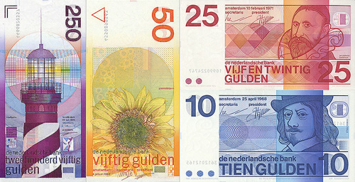
A few of Ootje Oxenaar’s designs for the Netherlands banknotes. More here.

Serbian Manuscripts

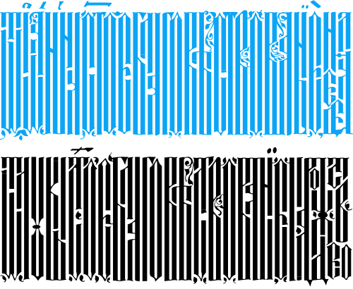
Well that was fun. BibliOdyssey posted these images of manuscripts from the National Library of Serbia last week, and I wasn’t sure if I wanted to trace vyaz script lettering, or redraw it. The urge to redraw won out, and as I was doing it I remembered this post from Tiffany on Flickr, which led me to this thread on Typophile, where Ivan Gulkov shows some virtuoso skills with the style. I can understand the decision not to create a font and instead create a vector file of parts - I ended up creating a set of parts myself for my redrawing below. Creating a font would be a mammoth task, and besides, creating lettering like this is fun. You can see more of Ivan’s work and his portfolio on his personal site. Go take a look.

Top, redrawn from this. Bottom, redrawn from this.

The lettering I’ve redrawn differs a bit from the vyaz script in the Typophile thread, which makes me wonder how much regional variation there was in the script, or whether it was just down to the styles and whims of the individual scribes. In my redrawing I’ve tried to keep to the original lettering, but have straightened the verticals and made the spacing more regular, which I think still keeps to the spirit of the original. I’m also interested in this one, which seems to have some kind of transitional form going on. As the style appears to be more about creating an image rather than being easy to read, it reminds me of the patterning and illustration possible with Arabic calligraphy, which I’ve posted about before.

Fighting Talk

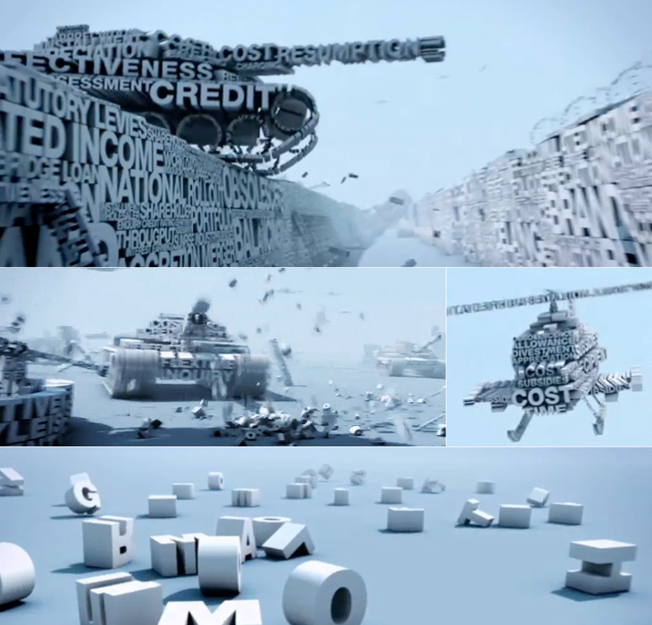
Yves posted on Friday on the FontFeed about a couple of campaigns by Inlingua promoting their business English courses. One of them is this brilliantly animated advert, creating a battlefield scenario out of words set all in Helvetica caps. As Yves says:

The video looks and feels like a first-​person shooter war game, with excellent POV camera work and sound design. The camera runs and ducks through the environ­ment, hiding behind walls and in trenches, while being assailed from all sides by heli­copters, fighter jets, tanks, and explosions made of type.Yves Peters, The FontFeed.

The thing I like especially, and it’s one of those great detail things, is the sound of voices mingled with the explosions, gunfire and engine noises. It’s not overt, but it’s a really nice touch. Go and take a look (and listen).

It’s a Bug՚s Death

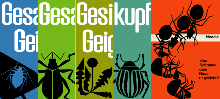
While browsing Ffffound I, er, found a few of the images from this article on Things To Look At on a new book about Geigy’s design and advertising. Some of the examples just call out to be traced - especially the bugs on the pesticide packaging. The illustration for Neocid is quite gloriously morbid - there’s no doubt at all what this stuff is designed to do, even without reading the tagline, “A barrier to house vermin”. The thin white barrier - of death.

Organic this isn’t. I have of course re-composed the elements for the four left-most tracings.

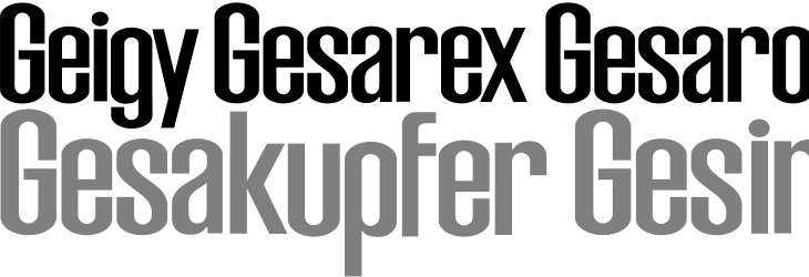
The examples make pretty consistent use of (I would guess) Berthold’s Akzidenz Grotesk, with a few other bits of interesting lettering on things like the herbicide and pesticide packaging above. I traced as best I could the letters from the photos, and though I’m not sure what typeface it is (if it is even a typeface) because of the flat curves and how closed the letterforms are, it reminds me just a little bit of House Gothic 23.

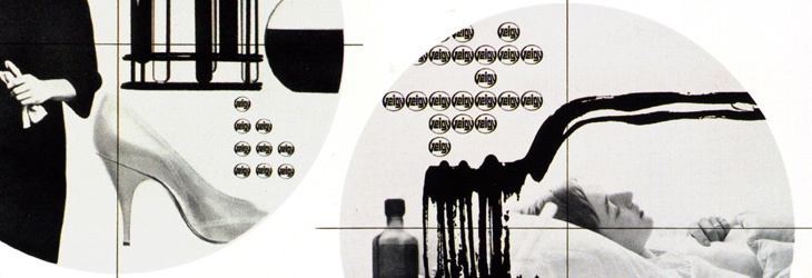
One thing that interests me on some of the examples is the Geigy roundel logo (at right). It’s so at odds with the simple wordmark used elsewhere, and with this other logo on Grain Edit, that I’m wondering where it came from - and where it went. I’m not saying it’s any great loss - I find it rather ugly - but it is very curious, and I will admit the treatment of it in one of the examples (detail below) is rather appealing. Does it have historical relevance I wonder?

The roundel works better as a design element than as a logo.

It’s a logo that works best in multiples, which might explain why it went. Perhaps the book has the answer. And on that note, I would link directly to the book on the publisher’s site, but they don’t have individual pages for them so I can’t. It’s in this list. Look for dolphins.

Further Enduring Characters

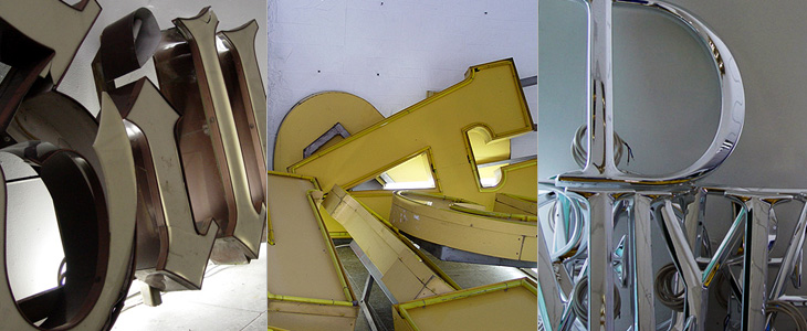
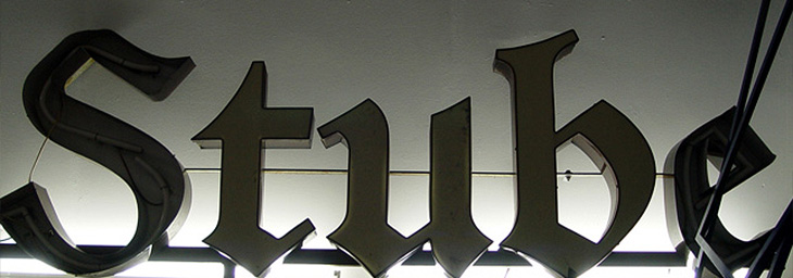
Coincidentally, not long after coming across Character, I found this article about the Berlin Museum of Letters on Core77 (via NOTCOT). Obviously enough it’s a museum devoted to letters, big ones created for building signage and wayfinding in wood, metal, glass and plastic. Core77 has some beautiful photographs and a bit of background info on each one. I really, really, want the DaimlerChrysler ones; so shiny! Lovely stuff, go and take a look.

Some of the letters, and the DaimlerChrysler ones on the right. Lovely.

I love this image. This and the other photos in the article are by Aart van Bezooyen.

Enduring Characters

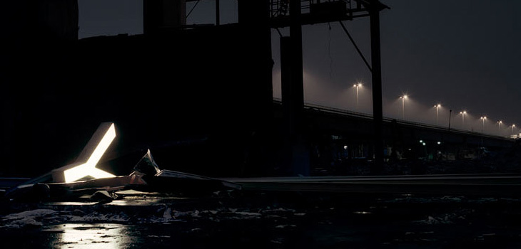
Fancy some big, glowing letters? Adrian Giddings linked to the Character website on Twitter (also via Design Observer), who refurbish and sell old letters from signs. They’re rain-proof and illuminated with LEDs, so I’d guess they’re good for the garden and will last quite a long time. I quite fancy a garden illuminated with big letters dotted about in the foliage. Mind, if you’re after the post-industrial look, the site’s home page has some lovely photos of some of the letters in dark and moody settings for your inspiration.

The Xerox Star UI

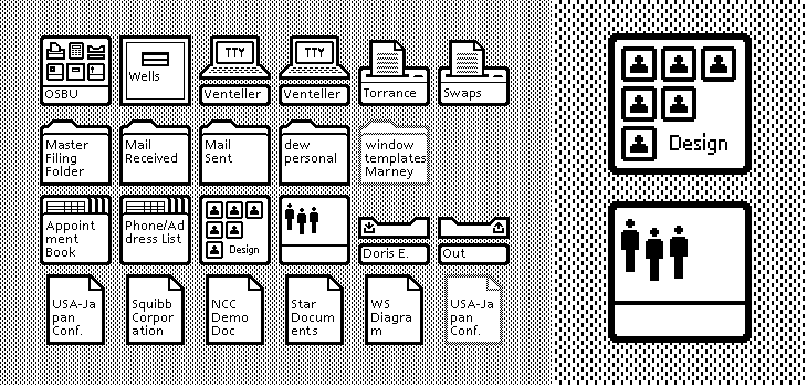
A couple of weeks ago ISO50 linked to this set of polaroids of the Xerox Star user interface on Digibarn, and I’ve been looking back at them on and off since. The UI has some interesting little details; it was designed for a two-colour display, so used a couple of dithered patterns to create the grey shading on the desktop background and window titles, which in turn created a few problems for the designers. To get a neat, crisp interface, icons and windows have to be sized and positioned on the background so that the black and white dots don’t interfere with the outlines and create a kind of blur or eye dirt effect. The polaroids show some of the design notes and instructions for doing this; it’s a lovely illustration of the attention to detail they employed to make the best of a technological limitation. Rather than recreate them directly (you can see the originals here, and here) I’ve redrawn a bit of the UI here, with ideal alignment on the left and detail top right:

The difference a pixel makes.

If I’m to get preachy (and ranty) for a moment, I think it’s a task any designer should attempt as part of their education - what you learn from designing for such a restricted display helps with all sorts of design tasks later; you learn what causes a lot of those visual disruptions and artifacts that you catch from a quick glance or out of the corner of your eye. It may be subtle, but it’s the kind of thing that reduces the overall apparent quality of your work, the stuff that marks out your work as being standard (read: mediocre) or exceptional. If you feel you shouldn’t get precious about such things, perhaps graphic design isn’t your thing.

How the icons are laid out on the desktop. The big flaw I see in this design, still not fully solved in desktop UIs today, is the display of longer filenames when displaying icons in a grid. They’re either truncated or hideously force-wrapped. Ouch.

As others have noted, the UI at first seems remarkable for its apparent modernity, the conventions it uses are still ones we use today; with a graphical update to it you’d get a reasonable facsimile of any windowed GUI of the past few decades. The designers at Xerox clearly did a remarkable job, addressing so many design problems at once, with solutions so good that almost three decades of development haven’t significantly improved on them. We could throw up our hands as a result and say that this is clearly it, that nothing new can be done, but apart from being depressing, this would miss a couple of important (to me) points:

  1. The hardware configuration of a desktop computer has barely changed - we still use a mouse (or equivalent), a keyboard (however fancy and bristling with hotkeys it is) and a screen (whatever the technology, it’s still a 2D array of pixels)
  2. We haven’t changed - we’re still human beings.

Essentially, we are still the same configuration of limbs and sensory organs using the same configuration of display and input devices. It’s when we change either of those configurations that we see where all the real innovation has been. Adaptive and assistive technologies are developing faster and faster as component prices fall and previously isolated innovators are connected and share information online, and in tandem with this we see the spread of input technologies that enable methods such as touch, voice and gesture. We can hope that these technologies become widespread enough to change the design of the traditional desktop, or even make it obsolete, and that leads me nicely onto…

A futurist digression

Heading off into the realms of the futurist for a moment, I think a lot of attention has been given to display-related technologies such as 3D/holograms, but not even sci-fi has come up with anything really remarkable with the idea - oh sure, you can create a hologram of a keyboard, or a touch screen, but those merely address matters of convenience: you don’t have to store the thing when it’s switched off. The interfaces we see in films are mostly still all about manipulating pictograms. What I’m really interested in are the kinds of interface that use our other senses, interfaces that seem less flashy and appear almost mundane such as vibration (as in mobile phones), things like the sleep indicator on Apple computers and potentially most importantly, speech.

Forget flying cars, we’ll know it’s the future when we can talk to our computers, just like in Star Trek, but hopefully not quite like in 2001: A Space Odyssey.

Preserve

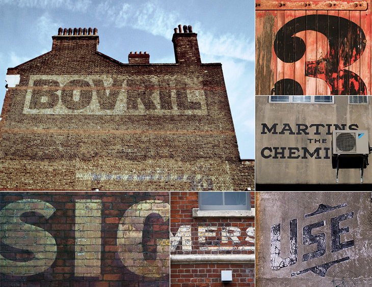
I keep meaning to post about Preserve. I had the image ready and everything, then Mark tells me about a big update to the site. It’s a project to record the painted signs on old buildings and other parts of the urban fabric before they fade completely, are painted over or are destroyed by demolition. Most of the pictures are of New Zealand buildings, but there are a few from elsewhere, including a great Bovril one in Brixton below.

The project also invites contributions, so you can help expand the scope of the site. I think something the site does need is a bit more context - it’s a general complaint I have about the subject of “found type” in general: the lack of context or place in the images. They are nice to look at though, so perhaps I shouldn’t complain too much.

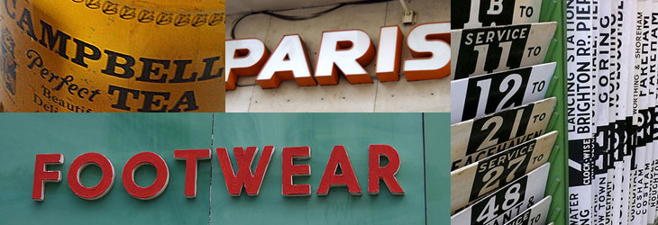
On the topic of found type, you may also be interested in the archive of Found Type Friday posts on Ace Jet 170. There’s some beautiful examples in there, so take a look. There are several pages of it, the pagination link is the little ‘»’ at the bottom.

The Romance of Printing

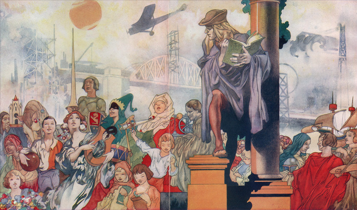
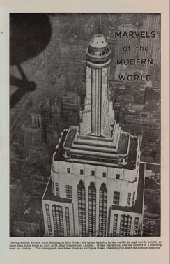
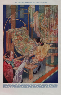
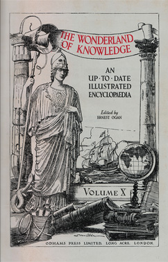
About 25 years ago I was given a full set of 1930s-era encyclopædias, The Wonderland of Knowledge, and I’m glad to still have them in good condition, countless house moves and two burglaries later. They’re fascinating things, with lots of illustrations and an engaging conversational style written to appeal (I guess) to older children. The illustrations are remarkable and are frequently quite beautiful. Each volume has a full colour frontispiece, colour and monochrome inserts throughout and many photos and diagrams in the text.

Knowledge is Power

The beautiful frontispiece for Volume Ⅰ, painted by Charles Robinson.

Marvels of the Modern World
Volume 10 Frontispiece - Left
Volume 10 Frontispiece - Right

Left: A sample of one of the rotary photogravure inserts. Centre and right: The frontispiece and title page for Volume Ⅹ. You can click each image for a larger version on Flickr.

The content, however, is very much of its time, with antiquated attitudes to race, nationality, gender and so on, and some interesting attitudes to the portrayal of history itself; this account of Oliver Cromwell, for example, shows how anything negative or critical is delicately avoided. Perhaps youngsters weren’t to be troubled with such complexities?

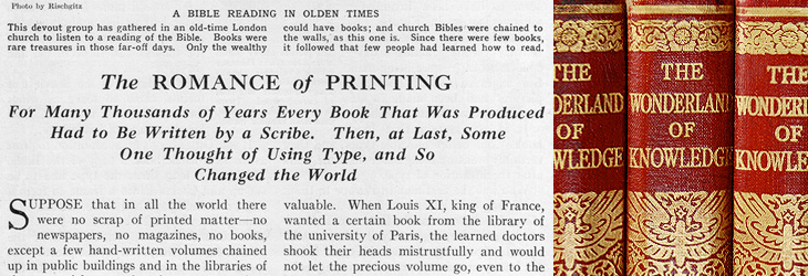
On the less-contentious subjects of science and technology there are some good articles, and some of them stand as being pretty informative and relevant today, including the one I’ve taken the title from for this post, The Romance of Printing. It’s a pretty good primer on the history and techniques of printing, covering ancient origins through Gutenberg and Caxton up to linotype and monotype machines, braille printing, etching, lithography and photogravure. I’ve put it up on Flickr in quite high resolution so you can have a read and see it in all its glory. I’ve also got a lower-resolution PDF here.

Pages from The Romance of Printing. There are high-res scans here, or a lower-res PDF here.

A detail of the type styles used, and of the gold blocking on the spine.

When the article gets to a description of the monotype process, there’s a little clue to the typeface used in the books. I did wonder what it was, but never got around to looking it up; it always seemed such a characteristic part of the books that I’d never really thought of it being something used elsewhere too:

The type for the book you are now reading was set and cast on a monotype machine.The Romance of Printing, Vol Ⅷ, p3964

So yes indeedy, from that little snippet it’s not a great mental leap to assume the typeface is the original of this Monotype Old Style, with optical weights for the captions and the indices that aren’t included in the digitised version.

The main reason I’d wondered about the typeface was because I did once have a completely mad plan to scan in the whole encyclopædia, do some OCR on it and have it online in some format, but I quickly realised that I’d need something like this to even start the job. Scanning in just the pages for this post took several hours, and considering that without the inserts there are 6144 pages, so the chances of seeing it all online are pretty slim.

Our Favourite Typefaces of 2008

Yes, it’s finally here! Typographica’s Favorite Typefaces of 2008, the fifth annual collection of reviews of the best in typeface design. I’ve not read all the reviews yet (that’ll take a while) but from the ones I have read you should set aside a couple of hours and go and take a look:

Stylistically, this year’s selections run the typographic gamut: slab serif, typewriter, blackletter, stencil, brush script, geometric sans … and some that are difficult to neatly classify. Some represent contemporary innovations in editorial style, while others look back to pre-typographic history for inspiration. Typographica

Also of note is the swanky new design for Typographica itself - the first significant redesign of the site since 2002, heralding its transition from a blog to a full-time review site. Congratulations to all involved!