The St. John’s Bible

This may be a bit of an old link, but it’s new for me, I think. The St. John’s Bible is a project by Donald Jackson (and team) and Minnesota’s Saint John’s Benedictine Abbey & University to produce a hand-written and illuminated bible to, as they put it, celebrate the new millennium. It’s both a massive project and a massive book - over 1000 pages with spreads 80cm wide by 60cm high, produced over 10 years at a cost of four million dollars (though its value may be denominated in other ways). The origin of the work is interesting in that it comes from the classic desire to complete a magnum opus:

For many years Donald Jackson, Senior Illuminator to Her Majesty’s Crown Office, had dreamed of creating a modern, illuminated Bible to celebrate the new millennium. Finally, in November 1995, he presented the idea to Saint John’s Benedictine Abbey & University in Minnesota.¶ Work started in 2000 and is scheduled for completion in 2007, at a total cost of over £2 million. It is taking place in a scriptorium in Monmouth, Wales, under the artistic direction of Donald Jackson and his team of scribes and illuminators.The Victoria and Albert Museum

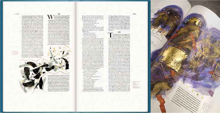
Some sample pages from the bible. The images on the left are from the St John’s Bible website, the ones on the right are from the Victoria and Albert Museum.

Jackson has brought together an incredible range of styles for the bible, from rich, lush, gold-encrusted illuminations reminiscent of Eastern Orthodoxy to crisp and spare compositions more like the modern style of the Church of England (to my mind at least):

The Saint John’s Bible will represent mankind’s achievements over the past 500 years. It will be a contemporary blending of religious imagery from various Eastern and Western traditions, as befits our modern understanding of the global village.St John’s Bible website FAQs

The disparate styles are unified by the common thread of that beautiful lettering and calligraphy, and by the script for the main text designed specifically for this project by Jackson himself. I’d love to hear more about that project! You can just about make out the script on the larger watermarked images. Just.

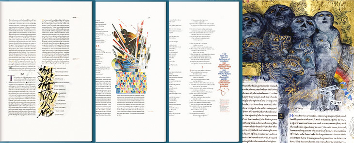
Some sample pages from the bible. The three on the left are from the St John’s Bible website, the rightmost one from Victoria and Albert Museum.

Which last point leads me nicely onto my one little whinge, not about the project, but about the website for it: I just wish there were a couple of closeup photos of the bible on the site. I can see why they’d be wary of possibly having their hard work ripped off, but it’s not like you need full-page scans to see the quality of the calligraphy and detail; a few square centimetres would do. After all, the prints aren’t all that cheap, and getting a bit of a closer look would be reassuring. Of course, if you’re seriously loaded, you can buy a copy of the Heritage Edition, for $145,000. If there are any left, that is.

Link via Greg Storey at Airbag.

Mahlau

I’ve been following the excellent Cooper Typography Blog for a little while now, and recently Sasha pointed me to his article on Alfred Mahlau, with a short biography and a large collection of images of his work. Of course I’ve traced a few of them below. The lettering is distinctive and highly geometric - the curves are all based on circles - and has some attractive ligatures. As Sasha said in his article, the treatment of some of the umlauts is attractive - replacing the diacritic with a digraph when writing Lübeck. Check out the rest of the site; it’s got great articles, fascinating examples and links (you may lose a day or three with this one), and is definitely well adding to your RSS/bookmarks.

Have a look at this article about Lübeck to see the original of what’s represented in these posters. The distinctive cityscape is also used in the still-used brand identities for Niederegger and Schwartauer Werke, also created by Mahlau.

A few more, so you can see the lettering. More here.

Calligraphy and Illustration in Light

While browsing NOTCOT earlier, I came across this post linking to this frankly quite amazing set of light writing photos by Julien Breton (also via this post). You know the idea; set the camera up in a dark place on a very long exposure, and use something like a flashlight or LED penlight to draw shapes. I’ve seen some beautiful examples before (bottom), but nothing as intricate and detailed as these. These are quite close crops; you can view the full images and get more information on Breton’s site.

I thought I’d already posted about these images from LAPP - Light Art Performance Photography. I can’t remember when I first saw them but they fascinate me, I’d love to watch some of these being made. The site has added a load of new photos since I last looked so it looks like they’re pretty active in creating new works too. Great stuff:

The Fox

Just saw this book cover on Sci-Fi-O-Rama with some gorgeous lettering. If you’re interested in lots of great sci-fi and fantasy illustration the site is worth visiting, though type and lettering don’t feature there very often. I loved the exuberance of this script, it’s perfect late 60s stuff, and yes, of course I’ve traced it.

The Art of the Title Sequence

I recently rediscovered The Art of the Title Sequence site, which is a goldmine of inspiration for anyone who needs to animate type, and I’m surprised I’ve not posted about it before. Title sequences are remarkable in that they have to fulfil some important roles in a film - they’ve got to tell you who made it, who’s in it, who paid for it, in a way that complements and introduces the film (but is clearly not the film itself, so you can get all your arrangements with popcorn/noisy snacks/coughing/sneezing, etc. out of the way), and all in a short a time as possible. Those requirements provide a fertile ground for all sorts of creativity, to the extent that the title sequence becomes a genre in itself: a very specific kind of animated short; an animated infographic if you like. So we have sites like this one for people like me to trawl through and drool over lovely examples of typography, lettering and iconography. First up, one of my favourite films, Bullitt.

Isn’t that just perfect? See it as part of the full sequence, here.

When I first saw this sequence I was scrabbling for my camera to try and get some shots of the lettering, but didn’t manage to get much worthwhile. The typeface is just beautiful, and I’ve always wanted a copy of it, but after a lot of investigation it turns out there isn’t an exact digital version of it. There’s a very, very similar one called XXII Black Block, but you’ll notice that it has slanted terminals on the E and T - almost there, but not quite.

I love the way the lettering leaves a ‘hole’ in the current scene, which expands to show the next one.

Next up is Stranger Than Fiction, a film I’ve never seen but might get around to watching one day just because the title sequence is interesting. It looks like it could be great or dreadful, and nowhere in between. Either way, the title sequnce is great and makes playful use of type, instructional iconography and labelling to enhance the story. I like the way the labels for everything definitely feel like part of the main character’s world, his obsessions, so real to him, made visible (and real) in the world for us to see.

Mmm. Numbers. Labels. Sequence here.

This next one is not so much about the type. It’s not really about the type at all. In fact, I hate the type in this one. The exploded diagrams are lovely and the way they tie in with the live footage of the Farnborough Air Show is highly compelling, so to have this clumsy uninspired type stuck over it is a real disappointment and a wasted opportunity. I’m including it in my favourites because you can imagine how nice it could be if a typographer had been given a chance to polish it up before delivery:

Nice graphics, shame about the type. Full sequence here.

Gradually coming back to nice type with this one - I remember, years ago, playing around with analogue electronics to draw letters and simple shapes on oscilloscope screens and though it was pretty painful it was satisfying when it worked. The animations in Tron were done this way, with the flat surfaces coloured in later by hand. The end sequence for Iron Man deliberately references these very first vector graphics with these CAD-style animations, with the type done perfectly to match:

A still from the Iron Man end sequence. Full animation here.

Next I’ve got this one which is just good solid no-frills typesetting, enlivened with great use of a close-up and, again, those vector graphics:

It’s Hitchcock’s Vertigo. Original sequence here.

And last of all, a very satisfying and clever use of 3D to form the names and titles by constantly changing the camera angle. I imagine it would be a nice way to tell a short story, as I found myself watching it and reading the words quite comfortably. It’s paced very well, and the fascination you develop for how the letters come together makes it an entrancing experience:

It’s Le Souffleur. Full sequence here.

Notgeld

I’ve been merrily tracing some of these Notgeld that Design Observer linked to last week. I could quite happily spend months tracing all these, they’re so beautiful. But what, I hear you cry, are Notgeld? Well to answer that, I’m going to quote from Wikipedia:

Notgeld (German for “Emergency Money” or “necessity money”) was special money issued primarily in Germany and Austria to deal with economic crisis situations such as a shortage of small change or hyperinflation. It was not issued by the central bank (Reichsbank) but by various other institutions, e.g. town savings banks, municipalities, private and state-owned firms. It was therefore not legal tender, but rather a mutually-accepted means of payment in a particular locale or site.Wikipedia

I knew about the money issued during the hyperinflation period (and posted about it too), but not about these ones. The big giveaway that this isn’t hyperinflation currency is the small denomination of the notes - 25 Pfennigs! On a banknote! The fifty pfennig one I had to trace because of that F, and unsurprisingly it’s taken me rather a lot longer that many other tracings I’ve done. The lettering was originally hand done, with all the interesting variations that implies, so no copy’n'paste shortcuts for me!

Wandsbek 25 Pfennig note, traced from this original. Click the image above for a larger version.

I love that F so much. Click the image for a larger version, or see the original here.

The local currency idea reminds me a little of a project near me, The Lewes Pound, designed to encourage local commerce in and around (you guessed it) Lewes, in East Sussex. The Lewes Pound notes are rather nice things, but I think a lot of these old German notes are actually beautiful. Indeed (and I’m basing this on Wikipedia again) Notgeld were issued for a few years after the need for them had subsided because people liked to collect them so much. I suppose having a lot of people collecting and framing your notes instead of spending it must affect the money flow a bit, so perhaps making money too beautiful isn’t a good idea. I guess that explains the designs of the US dollar and the Euro then. Ahem.

Feed Your Type Addiction

Sigurdur Armannsson has published his type-related RSS feeds, and it’s quite a list of typographic goodness. I already follow quite a few of these, but I’ve added a fair few more of these to my RSS feed, and the only thing stopping me adding the whole lot is the fear I’ll never do anything but read them for the rest of my life. I’m honoured to say I make the list, so if you like the kind of things I write about, you may find a bunch of other things that interest you here too. Go and look!

Spacesick

I got sent a link to Spacesick’s photostream this morning, mainly for these fantastic ‘novelisation’ covers of movies. I especially love the Close Encounters one. That, and the Temple of Doom one I want as posters. It’s the attention to detail that makes them special, the scuffmarks on the covers, the ‘repairs’ with yellowed Sellotape, as well as the quality of illustration. Great stuff. Make sure you have a look further back in the photostream too, as there’s plenty of great work in there, like this, and this. Delicate souls, easily offended by sketches of partial nudity, might not want to click that last one.

Close Encounters of the Third Kind, Vacation, Shaun of the Dead, Return of the Killer Tomatoes, Charlie and the Chocolate Factory, The Temple of Doom and Sixteen Candles.

Via @stephenreid via @tagliners, and also on grainedit.

Arabic Retail

What does the McDonald’s logo look like in Arabic? Or Yves Saint Laurent? Burger King? Rolex? Baskin Robbins? Well, now you can find out because Brand New linked to these two articles by Jason of Graphicology showing Arabic language versions of international brands: one for logos and another for packaging.

The ones that are really faithful interpretations are fascinating, they really highlight what it is about the logo and packaging that identifies the brand - the Mountain Dew, Dunkin’ Donuts and Baskin Robbins ones are particularly successful in this regard. The Subway one is so close to the original that at a glance you could miss the fact that it’s in Arabic. Others bear no apparent relation to the original logo, even though you’d think they could be easily redone in Arabic. The Calvin Klein one in particular is baffling - surely it would be a straightforward exercise to letter a short name in Arabic to look like Futura Book? Indeed, there is a version of the face called Bukra, which so far only exists in an extra bold weight, but still, it shows it can be done, and very well too. The Yves Saint Laurent one is a little closer to the parent, but again, not so much.

Comparing the originals to the Arabic versions, it’s the luxury clothing brands where the logos diverge the most, and fast moving consumer goods (FMCG) that are the most faithful. This might be because the luxury brand customers are nearer the top of the social scale, are more international and therefore more likely to recognise the Latin logo than those who buy washing powder and groceries. With that assumption, it would therefore be more important to accurately translate the brand image for the FMCG market than for luxuries. Perhaps. Having said that, it’s the Tide packaging that got my attention, and given that Brand New also used a picture of it I’m not alone in thinking that it’s one of the best, design-wise. It’s great in English, but I don’t think I’ve ever seen Arabic lettering quite so exuberant; artistic, inspiring, beautiful, yes, but this is pure teeth-jarring kitsch. Fab. I have of course redrawn my own version of it. Click the image for a wallpaper-sized version.