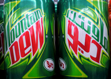
What does the McDonald’s logo look like in Arabic? Or Yves Saint Laurent? Burger King? Rolex? Baskin Robbins? Well, now you can find out because Brand New linked to these two articles by Jason of Graphicology showing Arabic language versions of international brands: one for logos and another for packaging.

The ones that are really faithful interpretations are fascinating, they really highlight what it is about the logo and packaging that identifies the brand - the Mountain Dew, Dunkin’ Donuts and Baskin Robbins ones are particularly successful in this regard. The Subway one is so close to the original that at a glance you could miss the fact that it’s in Arabic. Others bear no apparent relation to the original logo, even though you’d think they could be easily redone in Arabic. The Calvin Klein one in particular is baffling - surely it would be a straightforward exercise to letter a short name in Arabic to look like Futura Book? Indeed, there is a version of the face called Bukra, which so far only exists in an extra bold weight, but still, it shows it can be done, and very well too. The Yves Saint Laurent one is a little closer to the parent, but again, not so much.
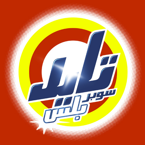
Comparing the originals to the Arabic versions, it’s the luxury clothing brands where the logos diverge the most, and fast moving consumer goods (FMCG) that are the most faithful. This might be because the luxury brand customers are nearer the top of the social scale, are more international and therefore more likely to recognise the Latin logo than those who buy washing powder and groceries. With that assumption, it would therefore be more important to accurately translate the brand image for the FMCG market than for luxuries. Perhaps. Having said that, it’s the Tide packaging that got my attention, and given that Brand New also used a picture of it I’m not alone in thinking that it’s one of the best, design-wise. It’s great in English, but I don’t think I’ve ever seen Arabic lettering quite so exuberant; artistic, inspiring, beautiful, yes, but this is pure teeth-jarring kitsch. Fab. I have of course redrawn my own version of it. Click the image for a wallpaper-sized version.

