I’ve been merrily tracing some of these Notgeld that Design Observer linked to last week. I could quite happily spend months tracing all these, they’re so beautiful. But what, I hear you cry, are Notgeld? Well to answer that, I’m going to quote from Wikipedia:
Notgeld (German for “Emergency Money” or “necessity money”) was special money issued primarily in Germany and Austria to deal with economic crisis situations such as a shortage of small change or hyperinflation. It was not issued by the central bank (Reichsbank) but by various other institutions, e.g. town savings banks, municipalities, private and state-owned firms. It was therefore not legal tender, but rather a mutually-accepted means of payment in a particular locale or site.Wikipedia
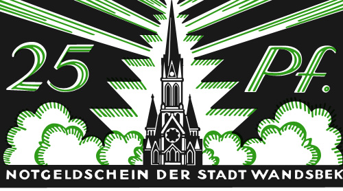
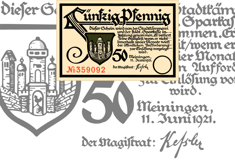
I knew about the money issued during the hyperinflation period (and posted about it too), but not about these ones. The big giveaway that this isn’t hyperinflation currency is the small denomination of the notes - 25 Pfennigs! On a banknote! The fifty pfennig one I had to trace because of that F, and unsurprisingly it’s taken me rather a lot longer that many other tracings I’ve done. The lettering was originally hand done, with all the interesting variations that implies, so no copy’n'paste shortcuts for me!

Wandsbek 25 Pfennig note, traced from this original. Click the image above for a larger version.

I love that F so much. Click the image for a larger version, or see the original here.
The local currency idea reminds me a little of a project near me, The Lewes Pound, designed to encourage local commerce in and around (you guessed it) Lewes, in East Sussex. The Lewes Pound notes are rather nice things, but I think a lot of these old German notes are actually beautiful. Indeed (and I’m basing this on Wikipedia again) Notgeld were issued for a few years after the need for them had subsided because people liked to collect them so much. I suppose having a lot of people collecting and framing your notes instead of spending it must affect the money flow a bit, so perhaps making money too beautiful isn’t a good idea. I guess that explains the designs of the US dollar and the Euro then. Ahem.
