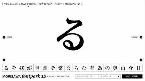
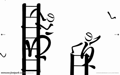
Coudal Partners linked to this rather nice toy by Morisawa & Company. My Japanese knowledge is rather woeful, so I don’t have very much more information than; it’s pretty, it’s fun, it has a very nice interface, and it appears to be promoting the sheer loveliness of Morisawa’s fonts, so please buy some. I was told by a Korean colleague that there are relatively few fonts available for East Asian languages compared to Western ones because of the sheer number of glyphs that need to be designed, so I would guess a new one would elicit at least a moderate fanfare. Maybe. Anyway, have a play - here are a few screenshots:
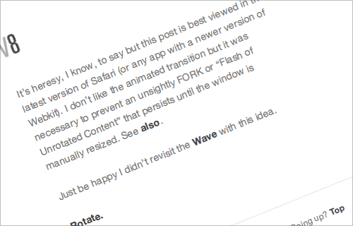
I just followed a link to this interesting demo of the latest webkit wonders on Shaun Inman’s site. I’m excited of course by the possibilities that the transitions and effects could provide - from more responsive UIs to having vertical labels on a graph or spreadsheet without graphics or flash, for example - but, and there’s always a but in things like this, that baseline is seriously wonky. Oddly, Photoshop has this problem too - you can’t just rotate a chunk of text and have it maintain a smooth, straight baseline, so you end up converting text to outlines instead and having to start afresh with each content edit. Annoying!
The Denver Egotist sent me a link to this rather nice piece of work, for Crawley Library in West Sussex. The new library is due to open in January 2009, so I might have to go up and have a look - I’ve not been to Crawley in years. There’s some more info on the Crawley Borough Council website, and some pictures on the Crawley Library Flickr set.
David sent me this article, discussing and demonstrating some of the new text rendering features in Firefox 3, compared to Safari. Finally, we have kerning. Hurrah! It really works, too. Now kern-sensitive souls can read Textism without having to scroll the site name off the top of the viewport.
Firefox also supports contextual and discretionary ligatures, which I was fully prepared to get quite excited about until I read that it appears to be somewhat broken when presented with languages other than English. As Ralf Herrmann points out, contextual ligatures are dependent on more than the context of neighbouring characters - the context of language matters too. Fancy that. The Turkish example is especially interesting, as the dotted-i and dotless-i are not interchangable, and using one in place of the other has caused deaths, quite recently too:
The life of 20-year-old Emine, and her 24-year-old husband Ramazan Çalçoban was pretty much the normal life of any couple in a separation process. After deciding to split up, the two kept having bitter arguments over the cellphone, sending text messages to each other until one day Ramazan wrote “you change the topic every time you run out of arguments.” That day, the lack of a single dot over a letter - product of a faulty localization of the cellphone’s typing system - caused a chain of events that ended in a violent blood bath. Gizmodo - rest of story here
As most of my work involves working in multiple languages, I tend to be a bit sensitive to things like this; where developers of a product build in a cultural or linguistic bias even when that product is destined for an international audience. The Firefox team clearly aren’t just intending their browser to be used within the confines of the United States - just one look at this map shows their global ambition. So they should have fully implemented the rules for contextual ligatures in other languages, if they’re going to do it at all. I’m sure it’s an oversight, but if you’re going to do something, you should always try and do it properly - after all, the ligatures could be turned off for languages where the rules haven’t yet been implemented.
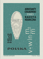
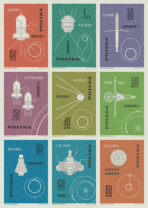
I saw pictures of these stamps on Ace Jet 170, and was absolutely fascinated by them. I love the illustrations of the orbits and paths taken by the space vehicles - the Łunnik 3 (Luna 3) one especially. As usual, I felt compelled to redraw them so as to understand them better, and they really are very well done - the orbits of Mars, Earth and Venus aren’t drawn perfectly circular, and the relative sizes of the planets are nicely visualised. The whole collection looks to have been a celebration of 60 years since the publication of Konstanty CioÅ‚kowski’s treatise on powered spaceflight “Изслѣдованiе мировыхъ пространствъ реактивными приборами” (The Exploration of Cosmic Space by Means of Reaction Devices), in 1903 - showing some of the results of the research his work started.
The first (or tenth?) stamp in the collection was devoted entirely to him, and the illustration is that of a design for a powered spacecraft from the cover of published versions of his paper - my redrawing of it is at right. The others show a variety of space missions, with the interesting date convention of having the month depicted with roman numerals. It’s not something I’d come across before, but it looks quite useful*. No longer would Americans and Europeans have any doubt over whether 01/03/08 is the 1st of March or the 3rd of January. Anyway, that’s another one of my must-do-something-with-this bookmarks cleared up, and it’s been quite a fun process in redrawing them. Here are the images I made based on the stamps. I’ve got them as vectors, so I’m thinking of getting them printed out A3 size.
I (re)discovered PSDTUTS today, with this rather nice grass effect. I must admit to having a certain soft spot for tutorials like these - a lot of them are just fun to play with and are usually too limited for any kind of professional use in themselves, but there’s always something useful to be discovered. Take this lighting effect for example, I’ve created similar things to this before and they’ve been very effective - some subjects (and clients) demand near photo-realism like this. Be sure to have a play around with the grass, fire and the lighting tutorials. If nothing else you can make a nice vanity desktop for yourself.
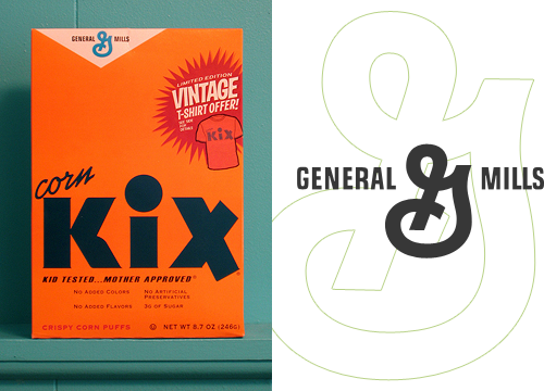
I’ve had this link on Hello Bauldoff hanging around for ages - the design of the box and the bold typography are fantastic, and the colours in the photo really appeal. One thing I noticed was the old-style General Mills logo which is far nicer than the version on their website, though they still use the crazy ‘G’ symbol. It’s the kind of thing that would drive me bonkers if I had to stare at it at breakfast every morning - is it a ‘G’? Is there an ‘M’ in there? Or is it some bonkers ampersand?
I know it’s the main point of the campaign they’re doing, but I’d remove the t-shirt promo flash, or massively simplify it - to me it looks like it’s trying too hard for that retro-Americana thang. The rest of the box carries that off perfectly, so it’s just not necessary.
I found this little tip today on the International Herald Tribune developer blog. It’s a simple solution to an old problem in a modern context - avoiding widows and orphans online. I’m poking around in the innards of my CMS (Expression Engine) to see about doing this on Ministry of Type (I am not going to do it manually!) and fortunately it will (if I do it) be retroactive, unlike the IHT.
OK. Rant time. I was sent this wonderful, wonderful link today. For many years now, I’ve been increasingly bothered by these little yellow flies buzzing around on my screen. They drive me to a level of distraction and rage that (in terms of interfaces) only Windows nag-bubbles can beat. Why developers think that these things are so helpful and vitally useful that they must pop up at almost every opportunity, and that the user must be given no obvious recourse to turn them off, I don’t know. They are the gnats of the typographic world - buzzing and darting in front of your eyes, imparting very little of use, and even then merely duplicating what the rest of the interface provides in a much more studied and calm manner.
The reasoning for them existing is often given (at least in the online world) as ‘accessibility’, assuming somehow that a user needing some kind of assistive technology would also be the kind of user always able to hold a mouse pointer steady over an arbitrary interface element for the requisite two seconds to see the damn thing. For the rest of us, just leaving the pointer somewhere ‘out of the way’ while typing, reading or (heaven forfend!) thinking, results in this pointless yellow box popping up. Perhaps ironically, it’s a situation made worse by using that finest of input tools, the wacom tablet, as removing the pen from the sensing region leaves the pointer static wherever it last was on screen; perfect prey for the predatory tooltip.
The actual accessibility modifications that lead to tooltips showing up everywhere are such things as adding title attributes to links and other elements, and the tooltip is merely an unpleasant symptom of this noble effort. That the browser shows a tooltip for these things is analogous to an overkeen child endlessly demonstrating how clever they’ve been: Look at me! Look at me! Look at me! In fact, the browser does not need to display tooltips for these things - they are there to provide additional information when the context of the item is removed, such as in an audio or text-only browser. If the interface relies on tooltips in, shall we say a conventional environment, then it’s a very poor interface indeed, or an experimental dotcom-boom-era ‘project’, which is I suppose the same thing.
I’ve done a fair bit of work designing interfaces, and I’m glad to say most of them are tooltip-free. I’d rather all of them were, but you can’t win every battle. My message to developers, marketers, designers, whatever, but more importantly OS developers, it’s quite simple: give us an option like this, please:
This Flickr set of vintage logos has been around a while now, and I looked and didn’t immediately get much inspiration. I mean, anyone else who’s linked to them has done the equivalent of, “Hey look, old logos! Um. Yes. Old logos!” so I guess I’m not alone.
Still, patience rewards the virtuous (or something) and I had a closer look through the ‘Original Size’ of all of them - my, that was a fun exercise, thank you, Flickr - and found some logos that I think are pretty interesting. Unfortunately, most of the ‘logos’ on those pages really don’t deserve the distinction of being called logos. In fact, most of them are pretty poor. I guess that makes the good ones stand out better. Perhaps.
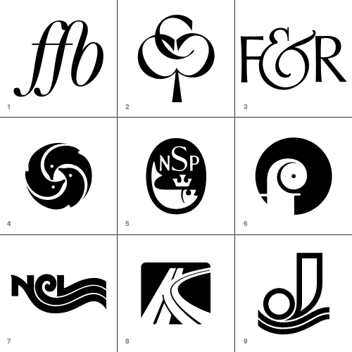
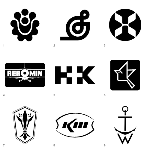
So, enough bad-mouthing. I’ve traced (manually, of course, with lovely beziers) the ones I either like, or think are inspirational and felt quite a bit of ’70s and ’80s nostalgia in the process. You may have a different set of choices of course, and no, I wouldn’t include the Lubalin logo in the ‘crap’ ones. I just don’t like it very much. I know, I know, there’s a space in Design Hell reserved just for me… Below are thumbnails of the ones I’ve traced, and I’ve added notes for most of them too. If you’re reading this on the home page, click “Read the rest…” to see the whole lot.
Forening for Boghaandvoerk I’ve seen plenty of FF ligatures, but it’s the FB one on this that I like and wanted to keep for reference.
Cumberland Capital Corp. Just great. I imagine it’s supposed to imply ‘growth’ with the tree image, but it makes a pleasing image - perfect for a monogram.
Fernandec & Rubin This ampersand is wonderful.
New York Aquarium Reminds me of Japanese mon, and unlike a lot of the logos that look symmetrical but aren’t, this one is. Perfectly.
National Sea Products Limited A fish with a crown? How could I say no? I like the composition and old-timey lettering too.
Oy Finleuy Ab This one makes me laugh. It looks like a demented chameleon.
Norwegian Caribbean Lines Interesting to keep, just to show any letter can be made to trail off into a wavey line.
Keystone Park I did make a slight modification to this - I cleaned up the ‘central reservation’ in the curved road. I’m not entirely sure what a motorway intersection has to do with a parkbut I’m sure it made sense at the time.
Jonneret SA Lovely wavey lines… ‘nuff said.
Hillside Townhomes It’s an interesting pattern, though not sure how that relates to a housing development though. Maybe it follows the rough plan of the road layout?
Splendix Musical Instruments I think this one would be vastly improved by removing the line trailing to the left. Still, it’s an interesting depiction of a treble-clef.
Hawaiian Airlines Well, it was fun to trace!
Ciba Geigy Canada Ltd. I’m guessing this is a trademark of theirs… This one really does look vintage.
Hill + Knowles Public Relations I like it as an example of the type - though I don’t think it readsparticularly well.
Japan Agricultural Co-op Associations An iconic little bird - for reference mainly.
Distinctive Designs Odd logo for a company with that name… it looks agricultural.
Kerr McGee Chemical Corp I like this because it’s so sparse and clean - it looks like someone overexposed a picture of the logo and just drew what was left of the dark bits.
Thomas Walker and Sons Well, it’s a monogram that looks like an anchor. What’s not to like?
Hillier Things to do with arrows, part 295,041
Herman Smith Management This one reallyreminds me of another logo…
Arbeitgemeinschaft der Lukal-und Bringing to mind a labarynth, without being one.
Kusnierz On the Flickr set, someone added a comment that this could be an alternative to the Firefox logo. I quite agree.
Harvey Dodds Limited Simple and clever.
Tjernlund Manufacturing Company Cute little Viking!
Nikko Again, for reference - playing with the letterforms to ensure consistent optical space around them. It can be difficult to make letters work in a circle like this.
Jelen This one seems really familiar too! I just can’t place it.
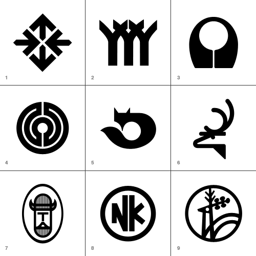
These are perhaps borderline for me, but there was just enough reason for me to keep them.
Beverly Hills Bancorp Very simple and attractive - it’s quite sweet.
Amigen Presumably a pharmaceutical logo - it certainly looks like one. I like it though.
Montgomery Ross and Partners This was fun to draw, but as a logo it’s incredible aggressive. All those phallic arrows…
Franco Ranchetti Now, a lot of the logos are simple geometric shapes with a chunk taken out, and they’re as a whole not very good. I think this is one of the few exceptions - the negative space does form a nice R.
Ramon Reig Cabanas This would be quite unremarkable if the strip hadn’t been removed from the R. It’s curious.
Health and Comfort Supplies Limited Very much of the time. Probably the only one of the op-art logos that I actually like.
Gregson Manufacturing Company This is just weird. Combining OCR and traditional forms like that. Maybe they were going for the old "fusion of old and new" schtick.
Pinewood Plantation Simple, not entirely satisfying, but I kept it as reference.
Orchard Decor Canada Limited Simple and straighforward… a bit borderline for me.


