Syriac

I was catching up on some reading recently and found this post on Pascal Zoghbi’s site, 29 letters, on the first printing press in the Middle East. There’s an interesting bit of history around its very existence in the Middle East at all. It was imported from England in 1585 to Saint Anthony’s Monastery in Qozhaya (a valley in modern day Lebanon) which was at the time part of the Ottoman Empire. Throughout the Empire, printing presses (and printed books) had been effectively banned following an edict by Bayezid Ⅱ in 1483. I’ve been reading up on the reasoning for the ban, and it seems that the public reason was that of piety; Arabic was the language of the Qu’ran and therefore was deemed a sacred language, so it was only allowed to be written by hand. The idea of the ‘Word of God’ being squeezed onto paper by a machine was supposedly anathema. There are of course other possible (and to my mind, rather more likely) reasons, in that the industry of copying out books and manuscripts was particularly lucrative and those who did it effectively used their considerable lobbying power to protect their interests. There’s no direct evidence for that, but, well, plus ça change and all that.

Some alternate glyphs from Serdo Mardin, and some photo details from 29 letters.

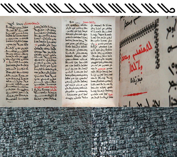
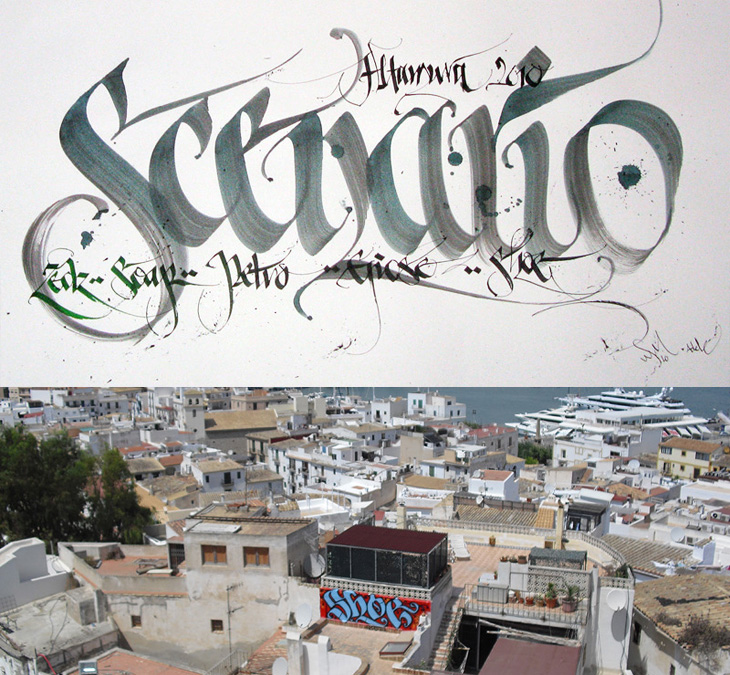
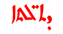
Anyway, regardless of the reason, the Monastery must have had a dispensation to be allowed to use a press at all, and I imagine as part of the deal they would have had to promise not to print Arabic, and here is where they stuck to the letter (literally) of the law, but not the spirit. Instead of the Arabic script, they used the Syriac. Syriac is a dialect of Aramaic, and was once dominant across the Middle East. By the time that printing press was delivered to the Monastery, it was in serious decline and replaced for most practical purposes by Arabic, except in the Christian liturgy (I freely admit that it was more complicated than that, but, moving on…). So the canny monks printed books in the Arabic language, but using the Syriac script. Sneaky. And here we get to the whole reason for this post, which is a wholehearted, will you look at that beautiful script! It’s really quite lovely. As before with a script I’m not familiar with, I’m not going to start trying to write stuff using a font that supports it, but I’ve taken some of the alternate glyphs from the font Serto Mardin that show the diagonal strokes the best. Beautiful stuff. I also traced a bit from one of the photos, which is up at the top of this post.

Shoe

I was convinced I’d written about Shoe before, but it turns out I haven’t. Shoe, or Niels Shoe Meulman, is the master of calligraphic graffiti, creating the label for the artform of calligraffiti - also the name of his site. I must have seen examples of his work in books and photos hundreds of times, yet sadly not in real life. I don’t think I have anyway. I’d have hoped I’d have noticed. So yes, go and look at his site, there are more pictures of his work, a rather impressive bio, and a nice story on the nature of creative work too.

Palindrome

This new sign for the V&A is wonderful. The museum commissioned Troika to make a sign for the tunnel connecting the museum and South Kensington tube station, and it’s bloody gorgeous. It’s a kinetic sculpture, rotating parts of the museum’s logo (in itself a wonderful thing, by Alan Fletcher in 1989) so that it reads at first from one side, and then from the other. I did wonder at first whether the V and A on Fletcher’s original logo were actually rotationally symmetric, and no, of course they aren’t, but for a sculpture like this the alteration to make them work like that isn’t at all noticeable. Go and watch the video (or of course, visit the museum) to see it in action. It’s so simple and yet so clever, whoever came up with the idea must have been quite pleased with themselves, and justifiably so.

Pictures from Troika’s site.

Not symmetric, but close enough for kinetic sculptural fun.

While Stocks Last

Me Design Magazine highlighted this fascinating project, While Stocks Last by designer Leandro Lattes; a massive collection of photos of Madrid, across two books, documenting the incidental details of the city; shop signs, intercom buzzers, bars, cafés and the like. I’m normally pretty wary of ‘found type’ collections as they tend to lack any kind of context, analysis or insight — or indeed any sense that they are curated, but what makes this different is the restriction to the one city, and the intent to document things that are likely to disappear without record. There’s very much the power of the collection going on with projects like this; individually the objects and scenes may have some interest, but all together like this they draw you in — the similarities and differences become compelling and before you know it you’ve lost an hour or two. Go and take a look.

Kalakari

Beth Shirrell has produced this attractive all-caps ornamental alphabet, inspired by Indian (and specifically Hindi) decorative culture. It’s nicely produced and has some fascinating little details, but I wish there were some higher resolution examples to look at. Putting up low resolution images for something as detailed as this feels frustrating, though I understand why it’s done. Anyway, a few characters below — see the rest on her site.

Recording the World Cup

I wasn’t expecting to have anything to write about that was football-related, even during such a big event as the World Cup, but wonders never cease. When Benjamin Prescott mailed me about a personal project to create and sell limited edition World Cup wall charts he’d designed I had a big of trouble thinking what it was for — I’m so out of touch with such things. I mean, yes, I’ve a theoretical knowledge of the offside rule (something that’s talked about as if it’s one of the Great Mysteries of the Ancients) and yes, I played it at school, but the whole yelling-at-the-tv, wearing team colours and flying the flag kind of thing always passed me by. Still, I know enough people who like it all (so I can ask), and as it turned out I was just re-reading the email when I noticed I was sat right next to one of the wall charts, and a lovely thing it is too! What really interested me in it was the recreation of the typeface from Subbuteo scoreboard references — I like lettering and illustrations made from dots anyway so this was a nice find, and it works well with the Avenir used on the rest of the chart too. The wallcharts are limited edition, so I hope I’m not too late in writing about them and you can still get one if you want one.

An original Subbuteo reference and a sample of Prescott’s redrawing.

Details of the actual wall chart. More here.

Virtual Water

I remember seeing, and liking, the first edition of the Virtual Water poster, and I see now there’s not only a new version but an iPhone app, which has even more information in it. I particularly like the visual style of the project — the simple black silhouettes and the blue accent colour work beautifully (a combo you may notice I rather like already), and the bold, slab-serif typeface (see below) just looks perfect. The little info cards behind each item are nicely laid out too, reminding me of classic recipe cards (or cocktail bar cards), and the short sharp explanations and consistent use of units back up the infographics nicely.

Some screens from the app. I like the indicator of the ‘usual’ amounts on the slider.
The background info cards.

I’m guessing the face is TheSerif Classic by Luc de Groot), though for unknown reasons I’ve never used it, it looks so incredibly familiar that I was convinced I must have. But, I hadn’t. How very odd! I may have to remedy the situation soon.

Your Name in Lignin

These wooden name puzzles by John Christenson are great. Grain Edit posted about them recently and I kept the link — one part of me really wants one of my own name, but the sensible part of me warns that I’ve got more than enough stuff and I’m supposed to be minimising clutter, but still, they are very nice. Seeing the photo of a number of them together makes me wonder whether a poem or short piece of prose would be a good subject, then it’d go on the wall and it’d be art and it wouldn’t be clutter at all, oh no. Rationalisations, rationalisations…

Kineda

I was reading the latest post on The Art of Hand Lettering earlier and found the stages in the process fascinating, in that I preferred some of the sketches to the end result. I do really like the final logo, but there was something about one of the on-screen workings of the logo that I thought really brought the word alive — it’s the one in the detail I cropped from the article at the bottom right below. There’s something really playful about it, like the rest of the word is being bounced along by the K. Still, that’s my impression and it most likely wasn’t the client’s intention — and that’s the difference between doing stuff for yourself and doing stuff for paying clients!