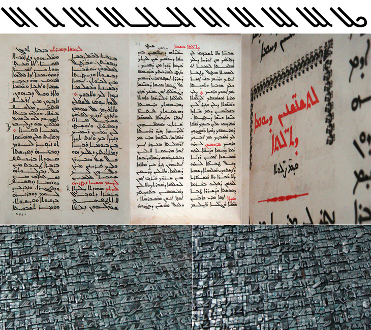
I was catching up on some reading recently and found this post on Pascal Zoghbi’s site, 29 letters, on the first printing press in the Middle East. There’s an interesting bit of history around its very existence in the Middle East at all. It was imported from England in 1585 to Saint Anthony’s Monastery in Qozhaya (a valley in modern day Lebanon) which was at the time part of the Ottoman Empire. Throughout the Empire, printing presses (and printed books) had been effectively banned following an edict by Bayezid Ⅱ in 1483. I’ve been reading up on the reasoning for the ban, and it seems that the public reason was that of piety; Arabic was the language of the Qu’ran and therefore was deemed a sacred language, so it was only allowed to be written by hand. The idea of the ‘Word of God’ being squeezed onto paper by a machine was supposedly anathema. There are of course other possible (and to my mind, rather more likely) reasons, in that the industry of copying out books and manuscripts was particularly lucrative and those who did it effectively used their considerable lobbying power to protect their interests. There’s no direct evidence for that, but, well, plus ça change and all that.

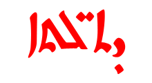
Anyway, regardless of the reason, the Monastery must have had a dispensation to be allowed to use a press at all, and I imagine as part of the deal they would have had to promise not to print Arabic, and here is where they stuck to the letter (literally) of the law, but not the spirit. Instead of the Arabic script, they used the Syriac. Syriac is a dialect of Aramaic, and was once dominant across the Middle East. By the time that printing press was delivered to the Monastery, it was in serious decline and replaced for most practical purposes by Arabic, except in the Christian liturgy (I freely admit that it was more complicated than that, but, moving on…). So the canny monks printed books in the Arabic language, but using the Syriac script. Sneaky. And here we get to the whole reason for this post, which is a wholehearted, will you look at that beautiful script! It’s really quite lovely. As before with a script I’m not familiar with, I’m not going to start trying to write stuff using a font that supports it, but I’ve taken some of the alternate glyphs from the font Serto Mardin that show the diagonal strokes the best. Beautiful stuff. I also traced a bit from one of the photos, which is up at the top of this post.
