A fun little collection of creatures drawn with a calligraphy pen by Andrew Fox. Simple, fun and attractive. It reminded me of this aspect of Islamic art, featured by BibliOdyssey a few years ago: Zoomorphic Calligraphy.
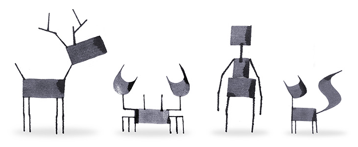
A fun little collection of creatures drawn with a calligraphy pen by Andrew Fox. Simple, fun and attractive. It reminded me of this aspect of Islamic art, featured by BibliOdyssey a few years ago: Zoomorphic Calligraphy.
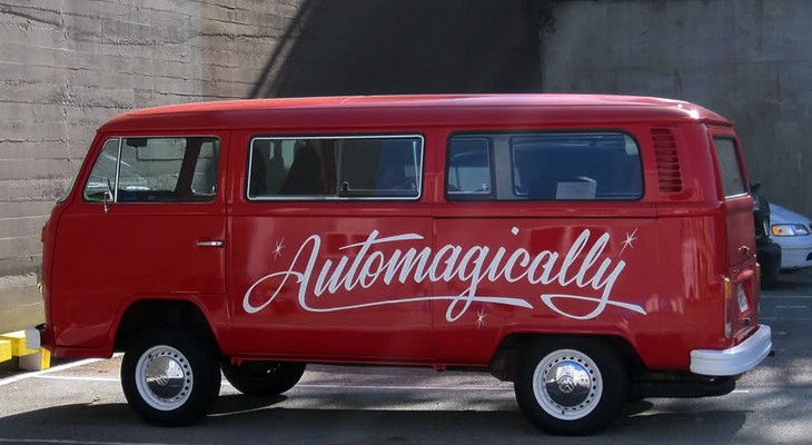
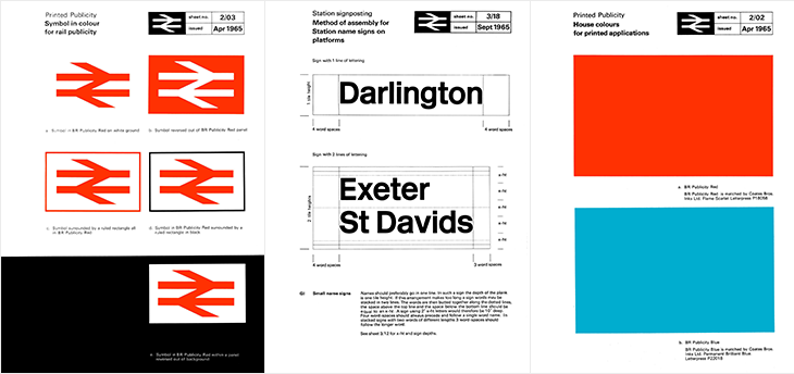
Here’s a glorious bit of design nostalgia for the New Year. It’s hardly a new find on the web; designer Nick Job first started this archive of the British Rail identity manuals in 2011, but I’ve just been reminded of it. Somehow I’ve never written about it either, which is a bit of an oversight given the entirely-unofficial and tongue in cheek name of this site: the British Rail alphabet and signage guidelines were also used by the British Airports Authority and National Health Service, making them as much a government standard as Britain ever usually manages.
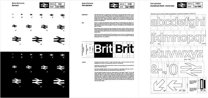
The alphabet had two variants, one for dark-on-light type and one for light-on-dark. Light (and illuminated) type on dark backgrounds creates an optical effect known as ‘halation’ - i.e. it develops a halo, a slight sense of the letterforms being thicker than they are. To cope with this, the letterforms are reduced by the width of an outline for the lighter type, shown in the last panel above — while retaining the same spacing and other details of the type. It’s worth pointing out that a revival of the typeface is now available to license and as a web font from FontDeck.
For the non-British (or the very young) British Rail was the nationalised entity that ran the vast majority of railways (and a few ferry routes and other transport-related things) in the UK, beginning in 1948¹. It was rarely out of the news (more so on slow news days) for ‘record losses’, ‘strikes’, ‘failures’, ‘delays’ and so on. Starting in 1994 the network was dismantled and sold off, with the last few bits sold in 1997. Instead of a nationally-owned monopoly, we have regional monopolies owned by a variety of companies and (perhaps amusingly), the nationalised rail corporations of other countries. The headlines are now about ‘record price rises’, ‘record profits’ (also: greedy executives and shareholders), ‘overcrowding’, and yes, ‘delays’. According to the polls², privatisation is generally considered to have been a Very Bad Idea and Can It Go Back To How It Was, Please. Whatever your view or politics on the matter are, running an at-capacity rail network will never make you popular with the people who have to use it. I’m being charitable there.
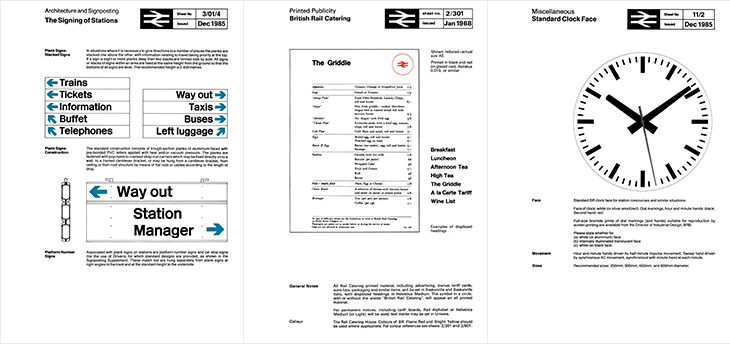
Despite each of the rail operating companies having their own brands, for most British people the British Rail identity is still a familiar part of the landscape, with the logo being the road sign symbol for any rail station, and much of the signage (especially at smaller stations) unchanged from pre-privatisation days. But what an identity! The whole thing is such a brilliantly consistent and well-designed system, owing much of its strength to its crisp, stark simplicity, to its minimalism and almost-total reliance on typography alone. There’s so little to it that there’s very little (virtually nothing) that can ever really look out of date or old fashioned — sure in the 80s everyone³ had a thing for Rotis (for heaven’s sake) and there was that grunge stuff in the 90s and we’ve had the web and all that⁴, but nothing that was really so outstandingly superior or more modern. What made the identity look bad was the usual thing that ruins most good things: neglect and apathy. A faded peeling sign in a shabby, half-ruined station with leaky roofs and deathtrap toilets is never going to look great, and by the time privatisation came along that was the caricature we were being presented with, and so out it went.
And that’s a real shame, for so many reasons.
I use the title guardedly, as these words featured and illustrated by Ella Frances Sanders at Maptia are all perfectly translatable, but as phrases rather than as neat single words. There’s probably a neat word in a language somewhere that we could use to describe concepts-as-single-words that can’t be translated into single words in other languages. We could of course make one up, say, we could call them uniglottal, i.e. existing as a word in only one language. Words like this get borrowed pretty quickly if they’re useful enough, for example, Schadenfreude — and while words get borrowed all the time, here they’re a special kind of loan word, describing an idea rather than a thing.
One of the words in the list, the lovely Japanese word komorebi reminded me of a word that’s been sufficiently borrowed long enough not to be included in lists like this anymore: bokeh, which is well-known in photography, and like a lot of loan words doesn’t venture much outside a particular profession or technical niche. Then you get to thinking of it and notice more and more, and it reminds me of a French colleague half-jokingly saying, “You can tell if an English word is one of the ones we brought over*: it has more than one syllable”. Controversial.
If you’re interested in the idea of words like this, Better Than English posts a new one fairly frequently.
A couple of years ago I wrote about Kuka, the RobotLab project built to write the entire Martin Luther bible onto a long roll of paper. The robot emulates the calligraphic style replicated in the Schwabacher blackletter typeface, writing it using a pen as a (particularly neat and tireless) human might. It’s quite a lovely thing*.
I was reminded of it when I saw this project by Walter Nicolino and Carlo Ratti (of Carlo Ratti Associati). They’ve designed and built a suspended plotter to write the contents of the Open Architecture Manifesto page on Wikipedia onto a wall at the Adhocracy exhibition at the Istanbul Design Biennial. As the text on Wikipedia is updated the robot erases and rewrites the document on the wall at the exhibition.
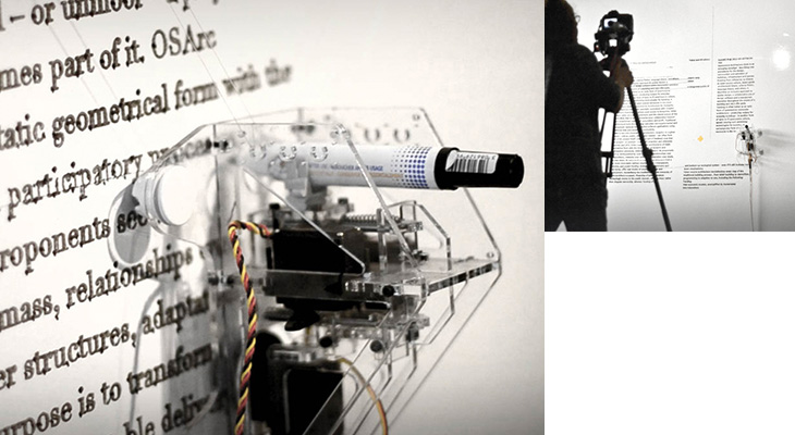
The comparison between the two projects is perhaps obvious, that one is reproducing a historical, unchanging document, while the other reproduces a brand new, constantly-updating and ephemeral one. Indeed until the manifesto was published in Domus magazine (whose editor Joseph Grima is curator of the biennial) the article kept being deleted by Wikipedia editors.
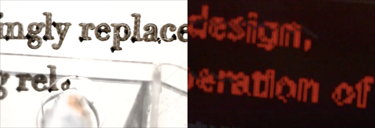
I’m especially interested how the plotter is reproducing the text. The typeface could be Times, but the generous amount of ink the fat nib of the plotter pen puts down, and the way it outlines the characters, makes it hard to tell exactly. Also, looking at the video the output is a serif face but part of the processing (in Processing) looks like it uses something more like Verdana or Tahoma. Could be that different parts of the text are in different faces of course. Curious.
Looking for various calligraphic-related things on image search, on Graffuturism I find the work of Greg Papagrigoriou, a graffiti artist from Athens—or, to use the term, a calligraffiti artist from Athens. He creates densely textured pieces, often collaborating with Simek whose work often acts as a centrepiece or focus. The two artists’ work complements each other perfectly and create striking images that remind me of protest posters or propaganda, but while on these the words flow and possess graphical rhythm, they defy any attempt to be read.
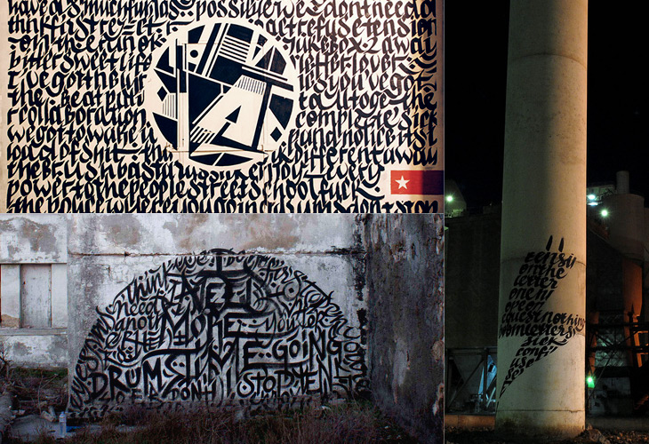
All images via Graffuturism, and presumably before that, Greg Papagrigoriou’s Flickr.
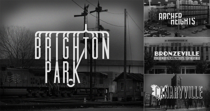
Kelly from Design Crush linked to this last week, a project by designer and Chicagoan Steve Shanabruch to create a logo for each of the Chicago neighbourhoods. Some, he says, are based on personal experience, and others on research. He’s created a lovely set of graphics so far, all of them remind me of old movie title cards (or end cards, like these), some look like they could actually be names of movies set in the neighbourhood.
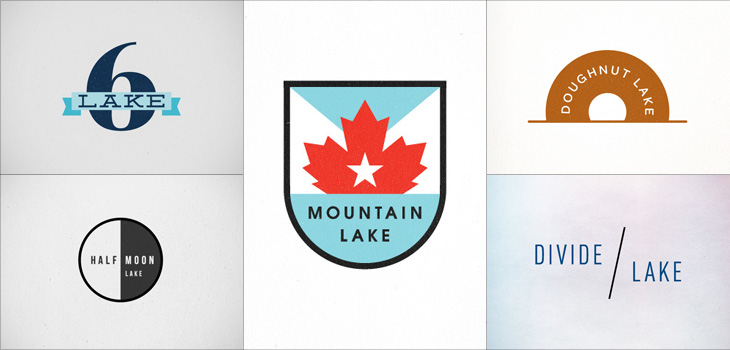
There’s something particularly compelling about design projects like these, they trigger a sort of completist tendency in me, an appreciation of the collection as object. I like sets of things, and interpretations (and reinterpretations) of things particularly so. Thinking of this, I was reminded of the Branding 10,000 Lakes project by Nicole Meyer, to design an identity for each of the lakes in Minnesota (which is indeed known as The Land of 10,000 Lakes). There are some lovely ones in the collection. Some recent ones here:
Jason Kottke linked to this incredible photoset by Timothy Allen of the Buzludzha Monument in Bulgaria. It was opened in 1981 to celebrate the beginnings of organised socialism in the country 90 years earlier, and it is everything you’d expect from a thumping great monument to communism. From some angles it looks like a World War Ⅱ defence post, from above it resembles part of an Olympic venue, complete with oversized torch for the ceremonial flame, and to many people it’s as if a flying saucer landed on the hillside. A concrete flying saucer. To anyone who’s ever seen a Bond movie, well, that’s clearly a SPECTRE hangout, right there. Taking a closer look, the outside is decorated with a glorious relief of socialist slogans set in gigantic concrete Cyrillic lettering, a lot of which seems to be missing now.
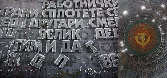
Pictures from the Timothy Allen article, © him.
Inside there were mosaics celebrating the usual themes and noteworthy characters of international socialism, and in the ceiling above the debating chamber, a geometric hammer and sickle, surrounded with the call for the proletariat of the world to unite. Again, a lot of the interior has been stripped out by trophy hunters, vandals, or simply ruined by the weather. Needless to say, the monument isn’t being maintained by the Bulgarian government, and in 2011 they ‘gifted’ the entire structure to the Bulgarian Socialist Party, who hope to restore it someday.
In researching this article, I found a couple of other articles and photo collections on the monument, one by Arch Daily, and the other here on Kuriositas.
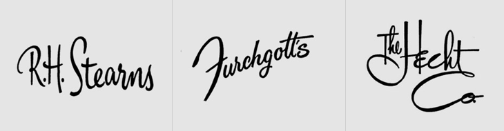
This is something I’ve had open in a browser tab for months, and I’m sure it’s officially ‘old’ in internet parlance, but I’m still drawing inspiration from the images. Christian Annyas has isolated (and traced?) these old department store logos and made quite a collection of them. He makes the point that very few stores today use similar lettered styles to these, and that they go for a logo style that “won’t offend” — I wonder though, if all these logos were created with a similar sentiment in mind? After all, brands in a sector do tend to cluster, so as fashions change, they all change together.
Somewhat late to the party mentioning this, but a couple of weeks ago I was at Ampersand Conference here in Brighton. It’s the first conference specifically on web typography, and so naturally a lot of the talks were quite technical, covering the techniques and problems in getting fonts to display at all in the first instance, and ultimately to display well. My friend Yves Peters has written a brilliant and comprehensive review of the day so I’d recommend you read that if you weren’t there.
I think for sheer wow-factor, Hoefler’s talk announcing that the entire H&FJ font library has been made ready for delivery as web fonts really outshone the rest. Well it did for me. The sheer scale of the work is astounding — 90 million hints for a start. I’m glad I was able to buy one of the hinters a beer afterwards.
Something I noticed about the whole ‘web fonts’ thing is that because it’s pretty new, a lot of the discussions around it are very technical. I’m looking forward to the ‘bedding in’ stage where artistry and craft come to the fore and we can start focussing on the what rather than the how. There are already some sites with beautiful typography out there, but this is only the start. I’m really looking forward to seeing what people will make and people focussing less on rendering issues.
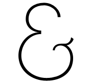
Of course, for full disclosure (and mild bragging rights) I should point out my involvement with the conference: I did the logo. That ampersand. I did that. Me.
Another thing I marked as “to look at later”, merely because of the big beautiful lettering. I was wondering what on earth it was all about and only managed to find a few pictures of it from this year’s Macworld and a reference to an iTunes plugin, which may or may not be this (the site doesn’t feature anything with this lettering on it, sadly). Whatever it’s for, it’s lovely. If you know more, let me know. I found it here.
Update: Thanks everyone. Seems Tune Up Media actually blogged about it here.