Somewhat late to the party mentioning this, but a couple of weeks ago I was at Ampersand Conference here in Brighton. It’s the first conference specifically on web typography, and so naturally a lot of the talks were quite technical, covering the techniques and problems in getting fonts to display at all in the first instance, and ultimately to display well. My friend Yves Peters has written a brilliant and comprehensive review of the day so I’d recommend you read that if you weren’t there.
I think for sheer wow-factor, Hoefler’s talk announcing that the entire H&FJ font library has been made ready for delivery as web fonts really outshone the rest. Well it did for me. The sheer scale of the work is astounding — 90 million hints for a start. I’m glad I was able to buy one of the hinters a beer afterwards.
Something I noticed about the whole ‘web fonts’ thing is that because it’s pretty new, a lot of the discussions around it are very technical. I’m looking forward to the ‘bedding in’ stage where artistry and craft come to the fore and we can start focussing on the what rather than the how. There are already some sites with beautiful typography out there, but this is only the start. I’m really looking forward to seeing what people will make and people focussing less on rendering issues.
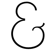
Of course, for full disclosure (and mild bragging rights) I should point out my involvement with the conference: I did the logo. That ampersand. I did that. Me.