I was hunting for a link I’d omitted from a previous post and came across an old bookmark for these infographics (found originally via Chris Glass). I especially like the red tape one, and the map part of the tobacco one is great.
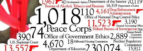
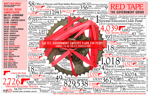
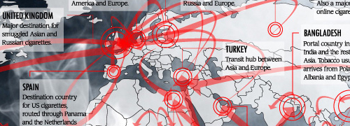
I was hunting for a link I’d omitted from a previous post and came across an old bookmark for these infographics (found originally via Chris Glass). I especially like the red tape one, and the map part of the tobacco one is great.
There’s a nice article on Cocoia Blog about the ‘pollution’ of various Mac OS X user interfaces by Helvetica. It’s worth a read, though I can’t resist excerpting this little bit, as it made me laugh:
Speaking of iCal, which proudly boasts Helvetica in miniature point sizes on the screen, it has the utterly mind boggling feature that it shows you calendar information on a computer screen with everyone’s favorite 1950 typeface for print, and prints these exact calendars on paper in Lucida Grande, a computer display font from this milennium. “Utterly backwards” might be an apt term for such misfit typography.
There are some interesting-looking infographics here on NOTCOT, apparently providing some sort of analysis of various literary works. I’ve had a look through them, and while they’re certainly attractive, they don’t seem to provide any insight at all. The one immediately below, for example, might suggest how shorter sentences bunch up together in the narrative flow, but there’s no guarantee that several groups of small sentences, separated by (say) many long sentences, a short sentence and more long sentences might overlap, giving an illusion of a single bunch of terse, active prose. The rotation of the line by 90 degrees with each sentence is an arbitrary insertion in the ‘analysis’, and in itself provides no valuable meaning - it doesn’t even serve as a neutral carrier for information, rather it distracts the reader and confuses the data.
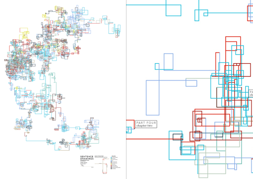
Some of the other illustrations provide a little more promise, but with having to refer to an (again) arbitrary key, any insight a graphical representation could provide is quickly lost. But, they’re beautiful. It’s as if the designer flipped through Tufte’s books without reading anything in them, and decided to create something that ‘looks like that’. OK, I’m being harsh; I’m sure that after a fair bit of reading and working out how the diagrams were made, there’s some vague possibility of gleaning some tiny hint of insight into the literary style of various authors, but you have to get past the fact that they seem to be primarily designed to be pretty* rather than useful. You can see more of the works on the designer’s site, apparently called “Untitled Document” (at the time of writing), here.

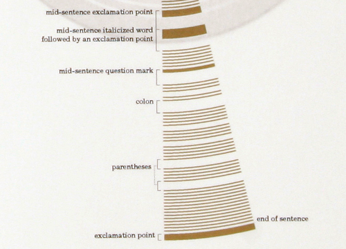
As for the ones attempting to depict sentence structure, they certainly leave a massive amount to be desired - in order to work out the difference between a colon and a parenthesis you’d have to get out your micrometer and be prepared to annotate like crazy. Or you could just read the original text. After all, there’s this amazing set of symbols and conventions that have been used for years to convey meaning and sentence structure. It’s called written language. Heard of it?
* And to appeal to people with more money than design sense, looking at the prices.
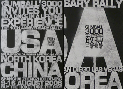
An old one I’ve had around for a while, this poster (or invite?) for this year’s Gumball 3000.
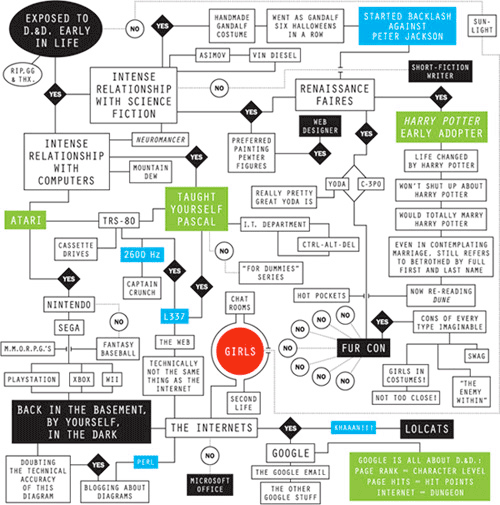
I love nonsense flowcharts. The one on this New York Times article by Sam Potts is nicely done, properly complicated in appearance and with some amusing possible answers (Fur Con being one). I answer “no” to the very first question (top left), but here I am, blogging about diagrams. OK, I’m not in the dark, I’m not in a basement, but since you can form intense relationships with science fiction and computers without knowing what D&D is, I am at least doubting the technical accuracy of the diagram.
I’m tempted to do one for typographers. First question bubble: “Exposed to Letraset early in life”
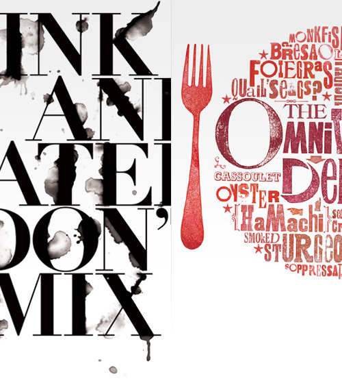
Browsing Drawn! the other day, I followed a link to Craig Ward’s site, showing some of his fantastic typographic illustrations. I’ve posted a couple of crops of two of my favourite images (so you can see the all-important detail) - visit his site for the full images. Beware the we-don’t-need-no-scrollbars site design. Leave your mouse over the word ‘DOWN’ and you’ll be able to see some more of his work… eventually. Are scrollbars so bad? Still, the site does look lovely.
I always liked the display screens in 2001: A Space Odyssey, and I was reminded of them the other day by something. I went online to have a look round for a picture of some of them, and, well, there’s really not very much. Even the IMDB pages have very low resolution blurry shots that barely show the HAL console, never mind the details of what the info screens are showing. I’ve got the DVD, so a bit of stepping through frames later I can at least recreate the basic appearance of them. The small text is unreadable for the most part, but I could make a guess (that’s part of the fun). I created a desktop (iPhone/mobile) out of them too.

The big question of these things, though, is, “What are they showing?” Given that so much of the rest of the film is pretty carefully thought out, it seems a bit odd that these screens should end up as a slightly more sophisticated version of Star Trek’s blinking lights. There are some graphs, some video feeds, and a few lines of numbers, but these three-letter codes are the most eye-catching. If they’re supposed to be some representation of HAL, what are all the buttons on the console for? Actually, I do wonder why the buttons are there - since everything is done by voice, and when HAL goes wrong, there’s no frantic hitting of buttons or any hint that these consoles do anything at all.
Still, it is all rather pretty!
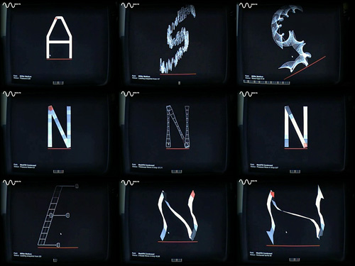
I just found a link to this odd thing on NOTCOT. It’s essentially a synthesiser control panel for changing the forms of glyphs in a typeface, but instead of just changing sound, it treats the strokes as a kind of ‘play-head’ for creating sound, rather like a groove in a vinyl record. As you change the glyph, you change the sound, and vice versa. Also, what you do to one glyph will be done to all the others.
Now, my first impressions after looking at the results are to say that this is an evil device born of the unspeakable nether regions of mythological demons - I mean, to do this to type? They’ll be kicking puppies next! However, I’ve since watched the video and I think there may be some interesting things in there, say, altering the stress on type, adding some interesting brush strokes and the like, but that what you get would be a starting point for any kind of type project. I wouldn’t ever use any of the results as they are. Besides, the noises the thing makes are stunningly annoying. It’s no wonder most of the results are so hideously ugly, you’d end up with a seriously bad headache and a foul temper after a few minutes of using it.
There is one good thing about it though: the display interface. It reminds me of graphics from Star Wars, or the info-screens in 2001: A Space Odyssey. Any moment you expect a Ti-Fighter to come in and start blasting vertices from the bastardised remains of the glyphs:
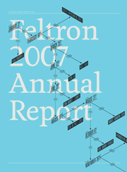
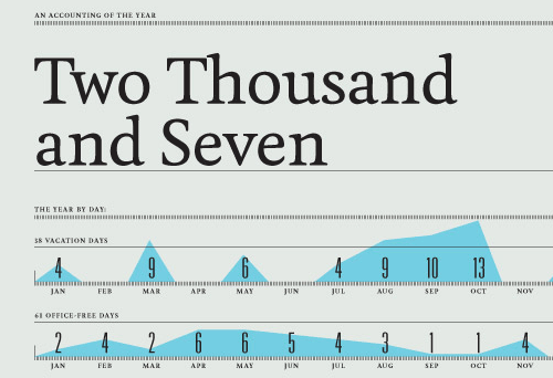
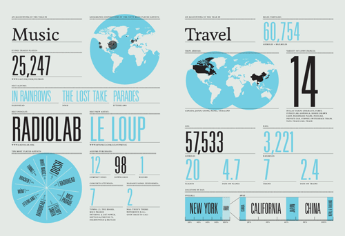
If you fancy ogling some beautifully presented numbers, graphs and maps, Nicholas Felton has published his annual report for 2007 and it’s quite the visual treat. I’m boggling a bit at the idea of keeping track of so much data over such a long period - I remember seeing his 2006 and 2005 reports and being impressed then. I barely keep track of anything. Maybe I should start.
Oh, and check out the workspace on his about page, it’s worthy of Unclutterer’s Workspace of the Week.

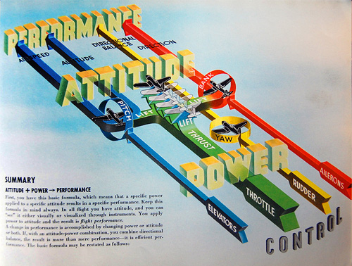
Over on Telstar Logistics there’s a great post on the book “Flight thru Instruments” which has some of the best information graphics I’ve ever seen. There is, as ever, a Flickr gallery of images from the book, which are a great source of inspiration, especially the seemingly simple ones like this and this. Go and take a look. There’s a nice bit of background on the production of the book:
It turns out, “Flight thru Instruments” is so beautiful because it was created by the General Motors “Graphic Engineering” Staff under the leadership of Harley Earl. And who was Harley Earl? Earl worked as a designer at General Motors from 1929 until 1959, where he rose to become the postwar chief of GM’s styling section. He drew styling inspiration from airplanes throughout his career, and Earl’s most famous design innovation was a little trick he cribbed from the swooping rear fins of the P-38 Lighting fighter flown during World War II.
The illustration below caught my eye especially. I’ve read definitions of pitch, bank and yaw in the past, and yes, they’re fairly straightforward concepts, but they never really seemed to stick in my mind. I always had to draw a little diagram to make it clear, and while the diagram below is much more complex (and I think it’s the least successful of the set for being hard to interpret) it contains a fantastic visual description of pitch, bank and yaw. I’ve redrawn them at right, a bit larger, mainly because I like redrawing things and I wanted to make a wallpaper of it (which you can get here: widescreen, square/4:3, and even iPhone). Yes, I know the text is a bit wonky, but I was trying to match the original, honest.
And, because I like the cover too:
