
Over on Telstar Logistics there’s a great post on the book “Flight thru Instruments” which has some of the best information graphics I’ve ever seen. There is, as ever, a Flickr gallery of images from the book, which are a great source of inspiration, especially the seemingly simple ones like this and this. Go and take a look. There’s a nice bit of background on the production of the book:
It turns out, “Flight thru Instruments” is so beautiful because it was created by the General Motors “Graphic Engineering” Staff under the leadership of Harley Earl. And who was Harley Earl? Earl worked as a designer at General Motors from 1929 until 1959, where he rose to become the postwar chief of GM’s styling section. He drew styling inspiration from airplanes throughout his career, and Earl’s most famous design innovation was a little trick he cribbed from the swooping rear fins of the P-38 Lighting fighter flown during World War II.
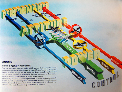
The illustration below caught my eye especially. I’ve read definitions of pitch, bank and yaw in the past, and yes, they’re fairly straightforward concepts, but they never really seemed to stick in my mind. I always had to draw a little diagram to make it clear, and while the diagram below is much more complex (and I think it’s the least successful of the set for being hard to interpret) it contains a fantastic visual description of pitch, bank and yaw. I’ve redrawn them at right, a bit larger, mainly because I like redrawing things and I wanted to make a wallpaper of it (which you can get here: widescreen, square/4:3, and even iPhone). Yes, I know the text is a bit wonky, but I was trying to match the original, honest.
And, because I like the cover too: