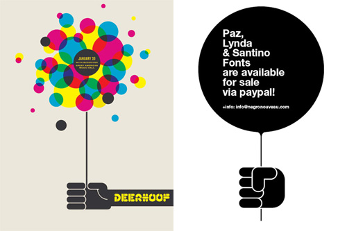
Fazai38 posted a couple of articles showing some examples of inspirational posters. I’ve a few favourites but at the same time (and coincidentally) Computerlove posted about Negro Nouveau’s new typefaces with a graphic that was happily similar to the Deerhoof poster. I rather enjoy the similarity of the basic motif, and the different effect each of the two implementations give.
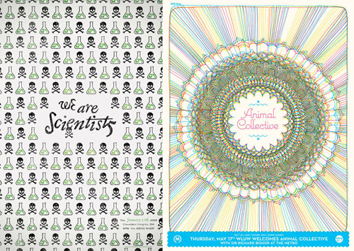
I like the little bubbling flask motif on the “We Are Scientists” one, and of course I’m going to like the one that resembles guilloches.
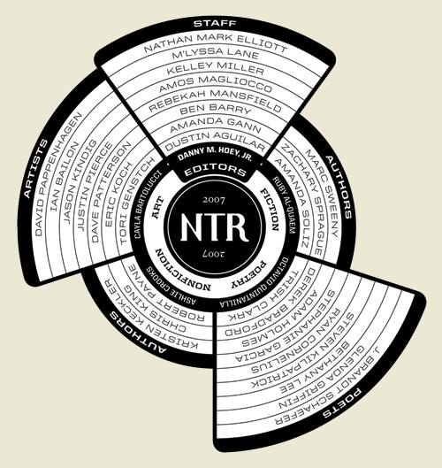
This is a great bit of information design, by Ben Barry. Typical lists of participants in an event or project tend to be dull affairs that don’t really grab the attention and most likely just get ignored; the names of the participants might as well be replaced with Lorem Ipsum for the amount anyone reads them. Something like this, however, is visually appealing and encourages you to have a look, to see what it’s all about. It’s not hard to work out, but part of the appeal here is that there is something to work out - that Octavio Quintanilla (what a great name) is the editor for the poetry, and that Chris King is a non-fiction author. It’s very nicely done, and I’m saving it for future inspiration. Read more about the project here.
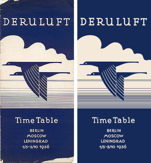
I love this timetable cover for Deruluft - the double bird motif is really quite lovely. The use of the motif in their brand imagery apparently starts out strong (good) and then falls out of favour entirely between 1933 and 1935 (strange) - even in the 1932 brochure it’s reduced to a small image on the flag, then finally being nicely refined and promoted to the central image on the 1936 timetable.
The type is interesting as a monoline form too - the serifs are enormous, and the one on the ‘a’ is just strange, especially given how close it comes to the ‘T’. I really like the numbers though - the balance between the 9 and the 6 in the year is particularly pleasing.
The airline was a joint venture between Germany and the Soviet Union, which didn’t survive the changing political situation between the two countries:
Deruluft’s route network remained fairly intact until the airline discontinued operations in March 1937. By then, relations between Nazi Germany and the Soviet Union had deteriorated to a point where a joint venture was politically impossible. Deutsche Lufthansa took over the route through the Baltic countries, but a service to Moscow was reopened only after the unexpected German-Soviet nonaggression pact of August 1939 had temporarily brought the two countries closer to each other.timetableimages.com
Of course, I had to trace the cover. Mind, much of the appeal of the original is down to the artifacts produced from the printing process, which I didn’t replicate here. I gather there are now filters for Photoshop to create them though.
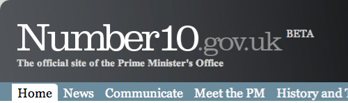
Steve sent me a link to the all-new official site for the Prime Minister of the UK, which, incredibly, is in beta. Get that: The official online presence for the leader of (allegedly) the fifth richest country in the world is a crummy beta site with dodgy kerning, inconsistent use of typefaces, colours, rounded corners, spacing, and, well everything apart from general crumminess. Look at the masthead. It’s in Clarendon, Times New Roman Bold and Georgia. The typographic soup continues with the addition of Arial for body text (and oddly, some headlines too), and on a graphic, Copperplate. There are boxes with rounded corners at the top but not the bottom, containing images that also have rounded corners but where the curvature doesn’t match the container (and appears to be damaged by JPEG artifacting on most images). The site is a mess.
The masthead at the time of writing.
The idea of adding features to the site such as YouTube, Twitter and Flickr feeds is a good one, and yes, these things can be a bit messy to integrate at first, but it’s not hard to get those things up and running in any design. The hard bits, especially for a site as prominent as this, is to ensure security, that the background infrastructure can handle the traffic and (importantly) all your content is written and entered into the site. Is this a site that got designed and implemented by several groups who never communicated? It looks like there may have been a design done at pitch stage, but largely ignored throughout development. A good, consistent design is vital for any site, and sticking to it is a must throughout all stages of development.
Still. All these things can be fixed. The design can be clarified, the layout can be rationalised, attention can be paid to consistency and quality, the HTML and CSS can be cleaned up, but it beggars the question, why did they launch an unfinished site and call it a beta? This is not what betas are about. This is arguably one of the most important sites representing the UK and should be implemented to the highest of standards, and yet they launched a crap blog and tried to cover their arses by calling it a beta. Very poor show indeed.
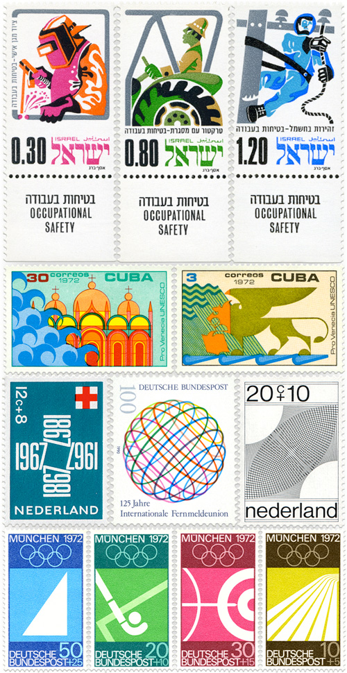
So yes, I rather like stamps. I’ve traced a couple of sets now, and then the other day I came across this incredible set of stamps, via Grain Edit. They’re incredible. Stamps are fascinating in the same way as banknotes, but while banknotes have to remain current for years and survive the harshest treatment, stamps are short-lived things, designed to be kept flat, used once, then thrown away. There are new designs, limited-edition runs, all the time.
Having said all that, I’m still going to trace some of these (because quite frankly I won’t be able to resist), so here are a few of my favourites.
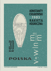
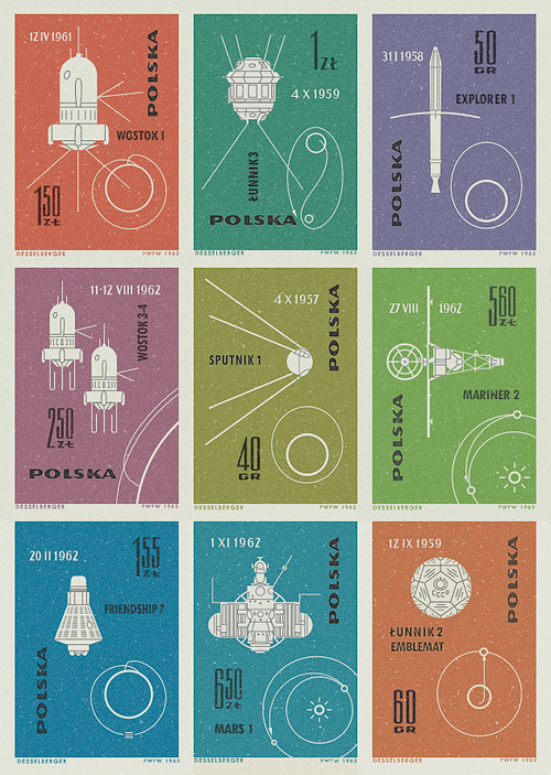
I saw pictures of these stamps on Ace Jet 170, and was absolutely fascinated by them. I love the illustrations of the orbits and paths taken by the space vehicles - the Łunnik 3 (Luna 3) one especially. As usual, I felt compelled to redraw them so as to understand them better, and they really are very well done - the orbits of Mars, Earth and Venus aren’t drawn perfectly circular, and the relative sizes of the planets are nicely visualised. The whole collection looks to have been a celebration of 60 years since the publication of Konstanty CioÅ‚kowski’s treatise on powered spaceflight “Изслѣдованiе мировыхъ пространствъ реактивными приборами” (The Exploration of Cosmic Space by Means of Reaction Devices), in 1903 - showing some of the results of the research his work started.
The first (or tenth?) stamp in the collection was devoted entirely to him, and the illustration is that of a design for a powered spacecraft from the cover of published versions of his paper - my redrawing of it is at right. The others show a variety of space missions, with the interesting date convention of having the month depicted with roman numerals. It’s not something I’d come across before, but it looks quite useful*. No longer would Americans and Europeans have any doubt over whether 01/03/08 is the 1st of March or the 3rd of January. Anyway, that’s another one of my must-do-something-with-this bookmarks cleared up, and it’s been quite a fun process in redrawing them. Here are the images I made based on the stamps. I’ve got them as vectors, so I’m thinking of getting them printed out A3 size.
Well, not quite, and I don’t think even I would go that far. However, as Swissmiss (from where I got this link) rightly points out, this is more of an Enhance Flickr, which is good, as Flickr certainly needs a serious redesign. From the site itself:
DestroyFlickr explores alternative methods for viewing and sharing Flickr content. Its user interface provides an environment that benefits photos rather than hindering them.
Go and take a look, and have a play round with it.
I just read this fascinating article on GT!Blog, presenting a theory of why Japan never made the iPod. The basic premise is due to the increased memory and processing requirements of representing Japanese text on screen adequately, Japanese manufacturers tended to develop appliances, rather than general purpose computers. So Japan (and by extension, east Asia in general) became leaders in electronic gadgetry such as games consoles, fax machines, watches, stereos and the like, with the trend reaching its (possible) apotheosis with the mobile phone - not one of which devices required a general purpose personal computer as the connecting hub. Each device did its thing, and was specialised for that - if anything became close to a general purpose device, it was the mobile phone itself, though it was, and is, quite limited in what it can do and what people want it to do.
Now, as the article points out, modern computers can handle Japanese (and Chinese, Korean, etc.) and the computer-as-hub idea is gaining popularity in east Asia, but it’s fascinating how the typographic requirements of a language have apparently altered the entire economy (and culture!) of not just a country or region, but the whole world.
Using the characters from the GT!Blog article, you can see how an 8×8 grid is inadequate for representing Kanji.
What happens if you produce a map of, say, the United States of America, only showing the streets? Will you be able to recognise non-man-made elements of the landscape, like mountains, or rivers? Well, it turns out yes, you can, as Ben Fry has done so. Interestingly, you can see how in the midwest there are counties that appear to have hardly any streets right in the middle of ones that are riddled with them - though this is apparently more due to how they identify a street than a lack of any thoroughfares. The difference between the east and the west of the continent is quite marked too - the west’s street patterns appear much more strongly influenced by the topography than the east, though given the scale and type of said topography, that’s hardly surprising. Here’s a scaled down image as a teaser, but definitely go and look at the originals.
OK. Rant time. I was sent this wonderful, wonderful link today. For many years now, I’ve been increasingly bothered by these little yellow flies buzzing around on my screen. They drive me to a level of distraction and rage that (in terms of interfaces) only Windows nag-bubbles can beat. Why developers think that these things are so helpful and vitally useful that they must pop up at almost every opportunity, and that the user must be given no obvious recourse to turn them off, I don’t know. They are the gnats of the typographic world - buzzing and darting in front of your eyes, imparting very little of use, and even then merely duplicating what the rest of the interface provides in a much more studied and calm manner.
The reasoning for them existing is often given (at least in the online world) as ‘accessibility’, assuming somehow that a user needing some kind of assistive technology would also be the kind of user always able to hold a mouse pointer steady over an arbitrary interface element for the requisite two seconds to see the damn thing. For the rest of us, just leaving the pointer somewhere ‘out of the way’ while typing, reading or (heaven forfend!) thinking, results in this pointless yellow box popping up. Perhaps ironically, it’s a situation made worse by using that finest of input tools, the wacom tablet, as removing the pen from the sensing region leaves the pointer static wherever it last was on screen; perfect prey for the predatory tooltip.
The actual accessibility modifications that lead to tooltips showing up everywhere are such things as adding title attributes to links and other elements, and the tooltip is merely an unpleasant symptom of this noble effort. That the browser shows a tooltip for these things is analogous to an overkeen child endlessly demonstrating how clever they’ve been: Look at me! Look at me! Look at me! In fact, the browser does not need to display tooltips for these things - they are there to provide additional information when the context of the item is removed, such as in an audio or text-only browser. If the interface relies on tooltips in, shall we say a conventional environment, then it’s a very poor interface indeed, or an experimental dotcom-boom-era ‘project’, which is I suppose the same thing.
I’ve done a fair bit of work designing interfaces, and I’m glad to say most of them are tooltip-free. I’d rather all of them were, but you can’t win every battle. My message to developers, marketers, designers, whatever, but more importantly OS developers, it’s quite simple: give us an option like this, please: