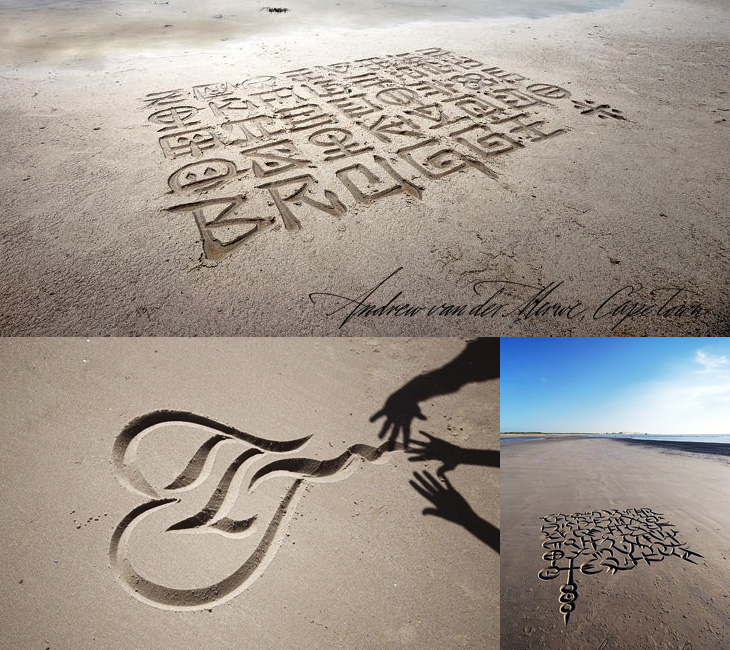
Browsing Behance the other day I came across the portfolio of Andrew van der Merwe, a calligrapher and letterer from Cape Town. These sand lettering pieces he’s done are really beautiful - the edges of the letters are so clean and the forms so precise, there’s definitely a technique going on here, which he confirms:
Scratching in the sand with a stick, however, has proved less than satisfactory because it makes more of a mess than a mark. This has led me, over the past seven years, to develop various instruments which mark the sand in less messy ways, and ultimately to a kind of scoop which leaves neat V-cut letters of the sort one gets in stone carving.Andrew van der Merwe
Lovely stuff. Go and have a look. There’s his Behance portfolio here, and a site which desperately needs some attention here.
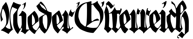
A while back Jo at Languste Fonts sent me a link to the collection of the Austrian Museum of Applied and Contemporary Arts. Their collections site is pretty huge, with sections for ornamental and woodblock prints, textiles, drawings, and posters. Lots and lots of posters. They’re arranged in categories, but the best thing is just to keep clicking through them and enjoy the variety - there’s some pretty gorgeous lettering, type and illustration in there. I’ve (of course) traced some of it, and I love the blackletter calligraphy below. I’d link to the page, but it’s one of those sites that doesn’t have unique URLs for things. Just search for Nieder Österreich and it’ll be in there somewhere.
The lettering on this one is beautiful; it’s so expressive and playful! Shame the illustration wasn’t finished to the same quality, even though the overall effect is still rather attractive.
While I liked the lettering on this, it was the illustration that caught my eye - it’d make a good poster in its own right.
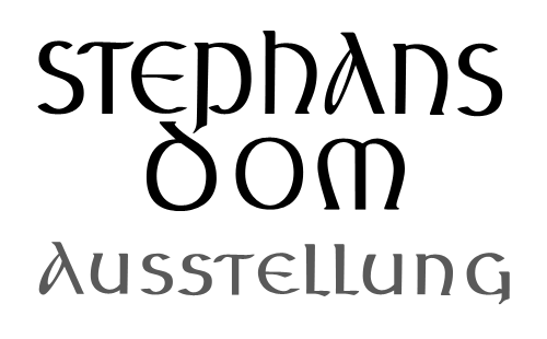
This beautiful uncial lettering is from this poster, showing the tower and spire of St Stephen’s Cathedral in Vienna, which I traced on another poster here.
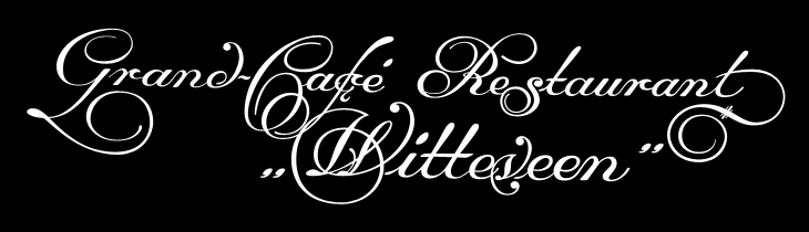
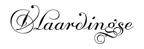
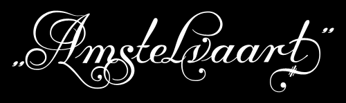
Another gem found through Coudal, this. Re-Type posted an article about the beautiful lettering by Leo Beukeboom on the windows of bars and cafes in Amsterdam (with a nice appreciation of decent, old-style, non-trendy bars in there too). There’s a series of photos with the article, which I’ve traced the lettering from (below), and as a bonus Re-Type themselves are working on interpreting the lettering into an Opentype face, which so far looks great - can’t wait to see it finished.
I did a bit of hunting around for more information on Beukeboom, and found this article on David Quay’s site, containing a lot of background information and an interview, which is fascinating and well worth a read. I’m particularly taken by this:
The letter you use on a pub window depends on the type of pub. If you have a traditional brown café, with lace curtains on copper curtain rods, with stained glass windows, you choose a nice, ornamental curly letter, because it fits in with the environment. It is not the information that counts, because everyone can tell it’s a café, but it’s about decoration, about creating an atmosphere. For the lettering on the traditional brown cafés I developed my own script based on the calligraphy of Jan van den Velde.Leo Beukeboom, from David Quay Design
I love that. The words themselves become secondary to the style in conveying information - without knowing what it says, you know what it says. Certainly not an infallible system, but most types of place (and many things) have their signature look, and as I’ve posted before (warning, extremely wordy article) you should know what you’re doing before you mess with it. They’re the design patterns of urban existence, if you will, though in the case of Beukeboom’s lettering, this is one that is slowly fading - unless anyone wants to become his apprentice that is. If he still wants one.
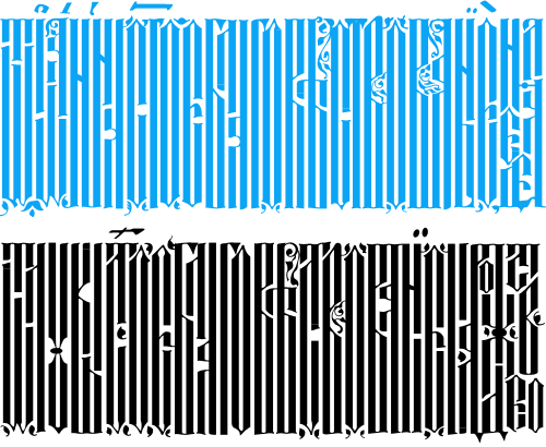
Well that was fun. BibliOdyssey posted these images of manuscripts from the National Library of Serbia last week, and I wasn’t sure if I wanted to trace vyaz script lettering, or redraw it. The urge to redraw won out, and as I was doing it I remembered this post from Tiffany on Flickr, which led me to this thread on Typophile, where Ivan Gulkov shows some virtuoso skills with the style. I can understand the decision not to create a font and instead create a vector file of parts - I ended up creating a set of parts myself for my redrawing below. Creating a font would be a mammoth task, and besides, creating lettering like this is fun. You can see more of Ivan’s work and his portfolio on his personal site. Go take a look.
Top, redrawn from this. Bottom, redrawn from this.
The lettering I’ve redrawn differs a bit from the vyaz script in the Typophile thread, which makes me wonder how much regional variation there was in the script, or whether it was just down to the styles and whims of the individual scribes. In my redrawing I’ve tried to keep to the original lettering, but have straightened the verticals and made the spacing more regular, which I think still keeps to the spirit of the original. I’m also interested in this one, which seems to have some kind of transitional form going on. As the style appears to be more about creating an image rather than being easy to read, it reminds me of the patterning and illustration possible with Arabic calligraphy, which I’ve posted about before.
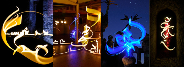
While browsing NOTCOT earlier, I came across this post linking to this frankly quite amazing set of light writing photos by Julien Breton (also via this post). You know the idea; set the camera up in a dark place on a very long exposure, and use something like a flashlight or LED penlight to draw shapes. I’ve seen some beautiful examples before (bottom), but nothing as intricate and detailed as these. These are quite close crops; you can view the full images and get more information on Breton’s site.
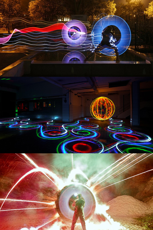
I thought I’d already posted about these images from LAPP - Light Art Performance Photography. I can’t remember when I first saw them but they fascinate me, I’d love to watch some of these being made. The site has added a load of new photos since I last looked so it looks like they’re pretty active in creating new works too. Great stuff:
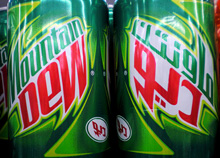
What does the McDonald’s logo look like in Arabic? Or Yves Saint Laurent? Burger King? Rolex? Baskin Robbins? Well, now you can find out because Brand New linked to these two articles by Jason of Graphicology showing Arabic language versions of international brands: one for logos and another for packaging.
The ones that are really faithful interpretations are fascinating, they really highlight what it is about the logo and packaging that identifies the brand - the Mountain Dew, Dunkin’ Donuts and Baskin Robbins ones are particularly successful in this regard. The Subway one is so close to the original that at a glance you could miss the fact that it’s in Arabic. Others bear no apparent relation to the original logo, even though you’d think they could be easily redone in Arabic. The Calvin Klein one in particular is baffling - surely it would be a straightforward exercise to letter a short name in Arabic to look like Futura Book? Indeed, there is a version of the face called Bukra, which so far only exists in an extra bold weight, but still, it shows it can be done, and very well too. The Yves Saint Laurent one is a little closer to the parent, but again, not so much.
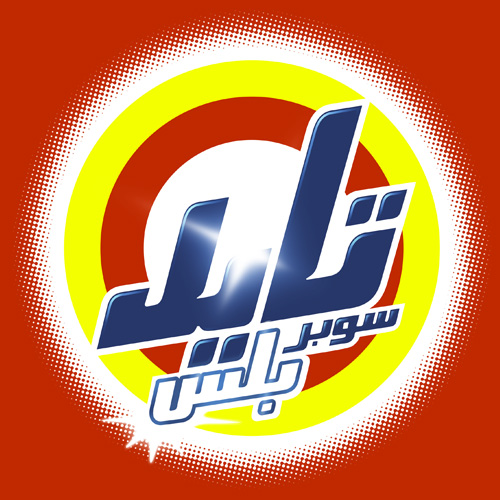
Comparing the originals to the Arabic versions, it’s the luxury clothing brands where the logos diverge the most, and fast moving consumer goods (FMCG) that are the most faithful. This might be because the luxury brand customers are nearer the top of the social scale, are more international and therefore more likely to recognise the Latin logo than those who buy washing powder and groceries. With that assumption, it would therefore be more important to accurately translate the brand image for the FMCG market than for luxuries. Perhaps. Having said that, it’s the Tide packaging that got my attention, and given that Brand New also used a picture of it I’m not alone in thinking that it’s one of the best, design-wise. It’s great in English, but I don’t think I’ve ever seen Arabic lettering quite so exuberant; artistic, inspiring, beautiful, yes, but this is pure teeth-jarring kitsch. Fab. I have of course redrawn my own version of it. Click the image for a wallpaper-sized version.
Part of my job involves developing websites in multiple languages, and earlier this week the decision was made to produce an arabic version of a particular very flash-heavy website we did. It’s going to be an interesting challenge, as the website in question is one of those that emulates the action of turning pages in a book (needless to say it’s a pure marketing ‘teaser’ style website) and so the entire site will need to be reconfigured to right-to-left reading and page turning. Anyway, those are fairly straightforward technical details and shouldn’t take too long. What really occupies my time is selecting a new typeface for the site - we use Arno Pro for its wide range of language support, especially Cyrillic and Greek, and so the new arabic face should work well with it. And lo, just this evening I find Palatino Arabic in the Type Director’s Club 2008 winning entries. Perfect.
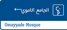
I’ve had this link stored for a little while now, waiting for me to explore further and write about it. I was initially taken by the use of arabic script to form directional signs (at right) and downloaded the beautifully designed and illustrated thesis by Luigi Farrauto. It’s well worth a look, even if you don’t read Italian. There’s a Q&A in English too:
Which are the main differences between the typography of arabic countries using arabic script and the one of non arabic country using arabic script? I find that there is more typographic freedom within the Arab world that outside of it. There is a perception, or maybe that’s just how I see it, that Westerners are more focused on fully calligraphic styles for Arabic typefaces, and so they are unaware that we need other typefaces to suit our daily life. Calligraphic styles are great but you can’t set a dictionary in 5 pts size with that.
That’s what I noticed about the sign in the first place - clean, sans-serif (as it were) arabic type. OK, anyone who watched a news broadcast in 2003 would most likely have seen motorway signs written in arabic, but the films crews were hardly focusing on the finer details of the typography.
Lam-Alef ligatures
How has been faced the problem of vertical ligatures in typography? Opentype provides us with GSUB (glyph substitution) lookups that can exchange a string of characters by a pre-designed ligature. That means that there is a large number of ligatures to be designed, and I’m not a fan of that. In my Naskh style typeface, I kept only horizontal stacking and so I have no ligatures except the Lam-Alef. I find that simpler to read and clearer.
This is also interesting. There are fonts that have been designed with loads of ligatures, but I guess sometimes, less is more.
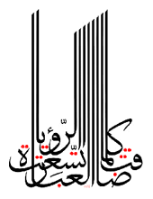
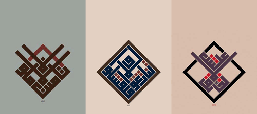
I recently rediscovered Mouneer Al-Shaárani’s work after trawling Google Images for the original of an image I had saved. His portfolio site has had (see Update below) some wonderful examples of quite remarkable calligraphy on it. The three examples of his work below show some of what’s possible with Arabic calligraphy, which may well be unreadable, but is definitely beautiful.
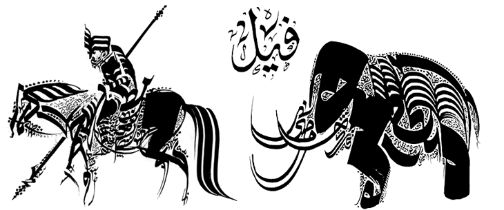
It’s also worth checking this collection of anthropomorphic and zoomorphic calligraphy on this post on BibliOdyssey. I gather from reading around the subject that the idea of doing this may have come from the prohibition on creating images of animals - this isn’t a picture of the animal, it’s just a description of it, written down. Whether that’s true or not is open to interpretation, but it makes a nice story. Would that defence stand up in court, I wonder?


