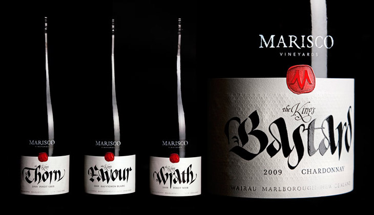
These wine labels, featured on The Dieline, by Marisco Vinyards are beautiful. They’re from “The King’s Series”, a range of wines produced to celebrate the family’s heritage — they’re descended from the tyrannical Marisco family who, during the 12th Century, owned and operated from Lundy Island, just off the coast of Devon. It turns out the family were periodically in and out of (but mostly out of) favour with the monarchy, inspiring the names of the wines, from The King’s Favour to The King’s Wrath. The labels were designed by Hook’s Christopher David Thompson and the beautiful, historically-appropriate calligraphy was done by Peter Gilderdale. I love the finishing on the labels — the textures are reminiscent of lacework and embroidered fabrics, and the strong varnish and deboss on the calligraphy makes it look like bright fresh ink. It’s all really rather lovely.
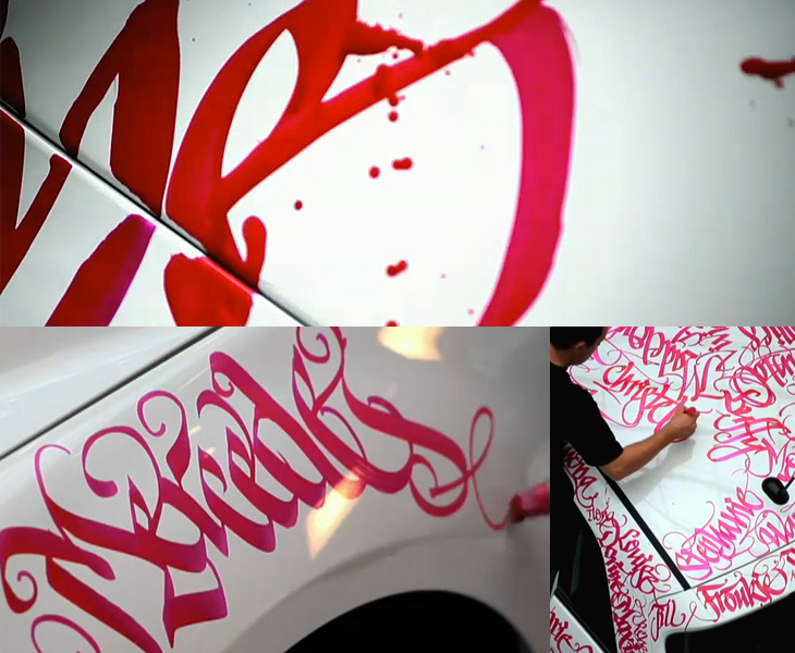
This has been around for a while, but I’ve only just seen it. Niels Meulman of Calligraffiti (AKA Shoe) was commissioned to customise a Mercedes-Benz B-Class by the Pink Ribbon Foundation in the Netherlands. The work consists of hundreds of women’s names, representing the Dutch women the foundation works to help, and is a product of Mercedes’ sponsorship of the foundation. Whatever you think of corporate sponsorship, the end result is pretty spectacular. I especially like the excess ink running down the side of the car, it enriches the flamboyance of the hand lettering and is a welcome contrast to the usual corporate image of Mercedes — and is a badge of honour to confound the cynics, that yes, this was done by hand, live, as it were. Go and look at the video, but I warn you, this is YouTube, so the usual vile trolls have infested the comments.
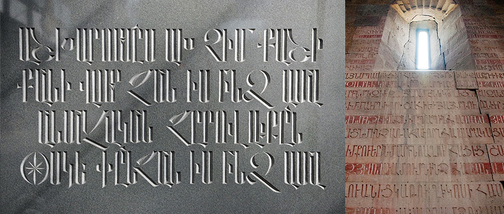
I’ve noticed a fair bit of interest on Twitter and the like recently on the subject of Armenian script, perhaps inspired by Carolyn Puzzovio’s talk on the subject at ATypI 2010. I’ve been meaning to have a look into the subject since then, so I’m glad Nina Stössinger and Hrant Papazian have created armenotype.com, a great new site devoted to the subject of the Armenian script and alphabet. It was only launched a few hours ago and the content is still being added to. In the words of Hrant:
We’d love to see anybody and everybody with even a remote curiosity about the Armenian script check it out, register for the mailing list, and post comments.Hrant on Typophile
It’s a beautiful alphabet. Look on the site for the full gallery, but here are a couple of my favourites so far:
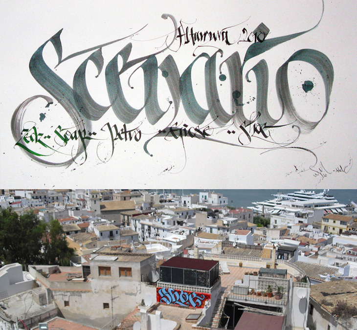
I was convinced I’d written about Shoe before, but it turns out I haven’t. Shoe, or Niels Shoe Meulman, is the master of calligraphic graffiti, creating the label for the artform of calligraffiti - also the name of his site. I must have seen examples of his work in books and photos hundreds of times, yet sadly not in real life. I don’t think I have anyway. I’d have hoped I’d have noticed. So yes, go and look at his site, there are more pictures of his work, a rather impressive bio, and a nice story on the nature of creative work too.
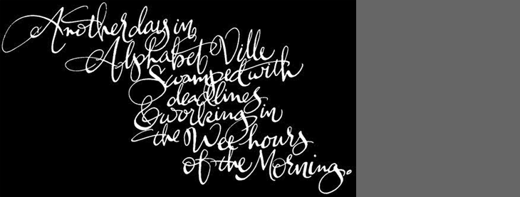
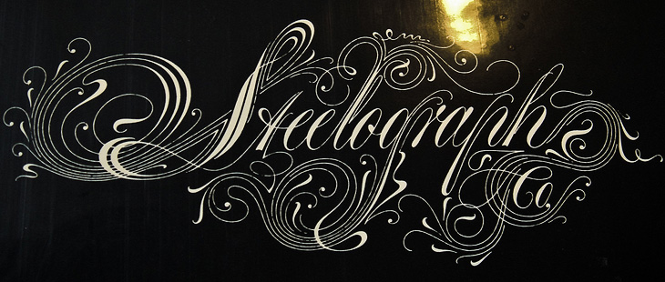
Another link to the ever-inspiring The Art of Hand Lettering, this script is beautiful. I love the composition and the flow of the letterforms, the even colour across the lettering takes my breath away, and it was all done by hand, late at night. I guess that’s the sign of an expert, no? Lovely. Go and take a look at more of his work.
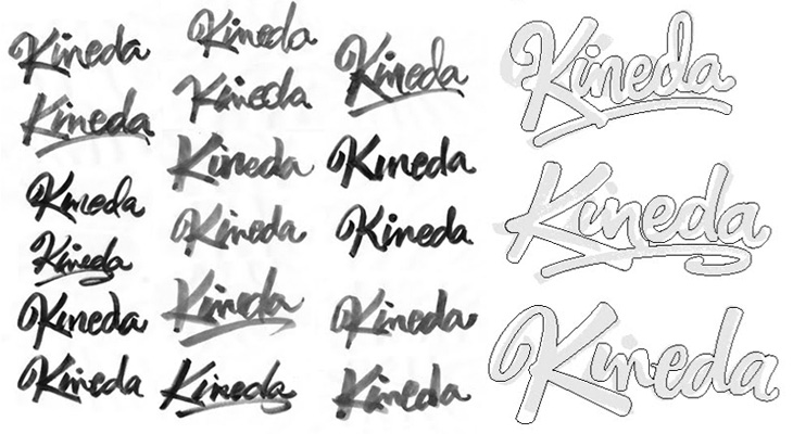
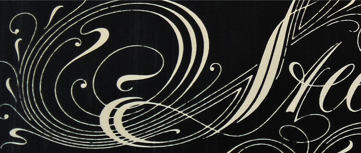
I was reading the latest post on The Art of Hand Lettering earlier and found the stages in the process fascinating, in that I preferred some of the sketches to the end result. I do really like the final logo, but there was something about one of the on-screen workings of the logo that I thought really brought the word alive — it’s the one in the detail I cropped from the article at the bottom right below. There’s something really playful about it, like the rest of the word is being bounced along by the K. Still, that’s my impression and it most likely wasn’t the client’s intention — and that’s the difference between doing stuff for yourself and doing stuff for paying clients!
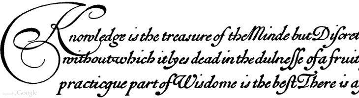
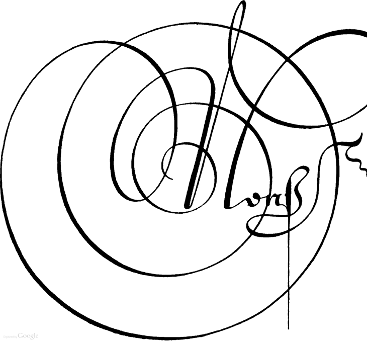
I’m sure this set of Google Books scans has gone round the design sites and twitter before, but I’ve only just recently come across it. Pretty much everything in here is beautiful and wonderful to just browse through, but if you’re a student of lettering and calligraphy (and of course, of type) then you’ll find it pretty useful too.
Personally I’ve mixed feelings about swashes and decorative initials, they look gorgeous but rarely seem appropriate to anything except for, well, historical contexts like the ones in this book. Often when I see them I think they look forced — shoved in there because they exist rather than because they add to the design or layout — It’s a real shame because I guess I’m not alone in really wanting to have a project that just calls out for a damn good swash, and yet when I do I start to fret that it’s just starry-eyed wishful thinking overruling good sense (and taste). It could be that I worry too much and should just get the pen out and start slashing away at the page with ink for the hell of it. Well, maybe not slashing as such, but when you look at some of these you get a real sense of the possibilities of drama and enthusiasm; the chance to create some really playful and exciting stuff. Wonderful:
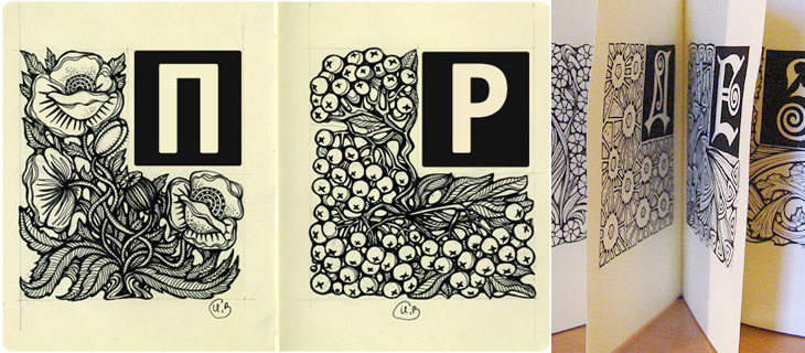
I was looking through this particularly linkbaity article and found the beautiful piece below, Alphabet, by Irina Vinnik. It really reminds me of a couple of books of fables and fairytales I had as a kid — they all had beautifully ornamented capitals at the start of each story and I was completely fascinated by them. I did trace quite a few and spent rather a lot of time trying to draw my own. Sadly I’ve not got any of those early attempts so I can’t see if they were any good or not, but it did get me into a long and happy habit of tracing and redrawing letters and lettering which has been incredibly useful throughout my career. Funny thing with kids, I’ve noticed with friends of mine who have children that shovelling tons and tons of information at them and seeing what sticks seems to be a pretty good strategy. Your mileage may vary, of course.
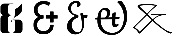
There seems to be a lot of ampersand-related activity about at the moment. Ampersands are of course beautiful things, and occupy a special place in most designers hearts, so you’d expect there to be a constant low-level hum of ampersand appreciation online, but two projects came up recently that are particularly interesting.
The first is a straightforward commercial venture, by Haäfe and Haph, who have designed a set of 10 display ampersands, on sale for $9.99. That’s less than seven quid! Of course I bought the set, how could I not, for I am weak:
The second project is Font Aid IV, organised by the Society for Typographic Aficionados to raise money for the earthquake rescue and reconstruction in Haiti. The idea is to get submissions for ampersand designs from loads of designers, assemble them together into a font and sell it, giving all the profits to Doctors Without Borders. Yves Peters wrote a bit more about the project on the FontFeed here, and there’s a good selection of submissions on this Typophile thread. Some of them are really rather lovely — a few of my favourites are below — I look forward to the font being available to buy:
From left to right, submissions by Sulekha Rajkumar, Jos Buivenga, Victor Zuniga, Oleg Macujev and Anderson Maschio. I curse my own talents for procrastination for not doing one myself.
Another recent post is this one by Alex on ISO50, showing some of his favourite ampersands and talking of the variations in the ampersand and the challenges in drawing the symbol. There’s also a calendar project showing a different ampersand every day, 300&65 and a whole blog about ampersands, called (you guessed it) Ampersand.
Then of course there’s Hoefler & Frere-Jones’ middle name, with historical information on the various forms of ampersands and how they appear in H&FJ fonts.
I can end this post with an appropriate quote from Bringhurst, “In heads and titles, use the best available ampersand”. You’ve a lot of choice, even online — even more if you use a font service, or some other method for showing type online.