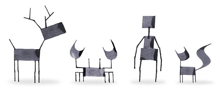
A fun little collection of creatures drawn with a calligraphy pen by Andrew Fox. Simple, fun and attractive. It reminded me of this aspect of Islamic art, featured by BibliOdyssey a few years ago: Zoomorphic Calligraphy.
A fun little collection of creatures drawn with a calligraphy pen by Andrew Fox. Simple, fun and attractive. It reminded me of this aspect of Islamic art, featured by BibliOdyssey a few years ago: Zoomorphic Calligraphy.
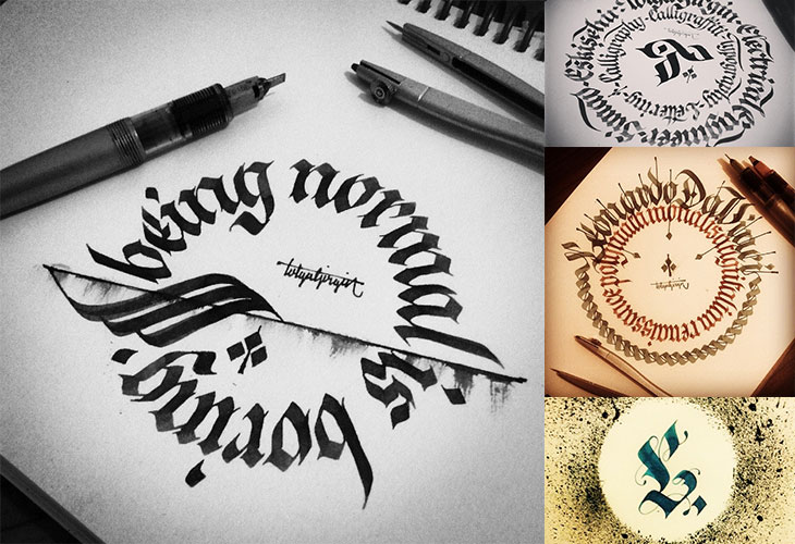
I found Tolga Girgin’s work from a link to his 3D lettering made with cut paper and traditional calligraphy on Behance, and went from there to his Instagram feed where there’s loads more of his work, including these beautiful circular compositions. I think I’m drawn to them because they remind me of coins and banknote patterns (which I am fond of). Go and have a look at the rest of it.
A couple of years ago I wrote about Kuka, the RobotLab project built to write the entire Martin Luther bible onto a long roll of paper. The robot emulates the calligraphic style replicated in the Schwabacher blackletter typeface, writing it using a pen as a (particularly neat and tireless) human might. It’s quite a lovely thing*.
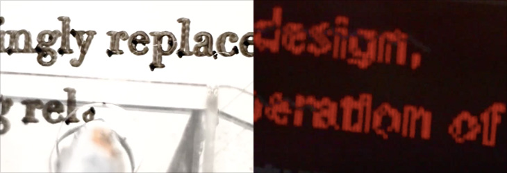
I was reminded of it when I saw this project by Walter Nicolino and Carlo Ratti (of Carlo Ratti Associati). They’ve designed and built a suspended plotter to write the contents of the Open Architecture Manifesto page on Wikipedia onto a wall at the Adhocracy exhibition at the Istanbul Design Biennial. As the text on Wikipedia is updated the robot erases and rewrites the document on the wall at the exhibition.
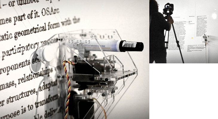
The comparison between the two projects is perhaps obvious, that one is reproducing a historical, unchanging document, while the other reproduces a brand new, constantly-updating and ephemeral one. Indeed until the manifesto was published in Domus magazine (whose editor Joseph Grima is curator of the biennial) the article kept being deleted by Wikipedia editors.
I’m especially interested how the plotter is reproducing the text. The typeface could be Times, but the generous amount of ink the fat nib of the plotter pen puts down, and the way it outlines the characters, makes it hard to tell exactly. Also, looking at the video the output is a serif face but part of the processing (in Processing) looks like it uses something more like Verdana or Tahoma. Could be that different parts of the text are in different faces of course. Curious.
Looking for various calligraphic-related things on image search, on Graffuturism I find the work of Greg Papagrigoriou, a graffiti artist from Athens—or, to use the term, a calligraffiti artist from Athens. He creates densely textured pieces, often collaborating with Simek whose work often acts as a centrepiece or focus. The two artists’ work complements each other perfectly and create striking images that remind me of protest posters or propaganda, but while on these the words flow and possess graphical rhythm, they defy any attempt to be read.
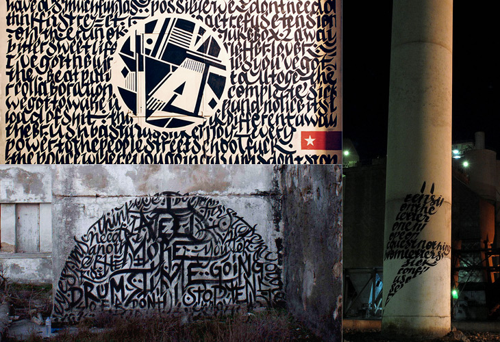
All images via Graffuturism, and presumably before that, Greg Papagrigoriou’s Flickr.
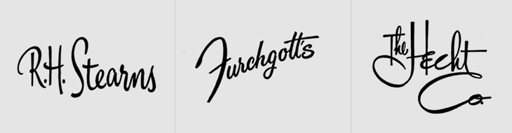
This is something I’ve had open in a browser tab for months, and I’m sure it’s officially ‘old’ in internet parlance, but I’m still drawing inspiration from the images. Christian Annyas has isolated (and traced?) these old department store logos and made quite a collection of them. He makes the point that very few stores today use similar lettered styles to these, and that they go for a logo style that “won’t offend” — I wonder though, if all these logos were created with a similar sentiment in mind? After all, brands in a sector do tend to cluster, so as fashions change, they all change together.
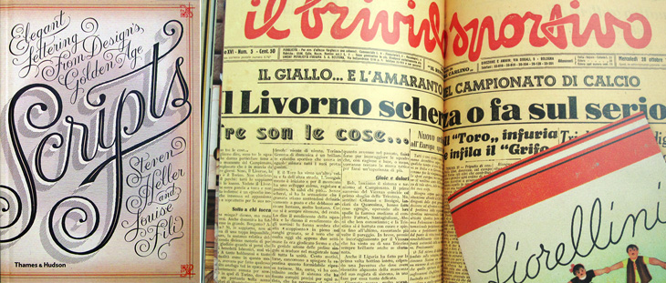
I’ve been sent a book by Thames & Hudson that I think is worth putting on here. The (slightly contentious) title is Scripts: Elegant Lettering from Design’s Golden Age*, and shows the collection by the authors, Steven Heller and Louise Fili, of handbills, flyers, posters, photos of signs, type samples, you name it, as long as it’s got script lettering or type on it. I’ve linked to a few big online collections of ephemera before, but never seen one in book form before. The photos are clear and detailed, and while I regret some (all) of the arty cropping, it’s a pretty good resource if you want to research scripts. The collection is broken down by country of origin (rather than by era or style, say) so there are chapters for French, British, German, Italian and American scripts. Thankfully, each chapter has at the end a listing of the origins of each of the pictured pieces, which provides some much needed context; however, I think I’d prefer to have had each image captioned, even if that might have reduced the impact of some of the spreads. A personal preference, I think; your mileage may vary. It’s definitely a book to enjoy browsing through, which is what I’ve been doing, funnily enough.
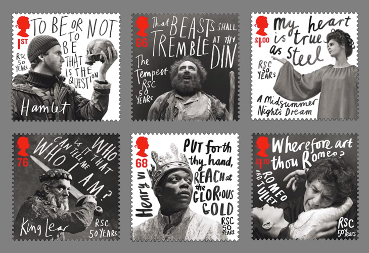
Creative Review highlighted this new issue of stamps from the Royal Mail by Hat-Trick, celebrating the 50 year anniversary of the Royal Shakespeare Company. The stamps feature images of David Tennant as Hamlet, Anthony Sher as Prospero, Chuk Iwuji as Henry VI, Paul Schofield as King Lear, Sara Kestleman as Titania, Ian McKellen and Francesca Annis as Romeo and Juliet accompanied by a line from a play rendered in gorgeous expressive lettering. I know that lettering has been applied to portraits for centuries, but these have a particularly graphic novel feel about them — the expressiveness, the iconic phrases used, the packing of text into white space, these are all ideas best known (to me at least) from the world of comics. Makes a lovely change from your usual setting of Shakespeare for stuff like this in an antique revival type — and is perfect for a company like the RSC. Get them from Royal Mail here.
Lettercult has posted an incredible collection of custom lettering projects by hundreds of lettering artists, all completed in 2010. There are so many projects that they’ve split the post across two days, and there are 33 (quite long) pages in each post. I’ve not had a chance to go through all of them yet, but the variety and the quality is remarkable — so much to look at! I’ve posted a few favourites below, one by David Croy, another by Jordan Jelev of The Fontmaker, and I’d be surprised if you’ve not seen her work already (but very worthwhile admiring again), a piece by Dana Tanamachi.
By David Croy
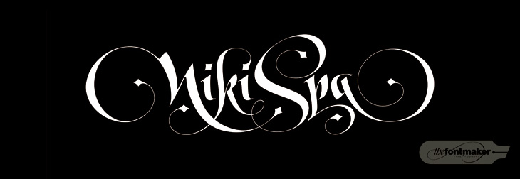
By Jordan Jelev of The Fontmaker
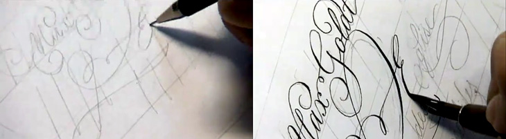
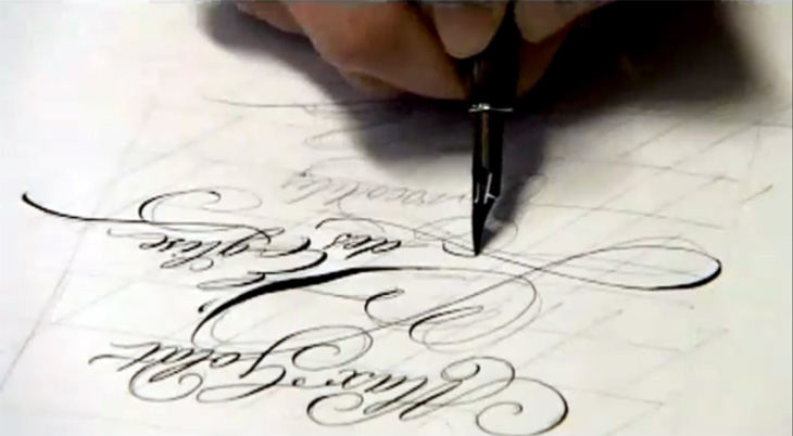
Continuing the process theme of my last post, Jan Middendorp posted a link to this (mostly) non-digital handwriting and lettering process by Frank Ortmann of Freies Grafik Design. I’ve done a few screenshots from the video to give you an idea of it, but nothing beats watching an expert directly. I particularly enjoyed the practice work — this time spent ‘loosening up’ is (I think) a key part of any creative process, digital or not. Go and watch the whole thing, it’s good.
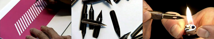
I’m endlessly fascinated by seeing how people work. Everyone who perseveres and creates something will find their own way of doing it, but seeing how other people work is extraordinarily helpful for getting started, overcoming creative block or frustration at the amount of grunt work something takes, or just for gaining the confidence to just get the job done. Sharing techniques doesn’t mean you lose your ‘edge’ or some kind of competitive advantage — if your success relies on something like that it’ll be a short-lived kind of thing anyway, as no matter how good the technique someone, somewhere, will find a better way of doing it. What you actually create is unique to you. If someone wanted to rip you off they wouldn’t copy your technique, they’d use something far easier to master, like a photocopier.
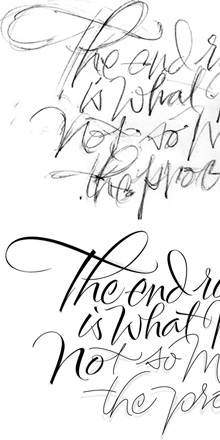
So yes, sermon over. I was thinking of this while reading this post by Alan Ariail on his site The Art of Hand Lettering. In it he describes the results of a discussion with Yves Leterme during one of his workshops, namely the idea that, “The end result is what matters not so much the process”, and goes on to show some of his own processes. I was surprised to see how he goes from sketches to digital monoline ‘skeletons’ of letters, building them up to a calligraphic result. I’ve done a fair bit of stuff like that and always had a niggling doubt, the idea that of course, real letterers wouldn’t do this. Well it turns out that they do. Marvellous!
I would make one personal comment on the whole result/process thing though. I do think that process matters — not in any professional or even moral sense (I use the term loosely) — but in a personal, artistic one. The process is what you spend your time doing so it matters in that it should be enjoyable, satisfying and inspiring. It’s a shame that with many of the digital tools available there’s a distinct lack of joy in using them. But if you do find something that’s good, let the developer know you like it, and just as importantly, tell everyone else. But that’s my original point again.