When I had first decided I wanted to design typefaces I looked around for books on the subject, and yet could never find any book that worked as a primer, a beginner’s how-to manual*. If I’d have come across Letters & Lettering back then I’d have found a very good book from which to learn about constructing letterforms. The examples you can see here (and lots more on the page on Liam’s site) are lovely and clear and show the construction of, say, Trajan-esque forms. There are other examples in the book, blackletter and modern type forms, but it’s the large outlines that interest me here. This site will definitely go in the bookmarks.
I just read this pingmag article on manga translator Simona Pini. I’m enjoying the idea of sound effects and actions being represented as graffiti-style japanese text.
I saw this on Serif’s ‘What are you currently working on?’ series. I often set type like that, but given the brands I work with, I rarely have a chance to work with such an ornamental serif type. It’s lovely.
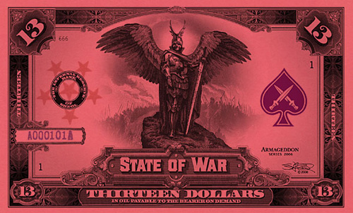
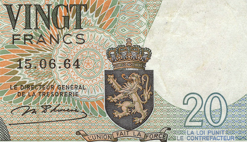
You know that feeling you get when you’ve had an idea to do something, and you’ve not got around to doing it for ages, then you come across something that shows that not only did someone else have the same idea, they’ve gone and implemented it? And very well, too. Well, I’m getting that now. Stephen Barnwell has made these incredible banknotes for the fictional Antarctic colony of Nadira, and for various other fictional microstates. There’s also the non-existent denominations of the Dream Dollars, which you can download, and various other products which you can buy. I think the whole thing is fantastic.
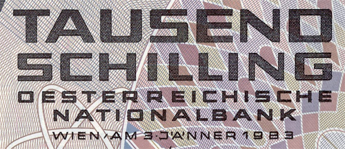
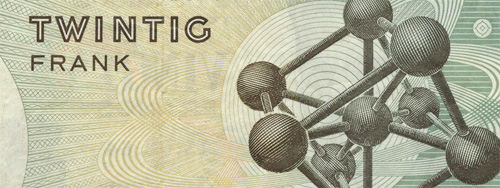
Still, it doesn’t stop me doing what I intended to do as my intention is different. I just like banknotes, I could look at the designs of them for hours, and hours, and hours. A bit like maps really - give me a good atlas and I could look at it all day. Maybe I just have an obsession with finely drawn lines? Either way, I have a collection of images grabbed from around the net. I’ve linked to the original page where it still exists.
First, the aforementioned Stephen Barnwell’s latest. The 13-dollar note from the State of War:
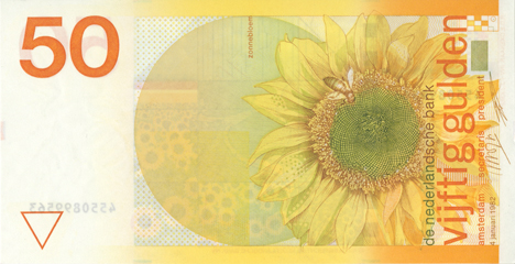
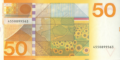
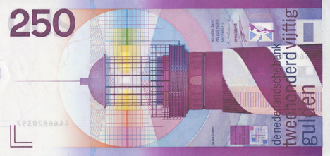
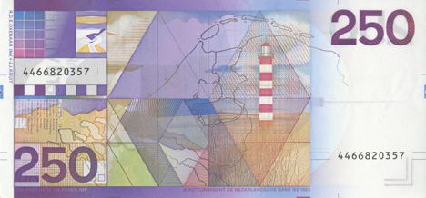
Then a selection of Robert Deodaat Emile Oxenaar’s designs for the banknotes of The Netherlands, which to me represent the only real argument against the Euro. Why couldn’t the European Commission have got him to design the money? Found on this article on Creative Review’s blog:
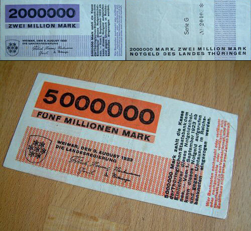
And then (and it took me a while to re-find these) the beautifully simple banknote designs by Herbert Bayer of the Bauhaus. These were done for the 1923 emergency issue of banknotes for the State of Thuringia in the Weimar Republic. The only place I could find a decent image was through the eBay store “Room 606”, where you can actually buy original notes.
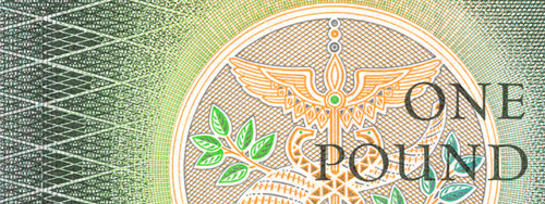
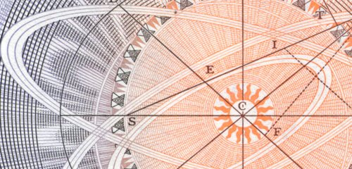
I also came across some images of banknotes that feature scientists, engineers and mathematicians. I won’t post the full images, but here’s a couple of exquisite details from the old one pound note. It’s about time Newton was restored to one of the denominations of the British pound:
With the note from the author of ‘Fuck Comic Sans’, the free typeface Comic Serif is introduced. To me it looks like a bouncy version of Rockwell, and is a hell of a lot nicer than Comic Sans.
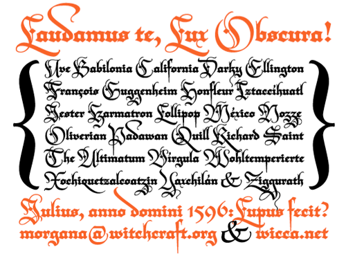
So yes, as mentioned elsewhere, Typographica released their favourite fonts of 2006. The face that immediately caught my eye and made me go “Ooo!” was Darka, a new interpretation of Blackletter type by Gabriel Martínez Meave. Some of the capitals could be used as cadels in themselves, they’re so beautiful, and a lot of the letterforms have a real calligraphic flamboyance. I have a love of blackletter types and of calligraphy in general, so Darka seems right up my street. The thing is, even though the site says the font can be bought from FontShop, it’s not on the site at all. As soon as it is, you can be sure I’ll be buying it. Until then, I’m stuck with the sampler PDF and a bit of copy’n'paste to play with the letterforms.
From the site:
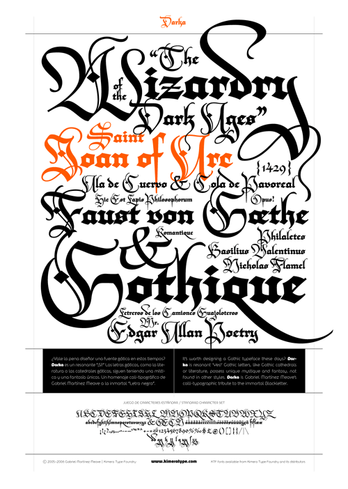
The second page of the PDF sampler:
And, I couldn’t resist. Not sure about the “Ty” kerning though, but I think to make that work nicely I’d have to redraw part of the T:
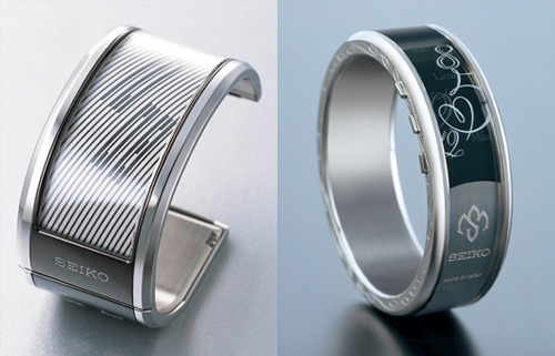
Another thing I came across. These watches labelled as “The SEIKO Electronic Ink watch for women”. Why specifically for women though? Apart from what the display can show, these don’t look particularly feminine. I think the e-ink watch idea is a good one though, and somewhat related to my post about mobile typography and manufacturers’ seeming obsession with 7-segment-style characters for showing the time, I think there’s a real opportunity to use non-lining numerals to display the time. At right, some examples.
I’m always intrigued by fonts that aim to have a fixed radius of curvature in the glyphs. They’re always display fonts, and sometimes they’re quite attractive. I came across this one today on Yo Lo. The site is stupid and doesn’t have individual urls for pages, so you’ll have to browse to find it.
I already wrote about typography on mobile devices, with a focus on the S60 platform and obligatory mentions of the iPhone and non-obligatory mention of the LG Prada phone. What I failed to mention was the current state of play over in the world of Windows Mobile. I don’t intend to write an exhaustive review of the OS, or of every screen; this is more of a first impressions piece.
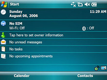
Microsoft have recently released the latest incarnation of the platform with Windows Mobile 6. I’ve seen adverts for version 5 (I think) around the place, and the shots that they’ve been using to advertise it (what’s this, using the UI in ads? Encroyable!) are fairly attractive and well laid-out. At right is a screenshot from a landscape-format device, and it looks quite similar to the S60 layout, though perhaps making a better use of space.
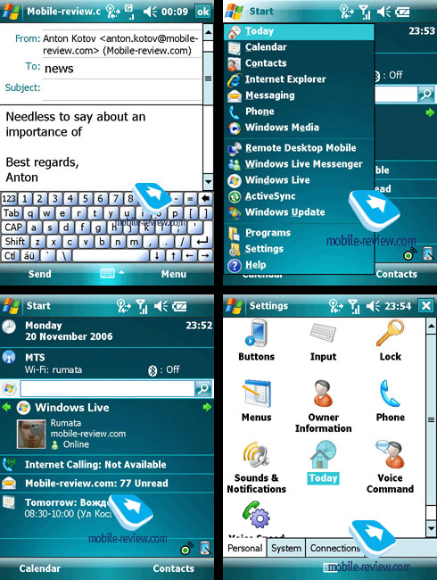
What’s the rest of the OS like though? Looking at some screenshots from mobile-review.com I have to say it’s not too bad at all. The type looks like Tahoma and is of course rendered using ClearType, which raises an important question; Why don’t more mobile devices use some form of smoothing? It’s not down to processing power surely? S60 devices used SVGs for their OS elements (all vector) and are smoothed rather nicely, so why not the type? Very odd indeed. So, apart from the type rendering being good, as I said, the layout and typography of WM6 is generally OK, but has a few odd inconsistencies. The main home screen (bottom left, below) has that rather odd search bar cutting across it, and then, apparently for the sake of cramming in the Windows Live icon, the left margin is broken, ruining the layout and making it difficult to ‘scan’ the screen - something that should be a paramount concern for any mobile device. The odd placement of the search bar might be down to user preference, but the Windows Live block should have been better to start with. It makes it look like someone designed it nicely, then extra stuff was just thrown at it til it stuck. Mind, the left margin itself is defined by the unnecessary divider line between the Windows logo and the ‘Start’ label, rather than the left edge of the label itself, which is typical of a design process that fails to operate on a strict principle of less is more. The type defines the margin! You don’t need an extra line! Grr.
The email screen (top left, below) is interesting just for the different sizes of the type used. The ‘from’ field looks fine (though any UI designer might ask why the field is needed at all) but for some reason the ‘to’ field is set in a larger type, and doesn’t share the same left margin. The mobile review people seem to be of that accursed group that sends emails with no subject (or maybe they got confused and ‘news’ is meant to be the subject) so we can’t really tell what that would look like. The keyboard stands out from the whole set of screens. It looks like it was grabbed wholesale from a different device entirely - it doesn’t match the green glassy theme at all, and I can’t really see why. I could get all Tufte about it, but do the buttons need to be all embossed with rounded corners and gaps between them? It all conspires to reduce the apparent click area. In fact, do the buttons Fitt’s Law right up to each other, or if you were to hit the three pixel gap (2 for borders, 1 for background) between them, would nothing happen?
I’ve recently started on designing a theme for the Symbian 60 platform. The software from Nokia, Carbide, is reasonable enough, providing access to almost every part of the UI for editing. All the elements of the UI are built using embedded SVGs, allowing them to scale to any resolution and meaning that themes can be used across a variety of devices without needing to be redesigned or rebuilt. However, as I said, the app only provides access to almost all parts of the UI. The one (to me) all-important omission is access to the fonts and typography of the UI. All Nokia S60 phones appear to use the company’s own font, Nokia Sans. It’s not a bad font by any means, it’s suited to low resolution applications and scales up to medium resolutions fairly well, but it’s just so dull and looks just so Windows 3.1 clunky. Also, the font that’s used for the standby ‘screensaver’ clock, Series 60 ZDigi, is just utterly vile. I don’t get why product designers have this obsession with making high resolution full-colour LCD screens look like ancient 7-segment displays. The numbers in Nokia Sans are perfectly readable and reasonably attractive (for a standby clock, it would be just fine) but instead the phone uses this horrid thing and you can’t change it.
So, in the process of trying to make a new theme I was looking into “alternative” ways to change the system font, and David of typographer.org pointed me at this hack. All very promising, but it didn’t work on my 3rd Edition phone. I suspect they’ve locked down the system files a bit more, though why they let you modify the theme at all and then get all protective about the fonts I have no idea. For them to allow (and encourage) people to make themes, but not change the font, it seems inconsistent and unnecessary - after all, if you screw up all the icons, backgrounds and menus, or just make something hideously ugly, it would make the phone just as unusable as copying over a duff TrueType would. By comparison, both Apple and Microsoft are very protective of their OS look and feel, only allowing very minor changes - you essentially can’t change anything, so I guess it’s better than nothing.
While I was rooting about in the S60 system files I noticed that as well as the four font files listed on the darlamack page, there were four others. I copied them over to have a look, and these look to be the fonts used on the Messaging and Web applications, and are suspiciously similar to Arial. At first I thought they were a Helvetica clone, given the name of SwissA, but a closer look (below) shows they are in fact clones of Arial. Interesting.
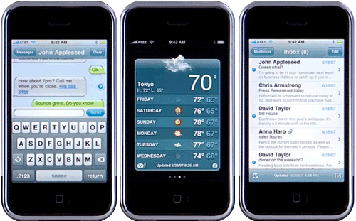
I could hardly make a post about Mobile Typography without a reference to the Apple iPhone. The UI of that object of desire is really quite beautiful, and graced with true, genuine, honest-to-God Helvetica. Now, as far as I know, it’s also the only phone that’s been advertised purely on its UI, because that’s what the whole thing is about. Behold:
The adverts for the Samsung D840 showed you the hardware buttons and how the glossy front of the phone is so reflective it can be used as a mirror, but with no showing off of the UI. The Motorola RAZR had a similar set of ads - you’re invited to gawp at the thin, sleek hardware, but you’re not shown the UI. Same for most of the Nokia ads in fact. That’s because the default UI is at best workable, at worst, hideous. Maybe it’s deliberate? If the UI of these other phones was usable, responsive and beautiful, there’d be little need for themes and a big source of revenue (from advertising on the theme sites alone) would disappear.
Well, it’s a theory.
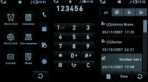
And while we’re on the topic of phone UIs not being shown in adverts, here’s one that should have been. The Prada phone by LG. Follow that link, and once the great chunk of Flash has loaded, try and find some shots of the UI. They’re not there. And yet, courtesy of this article about the LG Prada on GSM Arena, you can see that it’s absolutely nothing for them to be ashamed of. I love the typeface too, especially the ‘w’. Not that you can see it too well on the examples. There are some close up photos in the article, mind.
This is what’s inspired me to create the theme for the S60, in fact.


