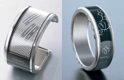
Another thing I came across. These watches labelled as “The SEIKO Electronic Ink watch for women”. Why specifically for women though? Apart from what the display can show, these don’t look particularly feminine. I think the e-ink watch idea is a good one though, and somewhat related to my post about mobile typography and manufacturers’ seeming obsession with 7-segment-style characters for showing the time, I think there’s a real opportunity to use non-lining numerals to display the time. At right, some examples.