So, as postedelsewhere, the Android platform now has its own set of fonts, created by Ascender Corp. They look pretty good from what I can tell from the PDF sampler, though only time will tell how they’ll be used. I’ve writtenbefore on the subject of mobile typography, and it’s clear that the problems with it are rarely down to the actual font - Nokia Sans is, after all, a rather pleasant face. What I’m really interested in is if the Open Handset Alliance will create a strict set of UI guidelines, with a grid, and whether any of the manufacturers will adhere to them.
So here’s the sampler from the PDF, without the hideous distracting colours (the fact that they were displayed thus doesn’t bode well to my mind):
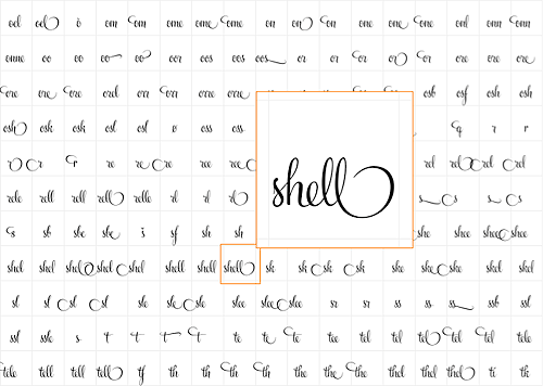
Now this is what I call a character set. Swissmiss pointed me at this incredible new typeface by Alejandro Paul, on Veer. I have a strong urge to buy it just to play at typing things and seeing the ligatures appear. I mean, some of these ligatures are whole words!
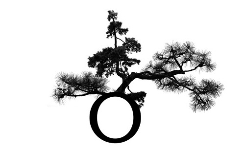
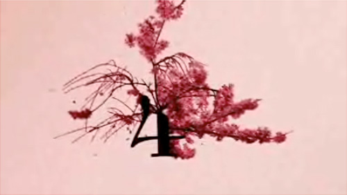
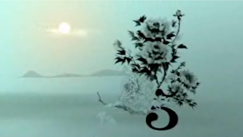
Discovered over on Fubiz, this beautiful animation from zero to ten using imagery from the arts of bonsai and ikebana. This really is a beautiful short film, and it reminded me of something I’d seen before, so a little bit of checking through my saved files and links I realise I saw some of the preparatory work on artless. In fact, I wrote about it here. The artwork is by Shun Kawakami, Illustration, Suibokuga, Drawing by Tadashi Ura and the photography (?) by Taisuke Koyama
The first picture here is from artless, the remainder are stills from the animation.
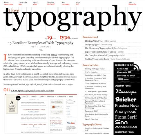
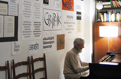
Since I don’t have a links page I should make posts about sites I read more often. I Love Typography is one. There are some great articles on here, some for beginners, most of interest to experts. I particularly like this one, 15 Excellent Examples of Web Typography, and this one made me laugh, Typoholism. An Addict’s Tale (image from the latter at right).
Another great article on pingmag: VEB Typoart: The East German Type Betriebsstätte. Go and read it, it’s got a good history of the organisation and on Karl-Heinz Lange, designer of Minima (both pictured at the end of this article). I’m thinking of ordering the limited edition Freundschaftpacket.
I’m particularly fascinated by these two bits from the article. The second being from the interview with four members of Typoart Freunde:
At Typoart, the principle “frugality and effectiveness” lead us to work with representatives from the printing enterprises to develop a type program that met all the important requirements: a Renaissance roman for literature, like Garamond, a classical, like Bodoni or Didot, then a slab-serif, for example Clarendon. There had to be something from each major style. Naturally also sans-serif, in different styles, like Helvetica and Futura. The “Zentrag” would even request imitations of specific western-made typefaces they couldn’t afford to license.
It’s the history of VEB Typoart, as an example of the fate that many GDR businesses met after the German reunification. Also, to the very end, their working methods were so modern and advanced. Unlike in West Germany, type design in the GDR wasn’t subject to the pressure of business competition. So, typefaces could be created with more care and craftmanship. You could truly call it Schriftkunst [typographic art]: No effort was spared in order to stay on the cutting edge.
So this is fascinating. They had to copy western designs (the article makes mention of Times New Roman) and yet the work they were producing themselves was of a higher quality than those western ones. They were working at the cutting edge, producing the best work, and yet when the business was taken over after reunification, it was run by someone not interested in type, and the place went under and the typefaces were all nearly lost. It reminds me of other businesses producing excellent products, most notably Adobe, which are now run by accountants and managers rather than by the engineers and designers who develop and use the products. Of course a business must have managers and accountants, but why must they be placed at the very pinnacle of the organisation? Their motivations can only be to profit and organisational efficiency, rather than to creativity and excellence. VEB Typoart avoided this for much of its life by operating under a soviet system where profit was not a motivation (and organisational efficiency came about through a scarcity of resources, rather than SMART objectives and the like) and collapsed under a new system with a rush for profits as an advertising agency. I guess it proves to me once again that placing managers, accountants and administrators in control of creative professionals always seems like a good idea to managers, accountants and administrators, and almost never works to improve productivity and creativity.
I’m getting fed up of Flickr. Does no-one write about the things they’ve seen anymore? Do they not care about how their images are presented? There are no narratives on Flickr, it’s a bucket full of photos with comments scrawled on them, using tags as a substitute for context and a sovietised interface as a feeble analogue for the blank gallery wall. I read on Kottke of the Tobias Frere-Jones Typographic Tour of Manhattan, with links to photos as ‘set 1’, ‘set 2’ etc. With a groan in my heart I clicked in full anticipation of yet another soulless grid of brutally-cropped thumbnails, and lo! there they were. Browsing this site is like Corbis Images in the early 2000s - the photos are subservient to a forbidding interface built to remind you that this isn’t a site to celebrate photography, but to make it conform to a catalogue. But what’s this? ‘Set 4’ is not Flickr! It’s an actual blog, with words and everything! No vile blue-with-pink vowel-less logos here! OK, it’s plain old Blogger, but it’s a sign of how things are going with presenting photos of things that even Blogger can seem exotic and challenging!
Yes, I know that many people don’t have the time, patience, resources and skills to set up their own photoblog, but there are plenty of blogging services out there, including some designed for photoblogs specifically! Break out from the Flickr mindset, please.
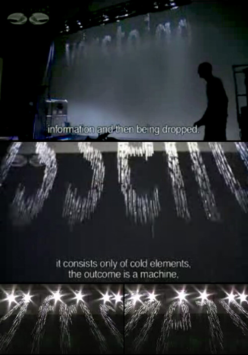
Browsing Design Observer, I came across a link to this short documentary on YouTube about Julius Popp and his work. He’s created a machine to take text from various online sources and display key words from it using water. The screenshots below give a hint of it, but are no match for the video. Go watch it, it really is incredible.
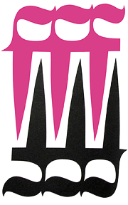
This Flickr set has some great images of the 1923 ATF Specimen Book. Later in the set are some wonderful images from other sources, including the one at right which is great - can’t beat blackletter and, er, pinkletter. I’m liking the monograms too, which you can see on the original set here.