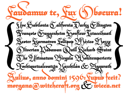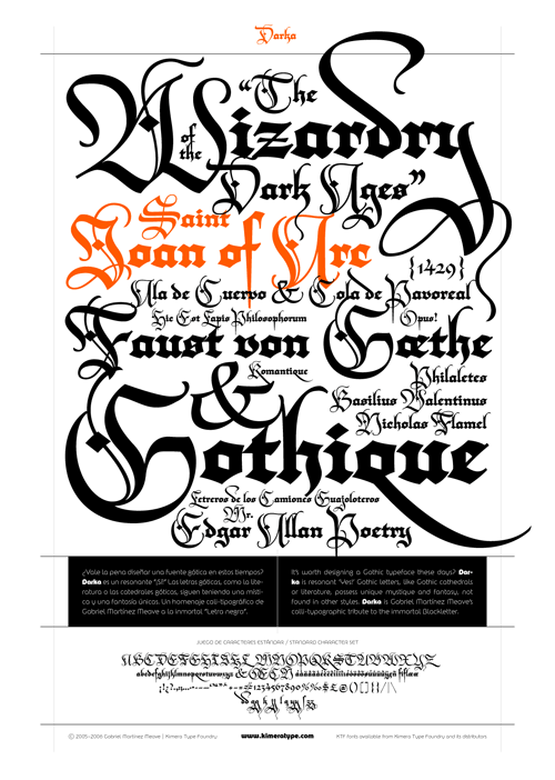
So yes, as mentioned elsewhere, Typographica released their favourite fonts of 2006. The face that immediately caught my eye and made me go “Ooo!” was Darka, a new interpretation of Blackletter type by Gabriel Martínez Meave. Some of the capitals could be used as cadels in themselves, they’re so beautiful, and a lot of the letterforms have a real calligraphic flamboyance. I have a love of blackletter types and of calligraphy in general, so Darka seems right up my street. The thing is, even though the site says the font can be bought from FontShop, it’s not on the site at all. As soon as it is, you can be sure I’ll be buying it. Until then, I’m stuck with the sampler PDF and a bit of copy’n'paste to play with the letterforms.
From the site:

The second page of the PDF sampler:

And, I couldn’t resist. Not sure about the “Ty” kerning though, but I think to make that work nicely I’d have to redraw part of the T:

