I already wrote about typography on mobile devices, with a focus on the S60 platform and obligatory mentions of the iPhone and non-obligatory mention of the LG Prada phone. What I failed to mention was the current state of play over in the world of Windows Mobile. I don’t intend to write an exhaustive review of the OS, or of every screen; this is more of a first impressions piece.
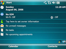
Microsoft have recently released the latest incarnation of the platform with Windows Mobile 6. I’ve seen adverts for version 5 (I think) around the place, and the shots that they’ve been using to advertise it (what’s this, using the UI in ads? Encroyable!) are fairly attractive and well laid-out. At right is a screenshot from a landscape-format device, and it looks quite similar to the S60 layout, though perhaps making a better use of space.
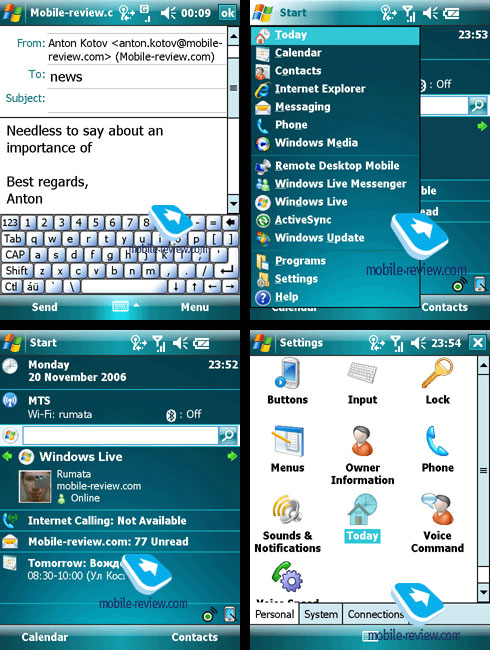
What’s the rest of the OS like though? Looking at some screenshots from mobile-review.com I have to say it’s not too bad at all. The type looks like Tahoma and is of course rendered using ClearType, which raises an important question; Why don’t more mobile devices use some form of smoothing? It’s not down to processing power surely? S60 devices used SVGs for their OS elements (all vector) and are smoothed rather nicely, so why not the type? Very odd indeed. So, apart from the type rendering being good, as I said, the layout and typography of WM6 is generally OK, but has a few odd inconsistencies. The main home screen (bottom left, below) has that rather odd search bar cutting across it, and then, apparently for the sake of cramming in the Windows Live icon, the left margin is broken, ruining the layout and making it difficult to ‘scan’ the screen - something that should be a paramount concern for any mobile device. The odd placement of the search bar might be down to user preference, but the Windows Live block should have been better to start with. It makes it look like someone designed it nicely, then extra stuff was just thrown at it til it stuck. Mind, the left margin itself is defined by the unnecessary divider line between the Windows logo and the ‘Start’ label, rather than the left edge of the label itself, which is typical of a design process that fails to operate on a strict principle of less is more. The type defines the margin! You don’t need an extra line! Grr.
The email screen (top left, below) is interesting just for the different sizes of the type used. The ‘from’ field looks fine (though any UI designer might ask why the field is needed at all) but for some reason the ‘to’ field is set in a larger type, and doesn’t share the same left margin. The mobile review people seem to be of that accursed group that sends emails with no subject (or maybe they got confused and ‘news’ is meant to be the subject) so we can’t really tell what that would look like. The keyboard stands out from the whole set of screens. It looks like it was grabbed wholesale from a different device entirely - it doesn’t match the green glassy theme at all, and I can’t really see why. I could get all Tufte about it, but do the buttons need to be all embossed with rounded corners and gaps between them? It all conspires to reduce the apparent click area. In fact, do the buttons Fitt’s Law right up to each other, or if you were to hit the three pixel gap (2 for borders, 1 for background) between them, would nothing happen?