
I’ve recently started on designing a theme for the Symbian 60 platform. The software from Nokia, Carbide, is reasonable enough, providing access to almost every part of the UI for editing. All the elements of the UI are built using embedded SVGs, allowing them to scale to any resolution and meaning that themes can be used across a variety of devices without needing to be redesigned or rebuilt. However, as I said, the app only provides access to almost all parts of the UI. The one (to me) all-important omission is access to the fonts and typography of the UI. All Nokia S60 phones appear to use the company’s own font, Nokia Sans. It’s not a bad font by any means, it’s suited to low resolution applications and scales up to medium resolutions fairly well, but it’s just so dull and looks just so Windows 3.1 clunky. Also, the font that’s used for the standby ‘screensaver’ clock, Series 60 ZDigi, is just utterly vile. I don’t get why product designers have this obsession with making high resolution full-colour LCD screens look like ancient 7-segment displays. The numbers in Nokia Sans are perfectly readable and reasonably attractive (for a standby clock, it would be just fine) but instead the phone uses this horrid thing and you can’t change it.
So, in the process of trying to make a new theme I was looking into “alternative” ways to change the system font, and David of typographer.org pointed me at this hack. All very promising, but it didn’t work on my 3rd Edition phone. I suspect they’ve locked down the system files a bit more, though why they let you modify the theme at all and then get all protective about the fonts I have no idea. For them to allow (and encourage) people to make themes, but not change the font, it seems inconsistent and unnecessary - after all, if you screw up all the icons, backgrounds and menus, or just make something hideously ugly, it would make the phone just as unusable as copying over a duff TrueType would. By comparison, both Apple and Microsoft are very protective of their OS look and feel, only allowing very minor changes - you essentially can’t change anything, so I guess it’s better than nothing.
While I was rooting about in the S60 system files I noticed that as well as the four font files listed on the darlamack page, there were four others. I copied them over to have a look, and these look to be the fonts used on the Messaging and Web applications, and are suspiciously similar to Arial. At first I thought they were a Helvetica clone, given the name of SwissA, but a closer look (below) shows they are in fact clones of Arial. Interesting.

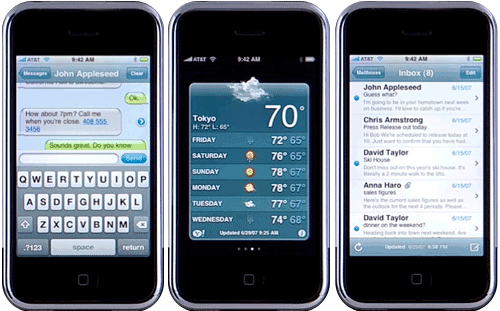
I could hardly make a post about Mobile Typography without a reference to the Apple iPhone. The UI of that object of desire is really quite beautiful, and graced with true, genuine, honest-to-God Helvetica. Now, as far as I know, it’s also the only phone that’s been advertised purely on its UI, because that’s what the whole thing is about. Behold:
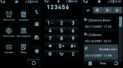
The adverts for the Samsung D840 showed you the hardware buttons and how the glossy front of the phone is so reflective it can be used as a mirror, but with no showing off of the UI. The Motorola RAZR had a similar set of ads - you’re invited to gawp at the thin, sleek hardware, but you’re not shown the UI. Same for most of the Nokia ads in fact. That’s because the default UI is at best workable, at worst, hideous. Maybe it’s deliberate? If the UI of these other phones was usable, responsive and beautiful, there’d be little need for themes and a big source of revenue (from advertising on the theme sites alone) would disappear.
Well, it’s a theory.
And while we’re on the topic of phone UIs not being shown in adverts, here’s one that should have been. The Prada phone by LG. Follow that link, and once the great chunk of Flash has loaded, try and find some shots of the UI. They’re not there. And yet, courtesy of this article about the LG Prada on GSM Arena, you can see that it’s absolutely nothing for them to be ashamed of. I love the typeface too, especially the ‘w’. Not that you can see it too well on the examples. There are some close up photos in the article, mind.
This is what’s inspired me to create the theme for the S60, in fact.