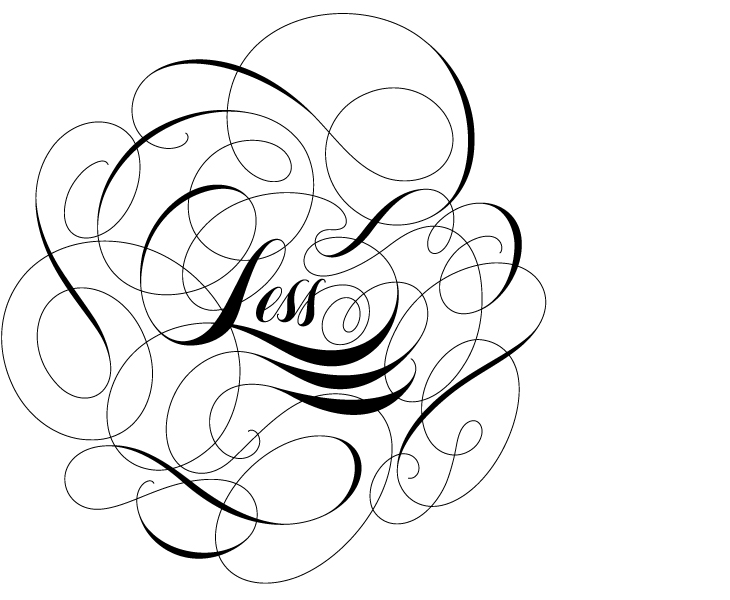
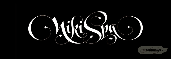
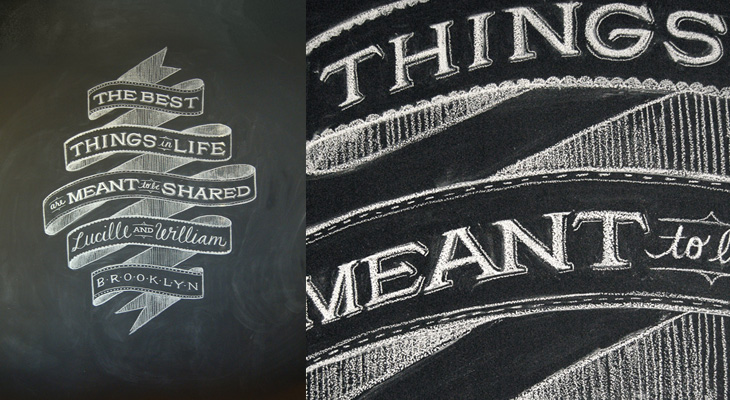
Lettercult has posted an incredible collection of custom lettering projects by hundreds of lettering artists, all completed in 2010. There are so many projects that they’ve split the post across two days, and there are 33 (quite long) pages in each post. I’ve not had a chance to go through all of them yet, but the variety and the quality is remarkable — so much to look at! I’ve posted a few favourites below, one by David Croy, another by Jordan Jelev of The Fontmaker, and I’d be surprised if you’ve not seen her work already (but very worthwhile admiring again), a piece by Dana Tanamachi.
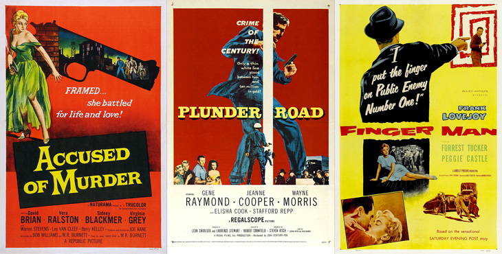
Andy Clarke (aka @malarkey) tweeted a couple of links to Where The Danger Lives, a site on crime films, which has reviews and in-depth info on classic crime and noir films, studios, and recently, a countdown of the best posters used to advertise the films. Each poster has been restored and cleaned up so you can see it clearly (with links to a decent size larger version to look at) and an illuminating analysis of the design and how it fits the film. It’s all pretty impressive stuff so far (I’ve only read a few of the posts as of writing this), so go and take a look.
What would Das Kapital, The Iliad or Faust look like if they were printed on a single page? What about Macbeth? This set of four posters by All The World’s A Page can show you exactly that. Oddly, they’re simultaneously both compelling and repellent — the concept, the flow of text, the exposed structure (especially in Macbeth) and the beautifully consistent and even colour give you a sense of wow, look at that, while the sheer scale of them, the obvious difficulty in reading them feels intimidating, even slightly upsetting. Not too upsetting, I might add; I bought two as soon as I saw them. I can’t wait for them to actually print Ulysses too…
There are many examples of ‘animated typography’ out there, some of them are good, most of them are crap, and some just take you by surprise and are utterly brilliant. This one on Newgrounds, sent to me by a friend, fits the ‘utterly brilliant’ category, but for slightly different reasons than you might expect.
It’s an animation of a review of a game on the site, written by someone who, if we’re being charitable, isn’t a very careful typist. The animation itself (by Mick Lauer) is well done, with some nice touches — the pause to define ‘contrail’ and the ‘explain to me’ parts are particularly good — and Impact is a perfect choice for the subject matter, but what really makes it brilliant is the voice track. It was done by voice artist Deven Mack who I imagine has quite the career ahead of him. Well I hope he does.
Advice To Sink In Slowly is a project set up in 2006 for graduates to pass on advice to first-year students when they arrive at university. Graduates design posters to illustrate their piece of advice, and each new student is given one at random — the idea being that each graduate now knows something they wish they’d known when they started, and that this is how to pass on that advice in a creative and welcoming way. It’s a great idea, there are some really good bits of advice in there — even the more obvious ones are cleverly illustrated so are made fresh and new. I wish I’d had some of these when I arrived at university.
A few people tweeted links to this brilliant collection of packaging redesigns by Antrepo — they’re done as an exercise to illustrate the idea of reducing the design of the labelling to its simplest form, while also showing an intermediary step of a ‘partially simplified’ design. It’s interesting the effect it has on the different products. Some gain a sense of being a premium, high-value product, while others start to resemble economy, basic versions. The Pringles packs look pretty basic; with the full-colour printing gone, the basic nature of the cardboard tube stands out, and with the simple black printing it looks like a supermarket own-brand or something bulk-bought by caterers. On the other end of the scale you have Nutella and the Schweppes drinks — both of them look like the kind of ‘artisanal’ packaging you’d see featured on the Dieline or similar targeted at people who want the same old stuff but to feel a bit special about buying it. And having said that, the Corn Flakes one is just great. It’s absolutely perfect — if I ate cereal then packaging like that would definitely have shelf appeal with that beautifully simple and stark lettering, and how. It reminds me a little of the General Mills Kix packaging, which I also like a lot.
Visit Antrepo’s site for more info and links to the full set.
Of course, packaging for most fast moving consumer goods is brightly coloured and covered in imagery for a reason — it’s to draw the eye and make its purpose, contents or intended use immediately obvious to the shopper. Without going into some kind of pop-psychology analysis of consumer habits, it’s interesting to think what the manufacturers are intending with each package. The simplified Mr Muscle one looks great, but on the original you can easily tell it’s for windows and tiles even without reading any of the words. Similarly for the Durex boxes, I’d hazard a guess and say the orange box contains flavoured ones — the word ‘select’ hardly makes that clear — again, the original packaging wins out.
The food ones all have some kind of serving suggestion (albeit a ridiculous one in the case of the Corn Flakes, I mean, that’s quite a tempest going in the bowl) designed to put the image of the food in your mind, a simple association that makes you more likely to buy it. The only one I think where that doesn’t happen is with the Schweppes bottles. The type is pretty small on the simplified one, but it’s a hell of a lot more legible than the original. Given that you’re likely to see bottles like these in a fridge behind a bar, you’re going to be hard-pressed to read the label and form an idea in your mind that maybe you’d want mandarin as the mixer in your drink, as opposed to orange juice, say. You’re going to look and see confusing labels all done up with sparkles and images of bubbles, and not know if it’s soda and plain old OJ in them or something more special. You’d just end up asking for something generic, and end up (in a lot of British pubs at least) with some rank pre-mix out of a tap on the bar. I could mention at this point that Red Bull might be considered drinkable by some, and therefore a food. It’s not, but it is easily recognisable in a behind-the-bar fridge, which tells you something about British pubs and the drinking culture they encourage, but that’s an entirely different rant.
So yes, beautifully simple packaging is a wonderful idea, but I doubt we’ll see many big manufacturers opting for it, sadly.
I wanted to trace this for the fun conceit of the C being used as a retort stand. It’s an interesting way of dealing with the open space created inside the Ch pair — I don’t think it quite works, the horizontal bar is a bit clumsy and the positioning of the retort glass itself could be more balanced, but it is all rather fun. I’ve traced it as best I can, not having any higher resolution example than what you see below, so yes, the script is quite clunky. At a certain point you realise you’re creating rather than copying. Who knows, maybe the original was even more wonky? I’d love to see a high-res example of it though. Originally seen here on CO₂Comics, via Drawn.
I love architecture. I love buildings — the art, the engineering, the design, the culture and history of them, and how they form en masse actually places that people recognise and form emotional attachments to; the design of cities, their growth, evolution and (perhaps sadly) eventual decline are all utterly fascinating to me. So I sometimes write about architectural stuff here, as it has a kinship in my mind with the design of type and lettering. I should warn you, this post is a bit of a rant, and because of the subject matter is a tad more political than normal. So, with that out of the way, we can proceed.
I follow a fair few architecture-related sites, one of which (and the most regularly and rewardingly updated) is Arch Daily. It’s basically a pretty damn fine site if you’re into architecture, featuring thousands of projects, new and old, innovative and traditional, and so on. One important thing I’ve noticed is that most of the larger projects being planned and built have a lot in common with each other, with innovation and traditional technique alike apparently reserved for the smaller projects. I’d actually go further and say these large projects are not merely similar but all subscribe to the same blank, unrelenting anonymity — an utterly uninspiring (if glittering and crystalline) mediocrity. Look at the renders below (from this article on New Chengdu City Center on Arch Daily), they could be anywhere in the world:
We’re not talking about adherence to some new International Style here — these buildings subscribe to no ethos, no design principle, no philosophy. They are the safe, neutral buildings guaranteed to be approved by conservative planning departments wanting the skyline of New York, Chicago or Hong Kong at any cost, ignoring the culture, history and sense of place of the city they’re supposedly ‘improving’, and with little to no apparent understanding of the conditions that gave those cities their skylines. Oh sure, they’ll package up some significant buildings, a monument here, a couple of streets there, and they’ll be prettied up and photographed for the ‘culture’ section of tourist brochures, and meanwhile vast swathes of the city will disappear under motorways (labelled ‘boulevards’), office blocks (sorry, ‘towers’) and shopping malls (or ‘pedestrian-friendly traditional streets’) and dreary dormitory estates (‘upscale residential developments’). Then they stick some thin screed of greenwashing over the top and invoke the holy acronym of LEED and declare themselves satisfied.
At this point I probably sound like some arch-traditionalist, railing against the depredations of the modern world and all it brings, but that’s not my intention, or my point. My problem with these developments is that they’re being sold to rapidly-expanding cities around the world and aren’t being designed with the long-term life of those cities in mind. Cities like Chengdu have ancient histories and in some cases still have some of their original structure and urban fabric intact — architecture firms, planners, and most importantly, citizens need to recognise what’s valuable about the best and even the worst areas of their cities and think long and hard before approving any large-scale improvements. If this sounds like western cultural imperialism, the jumped-up western opinionist telling people desperate for an improvement to their lives that they should keep their barrios, their slums, their favelas and their cramped hutongs then perhaps it is. But then, I’m not the only one to say it and this isn’t to say those slum areas should stay slums, that they can’t improve or change on smaller, community-level scales. There doesn’t have to be an overarching project to demolish and replace them with some glittering arcology, instead, a longer-term effort to support the communities within them and prevent their control by gangs, just like what’s happening in the favelas of Rio de Janeiro, including the infamous City of God itself:
For decades the favelas have been a deadly battleground, where thousands died in the turf wars of rival gangsters and drug lords. But two years ago - in anticipation of the football World Cup in 2014 and the 2016 Summer Olympics, the government launched a new initiative. Since then the Police Pacifying Units (UPP), have moved into 12 favelas, freeing 150,000 people from the control of the gangs and bringing a new calm to embattled neighbourhoods.
While the Chengdu development appears to be built at the edge of the metropolitan area, giving perhaps the possibility of the city’s core remaining intact, there are a whole new set of problems as the city expands into wild areas and farmland. Earlier this year Václav Havel explained some of the problems this kind of expansion can cause, citing his experience of the changes to Prague in recent years:
What was until recently clearly recognisable as the city is now losing its boundaries and with them its identity. It has become a huge overgrown ring of something I can’t find a word for. It is not a city as I understand the term, nor suburbs, let alone a village. Apart from anything else it lacks streets or squares. There is just a random scattering of enormous single-storey warehouses, supermarkets, hypermarkets, car and furniture marts, petrol stations, eateries, gigantic car parks, isolated high-rise blocks to be let as offices, depots of every kind, and collections of family homes that are admittedly close together but are otherwise desperately remote.Václav Havel at Forum 2000, October 2010
You can see the effect of this round many British cities; instead of a boundary, the place tails off with business parks, warehouses, big-box stores, and strange areas of empty land, prevented from becoming wild, not used for agriculture, not built on, just waiting. There is nothing about these hinterlands that gives you any clue to where you are, not just which city, but which region and (road signs aside) even which country. Governments bang on about growth, endless growth, but very few people seem to ask what kind of growth it is we want. The kind of growth that turns our cities into this kind of anonymous emulsion of steel, glass and concrete doesn’t seem to be the growth anyone would choose, but the consequences of any individual action that bring it about are so far removed that effectively our choices are abstracted to boardrooms and cabinet offices, where we have little say. When faced with the Anywhere City, should you just shrug and accept it?
I’ve had some of these woodcuts of The Triumph of Emperor Maximilian open in various tabs for a couple of weeks now, daring me to trace some of the captions on them. It’s not the easiest of jobs, as even in the highest resolution some of the fine lines are too faint to make out clearly, and some of the strokes are hard to understand, so I figure I’d trace one of the banners and see how it worked out. Well, not so bad, but a good learning exercise — the extra flourishes and swashes seem particularly arbitrary (“When are they not?”, you might ask, but these especially so) and it’s interesting to see how this rather florid style is put together. I guess that makes it sound like I’m not fond of it; quite the contrary, I love it.
A couple of the captions from here, obviously not in the same relative positions.
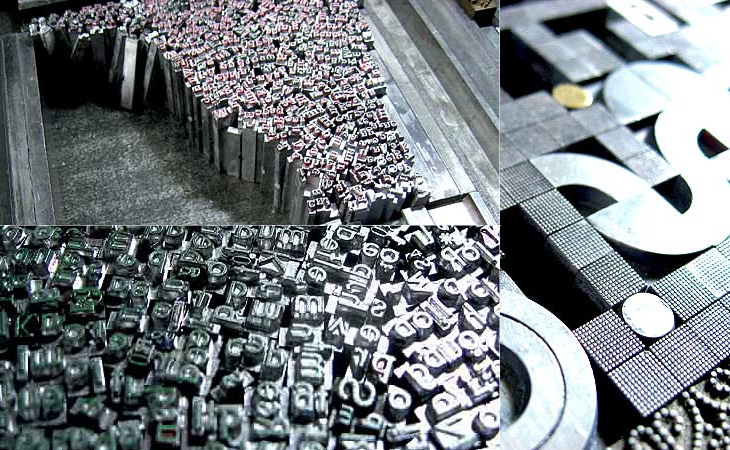
I’ve posted about Martin Schröder’s blog before, but with the images he’s been posting of his recent work I think it’s worth another link. I love the ‘making of’ pictures he puts up, showing how he builds the type in the forms, all that gleaming metal is quite something special: