The Ludlow Project

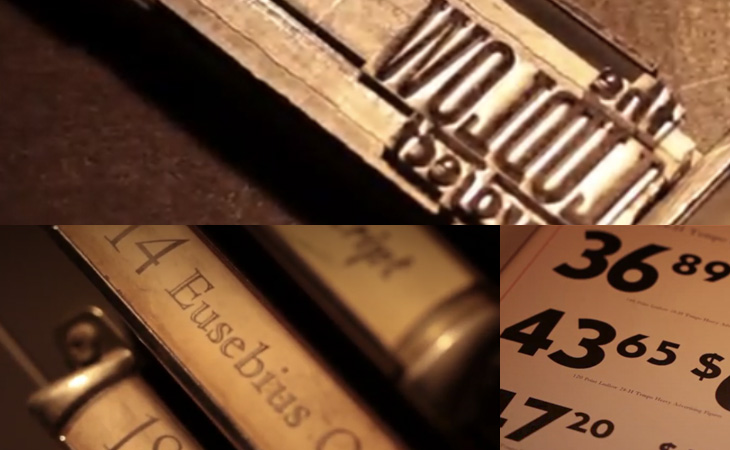
A bit of a campaigning post, this one. The International Printing Museum is running a Kickstarter campaign to expand their collection of matrices for the Ludlow Typograph. It’s a worthy project, to keep an example of fairly democratic technology in use and in people’s awareness, to keep rare typefaces in use and to let people around the world use them – and, well, just because. The Ludlow is similar to the Linotype, but excels at producing slugs for very large type - over 200pt. In the words of British Letterpress:

The principles behind the Ludlow are simple — the operator collects a small brass mould for each character needed in the line.  These are assembled into a ‘stick’, a small frame, and the moulds are clamped together to form a line of moulds.  This stick and moulds are then clamped in to a machine which injects hot metal into the moulds.  A line of type is cast and ejected from the front of the machine.  The moulds have to be distributed back into the relevant cases by hand. Unusually, the Ludlow can cast between 6pt and 228pt type on slugs without changes to the machine.  Other systems have to be modified with each size change. British Letterpress

If you’re interested in helping keep some printing technology alive and not just a piece of history, you can back the project here (there are some nice rewards on offer too).
The Typography of Speed

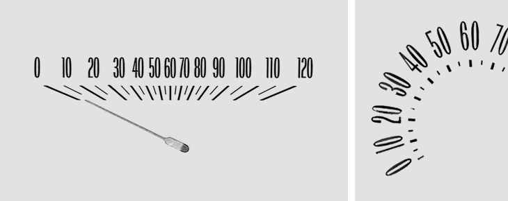
I was taken by this collection of Chevy speedometer designs brought together by Christian Annyas. As I’m always a passenger (I don’t drive) I’ve had plenty of time to study the details of the dashboard and to note the little typographic touches there. Purely graphically I much prefer the horizontal kind of indicator, but in terms of function the dial has an advantage in that the numbers are spaced evenly. The horizontal kind means it’s harder to differentiate at a glance between speeds in the centre of the speedometer, simply because they’re bunched together. It’s also just the range where most speed limits are. Just in writing this article I’ve wondered whether a logarithmic scale might work better for speedos – giving you greater read accuracy at lower speeds, and less at higher ones. The odds of killing someone in an accident change dramatically between 10 and 40 miles an hour, but don’t change much at all above that (i.e. it’s pure chance whether they die or not), so if you’re going fast the only practical awareness of your speed is whether you’re near the limit or not. I’m not entirely convinced by my own argument, but I’m not exactly a fan of going fast in cars and generally grumpily mutter about people going too fast on the roads anyway. Anyway, go and take a look at the full collection, here.

Music Typewriter

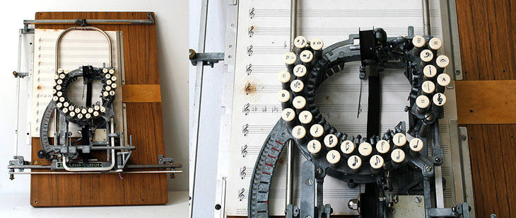
I’ve never seen one of these before, and I’ve never even heard of such a thing. A typewriter for music! I must admit it does seem like an obvious idea, but I’d had in mind the scene of a composer in some drafty garret, gripped by an urgent muse, scratching out notes on parchment with a tattered quill by feeble candlelight. Or is that just poets? The Etsy description for this is pretty interesting, and there’s a link to a PDF with more information on the device, and of course if you’ve got six grand spare you can actually buy it. No more feeble candlelight for you.

Geometric Batman

OK, nothing to do with type or lettering, but I do like to post a bit of illustration from time to time. This caught my eye yesterday on this isn’t happiness, an illustration by Liam Brazier. He’s done a load of other geometric illustrations (including this rather nice Superman one), but the colours and balance of this one appeals to me the most. Lovely stuff. I should mention that you can buy prints of his work from his site, and there’s a short Q&A with him here, on My Modern Met.

Automagically

Another thing I marked as “to look at later”, merely because of the big beautiful lettering. I was wondering what on earth it was all about and only managed to find a few pictures of it from this year’s Macworld and a reference to an iTunes plugin, which may or may not be this (the site doesn’t feature anything with this lettering on it, sadly). Whatever it’s for, it’s lovely. If you know more, let me know. I found it here.

Update: Thanks everyone. Seems Tune Up Media actually blogged about it here.

Suzy Lelièvre

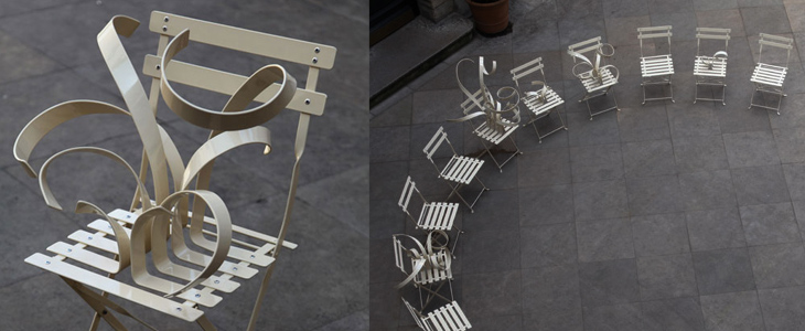
I’ve been buried in bezier-land for the past few weeks these chairs by Suzy Lelièvre, though they’re not type, illustration or lettering, appeal to my appreciation of curves; a physical world instance of beziers. They look like what you get when you try and drag a point in Illustrator and miss, dragging the line itself into some crazed loopy explosion. So yes, noted here for their appeal to all vector designers, and of course their wit.

I Am The Coin

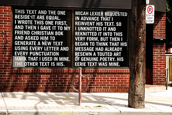
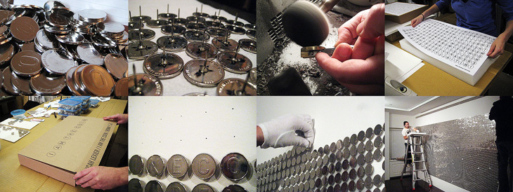
Another serendipitous find, this time via Font Bureau on Twitter. The linked image, of a piece by Micah Lexier and Christian Bok, got me looking for some background on it, and more info on the artist himself, and through that I found this wonderful installation: I Am The Coin, a story from the viewpoint (apparently) of a coin, told in 20,000 coins attached in a grid to a wall, with no spacing or punctuation. The bottom half of the grid has the story in a conventional readable form, while the top half has the mirror image of the text. Wonderful stuff — I’m off to have a look for more of his work.

Below is the image that Font Bureau linked to, followed by a few from the I Am The Coin website. Lexier’s site is mostly ‘under construction’ but there are a few links to further information, and of course there’s always Google.

Update: The original image is by Jacklyn Atlas from this article by Booooooom.

Linked image from Font Bureau’s tweet.

Some ‘making of’ images from the I Am The Coin installation

Sports Illustrated Book of Bridge

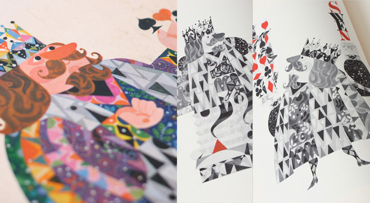
Found via Drawn, this post by Javier Garcia on his blog about the 1961 Sports Illustrated Book of Bridge. The book is illustrated with work by Jerome Snyder, whose work I’ve apparently often admired in the past, even though I didn’t know they were his. His pieces are dense with detail and (when printing allows) rich with colour — that he illustrated a book about bridge with playing-card inspired designs is pretty exciting; how did I not know about this before? I’ve managed to order a copy, so hopefully that’ll arrive soon in all its inspirational splendour and I’ll be able to take my own pictures — these I’ve nabbed from Garcia’s blog post:

Interestingly, Garcia has also featured a set of cards designed by the ceramicist Stig Lindberg that’s worth a look at, and also links to the Grain Edit article about those Jean David El Al cards (which inspired me to buy a set and post about it here).