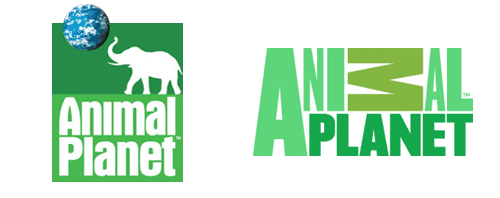
I just saw the new Animal Planet logo here, then after a search, here (of course). My first impressions weren’t too great, immediately I was wondering why the M was on its side - it looks like a reversed sigma, a kind of mathematical AniΣal Planet, if you will - and the mixed of weights and stretched type just seemed confusing and messy. However, after looking at some of the applications on the website (there aren’t many yet, though look at the videos on the home page, and here) I’ve changed my mind. Despite the obvious typographic objections (stretched type - ow!) I actually like it. I still think the sideways M isn’t too great, but overall the logo has a strong identity and fits with the aim of moving the channel from exclusively family friendly fare. They wanted to make the channel more grown up, and I think they’ve done it, simultaneously cutting the apron strings to the main Discovery brand by losing the spinning globe. I often like global ‘over-brands’ like Discovery had but it requires a consistently high standard of application and I think the old Animal Planet logo shows that that wasn’t the case. The new logo has a big advantage in that as it lacks imagery, it has a much wider range of applications for combining it with photography and video - a big strong typographic logo is much easier to apply to transitions, fades and tints than something with an image of an elephant on it, by far. The old one had some nice applications, but I look forward to far more from the new one.

