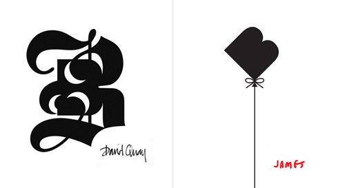
This is interesting, the Bunch design agency got a whole bunch (geddit?) of designers and illustrators they admired to ‘respond’ to their identity. As a result they got a whole load of variations on their logo which they’re now using as part of their identity. Very clever indeed, as commissioning all that work conventionally would be very expensive indeed.
A few of the results are shown on the CR blog page, but I picked my two favourites here. The blackletter style one is very interesting, as the negative spaces aren’t simply a reversed image of the implied continuation of the stroke, but an additional shape on the outer edge of that stroke. Very nice.