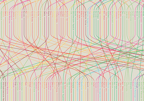
I was having a look through Behance’s Typography Served website and found this. It looks like it’s in Jihad Lahham’s portfolio (well, I think it does) but on his site there’s a post with pics and nothing else about it. Need info!
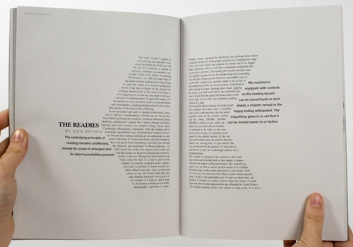

I was having a look through Behance’s Typography Served website and found this. It looks like it’s in Jihad Lahham’s portfolio (well, I think it does) but on his site there’s a post with pics and nothing else about it. Need info!


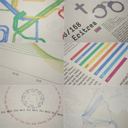
There are some great infographics here. There’s a video on gestalten.tv about their book project, Data Flow, and some documentation available here, in German. All good stuff.
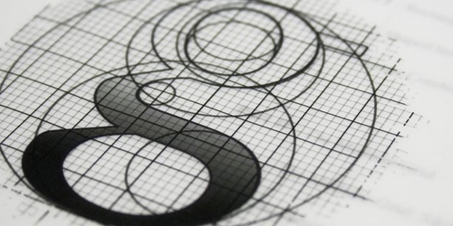
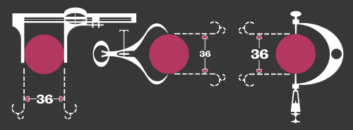
This is fantastic. I think I saw it here, linked from Design Observer first, though quite a few sites have linked to it too, but that’s no reason not to link to it again. It’s got some beautiful touches in it, with a gentle kind of humour and some reasonably groan-worthy puns. I love the little joke about the perfect proportions of the dot, playing off the classic ‘36-24-36’ hourglass proportions supposedly ideal at the time for women. The calipers are great, with the little hearts instead of arrows for the dimensions, and just demanded to be redrawn:
A few sites I’ve seen it on have lamented that things like this aren’t made anymore because it wouldn’t be popular, that people would be afraid of anything that mentions ‘hard stuff’ like mathematics. Perhaps they’re right, and maybe it is really anti-intellectualism preventing stuff like this being made today, but the animation is hardly a mathematical treatise. The only mentions of anything mathematical are the title and a few puns scattered here and there, ending in the rather nice, “To the vector go the spoils”.
The real point of this animation is the animation itself. It’s certainly not the story: a simple morality tale on the importance of hard work and discipline (and also, avoiding narrow thinking) to achieve your desire; in this case, a remarkably shallow and feckless sounding creature who is easily wowed by flashy glitz and glamour. Perhaps these days we might wonder whether that was worth all the poor line’s effort; “You can do better than that” we might say.
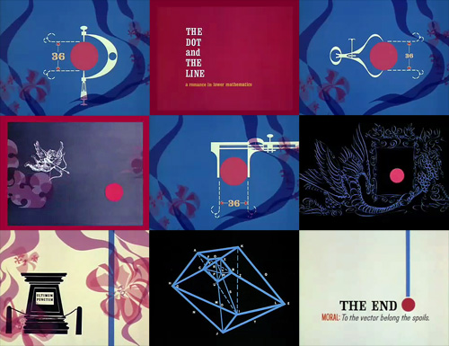
So the animation seems like a kind of showreel, a portfolio piece, beautifully done of course, but more remarkable in that it was released by the studio commercially. I have a little theory that it might have been released with the new technology of colour TV in mind - the audience at the time was very small and would have consisted of those who could afford it; professional, college-educated people? That might explain the choice of story too.
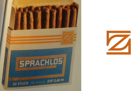
ISO 50 posted about the Taschen book, “East German Design from 1949 - 1989”, with some photos of the inside. There’s a fantastic ‘z’ logo on the cigar box, which of course I had to trace. I’m thinking of getting the book, as East German design shows how creativity can flourish even when resources are limited, and as I found when writing this piece, the resources were often very limited indeed.
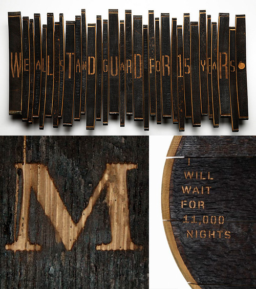
I’ve been following this series of articles by Johnson Banks about their Art from Barrels project for Glenfiddich. The aim of the project was to get across the length of time it takes to make a barrel of Glenfiddich Single Malt, and the end results are pretty interesting. I haven’t got all that much to say about it, especially as the articles explain it all pretty well, other than to say I’ve discovered I like sandblasted letters in charred wood:
Two of my favourite animations of all time are the advert H5 did for Areva, and their Royksopp video. I can watch them over and over again; they’re so good. So I went to the H5 website recently to see if there was anything else they’d done like that, and found the video for Alex Gopher. I’m sure I’ve seen it before somewhere, but it was a long time ago and I hadn’t made the connection it was done by H5 too. It’s available to view on YouTube, but you can see it on H5‘s (all flash) website by clicking ‘films’, then ‘clips’, then ‘alex gopher’.
Anyway, I like things like this, where the label is the thing itself, and it reminds me of the National Geographic trailers for Seconds from Disaster that I linked to before. I’m thinking it would be amusing to remake Powers of Ten in this style - zooming into the word ‘galaxy’ to see it made up of widely spaced words like ‘star’ and ‘nebula’, and so on, down to the sub-atomic level, with everything its own label.
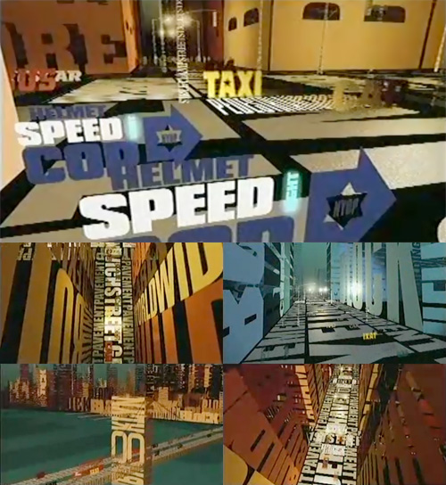
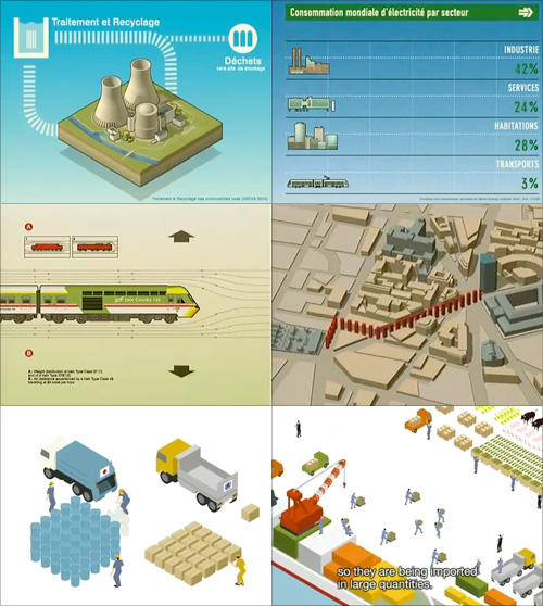
Screens from the Areva advert, the Royksopp video, and this rather good public information film by Japan’s Ministry of Agriculture, Fisheries and Food.
Talking of labels becoming the object itself, there was a short film, I think on the Sci-Fi channel, about a post-apocalyptic future where the apparently normal, happy, consumerist lifestyle everyone leads is in fact an illusion. There are many layers of unpleasant illusions underneath the ‘nice’ one to stop people trying to break free and see the real world. I particularly remember the ‘real world’ in the film as being made up of cardboard boxes labelled with the name of the object it was supposed to be, and a big barcode (the name set in Helvetica, natch), with one scene showing a load of cardboard boxes labelled as ‘Black Leather Briefcase’ going through some device (gotta love sci-fi) and emerging fully-clad in the illusion of black leather briefcases. I’m sure the film is nowhere near as good or as profound as I remember it, but does anyone know what it was?
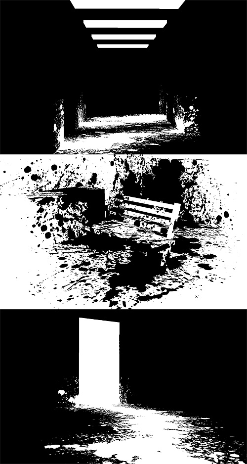
A beautiful name, and a beautiful concept for a game. The idea feels rather illustrative - finding your way across a blank white world with a load of black ink to delineate edges and discover hidden objects, it’s like creating the world of a graphic novel on the fly. To add to the effect, the game seems to have some reversed areas too, and the white paint on black really reminds me of Sin City.

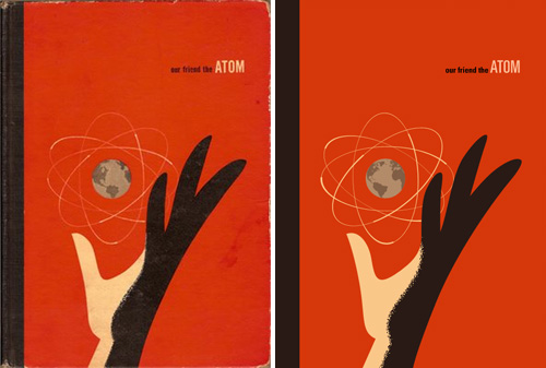
Found on ffffound a little while ago, this beautiful book cover. It reminds me of some books I used to have from the same era - I had a National Geographic book about all the massive engineering works being done in America in the early/mid 20th Century, from straightening and deepening the Mississippi to the building of the Hoover Dam. It was a bronze-coloured hardback with a big cross-section of the dam in white, and a plan of a canal cut across a loop of a river, in black, both embossed into the surface. I wish I still had it. Still, I’d only trace it as a vector like Our Friend The Atom, here:
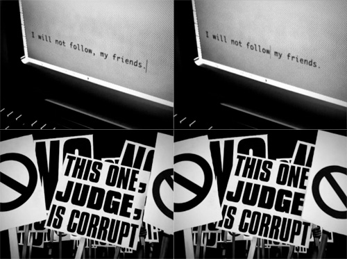
This pair of videos by the Brazilian Press Association is pretty interesting to watch. I’ve had the link bookmarked for a while as I like the animation style. In Portuguese and English, the animation demonstrates how the placement of a single comma can alter or reverse the meaning of a sentence, and makes the point that no one should be allowed to make any changes to what’s written in the press, no matter how ‘small’ the edit:
With the animation style for this piece being rather good, I can’t help but think that while there’s a lot of ‘typographic animation’ around, most of it is pretty samey and unoriginal, repeating over and over the idea of attaching each new word to the previous one, rotating the viewpoint, zooming in or out and then attaching the next word. The style can work wonderfully, but a lot of animations leave a lot to be desired - using typefaces that simply don’t work at such a range of scales and angles, are badly kerned, use too tight or too loose leading, and sometimes look just plain rushed. Sometimes they come so close to a great result, but a lack of polish (and checking for typos) limits the effect.
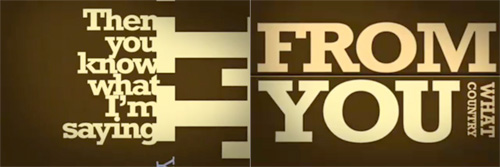
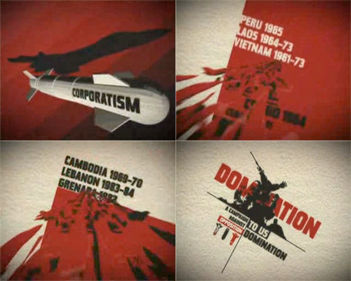
The style demands a great deal of attention to detail, which is why the really good ones are so impressive. The Pulp Fiction one is, to me, the acme of this style - being made up almost entirely of text, but I think that the animation on The Project for the New American Century deserves a lot of credit for using it with more traditional 2D and 3D animation to convey a powerful and provocative message.
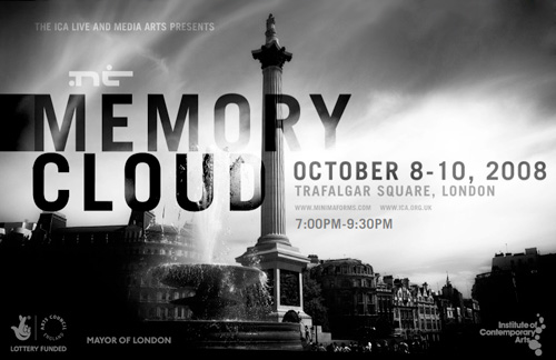
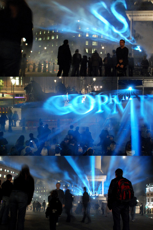
Alas, I found out about this way too late to visit it in person, but there are some pictures of the event on Flickr. I love the way the words float, apparently in multiple planes; a rich, multilayered and compelling effect; the silhouettes of the crowd, the dramatically lit lush architecture with the bright, translucent clouds of glowing words in the centre. Maybe the photos make it seem more impressive than it was, but I’d certainly like to have been there… with my own camera.
