Nothing to do with type! I was looking for an emulator to run Lander, or a port of it, then only an hour later I came across this image of a sculpture by Stéphane Sautour here. Nice similarity…
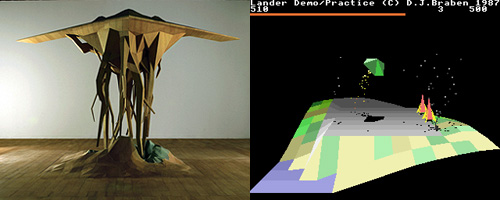
Nothing to do with type! I was looking for an emulator to run Lander, or a port of it, then only an hour later I came across this image of a sculpture by Stéphane Sautour here. Nice similarity…

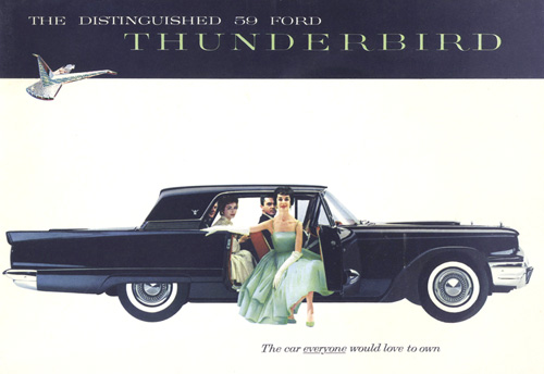
The car everyone would love to own!
Well, based on this fabulous brochure, who could blame them? Found on the Old Car Manual Project, another of those collections-of-things sites that you bookmark because you know you’re going to find them useful someday. This site is a great resource for 20th Century typography, illustration and layout, not to mention car design.
I recently came across the excellent site, Liam’s Pictures from Old Books, and while browsing came across scans from Letters & Lettering: A Treatise With 200 Examples.
When I had first decided I wanted to design typefaces I looked around for books on the subject, and yet could never find any book that worked as a primer, a beginner’s how-to manual*. If I’d have come across Letters & Lettering back then I’d have found a very good book from which to learn about constructing letterforms. The examples you can see here (and lots more on the page on Liam’s site) are lovely and clear and show the construction of, say, Trajan-esque forms. There are other examples in the book, blackletter and modern type forms, but it’s the large outlines that interest me here. This site will definitely go in the bookmarks.

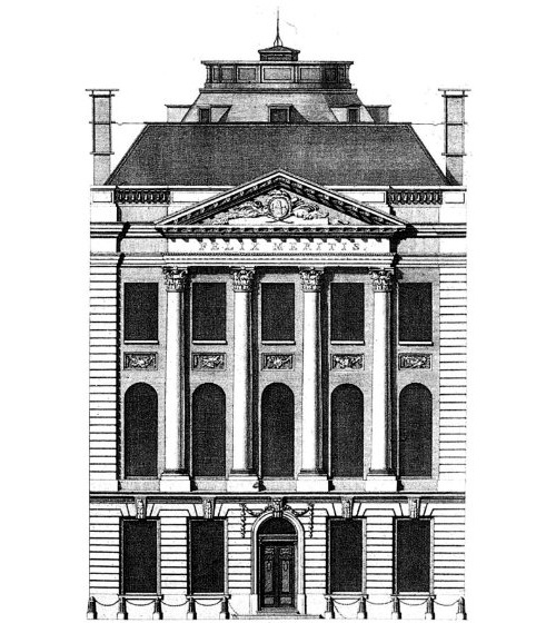
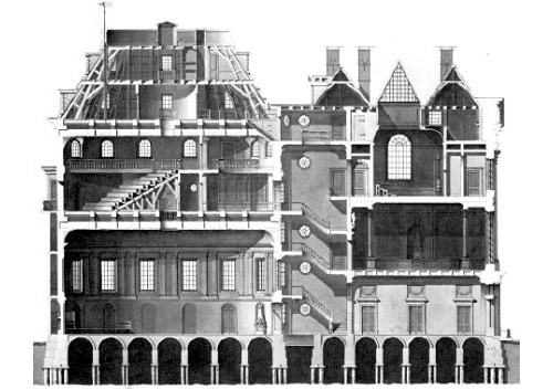
Ah, another great passion of mine: architecture. So I created a new category for it. I came across Andrew Cusack’s site this weekend, and it’s full of wonderful photos, illustrations and articles on the subject. A couple below, though I have to say this has to be one of my most favourite buildings. I’m not fond of the interior, mind.
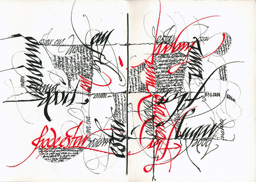
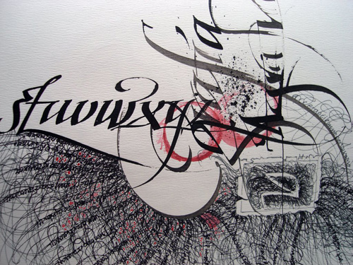
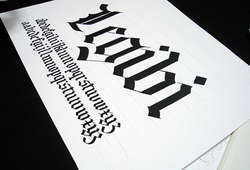
Something I’ve been meaning to blog for a while. This site is a veritable treasure trove of calligraphic inspiration. Three examples of my favourites below. Visit the site for much more.
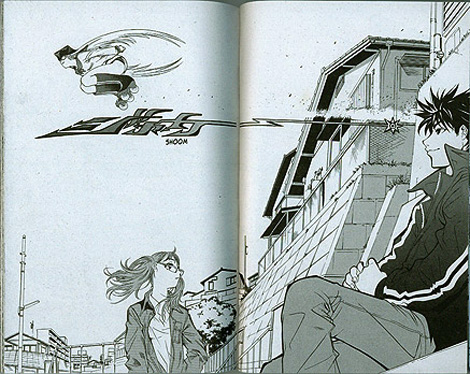
I just read this pingmag article on manga translator Simona Pini. I’m enjoying the idea of sound effects and actions being represented as graffiti-style japanese text.
I just came across “The Ladies Tea” on Swissmiss just now. Like her, I smiled at the logo, which is rather lovely, but couldn’t help but notice the awful kerning on the type. Below I’ve got the original on the left, and a version where I simply retyped the name in Arno Pro on the right. My modified version isn’t perfect, but at least the D-I-E combo isn’t quite so munged.

Yes, I know there’s a missing apostrophe, but putting it in doesn’t help the logo one bit.
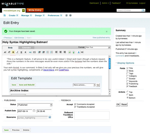
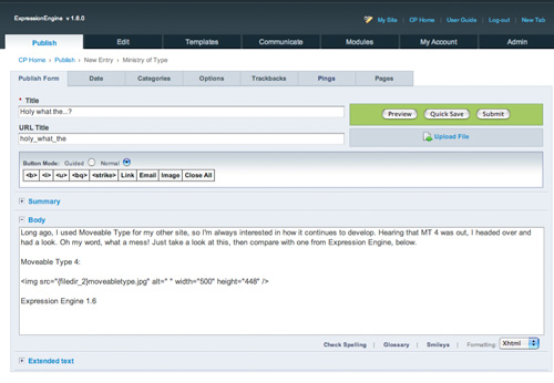
Long ago, I used Moveable Type for my other site, so I’m always interested in how it continues to develop. Hearing that MT 4 was out, I headed over and had a look. Oh my word, what a mess! Just take a look at this, then compare with one from Expression Engine, below.
Moveable Type 4:
Expression Engine 1.6:
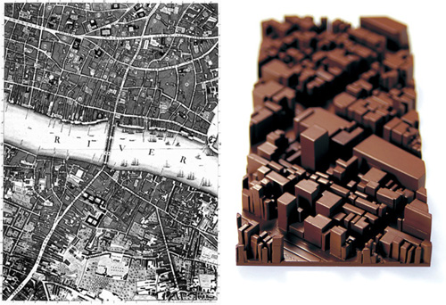
Not really related to type or illustration, but it comes under the definitions of sculpture and architecture, which is close enough for me.
I found this a while back on pingmag, on an article on chocolate. Unfortunately, like many sites for exhibition spaces, they seem to want to hide all the information from you and expect you to turn up to the thing on a mere hint of a title and a brief synopsis, so no link to more images, background info or what the piece at right is about. Whatever, I like it. I love maps, especially 3D ones and antique ones, like this one of London.
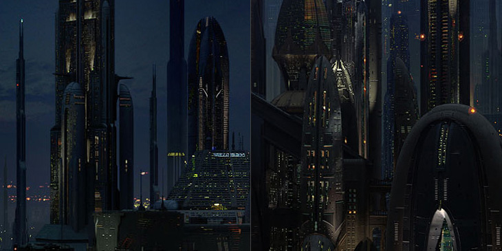
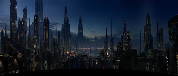
Related to this, I came across a load of great panoramas of Coruscant, the city-wide world from the Star Wars series. I am particularly fond of this one.
I saw this on Serif’s ‘What are you currently working on?’ series. I often set type like that, but given the brands I work with, I rarely have a chance to work with such an ornamental serif type. It’s lovely.
