I love the numerals on this, found here. I wonder how much the temptation was to align the bottom of the ‘1’ to the midpoint of the ‘D’?

I love the numerals on this, found here. I wonder how much the temptation was to align the bottom of the ‘1’ to the midpoint of the ‘D’?
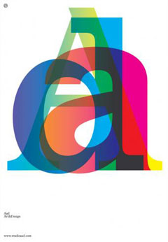
Caught my eye: An inspirational bit of lettering for (and by) AAD.
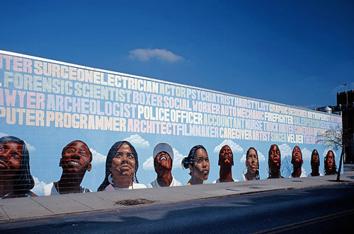
I was just looking through the Time piece on The Murals of Philadelphia, and came across this rather wonderful bit of lettering. I love the subtle changes in the colours to differentiate the words and the slight variations in the letterforms and x-height. It’s a really nice piece, I love the faces at the bottom too, but it was the lettering that caught my eye. Also, this one is just wonderful. Go and look at all of them!
This image has been knocking around the hard-drives of my last four computers since I scanned it in. I’ve always admired the typography of it since I found it on the pub table all those years ago. The joys of being type-obsessed, eh?

You know that feeling you get when you’ve had an idea to do something, and you’ve not got around to doing it for ages, then you come across something that shows that not only did someone else have the same idea, they’ve gone and implemented it? And very well, too. Well, I’m getting that now. Stephen Barnwell has made these incredible banknotes for the fictional Antarctic colony of Nadira, and for various other fictional microstates. There’s also the non-existent denominations of the Dream Dollars, which you can download, and various other products which you can buy. I think the whole thing is fantastic.
Still, it doesn’t stop me doing what I intended to do as my intention is different. I just like banknotes, I could look at the designs of them for hours, and hours, and hours. A bit like maps really - give me a good atlas and I could look at it all day. Maybe I just have an obsession with finely drawn lines? Either way, I have a collection of images grabbed from around the net. I’ve linked to the original page where it still exists.
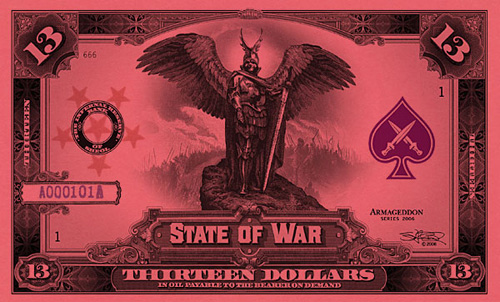
First, the aforementioned Stephen Barnwell’s latest. The 13-dollar note from the State of War:
Then a selection of Robert Deodaat Emile Oxenaar’s designs for the banknotes of The Netherlands, which to me represent the only real argument against the Euro. Why couldn’t the European Commission have got him to design the money? Found on this article on Creative Review’s blog:
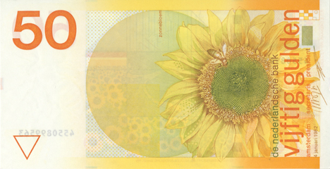
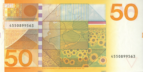
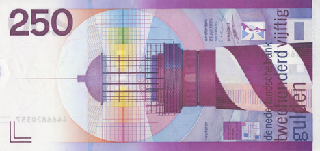
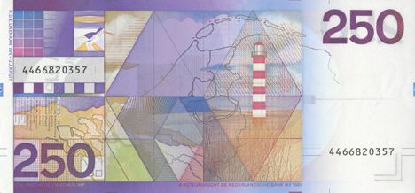
And then (and it took me a while to re-find these) the beautifully simple banknote designs by Herbert Bayer of the Bauhaus. These were done for the 1923 emergency issue of banknotes for the State of Thuringia in the Weimar Republic. The only place I could find a decent image was through the eBay store “Room 606”, where you can actually buy original notes.
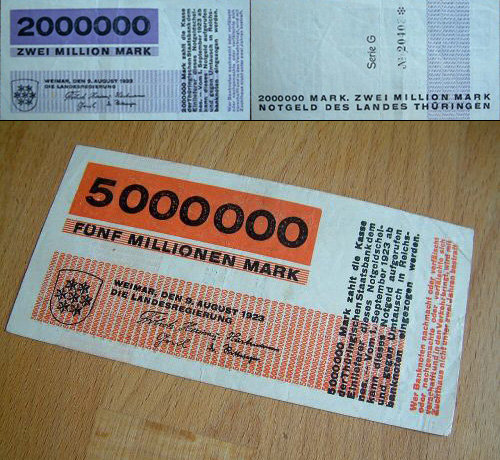
I also came across some images of banknotes that feature scientists, engineers and mathematicians. I won’t post the full images, but here’s a couple of exquisite details from the old one pound note. It’s about time Newton was restored to one of the denominations of the British pound:
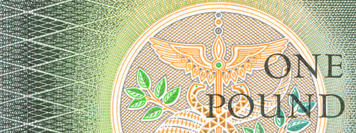
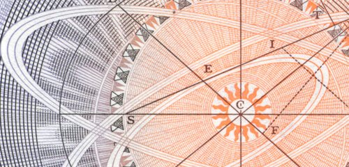
From the same site, various details:
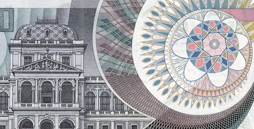
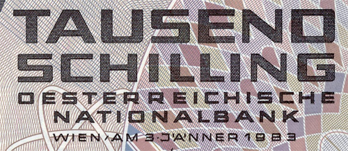
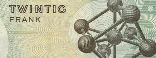
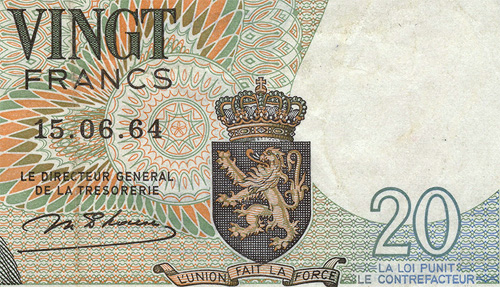
I love banknote designs so much.
With the note from the author of ‘Fuck Comic Sans’, the free typeface Comic Serif is introduced. To me it looks like a bouncy version of Rockwell, and is a hell of a lot nicer than Comic Sans.

I had a play with Fidgt a little while ago, enticed by the beautiful visualisations here. Thing is, I don’t use the networks the application works with (apart from a minor use of Flickr), so I wasn’t able to get more than the most basic representation to appear. I love the idea of it from an information representation point of view, and I can see it being useful for power-networkers. For most people, it would just be a novelty.

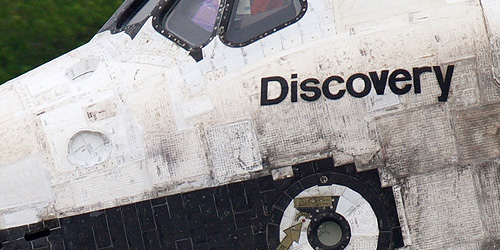
I always thought that the names of the shuttles was written in Helvetica, at the very least screened on in some regular manner. Looking at this image from airliners.net, I see that it looks hand-painted, and after all these years of patching and repainting, the lettering looks decidedly wonky.

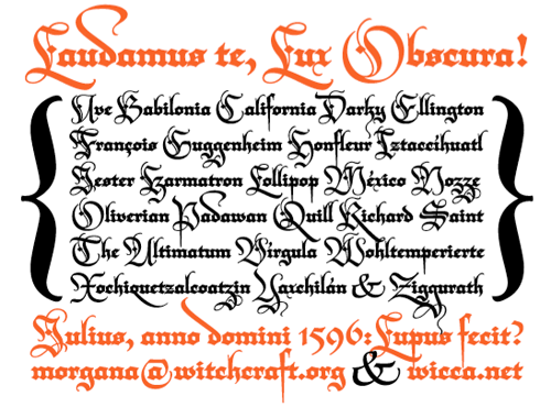
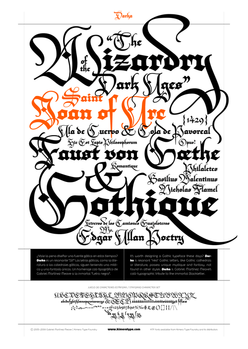
So yes, as mentioned elsewhere, Typographica released their favourite fonts of 2006. The face that immediately caught my eye and made me go “Ooo!” was Darka, a new interpretation of Blackletter type by Gabriel Martínez Meave. Some of the capitals could be used as cadels in themselves, they’re so beautiful, and a lot of the letterforms have a real calligraphic flamboyance. I have a love of blackletter types and of calligraphy in general, so Darka seems right up my street. The thing is, even though the site says the font can be bought from FontShop, it’s not on the site at all. As soon as it is, you can be sure I’ll be buying it. Until then, I’m stuck with the sampler PDF and a bit of copy’n'paste to play with the letterforms.
From the site:
The second page of the PDF sampler:
And, I couldn’t resist. Not sure about the “Ty” kerning though, but I think to make that work nicely I’d have to redraw part of the T:

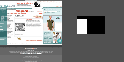
Tufte discusses this a fair bit in his book Visual Explanations, but I thought I’d raise it for a site I’ve just come across; style.com. I’d seen a thumbnail of one of the images from this ‘feature’ on pearls, and clicked to have a closer look. Unfortunately, it turns out that the ‘thumbnail’ was the actual posted size. Look at the area of the screen devoted to stuff that isn’t the article you’re interested in. I’ve coloured the areas below. The grey area is the useless area, the black area supporting text for the useful area, and the white area is the focus of the article, the most useful area. Look how small it is. Style.com is clearly a site utterly devoted to selling ads. They’re perfectly entitled to, mind, but I won’t be visiting them again.
