Instant Hutong

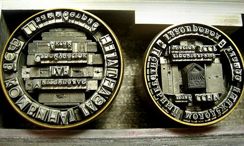
Only yesterday I posted about cities, maps and dense architecture, and I find this on NOTCOT - Instant Hutong. It’s an art project to both record and to bring to people’s attention the traditional patterns of neighbourhoods, courtyards and lanes in Beijing - under threat from development (of course). When I saw the small picture on NOTCOT, I thought it was actually close-set lettering as the main streets appear to form natural ‘baselines’ in the dense pattern of buildings. Interestingly, one of the pieces in the project is a collection of name stamps, set with small chunks of the street pattern - bringing to mind the idea of the built environment as being part of people’s identity, a kind of language they use in interacting with the city and the world. To lose that language, the structures of the city, the place where you grew up, is to lose a part of your identity - not a particularly controversial or new idea, but definitely worth reminding ourselves of from time to time.
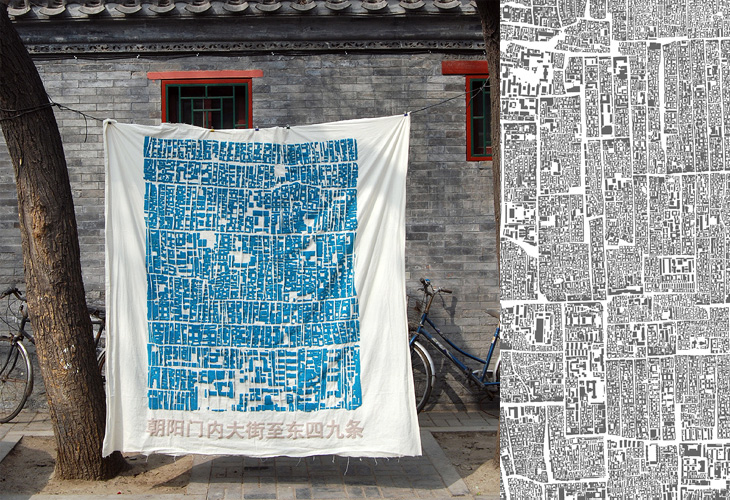
There are some more pictures here, on the Instant Hutong portfolio on Behance.

Reden ist Silber

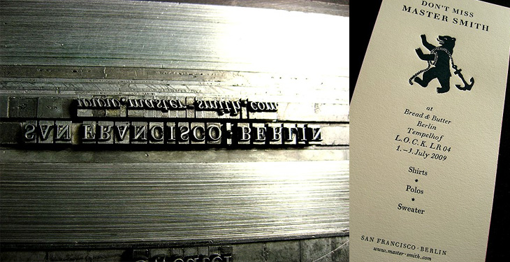
I’ve been following the RSS Feed of Martin Schröder’s blog for a while now; he’s a printer using traditional letterpress techniques in Berlin and posts a lot of interesting and beautiful work on his site. Mostly, I will admit, I just look at the pictures as Schröder usually includes a good set that tells the story of the process quite well. Sometimes though, despite my rusty German, I will work my way through the text as (of course) there’s a lot more interesting detail there. Well worth a look, even if you do just look at the pictures. I love these:

Creators Inn

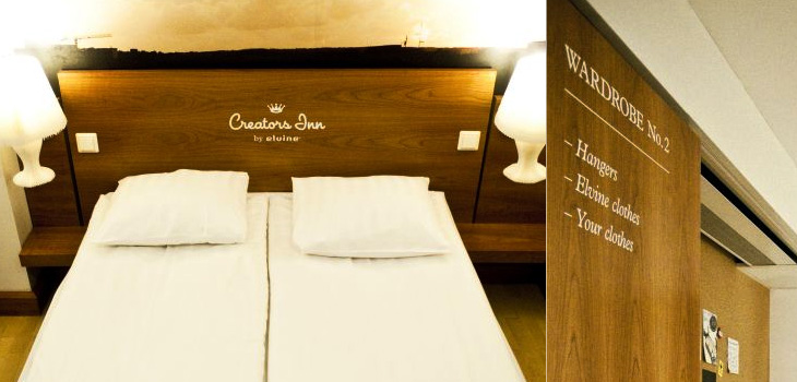
I’m often saving links from the Contemporist, but this hotel, Creators Inn by Elvine (and others), caught my eye for the nice labelling of the wardrobes and the printed history of Elvine on the shower screen. It’s a nice touch, but I wonder if it doesn’t seem a little incomplete as an implementation - things like this are best left subtle or taken to the extremes; if every item in the room was labelled in the same way, with usage notes perhaps, it would be quite the thing. Also, as one of the commenters pointed out, it’s hard not to notice the similarities between the hotel logo and that of a rather large hotel chain. Still, it does look rather nice, and if you’re a creative person visiting the city, you can get free accommodation there. Now that’s a nice touch.

Megacities

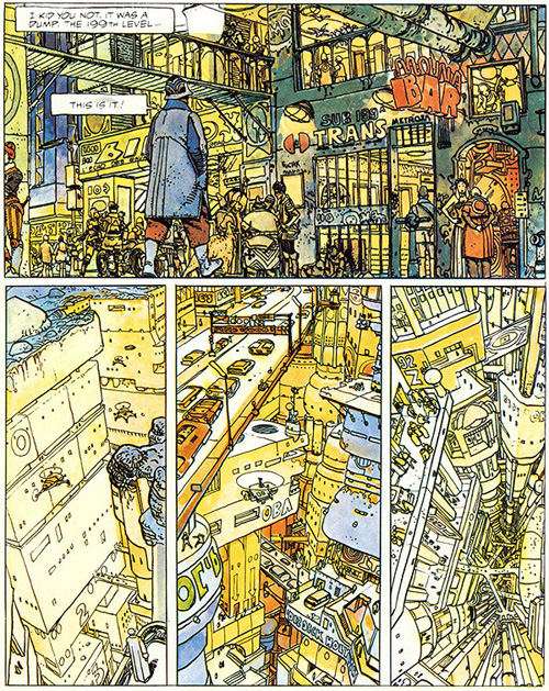
This has been hanging around in my browser tabs for a little while - it’s right up my street too, The Top 10 Comic Book Cities on the Architect’s Journal. A few people have linked to it (I have no idea where I first found it), so you may have already seen it, or even have the books listed. I’ve got a couple, and I think I’ve tracked down a copy of The Long Tomorrow, with Moebius’ fantastic visualisations. I’m quite fond of the idea of megacities, maps (especially of the built environments) and really crowded, dense architecture. It’s not type related, but I imagine such things tend to appeal to the typographically-inclined, if only for the recognition of the similarly detail-obsessed personalities that created them. Anyway, I got the picture below from a regular read of mine, Sci-Fi-O-Rama, which feeatures sci-fi related art and book covers:

Mechanical Cheetah

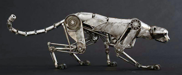
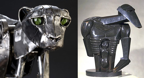
Nothing type related, this, but it’s still lovely. Andrew Chase is a photographer and all-round multi-skilled artist. I came across some pictures of his mechanical cheetah on NOTCOT, which linked to bookofjoe. There are more images of his sculptures on his own portfolio site, including a fantastic giraffe. The cheetah reminded me instantly of Jacob Epstein’s Rock Drill, perhaps not the current form of it so much, but a replica of it in its original state I saw years ago at Tate Liverpool. There’s a picture here (from this page on Art New Zealand) of it before Epstein modified it. It’s the upper part of the face that does it, I think.

Such a beautiful sculpture
The Rock Drill

Something about the eyes… this links to the original page about The Rock Drill on the Tate site. Go and take a look for more information and pictures.

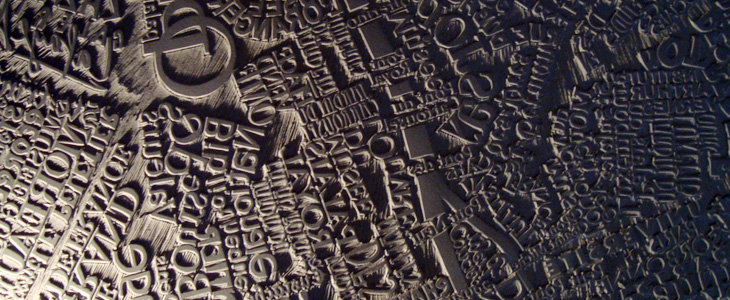
Paris Linocut

Adrian Giddings just linked to this on Twitter, a linocut map of Paris by Mark Andrew Webber. It reminds me a little bit of these typographic maps of London and Portsmouth, and of course the ORK ones of various places, but because it’s hand-done (and a linocut at that) when it’s printed it’ll have a very different effect. There’s one of Amsterdam (and London, and New York) on Webber’s site which shows how it might look.

The Paris one looks to be made of a combination of face and lettering styles, I assume to reflect the character of each place being represented, and from that I was wondering at the idea of doing that for whole cities, if you could. It could never be a perfect representation for everyone - I’m sure that for many people a typographic representation of London would involve Johnston Sans, whereas I tend to think of Caslon types. For others, who knows?

The linocut itself has a gorgeous sculptural quality, shown up beautifully in Webber’s photos; I would quite fancy a copy of that rather than a print (oh, OK, as well as a print) - to run your fingers over it would be a real pleasure. Lovely stuff:

Guerrilla Typography

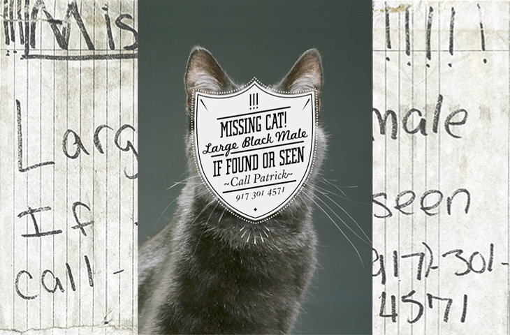
One for the ‘what a nice idea’ pile, this. Cardon Webb goes round upgrading notices pinned up in the streets - you know the ones, ‘Lost Cat’ and the like. There’s one I saw the other day near me that was pleading for the return of a lost plush bunny. I hope they found it; the tone of desperation told a whole story in itself, a wailing inconsolable child, pushchair left unfolded in the hall, coat fallen to the floor, scattered attempts to make-it-all-better: a melted bowl of ice cream, other toys, the Teletubbies DVD and so on, and still the sobbing.

Anyway, back to the nice things. I found this on idsgn, who had created a nice header graphic out of the ‘before’ and ‘after’ images of one of them, and I found that such an appealing presentation I’ve recreated it myself. Still, the original works are the stars of the show, so have a look round on Cardon Copy at the others. I initially thought that the idea was to simply improve the original notices but found a few of them rather hard to read, reading the Cardon Mission reveals all:

Cardon copy takes the vernacular of self-distributed fliers and tear-offs we have all seen in our neighborhoods. It involves hijacking these unconsidered fliers and redesigning them, overpowering their message with a new visual language. I then replace the original with the redesign in its authentic environment.Cardon Copy

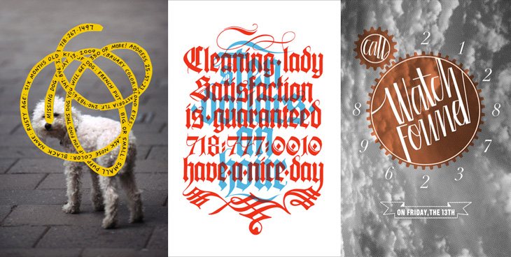
So there you go, the key phrase is ‘overpowering their message’. Explains some of them. The others, like the one below, are far more appealing. You’d keep an eye out for that cat:

This is my favourite one.
Harder to read at a glance, but probably more likely to make you stop and look than the originals.

Bryan Christie Design

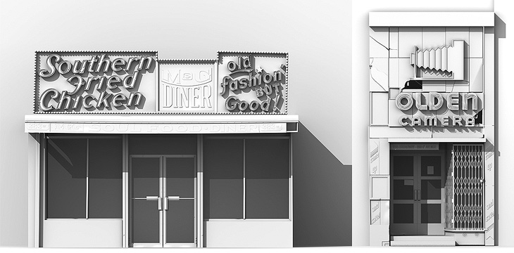
The Cooper Union Typography blog linked to some illustrations of New York storefronts by Bryan Christie. They’re lovely things, and remind me of this blog of London shopfronts, which I’ve written about before, sort of. Christie’s studio portfolio has a great collection of 3D illustrations and infographics, including this marvellous one of skyscrapers, which I love… You can order prints too. Tempting. Go and take a look.

New York storefronts, by Bryan Christie. Compare these photos of London shopfronts.

Magazine N°47

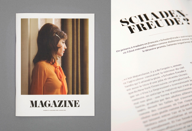
I saw the cover of this magazine, designed by Ill Studio, on ISO 50 and immediately saved the link; I love the type, the photo, the composition, everything. The rest of the magazine is beautiful, but it’s the cover I love - go and take a look at the rest of it. Now if only there was a link to the magazine’s site - with such a generic name it hardly pops right up on Google.

The cover and an inner page, from the Ill Studio portfolio.