A while back Jo at Languste Fonts sent me a link to the collection of the Austrian Museum of Applied and Contemporary Arts. Their collections site is pretty huge, with sections for ornamental and woodblock prints, textiles, drawings, and posters. Lots and lots of posters. They’re arranged in categories, but the best thing is just to keep clicking through them and enjoy the variety - there’s some pretty gorgeous lettering, type and illustration in there. I’ve (of course) traced some of it, and I love the blackletter calligraphy below. I’d link to the page, but it’s one of those sites that doesn’t have unique URLs for things. Just search for Nieder Österreich and it’ll be in there somewhere.
The lettering on this one is beautiful; it’s so expressive and playful! Shame the illustration wasn’t finished to the same quality, even though the overall effect is still rather attractive.
While I liked the lettering on this, it was the illustration that caught my eye - it’d make a good poster in its own right.
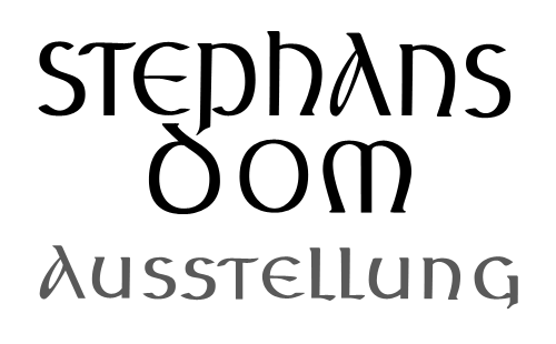
This beautiful uncial lettering is from this poster, showing the tower and spire of St Stephen’s Cathedral in Vienna, which I traced on another poster here.
This Thursday just gone, Matthew Carter presented the fourth annual Justin Howes Memorial Lecture for the St Bride Library, Genuine Imitations, a type designer’s view of revivals, and I was lucky enough to get a ticket for it. All the tickets went in two hours, and St Bride moved the event to Conway Hall to allow more people to go, yet even after that there was a waiting list!
I’ve written up the talk for I Love Typography, so head on over there to read all about it - it’s quite long, but Carter made some good points that I found rather inspirational, and I hope you will too.
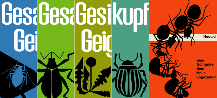
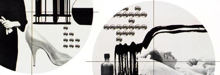
While browsing Ffffound I, er, found a few of the images from this article on Things To Look At on a new book about Geigy’s design and advertising. Some of the examples just call out to be traced - especially the bugs on the pesticide packaging. The illustration for Neocid is quite gloriously morbid - there’s no doubt at all what this stuff is designed to do, even without reading the tagline, “A barrier to house vermin”. The thin white barrier - of death.
Organic this isn’t. I have of course re-composed the elements for the four left-most tracings.
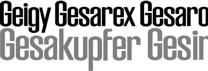
The examples make pretty consistent use of (I would guess) Berthold’s Akzidenz Grotesk, with a few other bits of interesting lettering on things like the herbicide and pesticide packaging above. I traced as best I could the letters from the photos, and though I’m not sure what typeface it is (if it is even a typeface) because of the flat curves and how closed the letterforms are, it reminds me just a little bit of House Gothic 23.
One thing that interests me on some of the examples is the Geigy roundel logo (at right). It’s so at odds with the simple wordmark used elsewhere, and with this other logo on Grain Edit, that I’m wondering where it came from - and where it went. I’m not saying it’s any great loss - I find it rather ugly - but it is very curious, and I will admit the treatment of it in one of the examples (detail below) is rather appealing. Does it have historical relevance I wonder?
The roundel works better as a design element than as a logo.
It’s a logo that works best in multiples, which might explain why it went. Perhaps the book has the answer. And on that note, I would link directly to the book on the publisher’s site, but they don’t have individual pages for them so I can’t. It’s in this list. Look for dolphins.
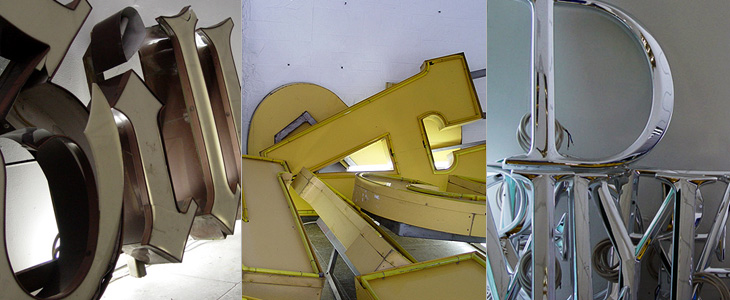
Coincidentally, not long after coming across Character, I found this article about the Berlin Museum of Letters on Core77 (via NOTCOT). Obviously enough it’s a museum devoted to letters, big ones created for building signage and wayfinding in wood, metal, glass and plastic. Core77 has some beautiful photographs and a bit of background info on each one. I really, really, want the DaimlerChrysler ones; so shiny! Lovely stuff, go and take a look.
Some of the letters, and the DaimlerChrysler ones on the right. Lovely.
I love this image. This and the other photos in the article are by Aart van Bezooyen.
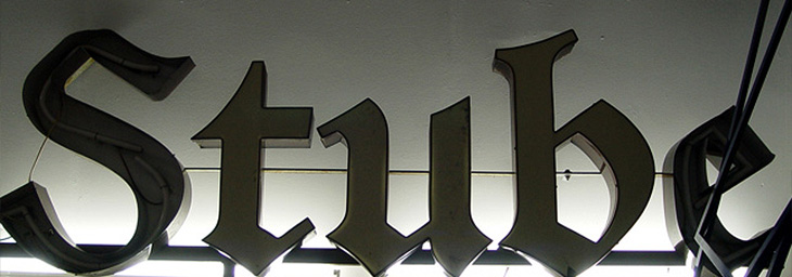
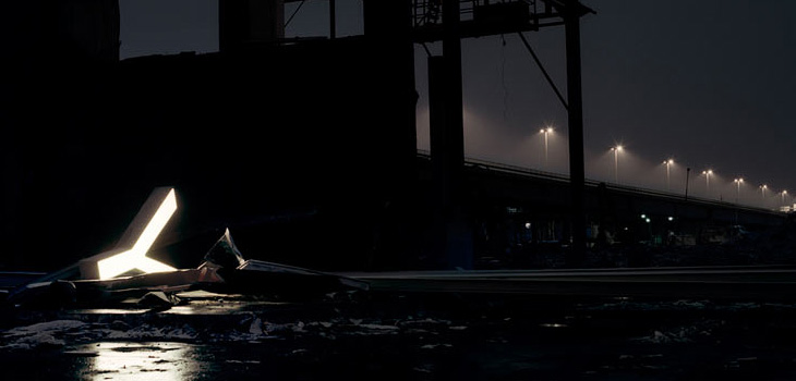
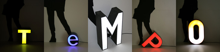
Fancy some big, glowing letters? Adrian Giddings linked to the Character website on Twitter (also via Design Observer), who refurbish and sell old letters from signs. They’re rain-proof and illuminated with LEDs, so I’d guess they’re good for the garden and will last quite a long time. I quite fancy a garden illuminated with big letters dotted about in the foliage. Mind, if you’re after the post-industrial look, the site’s home page has some lovely photos of some of the letters in dark and moody settings for your inspiration.
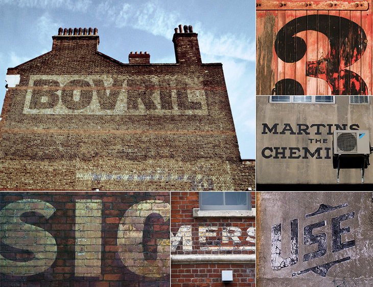
I keep meaning to post about Preserve. I had the image ready and everything, then Mark tells me about a big update to the site. It’s a project to record the painted signs on old buildings and other parts of the urban fabric before they fade completely, are painted over or are destroyed by demolition. Most of the pictures are of New Zealand buildings, but there are a few from elsewhere, including a great Bovril one in Brixton below.
The project also invites contributions, so you can help expand the scope of the site. I think something the site does need is a bit more context - it’s a general complaint I have about the subject of “found type” in general: the lack of context or place in the images. They are nice to look at though, so perhaps I shouldn’t complain too much.
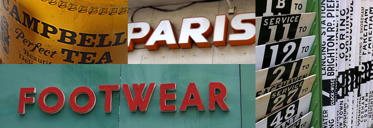
On the topic of found type, you may also be interested in the archive of Found Type Friday posts on Ace Jet 170. There’s some beautiful examples in there, so take a look. There are several pages of it, the pagination link is the little ‘»’ at the bottom.
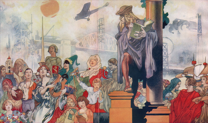
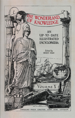
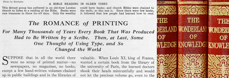
About 25 years ago I was given a full set of 1930s-era encyclopædias, The Wonderland of Knowledge, and I’m glad to still have them in good condition, countless house moves and two burglaries later. They’re fascinating things, with lots of illustrations and an engaging conversational style written to appeal (I guess) to older children. The illustrations are remarkable and are frequently quite beautiful. Each volume has a full colour frontispiece, colour and monochrome inserts throughout and many photos and diagrams in the text.
The beautiful frontispiece for Volume Ⅰ, painted by Charles Robinson.
Left: A sample of one of the rotary photogravure inserts. Centre and right: The frontispiece and title page for Volume Ⅹ. You can click each image for a larger version on Flickr.
The content, however, is very much of its time, with antiquated attitudes to race, nationality, gender and so on, and some interesting attitudes to the portrayal of history itself; this account of Oliver Cromwell, for example, shows how anything negative or critical is delicately avoided. Perhaps youngsters weren’t to be troubled with such complexities?
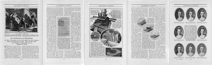
On the less-contentious subjects of science and technology there are some good articles, and some of them stand as being pretty informative and relevant today, including the one I’ve taken the title from for this post, The Romance of Printing. It’s a pretty good primer on the history and techniques of printing, covering ancient origins through Gutenberg and Caxton up to linotype and monotype machines, braille printing, etching, lithography and photogravure. I’ve put it up on Flickr in quite high resolution so you can have a read and see it in all its glory. I’ve also got a lower-resolution PDF here.
A detail of the type styles used, and of the gold blocking on the spine.
When the article gets to a description of the monotype process, there’s a little clue to the typeface used in the books. I did wonder what it was, but never got around to looking it up; it always seemed such a characteristic part of the books that I’d never really thought of it being something used elsewhere too:
So yes indeedy, from that little snippet it’s not a great mental leap to assume the typeface is the original of this Monotype Old Style, with optical weights for the captions and the indices that aren’t included in the digitised version.
The main reason I’d wondered about the typeface was because I did once have a completely mad plan to scan in the whole encyclopædia, do some OCR on it and have it online in some format, but I quickly realised that I’d need something like this to even start the job. Scanning in just the pages for this post took several hours, and considering that without the inserts there are 6144 pages, so the chances of seeing it all online are pretty slim.
Yes, it’s finally here! Typographica’s Favorite Typefaces of 2008, the fifth annual collection of reviews of the best in typeface design. I’ve not read all the reviews yet (that’ll take a while) but from the ones I have read you should set aside a couple of hours and go and take a look:
Stylistically, this year’s selections run the typographic gamut: slab serif, typewriter, blackletter, stencil, brush script, geometric sans … and some that are difficult to neatly classify. Some represent contemporary innovations in editorial style, while others look back to pre-typographic history for inspiration. Typographica
Also of note is the swanky new design for Typographica itself - the first significant redesign of the site since 2002, heralding its transition from a blog to a full-time review site. Congratulations to all involved!
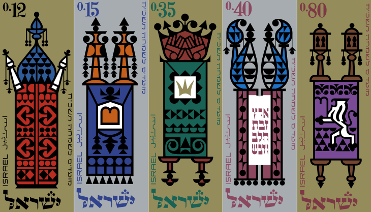
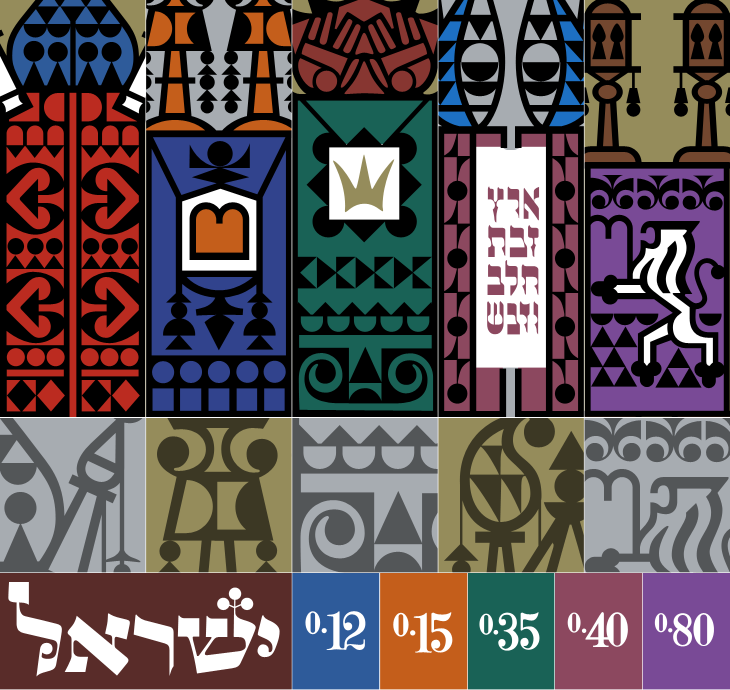
Ffffound is a dangerous site. I try not to visit unless I’ve got a couple of hours to spare as before I know it it’s dark outside and I’ve got a couple of hundred tabs open all with amazing things in. On my last bout of browsing the site I found a couple of links to So Much Pileup, specifically these two posts, Philately Fridays: Israel 1967 and Israel 1976. I’ve traced both, but I’m just going to post the one set for now as I’m not entirely satisfied with how the 1976 ones came out. Some things just need gold ink.
The set of stamps was called “Joyous Festivals 5728”, released in that year (1967) and commemorate five festivals with illustrations of decorated Torah scrolls. Each of the stamps originally had a tab showing an illustration of an open scroll and a biblical sentence, which unfortunately I don’t have decent pictures of. There’s a tiny bit of information here, courtesy of Israel Philatelic Federation’s stamp catalogue (another strangely hard to use website). I’ve included my tracing here. The patterns are beautiful:
When I was writing about the St John’s Bible last week I was reminded of the typography of Coventry Cathedral and wanted to post a couple of pictures of it then, but I wasn’t immediately able to find decent pictures. I’ve had a proper look round, done some more research and found some pictures and I think given the history of the cathedral it’s an appropriate post for Easter Sunday, with themes of rebirth and all; Following the destruction of St Michael’s Cathedral (and much of the city) in a Luftwaffe attack on the 14th of November 1940:
…the then leaders of the Cathedral Community took the courageous step to build a new Cathedral and preserve the remains of the old Cathedral as a moving reminder of the folly and waste of war. From that point, Coventry Cathedral became the inspiration for a ministry of peace and reconciliation that has reached out across the entire world.Wikipedia: Coventry Cathedral
The new Cathedral was designed by Sir Basil Spence (who also designed my alma mater, Sussex University), with stained glass by John Piper and Keith New, the great tapestry by Graham Sutherland, sculptures by Jacob Epstein and John Bridgeman, the Great West Window by John Hutton and last, but absolutely not least, lettering and carvings by Ralph Beyer. It’s this lettering that fascinates me, and it’s strange that there are so very few pictures of it.
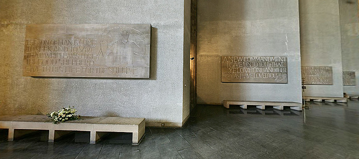
Some of the Tablets of the Word by Ralph Beyer. Picture from the QTVR movies in the Virtual Tour. There is also a picture from 1962 on the Time Life website here.
When I was looking for pictures I revisited the Cathedral’s website (which for some reason has no photo gallery) and realised that it’s possible to get some decent pictures out of the well-intentioned but bizzarely designed ‘Virtual Tour’. So with one exception (below), that’s where I got the pictures here. I don’t like being negative, but that virtual tour really could have a better user interface. It dominates and detracts from the movies, which are presented at a size that’s far, far too small - the content and the Cathedral deserves better than that.
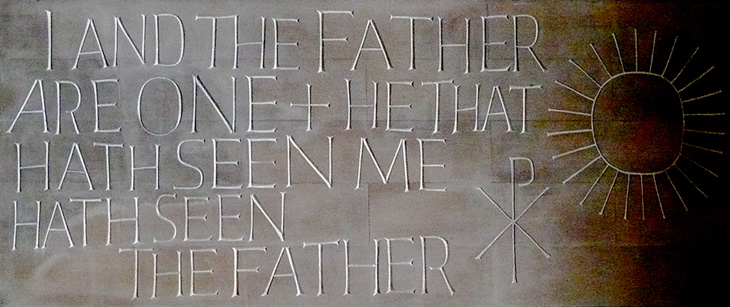
Detail of one of the Tablets of the Word by Ralph Beyer. Picture by Herry Lawford on Flickr.
How Beyer came to be chosen for the Coventry Cathedral project is interesting, and includes a fair few other famous names and some remarkable coincidences. I have to quote fairly liberally from his obituary in the Times, or I’d just be rewriting it:
In 1937, aged 16, Beyer visited England where, on the recommendation of Mendelsohn, he spent six months as an apprentice to Eric Gill. Like Gill, and doubtless enthused by him, Beyer was fascinated by the qualities of carved stone, by simple sculptural forms and especially by letterform. Ralph then studied in London, at the Central School of Arts & Crafts and at Chelsea School of Art where he met Henry Moore, for whom he worked briefly before being interned as an enemy alien at the outbreak of the war.The Times
While in the internment camp, he met and befriended the young Nikolaus Pevsner, who had started work on An Outline of European Architecture and would later write the Pevsner Architectural Guides.
Encouraged by Henry Moore, Spence decided that, the Sutherland tapestry apart, the dominant decorative feature of the interior of the new Coventry Cathedral should be lettering rather than narrative sculpture. He knew he was looking not simply for a craftsman but for an artist capable of making a truly distinctive contribution. It was Pevsner who suggested that Spence should meet Beyer, to learn how he might approach a project which was to become the defining challenge of his life.The Times
The Independent has a more extensive obituary, and highlights a good point about the style of the modern Church of England being inspired by the early church, which I think is what reminded me of this work when looking at the St John’s Bible:
Although Spence’s cathedral was criticised for its conventional Latin cross plan, Beyer’s Tablets of the Word reflected post-war ecclesiastical interest in the early church and today they remain strikingly innovative examples of lapidary art.The Independent
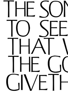
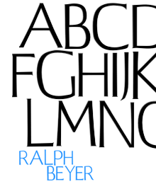
Beyer also designed a typeface for use on hymnals and other publications. The cathedral website makes good use of the typeface using Flash, and using browser zooming and screenshots I’ve assembled the text at right and top right. Of course that’s no substitute for the real typeface; I’d like to see if there’s a lowercase, other weights or styles, what the rest of the numerals look like, and how it’s kerned.
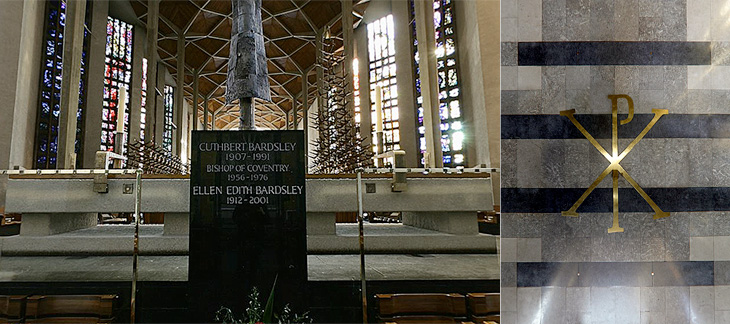
Further use of the Beyer face behind the altar, and at right more influences from the interest in the early Christian church, with the Chi Rho symbol, denoting Christ.
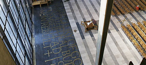
The inlaid lettering by the Great West Window. Finding clear pictures of this is nigh-on impossible, and I’m tempted to turn up with my camera and tripod and make my own. As it is, here’s a closeup.


