Browsing earlier, I came across this blog post for The Exquisite Book. It’s a book project involving ten groups of ten artists, including fine artists, illustrators, designers and comic artists, where each artist creates one page having only seen the previous page. It’s roughly the same idea as a game you may have played as a child, which I’ve only just learned was invented by the Surrealists and was called The Exquisite Corpse. I can’t remember what we called it, but certainly not that.
Anyway, the book project looks like one worth following, and the blog post has a few sample pages. I’ll be interested to see how it ends up looking as a collection, and what the binding will be. I was especially interested in the sketch for the book title page (below left) and had a play with the idea in Sketchup.
Some output from Sketchup, from me playing with the ideas in the sketch from The Exquisite Book site at bottom left. To match the sketch I used a mix of Century Gothic and Helvetica - and some hand lettering naturally.
I just read this post by Joe Clark, linked from Daring Fireball, about why you shouldn’t use small caps for acronyms. In it, Clark provides some examples which at first glance seem to support his argument, but a little thought reveals them to be mere examples of ill-considered typography rather than a crushing blow on the use of small caps.
I’m well aware the whole article may well be trolling, but there is one particularly egregious argument I’ve heard many times when the subject of typographic style comes up - though normally about apostrophes:
This nonsense, promulgated by snobs like that bore Bringhurst who have not read anything written after Jane Austen croaked, ostensibly improves typographic colour. What it actually does is inhibit reading.
Of course, anyone who has actually read ‘that bore’ Bringhurst would know that he is far from a bore and that he is all about promoting typography that aids reading. Setting acronyms in small caps does work well in a large number of cases, and it does indeed improve page colour, thereby reducing distractions to the reader, but as in anything there are no universal solutions. From the very section in The Elements of Typographic Style on the use of small caps for acronyms, Bringhurst states, ‘Refer typographic disputes to the higher courts of speech and thinking’. In other words, if you’re not sure, remind yourself how you’d say it or think of it — think of the meaning first and the style should follow.
I feel a little dirty responding to stuff like this, but I have a point to make. Articles like this promote a dichotomy, an idea that this way is right and that way is wrong, this way is snobbish and that way is proletarian — but when applied to typography it boils down to utter nonsense. The goal here is to allow the meaning of words to shine through. If you use small caps and it makes something hard to read, you should stop using small caps for that thing, and vice-versa.
Making a typographic decision based on some political or class motivation is fine if it’s appropriate for the text, but beyond that vanishingly rare case it’s a mere affectation. Don’t be swayed by trash-talking and accusations of ‘snobbery’, please.
Oh, and on the subject of apostrophes (amongst other things), read The Complete Plain Words by Sir Ernest Gowers. It’s a good read, and full of good sense.
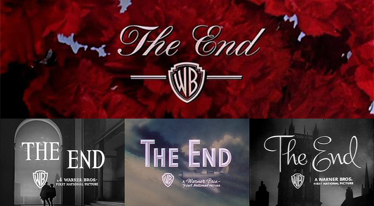
For all that I’ve heard and read from friends, colleagues and associates, it seems that the end of 2009 can’t come soon enough. I’ve not had a bad year at all — it’s been full of good things, both professional and personal — but somehow I’ve picked up the excitement and promise of a new year and I’m looking forward to 2010. It’s going to be a good year, I think. So, without further ado, I’ll bring your attention to a fantastic collection of ‘The End’ title stills from Warner Bros on The Movie Title Stills Collection, perfectly timed to commemorate the end of the year. Go and take a look!
Have a very happy and prosperous new year, and thank you for your visits, your kind, interesting and useful emails — I read every one and even if I can’t reply I appreciate and enjoy all of them. Here’s to two thousand and ten!
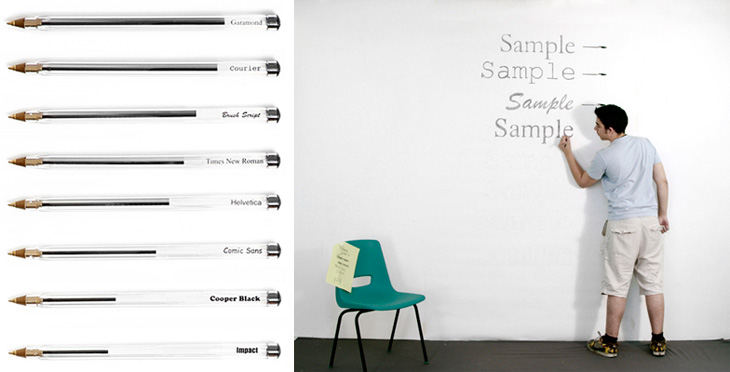
I’ve just seen this project on Swiss Miss and I really like the idea. Matt Robinson and Tom Wrigglesworth compared how much ink different common typefaces use at the same point size by drawing them out on a wall using biros. It’s not a scientific analysis or anything but it is a gloriously fun thing to do. I like the way they ended up with a graph made out of biros at the end of it, showing how much ink is left — the resulting evidence is its own data. It’s a great way of explaining typographic colour too. Love it.
Normally I find all-Flash websites intensely frustrating and rarely recommend them to anyone. I think no matter how glittering with effects, how technically accomplished they may be, they represent a regrettable attitude to the web; a lack of ‘playing nice with others’ that keeps the information locked away, often unlinkable, frequently unquotable and usually inaccessible. Still, sometimes there are sites that do something so nice it’s worth linking to them, despite their Flashtastic nature. A few days ago It’s Nice That linked to the new site of Established & Sons which has some lovely things, and some lovelier type treatments using URW’s Didoni. One of my favourite examples is below:
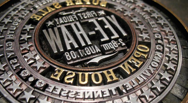
I found a link to this little beauty by Yee-Haw Industries on Coudal today. The linked article on Northcoast Zeitgeist says, “Now that’s a lockup”. Indeed. It’s quite something. It reminds me a bit of the round ones Reden ist Silber posted up a while back.
Some time ago I quietly redid the logo for The Ministry of Type, recreating the crown image out of little dots. I didn’t make an announcement out of it at the time, but I was (and am) pleased with it — it’s a lot more me now. I had a number of reasons for wanting to redo it, mainly that even though I drew the original crown image, it was very close to the official ones, and related to that, those Keep Calm and Carry On posters have become so incredibly popular that I’ve had more than one person ask whether there was a link between them and my site. Short and long answer: no, there isn’t.
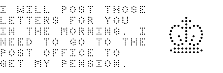
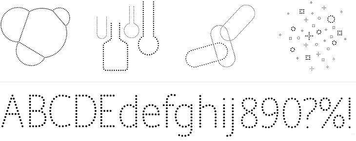
So, it was time to redo it, and with the dots I was feeling very pleased with myself indeed, until the very next day when I saw a link on TypeNeu (I think) to the recent work of Brighton’s own Colophon foundry, specifically their typeface Perfin, which has a crown made of dots in it. Consternation! Had I unwittingly ripped them off? But no, their crown is very different from mine, and I’m pretty sure I had my idea without seeing theirs, and more importantly, there’s plenty of room in the world for lots of things made of dots. Still, it did provide a nice excuse to get in touch and I can confirm they’re an extremely talented and nice bunch of people. Here’s a bit of Perfin, designed by Alison Haigh for Colophon, you can see their inspiration for the face: the perforations and dot-matrix printing Royal Mail use to identify post in their systems.
Perfin, designed by Alison Haigh for Colophon. Images courtesy of Colophon.
That was some time ago, and I was reminded that I’d meant to make a post on this when I read on Brand New about the new Pfizer branding. Ignoring for a moment the regrettable update to their logo, I was drawn to the other brand assets that Siegel+Gale produced for them — the dotted illustrations and typeface, below.
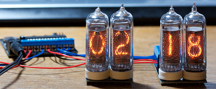
I can imagine that there were all sorts of discussions that likened the dots to pills or something or other, but to me, thinking of Pfizer as one of those old 20th Century companies like ICI, IBM and all that, I had images of mid-century computer displays, specifically a type of nixie tube called (I think) a pixie tube. I’ve got a picture of some basic nixie tubes below, as it seems that the type I’m familiar with—where the letters are formed from individual points of light — are quite rare. Indeed, this is the closest I could find online to the type I saw in my father’s and grandfather’s workshops. They’re really rather beautiful things:
A couple of nixie tubes. Image courtesy of Adam Greig on Flickr.
So yes, that Pfizer logo change. Overall, it’s good, but it’s just that P. It seems so disconnected from the rest of the name now — I really think they should have kept the serif in it, it provided a visual ‘push’ of the P into the F. Just my opinion, mind.
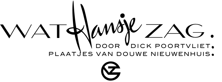
BibliOdyssey put up this great collection of Dutch picture-book covers from 1810 to 1950. There are some lovely illustrations, examples of lettering and type treatments on the covers, one of which I’ve traced below. I was thinking about tracing the illustration on this one, mainly for the overall effect it gives than for anything else, but I figure I’ll save that for a rainy day. Go and look at the rest of the covers, here.
‘Wat Hansje Zag’ by Dick Poortvliet, illustrated by van Douwe Nieuwenhuis, 1948
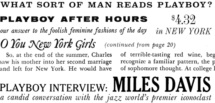
Entirely coincidentally, I get to post about another archive of a long-running and well-known magazine; this time, Playboy. John of I Love Typography tweeted a link to this, just over 50 issues of Playboy from 1954 to 2006. The site will require you to install Silverlight, but is fairly well put together and easy to use, with a nice contents feature that also lists the ads and a search function that works well. To be clear, Playboy is a pornographic magazine that used to use good journalism and good design as a fig-leaf (as it were) to try to get some respectability. It's still a magazine for pornography, objectifying women. Of course, the images and type I’ve included below are not pornographic.
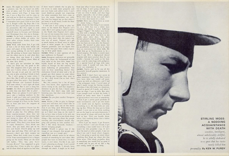
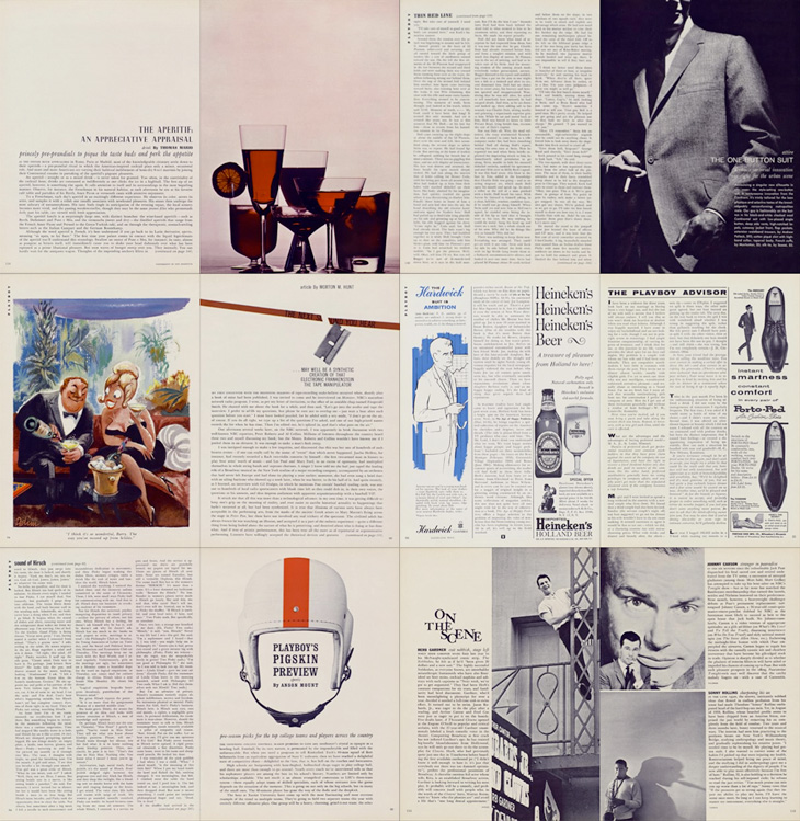
I’ve never looked at Playboy magazine before — its reputation preceded it and there are many better ways to read good journalism. There are some interesting-sounding articles in the earlier editions though; just a quick look through reveals interviews with Fidel Castro, Miles Davis, Sterling Moss, loads of fiction, journalism, pages and pages of dense, dense text. Then, so randomly you almost ask “What’s that doing there?” a picture of a young woman with not much on. I must admit I didn’t really look at the newer issues, as after the logotype changes in 1972 the whole thing looks a whole lot less appealing, and makes me think perhaps the magazine becomes a bit more straightforwardly pornographic from this point. The bits of type and spreads below are mostly from the late ’50s and early ’60s, and are just an example of some of the lovely bits of type and layouts in the magazine. So yes, go and have a look at the Playboy magazine archive, but keep in mind the attitudes and harms it represents.
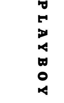
The ‘$4.32’ bit is from an advert, all the rest is from editorial content. I haven’t verified these forensically, but the editorial text looks like a mix of Clarendon, Nimbus Sans, Caslon, Caslon Italic and Cheltenham.I love the use of the rabbit device to end an article, and that it’s still in use today. Note also that the Playboy wordmark at the top left of the page has a serif on the A, which is missing on all other uses of it. I’ve reproduced it larger at the top of this article.
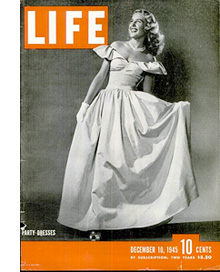
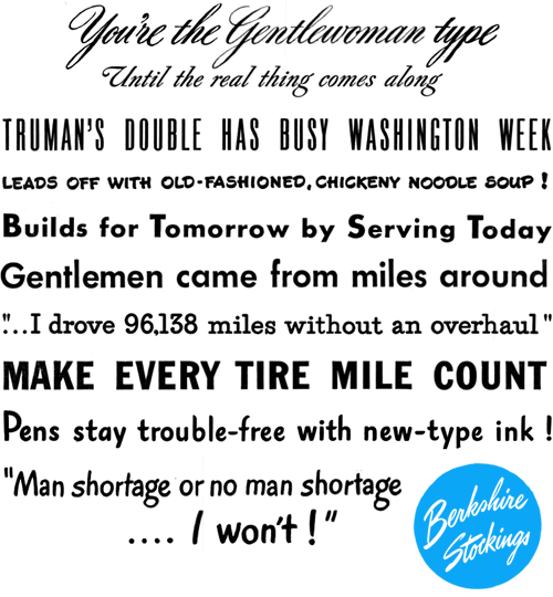
I’ve been browsing through some of the copies of LIFE magazine in this wonderful archive on Google Books, and as well as the photography and journalism I’ve found some real type treasures, especially in the advertisments. Some of the slogans and phrases read just like bits of pangrams or the beautiful mini-stories that Font Bureau create for their type samplers, and some of the type and lettering is quite lovely. The ones below are mostly from this issue from May 1945. A few are also from this one, which also has a short article and some photos (from page 43) of the first Lewes Bonfire night after the end of World War Ⅱ - something of local interest at least to me (and other Sussex people).
I’m sure you could make many amusing stories with a bit of patient searching through the archive.