
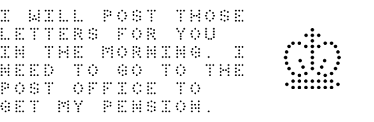
Some time ago I quietly redid the logo for The Ministry of Type, recreating the crown image out of little dots. I didn’t make an announcement out of it at the time, but I was (and am) pleased with it — it’s a lot more me now. I had a number of reasons for wanting to redo it, mainly that even though I drew the original crown image, it was very close to the official ones, and related to that, those Keep Calm and Carry On posters have become so incredibly popular that I’ve had more than one person ask whether there was a link between them and my site. Short and long answer: no, there isn’t.
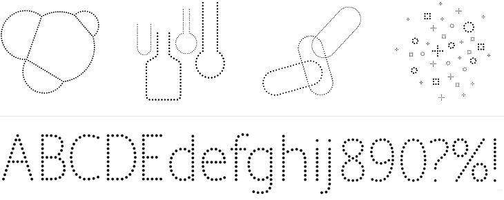
So, it was time to redo it, and with the dots I was feeling very pleased with myself indeed, until the very next day when I saw a link on TypeNeu (I think) to the recent work of Brighton’s own Colophon foundry, specifically their typeface Perfin, which has a crown made of dots in it. Consternation! Had I unwittingly ripped them off? But no, their crown is very different from mine, and I’m pretty sure I had my idea without seeing theirs, and more importantly, there’s plenty of room in the world for lots of things made of dots. Still, it did provide a nice excuse to get in touch and I can confirm they’re an extremely talented and nice bunch of people. Here’s a bit of Perfin, designed by Alison Haigh for Colophon, you can see their inspiration for the face: the perforations and dot-matrix printing Royal Mail use to identify post in their systems.
That was some time ago, and I was reminded that I’d meant to make a post on this when I read on Brand New about the new Pfizer branding. Ignoring for a moment the regrettable update to their logo, I was drawn to the other brand assets that Siegel+Gale produced for them — the dotted illustrations and typeface, below.
I can imagine that there were all sorts of discussions that likened the dots to pills or something or other, but to me, thinking of Pfizer as one of those old 20th Century companies like ICI, IBM and all that, I had images of mid-century computer displays, specifically a type of nixie tube called (I think) a pixie tube. I’ve got a picture of some basic nixie tubes below, as it seems that the type I’m familiar with—where the letters are formed from individual points of light — are quite rare. Indeed, this is the closest I could find online to the type I saw in my father’s and grandfather’s workshops. They’re really rather beautiful things:
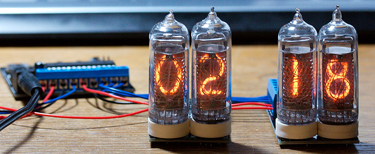
A couple of nixie tubes. Image courtesy of Adam Greig on Flickr.
Update: If you’re interested in perforated typefaces, you may also like to take a look at Dividend, from Hoefler & Frere-Jones. Amusingly, there’s also an article on typography.com about nixie tubes.
So yes, that Pfizer logo change. Overall, it’s good, but it’s just that P. It seems so disconnected from the rest of the name now — I really think they should have kept the serif in it, it provided a visual ‘push’ of the P into the F. Just my opinion, mind.