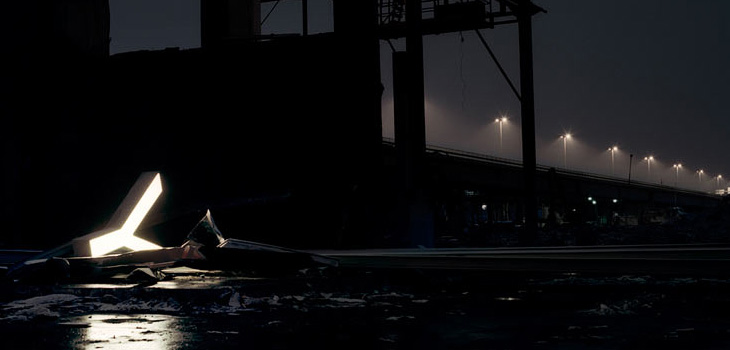
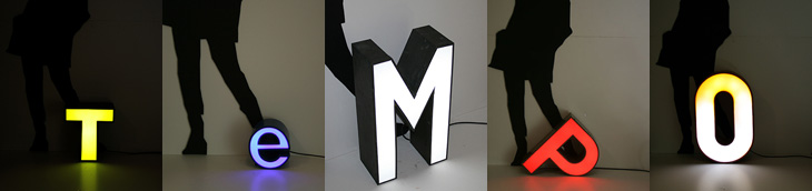
Fancy some big, glowing letters? Adrian Giddings linked to the Character website on Twitter (also via Design Observer), who refurbish and sell old letters from signs. They’re rain-proof and illuminated with LEDs, so I’d guess they’re good for the garden and will last quite a long time. I quite fancy a garden illuminated with big letters dotted about in the foliage. Mind, if you’re after the post-industrial look, the site’s home page has some lovely photos of some of the letters in dark and moody settings for your inspiration.
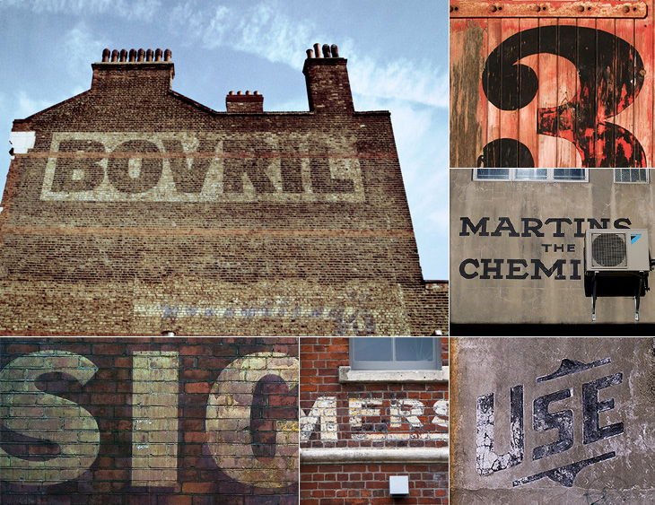
I keep meaning to post about Preserve. I had the image ready and everything, then Mark tells me about a big update to the site. It’s a project to record the painted signs on old buildings and other parts of the urban fabric before they fade completely, are painted over or are destroyed by demolition. Most of the pictures are of New Zealand buildings, but there are a few from elsewhere, including a great Bovril one in Brixton below.
The project also invites contributions, so you can help expand the scope of the site. I think something the site does need is a bit more context - it’s a general complaint I have about the subject of “found type” in general: the lack of context or place in the images. They are nice to look at though, so perhaps I shouldn’t complain too much.
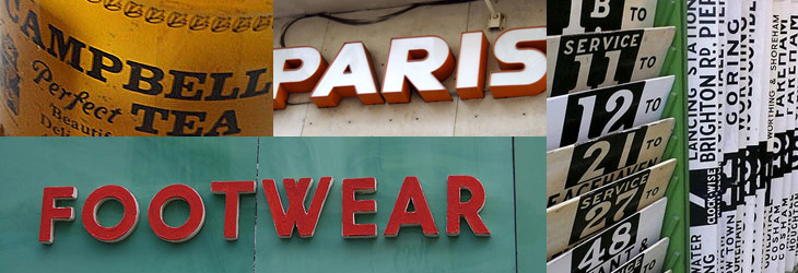
On the topic of found type, you may also be interested in the archive of Found Type Friday posts on Ace Jet 170. There’s some beautiful examples in there, so take a look. There are several pages of it, the pagination link is the little ‘»’ at the bottom.
When I was writing about the St John’s Bible last week I was reminded of the typography of Coventry Cathedral and wanted to post a couple of pictures of it then, but I wasn’t immediately able to find decent pictures. I’ve had a proper look round, done some more research and found some pictures and I think given the history of the cathedral it’s an appropriate post for Easter Sunday, with themes of rebirth and all; Following the destruction of St Michael’s Cathedral (and much of the city) in a Luftwaffe attack on the 14th of November 1940:
…the then leaders of the Cathedral Community took the courageous step to build a new Cathedral and preserve the remains of the old Cathedral as a moving reminder of the folly and waste of war. From that point, Coventry Cathedral became the inspiration for a ministry of peace and reconciliation that has reached out across the entire world.Wikipedia: Coventry Cathedral
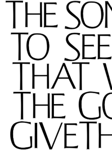
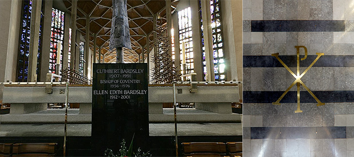
The new Cathedral was designed by Sir Basil Spence (who also designed my alma mater, Sussex University), with stained glass by John Piper and Keith New, the great tapestry by Graham Sutherland, sculptures by Jacob Epstein and John Bridgeman, the Great West Window by John Hutton and last, but absolutely not least, lettering and carvings by Ralph Beyer. It’s this lettering that fascinates me, and it’s strange that there are so very few pictures of it.
Some of the Tablets of the Word by Ralph Beyer. Picture from the QTVR movies in the Virtual Tour. There is also a picture from 1962 on the Time Life website here.
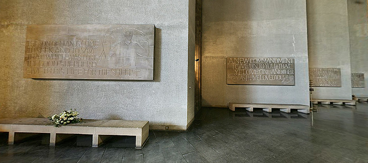
When I was looking for pictures I revisited the Cathedral’s website (which for some reason has no photo gallery) and realised that it’s possible to get some decent pictures out of the well-intentioned but bizzarely designed ‘Virtual Tour’. So with one exception (below), that’s where I got the pictures here. I don’t like being negative, but that virtual tour really could have a better user interface. It dominates and detracts from the movies, which are presented at a size that’s far, far too small - the content and the Cathedral deserves better than that.
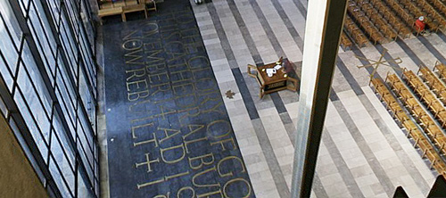
Detail of one of the Tablets of the Word by Ralph Beyer. Picture by Herry Lawford on Flickr.
How Beyer came to be chosen for the Coventry Cathedral project is interesting, and includes a fair few other famous names and some remarkable coincidences. I have to quote fairly liberally from his obituary in the Times, or I’d just be rewriting it:
In 1937, aged 16, Beyer visited England where, on the recommendation of Mendelsohn, he spent six months as an apprentice to Eric Gill. Like Gill, and doubtless enthused by him, Beyer was fascinated by the qualities of carved stone, by simple sculptural forms and especially by letterform. Ralph then studied in London, at the Central School of Arts & Crafts and at Chelsea School of Art where he met Henry Moore, for whom he worked briefly before being interned as an enemy alien at the outbreak of the war.The Times
While in the internment camp, he met and befriended the young Nikolaus Pevsner, who had started work on An Outline of European Architecture and would later write the Pevsner Architectural Guides.
Encouraged by Henry Moore, Spence decided that, the Sutherland tapestry apart, the dominant decorative feature of the interior of the new Coventry Cathedral should be lettering rather than narrative sculpture. He knew he was looking not simply for a craftsman but for an artist capable of making a truly distinctive contribution. It was Pevsner who suggested that Spence should meet Beyer, to learn how he might approach a project which was to become the defining challenge of his life.The Times
The Independent has a more extensive obituary, and highlights a good point about the style of the modern Church of England being inspired by the early church, which I think is what reminded me of this work when looking at the St John’s Bible:
Although Spence’s cathedral was criticised for its conventional Latin cross plan, Beyer’s Tablets of the Word reflected post-war ecclesiastical interest in the early church and today they remain strikingly innovative examples of lapidary art.The Independent
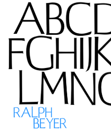
Beyer also designed a typeface for use on hymnals and other publications. The cathedral website makes good use of the typeface using Flash, and using browser zooming and screenshots I’ve assembled the text at right and top right. Of course that’s no substitute for the real typeface; I’d like to see if there’s a lowercase, other weights or styles, what the rest of the numerals look like, and how it’s kerned.
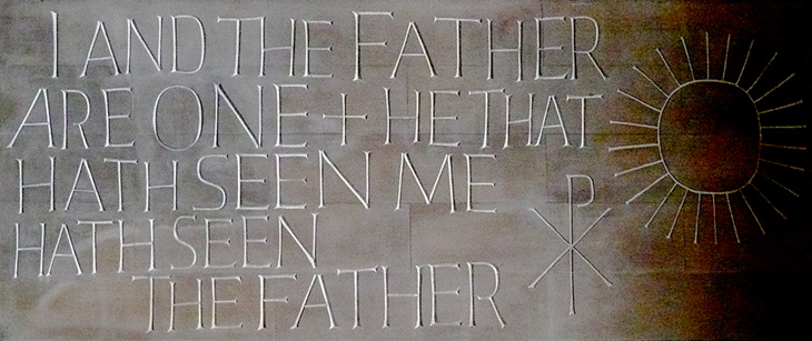
Further use of the Beyer face behind the altar, and at right more influences from the interest in the early Christian church, with the Chi Rho symbol, denoting Christ.
The inlaid lettering by the Great West Window. Finding clear pictures of this is nigh-on impossible, and I’m tempted to turn up with my camera and tripod and make my own. As it is, here’s a closeup.
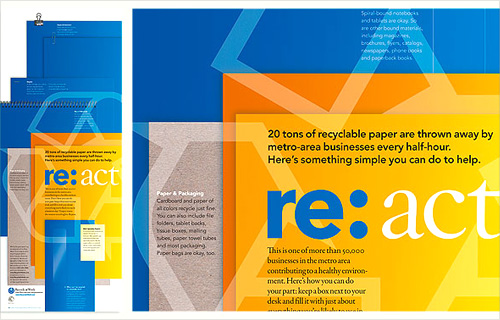
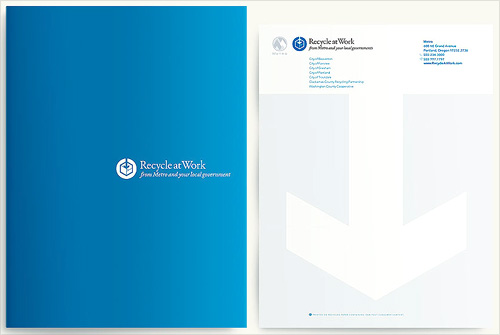
Another one I’ve had open in my browser for a while. I may have got it from a link in Twitter, possibly from Typegirl or (probably) Pinch themselves. I like the basic idea of the re:[word] brand identity, but the implementation is rather nice too. I wanted to keep a note of the two images below in particular because I like the effect of the overlaid print presentations and the super simple white on blue brochure cover.
Grain Edit found a great collection of vintage Porsche posters for sale. Well, some of them are for sale because a lot are already sold, buy they can be seen in the VP Racing poster archive. I’ve had a good look through them and I love the ones by Atelier Strenger - to me they make the 60s and 70s the golden age of Porsche posters - such tight composition, typesetting and use of photography! I’ve traced a couple of examples of type from this Strenger one and the numbers from this Holz one. Lovely stuff.
Ah, the things you see on Twitter. Just now @Elianneke linked to this Torontoist article about the hand-painted signs at Honest Ed’s. Yes, they’re hand-painted, in one department at least, by Wayne Reuben and a colleague called Douglas. I bet Honest Ed’s could do a good sideline in selling used signs online - I’d buy some.
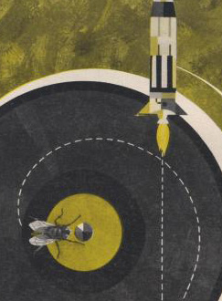
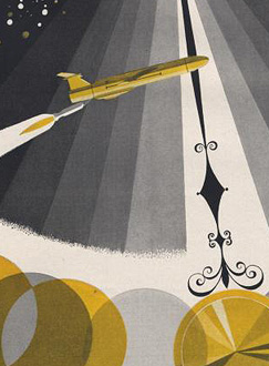
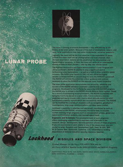
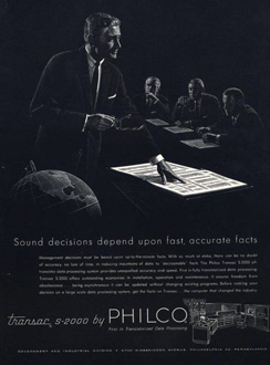
Here’s a great collection of science and techology adverts from the 50s and 60s, full of wonderful illustration, type treatments, vintage logos and some pretty inspirational layouts. I’ve got a few details of some of my favourites below, but be sure to have a good look through the set as there’s a load more in there that are great, such as this, and this. There are a few other interesting Flickr sets by bustbright too, including this collection of Bebrauchsgraphik covers which I’m going to have a look through. This one is great.
Click each image to go to the Flickr page for it.
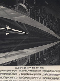
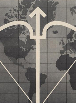
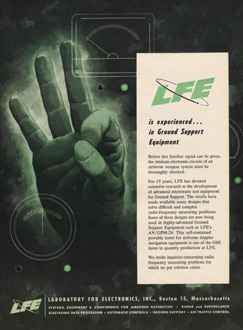
So there are some of my favourites. The top row is that combination of rough-textured painting and precise drawing that characterises mid-century graphic design. I love it. Below those are some nice type and logo treatments: that ampersand, for example, is made from an orbiting particle, yet sits halfway between the classic and commercial ampersands. Interesting! After that there’s six illustration styles: a dramatic JPL illustration which looks like a Victorian steampunk device for testing space-age technology; a cold-war classic world map with presumably The Crossbow of Progress overlaid on it; then a ghostly green hand of A-OK (don’t try this gesture in Turkey)
; a lovely space scene which I think could do without the little globe inset above the text; a spare and sharp layout and illustration for Philco - though the outline drawing of the computer looks like something demanded by the client rather than part of the original design; then an advert promising a level of defence from incoming missiles that even today we don’t have. Old adverts are great.
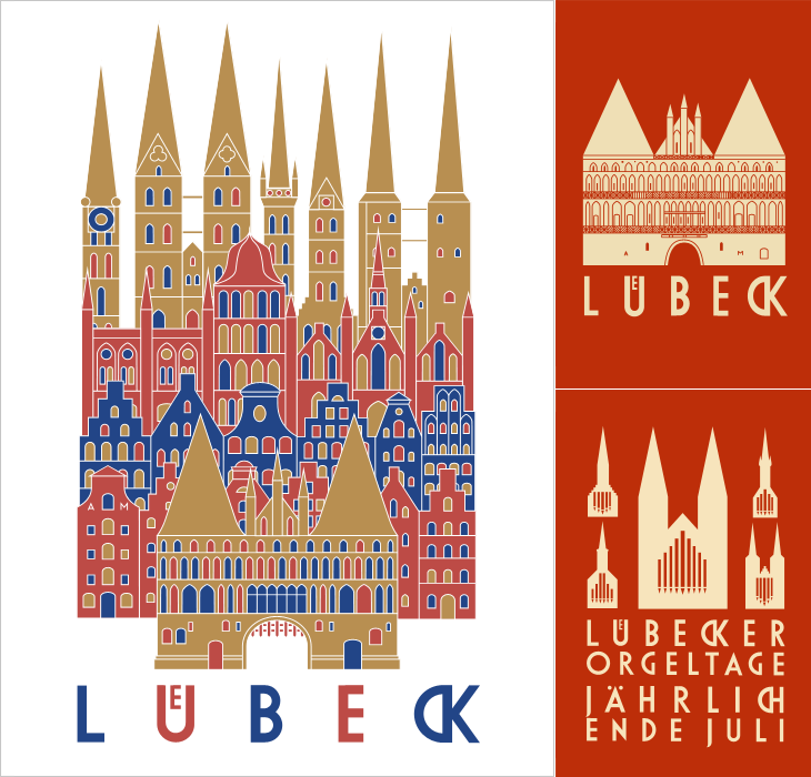
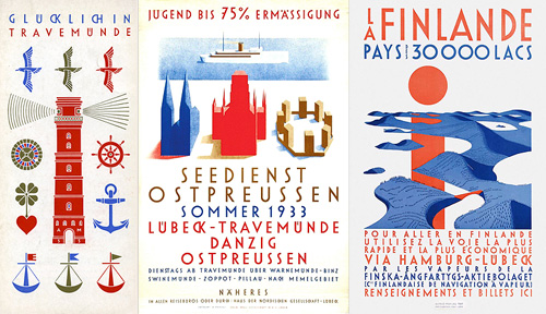
I’ve been following the excellent Cooper Typography Blog for a little while now, and recently Sasha pointed me to his article on Alfred Mahlau, with a short biography and a large collection of images of his work. Of course I’ve traced a few of them below. The lettering is distinctive and highly geometric - the curves are all based on circles - and has some attractive ligatures. As Sasha said in his article, the treatment of some of the umlauts is attractive - replacing the diacritic with a digraph when writing Lübeck. Check out the rest of the site; it’s got great articles, fascinating examples and links (you may lose a day or three with this one), and is definitely well adding to your RSS/bookmarks.
Have a look at this article about Lübeck to see the original of what’s represented in these posters. The distinctive cityscape is also used in the still-used brand identities for Niederegger and Schwartauer Werke, also created by Mahlau.
A few more, so you can see the lettering. More here.
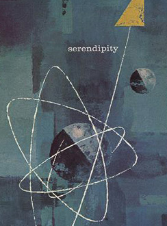
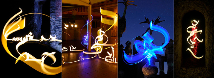
While browsing NOTCOT earlier, I came across this post linking to this frankly quite amazing set of light writing photos by Julien Breton (also via this post). You know the idea; set the camera up in a dark place on a very long exposure, and use something like a flashlight or LED penlight to draw shapes. I’ve seen some beautiful examples before (bottom), but nothing as intricate and detailed as these. These are quite close crops; you can view the full images and get more information on Breton’s site.
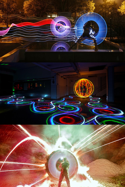
I thought I’d already posted about these images from LAPP - Light Art Performance Photography. I can’t remember when I first saw them but they fascinate me, I’d love to watch some of these being made. The site has added a load of new photos since I last looked so it looks like they’re pretty active in creating new works too. Great stuff:
Just saw this book cover on Sci-Fi-O-Rama with some gorgeous lettering. If you’re interested in lots of great sci-fi and fantasy illustration the site is worth visiting, though type and lettering don’t feature there very often. I loved the exuberance of this script, it’s perfect late 60s stuff, and yes, of course I’ve traced it.