Mongolian Script

If you’re here to ask me to translate something into Mongolian for a tattoo, please go and read the note at the bottom of the article now.

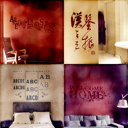
It’s not every day you come across something that you’ve not only never heard of before, but never even suspected existed. Such it was with me and Mongolian Calligraphy until yesterday evening. I found some examples of it in a Google image search from here and here and decided I needed to learn more about it.

It turns out that thanks to Stalin and the Soviet Union we nearly ended up losing the classic Mongolian script as a living writing system entirely:

Introduced in the times of Chinggis Khaan, some eight centuries ago, it was widely used until 1942, when Stalin decided that Asian nations including Kazakhstan, Uzbekistan, Turkmenistan and Mongolia must all use Cyrillic instead of their native script. Mongolia Today

Thankfully, now that the Soviet Union is dead and gone there are now efforts to revive interest and skills in ‘Old Script’. There are a couple of other writing systems used for Mongolian, but I’m mostly interested in the classic script, and especially the calligraphy it makes possible. It really is beautiful. Interestingly, it’s read from left to right, as Wikipedia explains (from the classic script article):

Most other vertical writing systems are written right to left, but the medieval Uyghur alphabet and its descendants - the Mongolian, the Oirat Clear, the Manchu, and the Buryat alphabets - proceed from left to right. This is because the Uyghurs rotated their script 90 degrees anti-clockwise to emulate the Chinese writing system.

I noticed the left-to-right reading direction after a bit of research led me to The Mongolian Bible site, which has the New Testament translated into Mongolian and presented in classic script. You need Internet Explorer to see it, as it uses Microsoft-specific things to display the font and the vertical type, but if you have IE it’s worth a look.

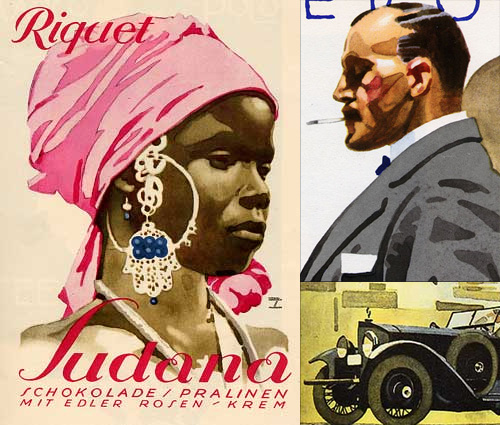
Ludwig Hohlwein

I’ve had some images from these articles in my ‘inspiration’ folder for about two years now, maybe even three. I’ve only just got around to looking closely at the lettering on them - it was the virtuoso watercolour technique that attracted me to them originally. The most interesting one for me is the Sudana chocolate poster… or is it packaging? The article doesn’t say. I think the best way to understand lettering is to redraw it using beziers - not a technique that works for everyone, but it works for me. I noticed right away that the letters are drawn with refinement and precision, and it was a very pleasant job to reproduce them with (almost) every point at extrema. The ‘S’ needed a couple of extra points along the main stroke, as if Holwein applied a little extra pressure at the midpoint to create a subtle bulge there. The swirly ‘a’s are a little more involved, and to draw them so they can be rendered reliably means a few extra points and outlines, and what with this being lettering they are of course different from each other. I doubt I’ll want to create a font out of these, but I’ll keep them handy for any lettering projects I have, that ‘R’ especially.

Toronto Type

I’ve had this page open in my browser for weeks now, demanding that I say something about it. Joe Clark writes a comprehensive critique of the state of typography on the Toronto subway system, from great beginnings to the chaos of today. From the introduction:

You might not expect something typographically unique to come out of Toronto, a B-tier city that stands in the shadow of A-tier cities even in the minds of some residents. But the margins are where originality can thrive, and the typography of the Toronto subway is a prime example. It is also an example of subverting, ignoring, and actively destroying a special typographic heritage - quite an achievement considering that the type involved is almost a foot high and permanently sandblasted into subway walls.

The article goes on to describe the poor state of information design for signage across the subway system, provides comparisons with New York’s system and shows us what can happen to type when people really don’t care (check out the letterspacing on Leslie, about halfway through the article). It makes you appreciate, even more, just how good London Underground’s type system really is.

The appalling thing is that the original type in Toronto’s system was really rather good, I love the R especially - it is, dare I say it, cute. See some more examples from the article below, then set aside half an hour or so and go and read the article.

The Nature of the Beast

Jeremy Pettis has produced a wonderful series of typographic illustrations, representing 26 animals - one for each letter of the alphabet. For each, custom lettering is designed to convey the appearance or behavioural characteristics of the animal. They’re all very clever, and some require a bit of contemplation to ‘get it’. My favourite is the (perhaps) rather obvious, but beautiful Zebra one, though the Kangaroo one has an ‘ar’ ligature that’s just perfect:

He’s put the background sketches and roughs on Flickr, which is a great use of the site and for once, a use of the site that I actually can get behind. Flickr’s soviet, rigid, artless presentation is actually ideal as a kind of digital scrapbook for roughs.

Graphis Collection

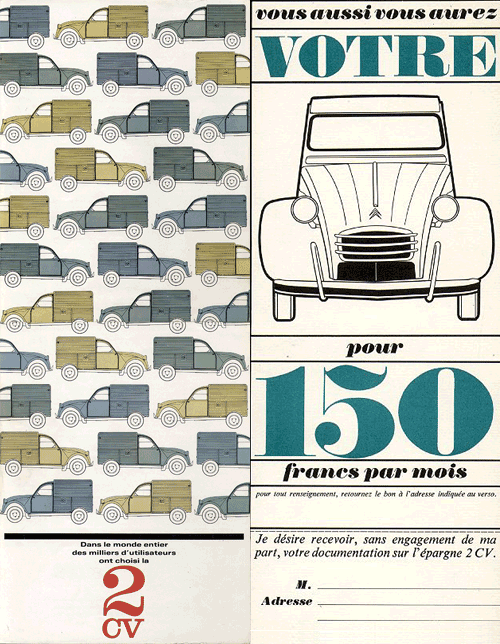
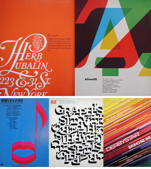
Here’s a good collection of photos of Graphis Magazine from between 1965 and 1982 which might be useful for inspiration. I’ve moaned about Flickr before, but I still wish that people would take the opportunity to write something about the pictures they dump there. Still, I shouldn’t complain too much, as I’d rather people put them there at least than not share them at all! I’ve assembled a few of my favourites, and at right is a particularly nice logo - I’ve played around with fitting a J into a round letter (an ‘O’ I recall), and it can be hard to get it just right.