Oded Ezer

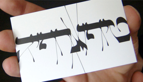
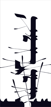
I’ve been meaning to write something about Oded Ezer for ages, ever since seeing his contribution to the Urban Forest Project (at right). Unfortunately I know only a little about Hebrew typography and calligraphy so I can’t write from any qualified angle on it. Ezer’s work is just amazing though, and so I add another entry to my ever-expanding Things To Learn Or Find Out More About list - Hebrew! Recently I saw a link on Notcot about his recent Ketubah project, which looks great, but I’m having a little difficulty working it out. The closeups show what appear to be cut out letterforms folded over to form new shapes, but the photos don’t say whether they’re printed to look like that or they’ve actually been cut out and stuck down again. I’m hoping the former. Below are some images of his work that I’ve saved for inspiration. Take a look at his site for more, and here for some samples of his poster work.
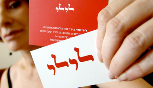
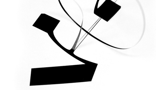
From Ketubah:

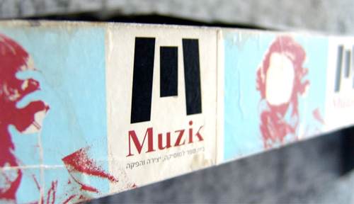
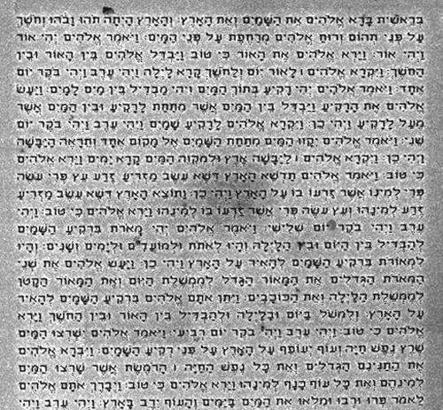
Other inspirational images from Oded Ezer’s site. These really are lovely.

Ambigrams

I came across these ambigrams by Tiffany Harvey during the big Christmas/New Year break. There are some great examples in the gallery (on Flickr, of course), but these two caught my eye especially. I’m fascinated by ambigrams, and always thought words suitable for making them were fairly rare, but Harvey seems to promise any word can be made into an ambigram, even two, three or four words. Fascinating.

The Nanoscale Bible

I’m a bit loath to post another article on something to do with the Bible, after the flood of mostly offensive, illiterate and incomprehensible emails I got the last time I posted on the subject. However, needs must, and I think this is remarkable enough to post on. Researchers at Israel’s Institute of Technology, Technion, have enscribed the entire Hebrew Bible onto a silicon surface smaller than the head of a pin.

I could quip that, of course, the kerning’s all wrong but I suspect these letters were created by a process akin to dot-matrix printing. I think it’s amazing. Beat that, microfilm!

Wear Your Favourite Typeface

Been meaning to post this for a little while, I think I found it via Design Observer, these simple t-shirts each bearing a sample of a great typeface. I think they’re a nice idea, but I’m a little disappointed that they don’t have designs that reflect the character of each face more, instead opting for name-of-face-in-a-box. Printing restrictions, I assume.

Still, they’re nice, if too small for me. Go and look.

The Colour of Type

I can’t quite recall why I’ve not blogged this before. For the life of me I can’t recall where I found it (I’ve had it on my hard drive for a while), but it was made by the “United Designers Network - Berlin”, a search for whom redirects to Spiekermann Partners.

Now and again I look at it and marvel how two entirely different types work so well on the same page. Viewed scaled down (below, in positive and negative) you can see that the whole piece has an even colour, and yet a closeup (right) shows that it’s set in Adobe Caslon and Wittenberg Fraktur (OK, I cribbed the name of the blackletter from the original PDF). I’d never have thought the two faces could have the same colour like that. I love it, it’s a really nice bit of inspiration.

Update: I guess I should have had a closer look through the Spiekermann Partners site! Alessandro Segalini mailed me with the blog entry describing the design motivation of the poster, apparently by Erik Spiekermann himself. Excerpt here:

The poster designed itself: the English text is set in Caslon, the typeface that George Bernard Shaw always specified for his writings; the German copy is set in Fraktur, the typeface used for setting German and other northern languages since Gutenberg. If it hadn’t been for the Nazis misusing these faces for their sinister purposes, we would still be reading Fraktur. It is the typeface of Goethe, Martin Luther, Karl Marx and Hegel. And it is perfectly suited to set our long words and interminable sentences, still evoking Gothic cathedrals and narrow streets with timbered houses. The one used is called Wittenberg Fraktur, after the town where Luther nailed his theses on a church door in 1517.

Incidentally, Spiekermann Partners developed the Deutsche Bahn brand system which I’ll no doubt blog about some time in the future.

Pylons

It’s a bit tempting to create a category called “Stuff you didn’t know needed a name” for this. You know those bits that hold the counters in on type stencils? They’re called Pylons now, apparently.

Actually, I’m surprised they don’t already have a name.

I, For One, Welcome Our New Robotic Calligraphers

This robot has been programmed to write out the entire Martin Luther bible in a calligraphic style on a long roll of paper. I wonder if they’re going to bind the pages up and publish it? What the robot does is a step up from print in reproducing the manuscripts made by monks, which is great, though it doesn’t say (though my German isn’t good enough to read the product page) whether the robot arm applies differential pressure and angle of stroke depending on the previous letters, or how far across the line it is, or how far down the page, like a human being would. If it did, then that would in my mind give the work a magical, delicate quality of something written. I don’t want to get all tedious and mystical about some missing innate human or animistic quality, but I like the idea of a robot arm having to stretch a bit at the edges of the page, altering its stroke weight after a particularly arduous cadel previously, all that kind of stuff. I can imagine a whole series of publications that could be given this ‘hand done’ treatment. We could have special editions of books made by one-time-only robot arms, ones that get tired after a number of copies and can’t be made to write any more, books made by robots with a signature style, with minds of their own. All eventually of course leading to original works created by machines so advanced we have to refer to them as human (or post-human) too…

If you fancy emailing me about this, do go ahead, but read this first!

  • I didn’t make this robot, I’m not involved with the team who made it, and what I know about it is written above
  • I am well aware that the original version of the Bible being written was printed, but I’m also aware that the Gutenberg Press had features to attempt to replicate human variation in manuscript writing. My comments are a hope for the future of this machine and not a ‘lament’ or a complaint about it.
  • Please don’t be unpleasant. I have no idea what is so upsetting to people about this robot, but please don’t send me insults.