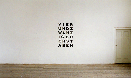
Not much information about this, apart from it being from 2001 and being 24 characters that say “twenty four characters” in German. As a wall decoration, however, it reminds me of these.
David sent me a link to this, somewhat appropriate for April Fools Day, about an H&FJ spoof font, estupido. I find the idea of creating swashes for OCR A hilarious, but I thought, shouldn’t robots have fancy type too? One day, our machine comrades will be attending theatres and poetry recitals, and instead of programmes set in flourish-heavy Regency scripts like we do, maybe they’ll want something a little more evocative of their earlier eras; Simpler, slower times before 100 Exabyte connections ruined the slow pace of digital romance… And who says computers can’t read swashes? It’s discrimination I say! Discrimination!

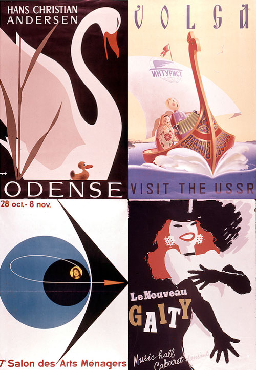
There are many collections of vintage posters on Flickr, most of them full of the mundane, rather than the classic. What makes an old poster a ‘classic’ anyway? Does it have to have inspired a whole style of advertising, or be an exemplar of a particular style, be well-executed or just be by someone famous? I guess it doesn’t really matter, it seems it just has to be old and have survived to be scanned in and shoved online. It’s nice though when you find some good examples in these collections. I particularly like some of the (depressingly low-resolution) scans on this collection, especially the lettering on the Volga one, which I nearly missed thanks to Flickr’s brutal it-must-be-square thumbnail cropping.

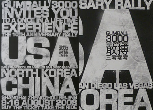
An old one I’ve had around for a while, this poster (or invite?) for this year’s Gumball 3000.
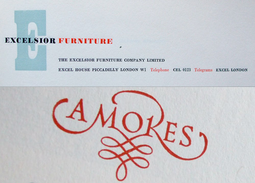
Courtesy of the ever-fantastic Ace Jet 170, this collection of images of the 1958 Penrose Annual. A couple of my favourites at the bottom, but I just had to trace the Amores one, below. I love it. The M-R* ultra-ligature was rather satisfying to do.

There’s a great collection of 3D type designs on You The Designer. I was looking through them and was reminded of the long-neglected Atlas Magazine, which is sort-of still going (well, it’s there but not being updated from what I can tell). I remember Atlas having a new design with each issue, which was what kept me going back, and looking through previous issues you can see how fast the technology was developing in those years. One of them even offers a link to the Netscape Plugin Finder, using a pop-up window. Still, it’s stuck on the last design now, though you can look at previous issues by clicking the roman numerals floating about on the left, if you can. It’d be interesting to see how it would have developed, had it avoided the big-time of IPOs and say, a merger with Slate or similar. I wonder if it would still have navigation that tries to run away from you?


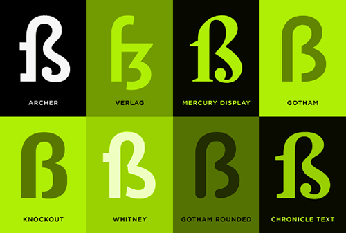
Favourite to draw that is… Two interesting articles I’ve followed links to on the H&FJ site recently are the ones about the Sulzbacher Eszett and the Pilcrow (and Capitulum) (via Kottke and Ace Jet 170). It seems both come up in people’s favourite characters to draw. I like drawing the ‘3’ myself, both in ink and with beziers, but drawing the eszett is like a super big extra special bonus ‘3’ with soft curves, sharp edges, stressed strokes… lovely. Some people I work with have eszetts in their surnames, and it disappoints me that after a few months of blank incomprehension from some of the less linguistically capable* they replace it with a double-s. A real shame.
Office doodles testify to the popularity of the letter R, perhaps because it synopsizes the rest of the alphabet in one convenient package (it’s got a stem, a bowl, serifs both internal and external, and of course that marvelous signature gesture, the tail.)
I think I’ll chime in with Kottke and ask to see some of these office doodles!
* I’m ashamed to say this can be summed up as, “mostly British people”.
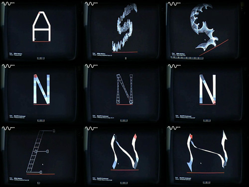
I always liked the display screens in 2001: A Space Odyssey, and I was reminded of them the other day by something. I went online to have a look round for a picture of some of them, and, well, there’s really not very much. Even the IMDB pages have very low resolution blurry shots that barely show the HAL console, never mind the details of what the info screens are showing. I’ve got the DVD, so a bit of stepping through frames later I can at least recreate the basic appearance of them. The small text is unreadable for the most part, but I could make a guess (that’s part of the fun). I created a desktop (iPhone/mobile) out of them too.

The big question of these things, though, is, “What are they showing?” Given that so much of the rest of the film is pretty carefully thought out, it seems a bit odd that these screens should end up as a slightly more sophisticated version of Star Trek’s blinking lights. There are some graphs, some video feeds, and a few lines of numbers, but these three-letter codes are the most eye-catching. If they’re supposed to be some representation of HAL, what are all the buttons on the console for? Actually, I do wonder why the buttons are there - since everything is done by voice, and when HAL goes wrong, there’s no frantic hitting of buttons or any hint that these consoles do anything at all.
Still, it is all rather pretty!

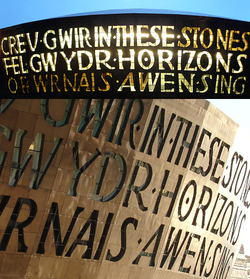
During a discussion of modern architecture in Wales (as you do), David pointed me in the direction of some pictures of the Millennium Centre in Cardiff, which has some fantastic lettering on the front canopy. The letters, big, chunky and pretty dramatic and spell out the title of a work for chorus and orchestra commissioned from Gwyneth Lewis for the opening ceremony of the building. I particularly like the way the two languages have been written together - the Welsh one being flush-left, the English flush-right, with the ragged edges slotting together nicely - and that they aren’t a direct translation of each other. The lettering itself is lovely, with varied letterforms and spacing giving the whole thing the sense of something hand-done, which given its scale is something to behold. In Lewis’ own words:
The windows out of which the words are made suggest to me an ideal of poetry: that it should be clear enough to let light in and out of a building, offering enough a distinctively local view of the world; it should speak a truth which is transparent, beautifully crafted but also fragile and, therefore, doubly precious.
I think it looks great as it is, but I’ll be interested to see what it looks like after a good layer of verdigris has formed on the copper.
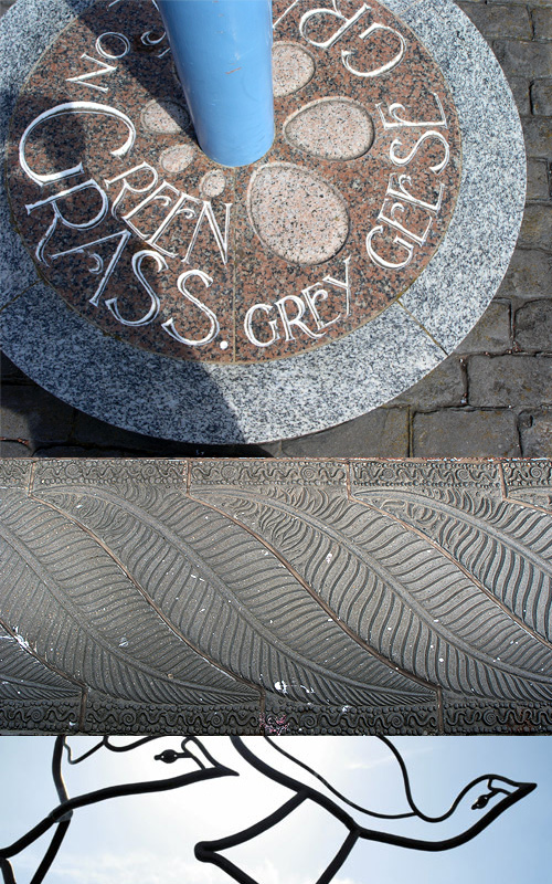
The appearance of the building reminded me of a big regeneration project for Morecambe’s seafront, which also has a strong typographic element. Well, several in fact. It’s the Tern Project, a series of sculptures, walkways, and general improvements to the seafront to make it a more fitting location to see Morecambe’s (arguably) finest asset - its view of the bay. The Tern Project website gives you some idea of what’s been done, but I think whoever built it based it on a museum or art gallery’s site - i.e. make the pictures as small and uninformative as possible - probably labouring under some delusion that seeing a nice big photo will somehow deter you from visiting. Note to developers of these sites: it doesn’t! Put big pictures on your site! Let people get an idea of it, and they’ll be more likely to visit! A photo can only give a rough impression, but seeing the context and some detail, you will hopefully want to visit. The top two of these pictures are mine, the bottom one is from this we-think-all-caps-is-cool site. Still, irritating websites aside, I would strongly suggest paying a visit to Morecambe to have a look at the artworks, and to see the view across the bay to the Lake District.
I just found a link to this odd thing on NOTCOT. It’s essentially a synthesiser control panel for changing the forms of glyphs in a typeface, but instead of just changing sound, it treats the strokes as a kind of ‘play-head’ for creating sound, rather like a groove in a vinyl record. As you change the glyph, you change the sound, and vice versa. Also, what you do to one glyph will be done to all the others.
Now, my first impressions after looking at the results are to say that this is an evil device born of the unspeakable nether regions of mythological demons - I mean, to do this to type? They’ll be kicking puppies next! However, I’ve since watched the video and I think there may be some interesting things in there, say, altering the stress on type, adding some interesting brush strokes and the like, but that what you get would be a starting point for any kind of type project. I wouldn’t ever use any of the results as they are. Besides, the noises the thing makes are stunningly annoying. It’s no wonder most of the results are so hideously ugly, you’d end up with a seriously bad headache and a foul temper after a few minutes of using it.
There is one good thing about it though: the display interface. It reminds me of graphics from Star Wars, or the info-screens in 2001: A Space Odyssey. Any moment you expect a Ti-Fighter to come in and start blasting vertices from the bastardised remains of the glyphs: